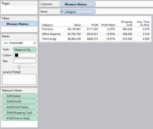
In Tableau, there are three types of filters. More explicitly, there are three different ways to limit the data that is displayed by your graph. These types are Custom SQL "Filters", Context Filters, and Traditional Filters. Each of these has its own strengths and weaknesses, and we will look at them one at a time.
First, a Custom SQL "Filter" is a WHERE clause that is placed in the SQL that queries the data to be used in the workbook. "Filter" is a Tableau term that technically applies only to Context and Traditional Filters; however, the Custom SQL "Filter" emulates the behavior of a global Context Filter, so we will refer to it as such. By construction, Custom SQL "Filters" are always global. The most common reason for using a Custom SQL "Filter" is to limit the size of a data extract. The smaller your data extract, the more quickly your charts will load. In other words, you can make more complex charts without sacrificing efficiency.
One of the ways to create a Custom SQL "Filter" is during the Server Connection process. For example, here I create a new SQL Server Connection.
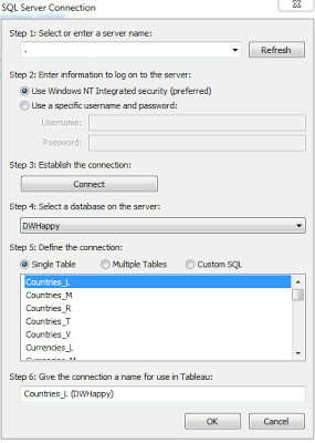 |
| SQL Server Connection |
Once I select the Server and Database I would like to use, I can select the table(s). I can use either the Single Table or Multiple Tables feature to select the table, then I can click on the Custom SQL button.
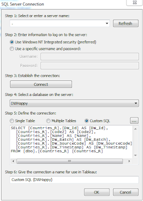 |
| Custom SQL Server Connection |
In the SQL code, I can place a WHERE clause to filter on any values I would like. This is the most efficient of all filters. If you would like to place a static, global filter on your data, this is where you should do it.
Next, a Context Filter is a filter in Tableau that affects the data that is transferred to each individual worksheet. Context Filters are great when you want to limit the data seen by the worksheet. When a worksheet queries the data source, it creates a temporary, flat table that is uses to compute the chart. This temporary table includes all values that are not filtered out by either the Custom SQL or the Context Filter. Just like with Custom SQL "Filters", your goal is to make this temporary table as small as possible.
Context Filters have a few advantages over Traditional Filters. First, they execute more quickly than Traditional Filters. They are also executed before Traditional Filters and can be executed all at once, which further improves efficiency. However, they do have one drawback. It takes time for the filter to be placed into context. A rule of thumb, from Tableau's KnowledgeBase, is to only place a filter into context if it reduces the data by at least 10%.
A Context Filter is created by dragging a field onto the "Filters" Shelf and editing the filter. Then, you can Right-Click the field on the shelf and select "Add to Context." If you have multiple context filters, you can CTRL-Select them all and add them to context in a batch. This will improve the efficiency of your filter.
Lastly, a Traditional Filter is exactly what most people think of when they think of filters. When Tableau is creating the visualization, it will check to see if a value is filtered out by a Traditional Filter. Since this is not performed at the table level, it is the slowest of all filter types. However, it does have the advantage of being performed after the Context Filters. This is a necessity if you are dealing with complex "Top N" filters. A Traditional Filter can be created by simply dragging a field onto the "Filters" Shelf.
EDIT: If you would like to know more about the order in which Traditional Filters are processed. Check out this link submitted by Jonathan Drummey:
http://community.tableausoftware.com/message/139603#139603
(Jonathan's Google+)
https://plus.google.com/114523841892404322313
I hope you found this post to be informative. Thanks for reading.
Brad Llewellyn
Associate Consultant
Mariner, LLC
llewellyn.wb@gmail.com
https://www.linkedin.com/in/bradllewellyn


.PNG)


.PNG)
.PNG)
.PNG)
.PNG)


.PNG)

.PNG)
.PNG)

.PNG)
.PNG)
.PNG)
.PNG)

.PNG)


.PNG)