Today, we will look at a few different types of graphs in Tableau. More specifically, we will look at the options within the "Marks" Card. As usual, we will use the Superstore Sales sample data set in Tableau.
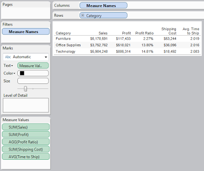
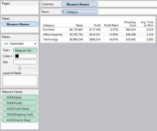
Type 1: Text Table
 |
| Text Table |
Text Tables are definitely the simplest of charts in Tableau. They contain no graphics at all. Despite their simplicity, they excel at displaying multiple measures simultaneously. In the above chart, I easily displayed five measures without cluttering the screen. Text tables also display much more quickly due to their non-existent graphics.
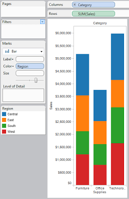
Type 2: Bar Graph
 |
| Bar Graph |
Bar Graphs, sometimes improperly referred to Histograms, are great for displaying a small number of measures across one or two dimensions. The stacked bar graph above gives an easily interpreted view of Sales across Region and Category. Bar Graphs display somewhat more quickly as well, due to their visual simplicity.
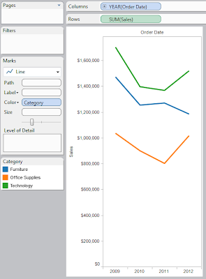
Type 3: Line Graph
 |
| Line Graph |
Line Graphs are somewhat similar to bar graphs in their interpretation. There is one minor difference. In a bar graph, it is difficult to detect differences in size across a single color due to the bar being located in different places. A line graph does not have this limitation due to the fact that the values are linked via a line. However, line graphs typically denote some sort of ordering, usually time. It is unwise to use a line graph when your dimension has no innate ordering (That's what a bar graph is for).
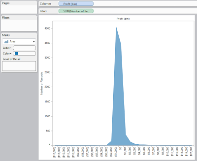
Type 4: Area Graph
 |
| Area Graph |
An area graph is pretty much a mix of a line and a bar graph. It is a line graph where all of the area below the line is shaded. While this is pretty much a waste of space in most applications, I find it useful when combined with the "Bin" feature to create a probabilistic function. However, if you were to switch this graph from an area graph to a bar graph, it will maintain it readability and become something people have seen before (This is the description of an actual histogram). Alas, I like this view.
Type 5: Shape Tables
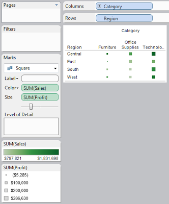 |
| Shape Graph |
Shape graphs are the broadest range of graphs. They allow you to place pretty much any shape you want, wherever you want, while also giving it dynamic sizes and colors to allow easy interpretation. The graph above is called a heat map. It allows the user to see, at a glance, which values are high and which values are low. Shape graphs are my favorite in my most applications. However, due to their complexity, they tend to display more slowly than other types of graphs.
Type 6: Pie Chart
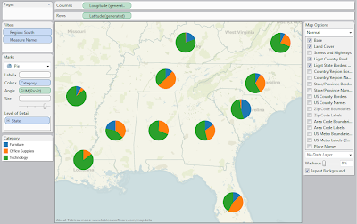 |
| Pie Chart |
The pie chart may be the most universal of graphical charts. It is widely known exactly how to interpret these. They are also rejected by most visualization experts due to their lack of space efficiency and their limitation of only being able to display a single concept. The above chart is the best example I could come up with as to how to use a pie chart. Alas, I still feel this information would be better displayed in some other form, like a Heat Map.
Type 7: Gantt Bar Graph
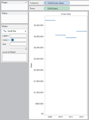 |
| Gantt Bar Graph |
A Gantt Bar Graph is similar to a line graph, but the points don't connect. So far, I've yet to see someone up with a good use for one. However, I will keep my eyes open. Maybe there's a hidden use for them that I'm missing?
Type 8: Filled Map
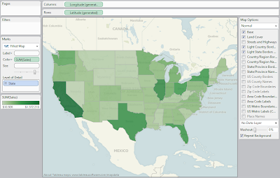 |
| Filled Map |
A filled map is a great way to display geographic data. It's pretty much a heat map superimposed on an actual map. With Tableau's abilities to generate all kinds of maps, as well as allow custom maps, this could be the best of the basic display tools. If you have geographic data, I highly recommend using some type of filled map.
Type 9: Polygon
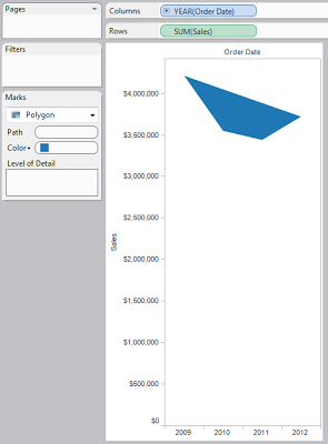 |
| Polygon |
This is an interesting concept that Tableau implemented. This is not a graph "per se." It is more of a visualization tool. Tableau allows you to create your own coordinates and superimpose them on an image. Therefore, with enough time and effort, you would create some incredibly detailed visuals with this tool.
I hope you found this introduction to be enlightening. Thanks for reading.
Brad Llewellyn
Associate Consultant
Mariner, LLC
llewellyn.wb@gmail.com
https://www.linkedin.com/in/bradllewellyn


No comments:
Post a Comment