Today, we're going to delve into the new Power BI. Some of you may remember a couple of years ago when we wrote a series of posts comparing Tableau to Power Pivot (technically, it was a comparison of Tableau to Power BI). Well, Power BI has matured substantially since then. So, let's check in on it and see how it works now.
Power BI still contains the original four features, Power Query, Power Pivot, Power View, and Power Map. However, they are all packaged into a single source that's both easy to install and easy to use, not to mention free.
We'll start by showing you some of the completed sample works from Microsoft's website. You can download the sample content packs
here. Let's begin by looking at the Human Resources Sample. This file is actually an Excel file with an underlying Power Pivot model, as well as some Power View dashboards. We could open this file directly in Excel if we wish. If we do this, we must enable all of the add-ins required to run a workbook with these features.
 |
| Human Resources Sample in Excel |
This is using base Power Pivot and base Power View to create the dashboard. That means that some of the more important pieces are missing. For instance, this color palette is pretty uncomfortable. Also, there doesn't seem to be an easy way to change this. Now, let's open this in Power BI.
We start by installing Power BI Desktop, which can be found
here. Then, we open a blank Power BI canvas. From here, we could open the file as an Excel file.
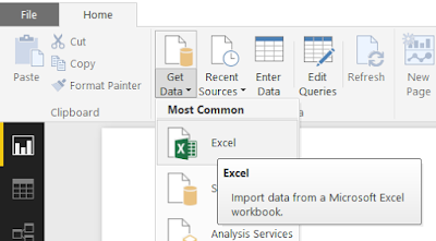 |
| Get Data from Excel |
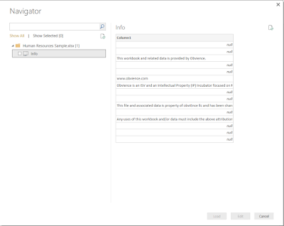 |
| Unusable Data |
When we do this, the only data we have available appears to be some sort of header page. Turns out that when you get data from an Excel file, Power BI only reads data that exists in the Excel file, it will not pull data from Power View sheets or the Power Pivot model. In order to open this type of file, we need to use the Import Excel Contents option.
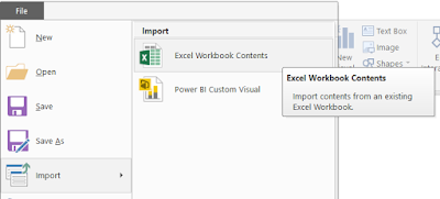 |
| Import Excel Contents |
 |
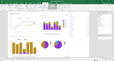
| Human Resources Sample in Power BI |
As you can see, the custom color palettes came through just fine. That's the first indication that this file was meant for Power BI, not Excel. Every one of these charts has a plethora of options you can tinker with on the right "Visualizations" panel.
On the left side of the screen, you can switch between the "Report", "Data", and "Relationships" canvases. The Report canvas is very similar to the old Power View sheets we are used to. The Data and Relationships canvases are very similar to Power Pivot.
One important caveat is that not all visualizations come standard with Power BI. Any of the more unconventional visuals will need to be downloaded from the
Power BI Visual Library. If you attempt to open a Power BI file that contains visuals you do not currently have installed, you will get an empty visual. Here's an example from the Customer Profitability Sample.
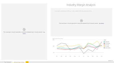 |
| Unsupported Visuals |
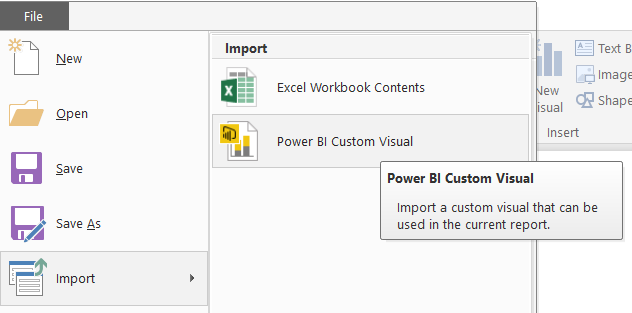
Importing a custom visual is easy. Simply open the Power BI file you would like to use the visual in, then select the Import Custom Visual option.
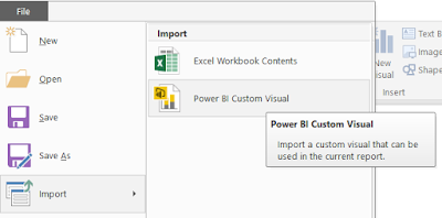 |
| Import Custom Visual |
What if you want to make some cool dashboards without using the Power BI Desktop client? Power BI also has a web interface that you can use to make you dashboards as well. Simply navigate
here and sign in to Power BI. Currently, It seems as though you can only use this service if your organization has an Office 365 subscription. However, this is constantly changing and we encourange you to try for yourself or check with your IT department to get a subscription. Using the web interface, you can create, edit, and interact with dashboards and reports, as well as share them with your colleagues. This service is integrated into Office 365 and should support the same sharing functionality that you are familiar with. Even if your organization doesn't have Office 365, you can still use Power BI Desktop for free.
Hopefully, this opened your eyes to the potential of Power BI. Stay tuned for further posts where we'll talk about how to create your own data models and build your own dashboards. Thanks for reading. We hope you found this informative.
Brad Llewellyn
BI Engineer
Valorem Consulting
@BreakingBI
www.linkedin.com/in/bradllewellyn
llewellyn.wb@gmail.com