Today, we're going to use Power BI to explore our data. Let's say that someone hands us an Excel file and we want to know what's going on in it. The sample data set we are using can be found
here. This workbook contains 3 sheets with data. Let's try to import it into Power BI Online.
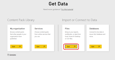
 |
| Get Data |
 |
| Get Data from File |
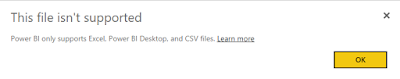 |
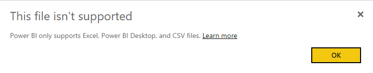
| File Not Supported |
Turns out that this file was created using a very old version of Excel. This means that we need to convert it to a new version, then we can upload it.
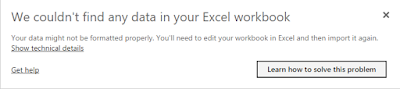 |
| No Data |
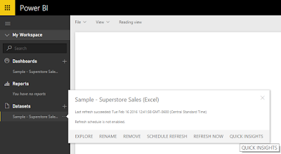
Now it's telling us the file has no data in it. But, we know that it has 3 tabs of data. Turns out that Power BI doesn't look at the tabs at all. It looks for tables. So, we need to turn each set of data into a table, for a total of 3. Now that we have the data uploaded to Power BI Online, we can start exploring. Where do we start? Turns out that Power BI Online will do that for us via the Quick Insights option.
 |
| Quick Insights |
 |
| Quick Insights for Sample |
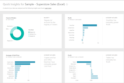
This is amazing! It churned through our data and showed us a some key features without us doing any work at all. It doesn't just show us the 4 insights above. The list continues on for pages and pages. Some of the insights are quite interesting. For instance, it shows that Technology is by far the most profitable Category and Tables are the least profitable Sub-Category. Unfortunately, Power BI Online did not recognize the relationships between the tables automatically. More to that point, there doesn't seem to be a way to create a data model from Power BI Online. It seems that Power BI Online is designed as a way to share your insights, not to replace Power BI Desktop or any other modeling/ETL tool.
There's one more cool thing you can do with Power BI Online. You can ask natural language questions to your data using the Q&A feature.
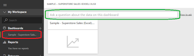 |
| Q&A |
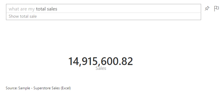
If you create a dashboard using the Sample data, you can ask Power BI a question, and it will try to answer it for you. For instance, what happens if we ask "What are my total sales?"
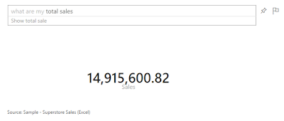 |
| What are my total sales? |
As you can see, it translates this question into "data-speak" so that the Power BI can return the appropriate query. Amazingly, it doesn't seem to mind when you throw more logic at it.
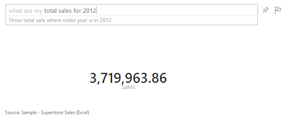 |
| What are my total sales for 2012? |
 |
| What are my total sales of Tables for 2012? |
This is definitely one of the coolest things we've seen an analytics tool do. Power BI Online definitely shows its chops when it comes to fast answers. An interesting addition to the Q&A feature is Cortana. You can enable Cortana to query Power BI Online directly from your Windows machine. This functions in the same way that Q&A does, without requiring that you go through the browser to ask. You can find more information on that
here. Now that we've seen how cool Quick Insights and Q&A can be, let's move over to Power BI Desktop and start tinkering.
Interestingly enough, Power BI Desktop is capable of connecting to the original Excel file, even though it's not a recent version. Moreover, it can also connect directly to the tabs instead of us having to assign tables. It also attempts to automatically detect relationships so that we don't have to explicitly define them. As a note, automatic relationship detection may not work if you have unorthodox relationships or your columns are not named the same. We'll talk more about modelling in a later post. As you can see, we have modeled the data appropriately.
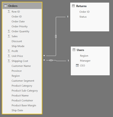 |
| Relationships |
There doesn't seem to be a Quick Insights or Q&A option in Power BI Desktop. This is likely because it is designed more as a Power User tool, as opposed to a standard business user tool. However, since our data is properly modeled, there's nothing stopping us from creating some charts.
 |
| Order Date |
We start by dragging Order Date onto an empty Power BI Desktop Canvas.
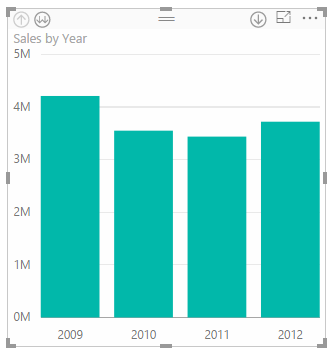 |
| Sales by Order Date |
Then, we drag Sales onto the chart. Power BI decides to display this as a bar chart. Generally, when we are looking at an additive metric (like Sales) over time, we want to see it as a line.
 |
| Sales by Order Date (Line) |
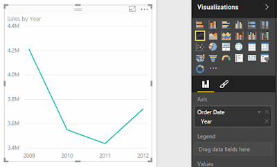
We can easily do that by clicking the "Line" button in the "Visualizations" panel. Now, let's split these lines by Category.
 |
| Sales by Order Date and Category |
We can do that by simply dragging Category onto the chart. What if we want to look at these at the Month-Year Level? It turns out that this is one of the places where Power BI falters. Not all charts have all capabilities. For instance, there doesn't seem to be a way to drill down a line chart. You can only show one dimension at a time. We even decided to create a new column in our data model called Order Month and dragged it onto the chart. We could not have Year and Month on the chart at the same time. Therefore, if you want to see Month Year, you have to create a single calculated column that combines the two or better yet, have a date dimension that does it for you. Fortunately, Matt Masson blogged about a way to do this using Power Query. You can find the post
here. Now, we've run into the problem of using string names (which are sorted alphabetically, but this can be changed) or using YearMonth numerics, such as 200901 (which have huge gaps between 200912 and 201001). Either way, this is disappointing. Fortunately, bar charts give the option to drill-down. So, we have something we can use, even if it's not perfect.
 |
| Sales by Year |
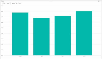 |
| Sales by Quarter |
A caveat of this approach is that you can't show multiple quarters across multiple years at the same time without using more advanced hierarchies. You can either drill down into a single year (by clicking on the bar) or drill down across all years (by clicking the "Double Down-Arrow" button in the top-left). Hopefully, someone in the community has come up with a good workaround for this. Alas, we have seen some very powerful options for a free tool. Stay tuned for more posts about the new Power BI. Thanks for reading. We hope you found this informative.
Brad Llewellyn
BI Engineer
Valorem Consulting
@BreakingBI
www.linkedin.com/in/bradllewellyn
llewellyn.wb@gmail.com