Today, we're going to continue looking at Sample 3: Cross Validation for Binary Classification Adult Dataset in Azure Machine Learning. In the four previous posts, we looked at the
Two-Class Averaged Perceptron,
Two-Class Boosted Decision Tree,
Two-Class Logistic Regression and
Two-Class Support Vector Machine algorithms.
In all of these posts, we used a simple contingency table to determine the accuracy of the model. However, accuracy is only one of a number of different ways to determine the "goodness" of a model. Now, we need to expand our evaluation to include the Evaluate Model module. Specifically, we'll be looking at the
ROC (Receiver Operating Characteristic) tab. Let's start by refreshing our memory on the data set.
 |
| Adult Census Income Binary Classification Dataset (Visualize) |
 |
| Adult Census Income Binary Classification Dataset (Visualize) (Income) |
This dataset contains the demographic information about a group of individuals. We see the standard information such as Race, Education, Martial Status, etc. Also, we see an "Income" variable at the end. This variable takes two values, "<=50k" and ">50k", with the majority of the observations falling into the smaller bucket. The goal of this experiment is to predict "Income" by using the other variables.
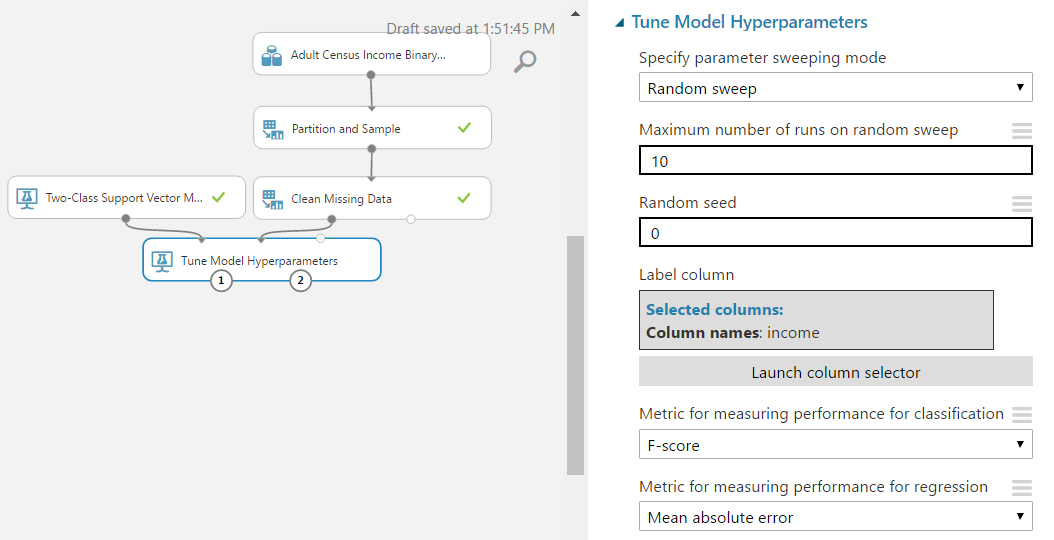
Utilizing some of the techniques we learned in the previous posts, we'll start by using the "Tune Model Hyperparameters" module to select the best sets of parameters for each of the four models we're considering.
 |
| Experiment (Tune Model Hyperparameters) |
 |
| Tune Model Hyperparameters |
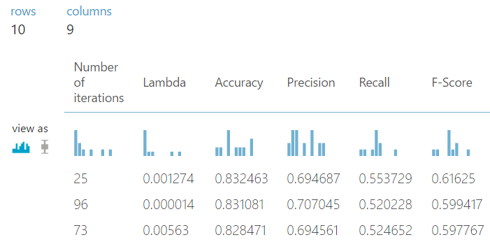
As you can see, we are doing a Random Sweep of 10 runs measuring F-scores. One of the interesting things about the "Tune Model Hyperparameters" module is that it not only outputs the results from the Tuning, it also outputs the Trained Model, which we can feed directly into the "Score Model Module".
At this point, we have two options. For simplicity's sake, we could simply train the models using the entire data set, then score those same records. However, that's considered bad practice as it encourages
Overfitting. So, let's use the "Split Data" module to Train our models with 70% of the dataset and use the remaining 30% for our evaluation.
 |
| Experiment (Score Model) |
 |
| Split Data |
Looking back at the "Income" histogram at the beginning of the post, we can see that a large majority of the observations fall into the "<=50k" category. This creates an issue known as an "imbalanced class". This means that there is a possibility that one of our samples will contain a very small proportion of ">50k" while the other sample contains a very large proportion. This could cause significant bias in our final model. Therefore, it's safe to use a
Stratified Sample. In this case, the Stratification Key Column will be "Income". Simply put, this will cause the algorithm to take a 70% sample from the "<=50k" category and a 70% sample from the ">50k" category. Then, it will combine these together to make the complete 70% sample. This guarantees that our samples have the same distribution as our complete dataset, but only as "Income" is concerned. There may still be bias on other variables. Alas, that's not the focus of this post. Let's move on to the "Evaluate Model" module.
 |
| Experiment (Evaluate Model) |
We chose not to show you the parameters for the "Score Model" and "Evaluate Model" modules because they are trivial for the former and non-existent for the latter. What is important is recognizing what the inputs are for the "Evaluate Model" module. The "Evaluate Model" module is designed to compare two sets of scored data. This means that we need to consider how we're going to handle our four sets of scored data. If we wanted to be extremely thorough, we could use six modules to connect every set of scored data to every other set of scored data. This may be helpful in case there are any cases where one model is good is some areas and weak in others. For our case, it's just as easy to compare them as pairs, then compare the winners from those pairs. Let's take a look at the "ROC" tab of the "Evaluate Model" visualization. Given the size of the results, we'll have to look at it piece-by-piece.
 |
| ROC Tab |
In the top left corner of the visualization, you will see three labels for "ROC", "Precision/Recall", and "Lift". For this post, we'll be covering the ROC tab, which you can find by clicking on the ROC button in the top left, although it should be highlighted by default.
 |
| ROC Experiment View |
If you scroll down a little, you will see a view of the Experiment on the right side of the visualization. This might not seem too handy at first. However, you should take note of which dataset is coming in the left and right sides. In our case, this would be Averaged Perceptron on the left and Boosted Decision Tree on the right.
 |
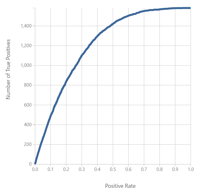
| ROC Chart |
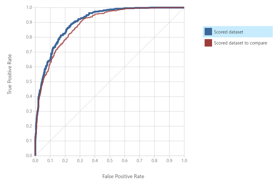
On the left side of the visualization, you will find the
ROC Curve. This chart will tell you how "accurate" your model is at predicting. We like to think of the ROC Curve as follows: "If we want a
True Positive Rate of Y, we must be willing to accept a
False Positive Rate of X". Therefore, a "better" model would have a higher True Positive Rate for the same False Positive Rate. Conversely, we could say that a "better" model would have a lower False Positive Rate for the same True Positive Rate. In the end, True Positive predictions are a good thing and should be maximized. Moreover, False Positive predictions are a bad thing and should be minimized. Therefore, we are looking for a curve that travels as close to the top-left as possible. In this case, we can see the "Scored dataset to compare" is a "better" model. In order to find out which model that is, we have to look over at the ROC Experiment View on the right side of the visualization. We can see that the "Scored Dataset" (i.e. the left input) is the Averaged Perceptron, while the "Scored Dataset To Compare" (i.e. the right input) is the Boosted Decision Tree. Therefore, the Boosted Decision Tree is the more accurate model according to the ROC Curve.
As an added note, there is a grey diagonal line that goes across this chart. That's the "Random Guess" line. It follows a line for 50% probability of guessing correctly, just like if we flipped a coin. If we find that our model dips below that line, then that means our model is worse than random guessing. In that case, we should seriously reconsider a different model. If the model is always significantly below that line, then we can simply swap our predictions (True becomes False, False becomes True) to create a good model.
 |
| Threshold and Evaluation Tables |
If we scroll down to the bottom of the visualization, we can see some tables. We're not sure what these tables are called, so we've taken to calling them the Threshold table (top table with slider) and the Evaluation table (bottom table). These tables are interesting in their own right and will be covered in a later post.
 |
| ROC Curve 2 |
Look at the ROC Curve for the other "Evaluate Model" visualization, we can see that the Logistic Regression model is slightly more accurate than the Support Vector Machine. Now, let's create a final "Evaluate Model" module to compare the winner from the first ROC analysis (Boosted Decision Tree) to the winner from the second ROC analysis (Logistic Regression).
 |
| ROC Curve (Final) |
We can see that the ROC Curve has determined that the Boosted Decision Tree is the most accurate model out of the four. This wasn't a surprise to use because we did a very similar analysis using contingency tables in the previous four posts. However, model evaluation is all about gathering an abundance of evidence in order to make the best decision possible. Stay tuned for later posts where we'll go over more information in the "Evaluate Model" visualization. Thanks for reading. We hope you found this informative.
Brad Llewellyn
Data Scientist
Valorem
@BreakingBI
www.linkedin.com/in/bradllewellyn
llewellyn.wb@gmail.com


