 |
| Sample 3: Model Building and Cross-Validation |
 |
| Adult Census Income Binary Classification Dataset |
 |
| Sample Dataset |
 |
| Adult Census Income Binary Classification Dataset (Visualize) |
 |
| Adult Census Income Binary Classification Dataset (Visualize) (Income) |
 |
| Partition and Sample |
 |
| Partition and Sample (Visualize) |
 |
| Clean Missing Data |
 |
| Two-Class Averaged Perceptron |
This algorithm gives us the option of providing three main parameters, "Create Trainer Mode", "Learning Rate" and "Maximum Number of Iterations". "Learning Rate" determines how many steps the algorithm takes in order to calculate the "best" set of weights. If the "Learning Rate" is too high (making the number of steps too low), the model will train very quickly, but the weights may not be a very good fit. If the "Learning Rate" is too low (making the number of steps too high), the model will train very slowly, but could possibly produce "better" weights. There are also concerns of Overfitting and Local Extrema to contend with.
"Maximum Number of Iterations" determines how many times times the model is trained. Since this is an Averaged Perceptron algorithm, you can run the algorithm more than once. This will allow the algorithm to develop a number of different sets of weights (10 in our case). These sets of weights can be averaged together to get a final set of weights, which can then be used to classify new values. In practice, we could achieve the same result by creating 10 scores using the 10 sets of weights, then averaging the scores. However, that method would seem to be far less efficient.
Finally, we have the "Create Trainer Mode" parameter. This parameter allows us to pass in a single set of parameters (which is what we are currently doing) or pass in multiple sets of parameters. You can find more information about this algorithm here and here.
This leaves us with a few questions that perhaps some readers could help us out with. If you have 10 iterations, but set a specific random seed, does it create the same model 10 times, then average 10 identical weight vectors to get a single weight vector? Does it use the random seed to create 10 new random seeds, which are then used to create 10 different weight vectors? What happens if you define a set of 3 Learning Rates and 10 Iterations? Will the algorithm run 30 iterations or will it break the iterations into sets of 3, 3, and 4 to accomodate each of the learning rates? If you know the answers to these questions, please let us know in the comments. Out of curiosity, let's see what's under Visualize for this tool.
 |
| Two-Class Averaged Perceptron (Visualize) |
 |
| Data Flow |
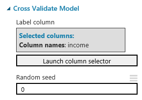 |
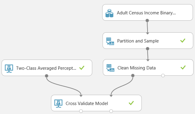
| Cross Validate Model |
Imagine that we used the Testing/Training method to create a model using the Training data, then tested the model using the Testing data. We could estimate how accurate our model is by seeing how well it predicts known values from our Testing data. But, how do we know that we didn't get lucky? How do we know there isn't some strange relationship in our data that caused our model to predict our Testing data well, but predict real-world data poorly? To do this, we would want to train the model multiple times using multiple sets of data. So, we separate our data into 10 sets. Nine of the sets are used to train the model, and the remaining set is used to test. We could repeat this process nine more times by changing which of the sets we use to test. This would mean that we have created 10 separate models using 10 different training sets, and used them to predict 10 mutually exclusive testing sets. This is Cross-Validation. You can find out more about Cross-Validation here. Let's see it in action.
 |
| Scored Results (1) |
 |
| Scored Results (2) |
The remaining columns, Scored Labels and Scored Probabilities, are added to the end of the data. The Scored Labels column tells us which category the model predicted this row would fall into. This is what we were looking for all along. The Scored Probability is a bit more complicated. Mathematically, the algorithm wasn't trying to predict whether Income was "<=50k" or ">50k". It was only trying to predict ">50k" because in a Two-Class algorithm, if you aren't ">50k", then you must be "<=50k". If you looked down the Scored Probabilities column, you would see that all Scored Probabilities less than .5 have a Scored Label of "<=50k" and all Scored Probabilities greater than .5 have a Scored Label of ">50k". If were using a Multi-Class algorithm, it would be far more complicated. If you want to learn about the Two-Class Average Perceptron algorithm, read here and here.
There is one neat thing we wanted to show using this visualization though.
 |
| Scored Results (Comparison) |
When we click on the "Income" column, a histogram will pop up on the right side of the window. If we click on the "Compare To" drop-down, and select "Scored Labels", we get a very interesting chart.
 |
| Contingency Table |
This is called a Contingency Table, also known as a Confusion Matrix or a Crosstab. It shows you the distribution of your correct and incorrect predictions. As you can see, our model is very good at predicting when a person has an Income of "<=50k", but not very good at predicting ">50k". We could go much deeper into the concept of model validation, but this was an interesting chart that we stumbled upon here. Let's look at the Evaluation Results by Fold.
 |
| Evaluation Results by Fold |
This shows you a bunch of statistics about your Cross-Validation. The purpose of this post was to talk about the Two-Class Averaged Perceptron, so we won't spend much time here. However, don't be surprised if we make a full-length post about this in the future because there is a lot of information here.
We hope that this post sparked as much excitement in you as it did in us. We're really starting to see just how much awesomeness is packed into Azure Machine Learning Studio; and we're so excited to keep digging. Thanks for reading. We hope you found this informative.
Brad Llewellyn
BI Engineer
Valorem Consulting
@BreakingBI
www.linkedin.com/in/bradllewellyn
llewellyn.wb@gmail.com
BI Engineer
Valorem Consulting
@BreakingBI
www.linkedin.com/in/bradllewellyn
llewellyn.wb@gmail.com


