Monday, December 17, 2018

Data Science in Power BI: Python

Today, we're going to talk about Python in Power BI.  If you haven't read the earlier posts in this series, Introduction, Getting Started with R Scripts, Clustering, Time Series Decomposition, Forecasting, Correlations, Custom R Visuals and R Scripts in Query Editor, the may provide some useful context.  You can find the files from this post in our GitHub Repository.  Let's move on to the core of this post, Python.

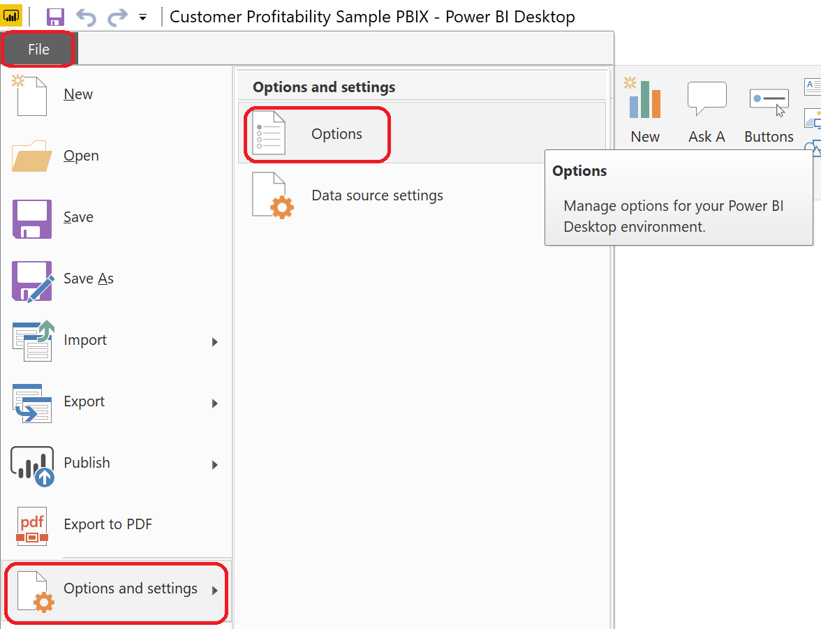
In the previous two posts, we've shown how to implement custom visuals and queries using R.  In this post, we'll use the new Python functionality to do the same thing.  Since the Python functionality is still in Preview at the time of writing, we need to enable it in Power BI.
Options

Python Support
We can enable this feature by selecting "File" -> "Options and Settings" -> "Options". Then, select "Preview Features" -> "Python Support" -> "OK". We also need to restart Power BI after enabling this feature. After restarting Power BI, we can navigate back to "Options" to see a new tab, "Python Scripting".
Python Scripting
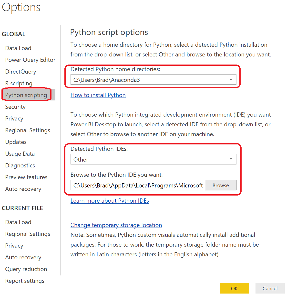
In this tab, we need to define a Python directory and an IDE, just like we did with R. We'll be using Anaconda as our Home Directory and VSCode as our IDE.

For the first part of this post, we'll recreate our linear regression model from the Custom R Visuals post. You can download the PBIX here. For reference, here's the R script that we will be recreating in Python.

<CODE START>

# Input load. Please do not change #

`dataset` = read.csv('C:/Users/Brad/REditorWrapper_36d191ca-4dae-4dab-a68c- d15e6b37d3ed/input_df_fe354708-4578-4d89-9272-faf3096df75b.csv', check.names = FALSE, encoding = "UTF-8", blank.lines.skip = FALSE);

# Original Script. Please update your script content here and once completed copy below section back to the original editing window #

dataset[is.na(dataset)] <- 0
reg <- lm(`Revenue Current Month (Log)` ~ . - `Name` , data = dataset )
plot(x = reg$fitted.values, y = reg$residuals, xlab = "Fitted Values", ylab = "Residuals",
     main = paste( "Predicting Revenue Current Month (Log): R-Squared = ",
     round(summary(reg)$r.squared, digits = 3), sep="")) abline(h = 0)

<CODE END>

First, we need to create a Python visual. It's just easy as it was with R.

Python Visual
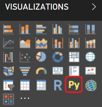
We simply need to select the "Py" visual from the visualizations pane.
Empty Python Visual
Then, we get an empty Python visual. Let's recreate our chart by dragging on the same fields we used in the R visual.
Values
Now, we can open the Python IDE to begin writing our code.
Open External IDE
Base Script in VSCode
We won't be explaining the intricacies of VSCode in this post. Just think of it an easy way to test our Python code. Let's start by looking at our dataset. Just like in R, it's stored in the "dataset" variable. We can look at this by using the print() and head() functions as follows:

<CODE START>

print( dataset.head() )

<CODE END>

<OUTPUT START>

      Name                             Revenue Current Month (Log) \
0    NaN                               10.441484
1    ABC Helicopter            11.718719
2    ABISCAS LTD             8.812843
3    Austin Music Club        9.635608
4    BINI Pharmaceutical    12.056482

      Revenue Previous Month (Log)   COGS Previous Month (Log) \
0    10.155070                                     9.678040
1    NaN                                              NaN
2    9.554781                                       9.877554
3    9.712569                                       9.885533
4    11.900634                                     12.165114

      Labor Cost Previous Month (Log)    Third Party Costs Previous Month (Log) \
0    9.678040                                            NaN
1    NaN                                                    NaN
2    NaN                                                    9.877554
3    9.885533                                            NaN
4   11.578833                                           10.181119

      Travel Expenses Previous Month (Log) \
0     NaN
1     NaN
2     NaN
3     NaN
4     10.288086

       Rev for Exp Travel Previous Month (Log)
0     NaN
1     NaN
2     NaN
3     NaN
4    10.288086

<OUTPUT END>

Now that we've seen our data, it's a relatively simple task to convert the R script to a Python script. There are a few major differences. First, Python is a general purpose programming language, whereas R is a statistical programming language. This means that some of the functionality provided in Base R requires additional libraries in Python. Pandas is a good library for data manipulation, but is already included by default in Power BI. Scikit-learn (also known as sklearn) is a good library for build predictive models. Finally, Seaborn and Matplotlib are good libraries for creating data visualizations.

In addition, there are some scenarios where Python is a bit more verbose than R, resulting in additional coding to achieve the same result. For instance, fitting a regression line to our data using the sklearn.linear_model.LinearRegression().fit() function required much more coding than the corresponding lm() function in R. Of course, there are plenty of situations where the opposite is true and R becomes the more verbose language.

Let's take a look at the Python code and the resulting visualization.

<CODE START>

from sklearn import linear_model as lm
from sklearn import metrics as m
import seaborn as sns
from matplotlib import pyplot as plt

dataset.fillna( 0, inplace = True )
X = dataset.drop(['Name', 'Revenue Current Month (Log)'], axis = 1)
y = dataset['Revenue Current Month (Log)']
reg = lm.LinearRegression().fit(X, y)

sns.scatterplot(x = reg.predict(X), y = reg.predict(X) - y)
plt.axhline(0)
plt.title('Predicting Revenue Current Month (Log): R-Squared = ' + str( round( m.r2_score( y,
     reg.predict(X) ), 3 ) ) )
plt.xlabel('Fitted Values')
plt.ylabel('Residuals')

plt.show()

<CODE END>
Residuals vs. Fitted
We see a very similar chart to the one we created in the Custom R Visuals post.

For the second part of this post, we'll receate the custom ETL logic from the R Scripts in Query Editor post. You can download the PBIX here.

Just as with the R script, there is no way to automatically pull the data from the Query Editor into a Python IDE. Instead, we need to write the data out to a csv and upload it into our favorite IDE. Fortunately, Pandas has a very easy function for this, to_csv().

<CODE START>

dataset.to_csv(<path>)

<CODE END>
Load CSV into Jupyter
When we have a choice, we always go with Jupyter as our Python IDE. It's a notebook, which allows us to see our code and results in an format that is easy to view and export. Next, we can create the "TaxPerc" and "FreightPerc" columns to be used in our dataset.

<CODE START>

tax = dataset[["SalesOrderID", "TaxAmt", "TotalDue"]]
taxperc = tax["TaxAmt"] / tax["TotalDue"]
tax = tax.assign(TaxPerc = taxperc)

freight = dataset[["SalesOrderID", "Freight", "TotalDue"]]
freightperc = freight["Freight"] / freight["TotalDue"]
freight = freight.assign(FreightPerc = freightperc)

<CODE END>
Creating New Columns

Creating New Columns (Query Editor)
One of our personal frustrations with Python is how unintuitive it is to add new columns to an existing Pandas dataframe. Depending on the structure, there seem to be different ways to add columns. For instance, 'tax["TaxPerc"] =', 'tax.loc["TaxPerc"] =' and 'tax = tax.assign(TaxPerc = )' all seem to work sometimes, but not every time. Perhaps someone in the comments can shed some light on why this is. Alas, it's not overly difficult once you find the method that works.

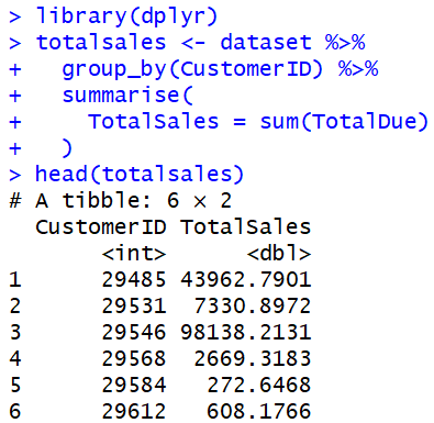
Let's move on to calculating Total Sales per Customer.
Total Sales by Customer
<CODE START>

totalsales = pandas.DataFrame( dataset.groupby("CustomerID")["TotalDue"].sum() )
custid = totalsales.index

totalsales = totalsales.assign(CustomerID = custid)

<CODE END>

The code to create a summarization using Pandas is actually quite simple. It's simply "dataset.groupby(<column>).<function>". However, we found an interesting interaction while using this in the Query Editor.
Total Sales Series
The line mentioned above actually outputs a Series, not a Pandas DataFrame. This is similar to how the R code outputs a Tibble, instead of an R DataFrame. While the Query Editor was able to read Tibbles from R, it is not able to read Series from Python. So, we needed to cast this to a Pandas Dataframe using the "pandas.DataFrame()" function.
Total Sales Dataframe
After this, we found another interesting interaction.  While this may look like two columns in a Python IDE, this is actually a one-column Pandas Dataframe with an Index called "CustomerID". When the Query Editor reads this Dataframe, it throws away the index, leaving us with only the single column.
Total Sales by Customer (No CustomerID)
So, we actually had to manually add the "CustomerID" back to the Dataframe using the "assign()" function. It's important to note that the Python functionality is still in preview. Hopefully, they will change this in the future to bring the index into the Query Editor as an additional column.

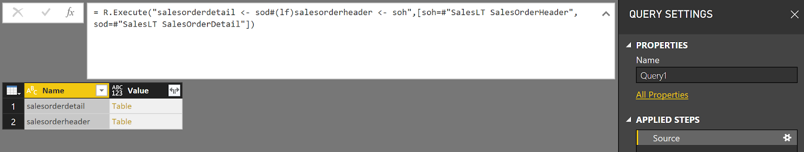
Finally, let's move on to joining two tables together using Python.
Joined
<CODE START>

joined = sod.set_index("SalesOrderID").join(soh.set_index("SalesOrderID"), how = "inner", 
     lsuffix = "_sod", rsuffix = "_soh")

<CODE END>

We utilized the "join()" function from the Pandas library to accomplish this as well. We prefer to manually define our join keys using the "set_index()" function. As you can see, this isn't much more complex than the R code.

Hopefully, this post empowers you to leverage your existing Python skills in Power BI to unleash a whole new realm of potential. There's so much that can be done from the visualization and data transformation perspectives. Stay tuned for the next post where we'll incorporate one of our favorite tools into Power BI, Azure Machine Learning Studio. Thanks for reading. We hope you found this informative.

Brad Llewellyn
Service Engineer - FastTrack for Azure
Microsoft
@BreakingBI
www.linkedin.com/in/bradllewellyn
llewellyn.wb@gmail.com

Monday, November 19, 2018

Data Science in Power BI: R Scripts in Query Editor

Today, we're going to talk about R Scripts in Query Editor within Power BI.  If you haven't read the earlier posts in this series, Introduction, Getting Started with R Scripts, Clustering, Time Series Decomposition, Forecasting, Correlations and Custom R Visuals, they may provide some useful context.  You can find the files from this post in our GitHub Repository.  Let's move on to the core of this post, R Scripts in Query Editor.

We haven't covered Power Query in a very long time on this blog.  Since our last post in 2013, it's been fully integrated into the Power BI Desktop tool.  Power Query is now known as the Power BI Query Editor and is a fully-functional ETL (Extract, Transform, Load) tool capable of pulling data from many data sources and integrating them into a single Power BI Data Model.  You can read more about it here.

The first step is to load some data using the "Get Data" feature in Power BI.
Get Data
For this post, we'll be using the AdventureWorksLT sample database from Azure SQL Database.  You can spin one of these up for free using an Azure trial account.  Once we select "Get Data", we need to connect to our Azure SQL Database.
Connect to Azure SQL Database
SQL Server Database
We have the option to select between Import and DirectQuery modes.  There's enough content there to be a post on its own.  The default mode is Import, which is what we typically use.  You can find out more information on DirectQuery mode here.  After this we also need to provide our credentials.  Then, we can select the tables or views that we want to import.
Navigator
In the "Navigator" window, we want to select the Customer, Product, SalesOrderDetail and SalesOrderHeader tables.  Now, we can use "Edit Queries" to access the Query Editor.
Edit Queries
Power Query Editor
Once in the Query Editor, we can see the queries that pull in our four tables, as well as previews of these tables.  The Query Editor has a tremendous amount of built-in capabilities to do any type of traditional data transformations.  We're interested in the R functionality.  Starting from the SalesLT SalesOrderHeader table, in the "Transform" tab, we can select "Run R Script" to open a scripting window.
Run R Script
R Script Editor
If you aren't able to open the R Script Editor, check out our previous post, Getting Started with R Scripts.  While it's possible to develop and test code using the built-in R Script Editor, it's not great.  Unfortunately, there doesn't seem to be a way to develop this script using an external IDE like RStudio.  So, we typically export files to csv for development in RStudio.  This is obviously not optimal and should be done with caution when data is extremely large or sensitive in some way.  Fortunately, the write.csv() function is pretty easy to use.  You can read more about it here.

<CODE START>

write.csv( dataset, file = <path> )

<CODE END>

Write to CSV
Now, all we need to do is open RStudio and use read.csv() to pull the data in.  We saved it as dataset to be consistent with Power BI's naming convention.
Read from CSV
Looking at this dataset, we see that it contains a number of fields.  The issue is that it seems to contains a bunch of strange text values such as "Microsoft.OleDb.Currency", "[Value]" and "[Table]".  These are caused by Base R not being able to interpret these Power Query datatypes.  Obviously, there's nothing we can do with these fields in this format.  So, we'll use Power Query to trim the dataset to only the columns we want and change the datatype of all of the other columns to numeric or text.  To avoid delving too deep into Base Power Query, here's the M code to accomplish this.  M is the language that the Query Editor automatically generates for you.

<CODE START>

 #"Removed Columns" = Table.RemoveColumns(SalesLT_SalesOrderHeader,{"SalesLT.Address(BillToAddressID)", "SalesLT.Address(ShipToAddressID)", "SalesLT.Customer", "SalesLT.SalesOrderDetail"}),
#"Changed Type" = Table.TransformColumnTypes(#"Removed Columns",{{"TotalDue", type number}, {"Freight", type number}, {"TaxAmt", type number}, {"SubTotal", type number}}),

<CODE END>
Clean Data
Looking at the new data, we can see that it's now clean enough to work with in R.  Next, we'll do some basic R transformations to get a hang of it.  Let's start by removing all columns from the data frame except for SalesOrderID, TaxAmt and TotalDue.  We'll post the code later in the post.
Tax
Now, let's create a new column "TaxPerc" that is calculated as "TaxAmt" / "TotalDue".
We can see that the tax percentages all hover right around 7.2%.  It looks like the difference is probably just rounding error.  Nevertheless, let's see how this outputs to the Query Editor.
Tax in Query Editor
We can see the same data in Power Query that we saw in RStudio.  This leads to the question "How did Power Query know to use the tax data frame as the next step?"  If we look at the "Applied Steps" pane on the right side of the screen, we see that the Query Editor added a "tax" step without asking us.  If we select the "Run R Script" step, we can see what the intermediate results looked like.
Run R Script in Query Editor
Apparently, the Query Editor pulls back every data frame that was created in the R script.  In this case, there was only one, so it expanded it automatically.  We can confirm this by altering the R code to create a new data frame that similarly calculates "FreightPerc".
Tax and Freight in Query Editor
Here's the code we used to generate this.

<CODE START>

tax <- dataset[,c("SalesOrderID", "TaxAmt", "TotalDue")]
tax[,"TaxPerc"] <- tax[,"TaxAmt"] / tax[,"TotalDue"]

freight <- dataset[,c("SalesOrderID", "Freight", "TotalDue")]
freight[,"FreightPerc"] <- freight[,"Freight"] / freight[,"TotalDue"]

<CODE END>

Obviously, we could use the fundamentals we just learned, combined with what we worked on in our previous post <INSERT LINK HERE> to build some predictive models here.  Feel free to try that out on your own.  For now, we'd rather look at some slightly different functionality.

There are a number of libraries that allow us to use R to perform data manipulation exercises, such as aggregations and joins.  One of the more common packages is "dplyr".  You can read more about it here.  Let's install this package using RStudio and get started.  If you need a refresher on how to install packages, check out this post.

Now, let's start by calculating the total sales per customer.
Total Sales by Customer
We see that the dplyr syntax is pretty simple and feels similar to SQL.  However, these functions don't output data frames.  Instead, they output tibbles.  Fortunately, the Query Editor can read these with no issues.
Total Sales in Query Editor
Here's the code we used.

<CODE START>

library(dplyr)
totalsales <- dataset %>%
  group_by(CustomerID) %>%
  summarise(
    TotalSales = sum(TotalDue)
  )

<CODE END>

Finally, let's take a look at table joins using dplyr.  In order to do this, we need a way to bring two tables into the R script once.  Fortunately, we can do this by tampering with the M code directly.
Blank R Script
If we look at our existing Power Query query, we see that the Query Editor leverages the R.Execute() function with an additional parameter at the end that says '[dataset=#"ChangedType"]'.  This tells M to bring in the #"Changed Type" object into R and assign it to the dataset data frame.  The #"Changed Type" object in the Query Editor is simply the temporary table created by our previous applied step.
Changed Type
First, let's create a Blank M Script.
Blank Query
Then, we can open the "Advanced Editor".
Advanced Editor
Advanced Editor Window
Here, we see an empty M query.  Let's use the R.Execute() function to pull in two other queries in the Query Editor.
Two Tables
Here's the code we used to generate this.

<M CODE START>

let
    Source = R.Execute("salesorderdetail <- sod#(lf)salesorderheader <- soh",[soh=#"SalesLT SalesOrderHeader", sod=#"SalesLT SalesOrderDetail"])
in
    Source

<M CODE END>

<R CODE START>

salesorderdetail <- sod
salesorderheader <- soh

<R CODE END>

We also dropped a few unnecessary columns from the SalesOrderDetail table and changed some data types to avoid the issues we saw earlier.  Let's join these tables using the "SalesOrderID" key.
Joined in Query Editor
Here's the code we used.

<CODE START>

library(dplyr)
joined <- inner_join(sod, soh, by = c("SalesOrderID"))

<CODE END>

We see that it's very easy to do this as well.  In fact, it's possible to add joins to the "%>%" structure we were doing before.  To learn more about these techniques, read this.

Hopefully, this post enlightened you as to some ways to add the power of R to your Power BI Queries.  Not to give it all away, but we'll showcase some very interesting ways to build on these capabilities in the coming posts.  Stay tuned for the next post where we'll take a look at the new Python functionality.  Thanks for reading.  We hope you found this informative.

Brad Llewellyn
Senior Analytics Associate - Data Science
Syntelli Solutions
@BreakingBI
www.linkedin.com/in/bradllewellyn
llewellyn.wb@gmail.com

Monday, October 29, 2018

Data Science in Power BI: Creating Custom R Visuals

Today, we're going to talk about Creating Custom R Visuals within Power BI.  If you haven't read the earlier posts in this series, Introduction, Getting Started with R Scripts, Clustering, Time Series Decomposition, Forecasting and Correlations, they may provide some useful context.  You can find the files from this post in our GitHub Repository.  Let's move on to the core of this post, Creating Custom R Visuals.

In Power BI, it's possible to create custom visuals using TypeScript.  It's also possible to have these visuals leverage custom R code.  You can find out more about this process here.  While extremely interesting, these is NOT the type of visuals we'll be talking about today.

Over the last few posts, we've shown how to use custom R visuals built by others.  Today, we're going to build our own using the Custom R Visual available in Power BI Desktop.  If you haven't read the second post in this series, Getting Started with R Scripts, it is highly recommended you do so now, as it provides necessary context for how to link Power BI to your local R ISE.

In the previous post, we created a bunch of log-transformed measures to find good predictors for Revenue.  We're going to use these same measures today to create a basic linear regression model to predict Revenue.  If you want to follow along, the dataset can be found here.  Here's the custom DAX we used to create the necessary measures.

<CODE START>

Revenue Current Month (Log) = IFERROR( LN( CALCULATE( [RevenueTY], 'Date'[YearPeriod] = "201411" ) ), BLANK() )

Revenue Previous Month (Log) = IFERROR( LN( CALCULATE( [RevenueTY], 'Date'[YearPeriod] = "201410" ) ), BLANK() )

COGS Previous Month (Log) = IFERROR( LN( CALCULATE( [Total COGS], 'Date'[YearPeriod] = "201410" ) ), BLANK() )

Labor Cost Previous Month (Log) = IFERROR( LN( CALCULATE( [Sum of Labor Costs Variable], 'Date'[YearPeriod] = "201410" ) ), BLANK() )

Third Party Costs Previous Month (Log) = IFERROR( LN( CALCULATE( [Sum of Cost Third Party], 'Date'[YearPeriod] = "201410" ) ), BLANK() )

Travel Expenses Previous Month (Log) = IFERROR( LN( CALCULATE( [Sum of Travel Expenses], 'Date'[YearPeriod] = "201410" ) ), BLANK() )

Rev for Exp Travel Previous Month (Log) = IFERROR( LN( CALCULATE( [Sum of Rev for Exp Travel], 'Date'[YearPeriod] = "201410" ) ), BLANK() )

<CODE END>

Next, we create an empty "Custom R Visual".
Custom R Visual
Then, we add "Name" from the Customer table and all of our new measures to the Values Shelf for the Custom R Visual.
Values Shelf
Now, we could begin writing our script directly in Power BI.  However, it's very difficult to test and debug within Power BI.  So, we recommend using an external ISE, such as RStudio.  Fortunately, Power BI has a button that exports the data to a csv and loads it into the ISE we specified in the options.
Edit Script in External ISE
In our ISE, the first thing we want to do is take a look at our dataset using the following command:
head(dataset)
Dataset Head
We can see that we have nulls (R calls them NAs) in our dataset.  In our case, we can assume that all of these nulls are actually 0's.  Please note that this is not always the case, but we are assuming it in this case.  We've done a number of posts in the past on different ways to handle "imputation".  Check them out here and here.  There are probably some more further back if you want to dig.  For now, all we want to do is replace all NA's with 0's.  We can do this using the following command:
dataset[is.na(dataset)] <- 0
head(dataset)
Imputed Dataset Head
Now, we're ready to build a basic linear regression model.  However, we don't want to include the Name column, as it provides no analytical value.  We can do this using the following command:
reg <- lm(`Revenue Current Month (Log)` ~ . - `Name` , data = dataset )
summary(reg)
Regression Results
Those with experience in linear regression will notice that an "Adjusted R-Squared" of .08 and a "P-Value" of .15 mean that this model is terrible.  However, the purpose of this point is on visualizations, not regression models!  We have a previous post that touches on the finer points of regression.

Now that we have a regression model, we can plot some interesting things about it.  Our original dataset contained seven columns, not counting "Name".  We can't plot seven dimensions on a scatterplot.  So, we need another way to look at our regression model.  One of the ways to do this is with a Residuals vs. Fitted plot.  Basically, this plot shows how "far off" the regression model was.  A better model would have residual values tightly clustered around zero, whereas a worse model would have larger residual values.  We can make one using the following code:
plot(x = reg$fitted.values, y = reg$residuals, xlab = "Fitted Values", ylab = "Residuals")
Residuals vs. Fitted Plot
While this chart is interesting, it's tough to see where zero is for the residuals.  Let's add a horizontal line to make it more obvious.  We can accomplish this using the following code:
abline(h = 0)
Residuals vs. Fitted (Horizontal Line)
This is becoming easier to understand.  Now we can see that the majority of our points are slightly above the zero line, with a few points very far below.  It's pretty obvious that these three points are having a major impact on our model.  This is the value of using a Residuals vs. Fitted plot.  Alas, this post is not about improving our model.  Let's add one final detail, the R-Squared value.  We can use the following code to add the R-Squared value to the title:
plot(x = reg$fitted.values, y = reg$residuals, xlab = "Fitted Values", ylab = "Residuals", main = paste( "Predicting Revenue Current Month (Log): R-Squared = ", round(summary(reg)$r.squared, digits = 3), sep=""))
abline(h = 0)
Now we have a plot that gives us some interesting information about our data.  The final step is to take the R code we've created and copy it into the Custom R Visual in Power BI.  We don't need any of the heads or summaries since Power BI won't output them anyway.  Here's all the code we need:
dataset[is.na(dataset)] <- 0
reg <- lm(`Revenue Current Month (Log)` ~ . - `Name` , data = dataset )
plot(x = reg$fitted.values, y = reg$residuals, xlab = "Fitted Values", ylab = "Residuals",
      main = paste( "Predicting Revenue Current Month (Log): R-Squared = ", round(summary(reg)$r.squared, digits = 3), sep=""))
abline(h = 0)
Now for the final piece.  One of the main reasons this R functionality is so powerful is that you can filter this R visual by using other Power BI charts or slicers.  For instance,  we can see the difference in our regression before and after excluding certain products.
Custom R Visual (All Products)
Custom R Visual (Some Products)
We can see that our R-Squared increased by .1 when we removed the (Blank) and Sova products.  This would be a great way for us to see which products may follow a different sales pattern.

Hopefully, this post opened your minds to the possibilities of creating your own R visuals within Power BI.  Obviously, we only scratched the surface of this incredibly complex topic.  There are many excellent blog posts around the internet showcasing some of the coolest visuals available in R.  We encourage you to try some of them out.  Stay tuned for the next post where we'll dig into R Scripts in Power Query to see what they have to offer.  Thanks for reading.  We hope you found this informative.

Brad Llewellyn
Senior Analytics Associate - Data Science
Syntelli Solutions
@BreakingBI
www.linkedin.com/in/bradllewellyn
llewellyn.wb@gmail.com