Today, we're going to talk about Correlations within Power BI. If you haven't read the earlier posts in this series,
Introduction,
Getting Started with R Scripts,
Clustering,
Time Series Decomposition and
Forecasting, they may provide some useful context. You can find the files from this post in our
GitHub Repository. Let's move on to the core of this post, Correlations in Power BI.
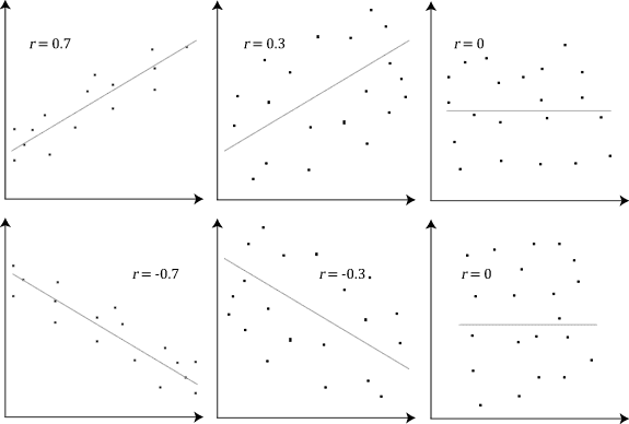
Correlation is a measure of how different values tend to relate to each other. When we talk about correlation in a statistical context, we are typically referring to
Pearson Correlation. Pearson Correlation is the measure of how linear the relationship between two sets of values is. For instance, values that fall perfectly in a "up and to the right" line would have a correlation of 1, while values that fall roughly on that line may have a correlation closer to .5. These values can even be negative if the line travels "down and to the right".
 |
| Pearson Correlation |
In many industries, the ability to determine which values tend to correlate with each other can have tremendous value. In fact, one of the first steps commonly performed in the data science process is to identify variables that highly correlate to the variable of interest. For instance, if we find that Sales is highly correlated to Customer Age, we could utilize Customer Age in a model to predict Sales.
So, how can we use Power BI to visualize correlations between variables? Let's see some different ways. We'll start by making a basic table with one slicer and two measures.
 |
| Revenue Current Month and Revenue Previous Month by Customer Name (Table) |
This table lets us see the current and previous month's revenue by customer. While this is good for finding individual customers, it doesn't give us a good idea of how closely related these two measures are. Scatterplots are usually much better at visualizing this type of information. Let's switch over to one of those.
 |
| Revenue Current Month and Revenue Previous Month by Customer Name (Scatterplot) |
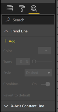
We can add a trend line to this graph by using the "Analytics" pane.
 |
| Add Trend Line |
 |
| Revenue Current Month and Revenue Previous Month by Customer Name (Trend) |
There's something missing with the way this data is displayed. It's very difficult to understand our data when it looks like this. Given the nature of money, it's common for a few large customers to have very large values. One way to combat this to change the scale of our data by using the
logarithm transformation. It's important to note that the
LN() function in DAX returns an error if it receives a negative or zero value. This can be remedied using the
IFERROR() function.
 |
| Revenue Current Month and Revenue Previous Month by Customer Name (Log) |
We can see now that our relationship is much more linear. It's important to note that Pearson correlation is only applicable to linear relationships. By looking at this scatterplot, we can guess that our correlation is somewhere between .6 (60%) and .8 (80%).
Now, how would we add another variable to the mix? Let's try with
COGS.
 |
| Revenue Current Month and Revenue Previous Month by Customer Name (COGS) |
It's not easy to see which scatterplot has the higher correlation. In addition, this solution required us to create another chart. While this is very useful for determining if any transformations are necessary (which they were), it isn't very scalable to being able to visualize a large number of variables at once. Fortunately, the Power BI Marketplace has a solution for this.
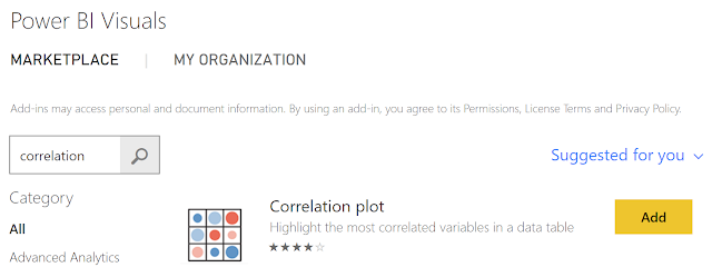 |
| Correlation Plot |
If you haven't read the previous entries in this series, you can find information on loading Custom R Visuals in this
post. Once we load the Correlation Plot custom visual, we can utilize it pretty simply.
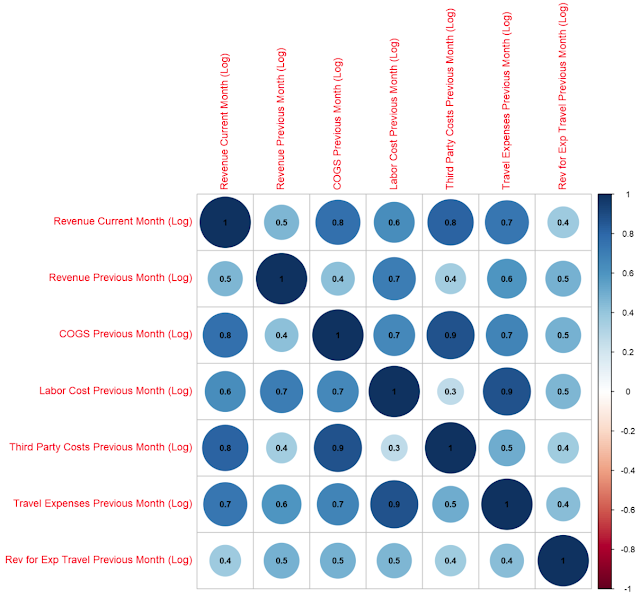 |
| Correlations |
We made one tweak to the options to get the coefficients to display, but that's it. This chart can very easily allow us to look across a number of variables at once to determine which ones are correlated heavily. This, combined with the scatterplots we saw earlier, gives us quite a bit of information about our data that could be used to create a great predictive or clustering model.
Hopefully, this post piqued your interest to investigate the options for visualizing correlations within Power BI. This particular custom visual has a number of different options for changing the visual, as well as grouping variable together based on clusters of correlations. Very cool! Stay tuned for the next post where we'll dig into the R integration to create our own custom visuals. Thanks for reading. We hope you found this informative.
Brad Llewellyn
Senior Analytics Associate - Data Science
Syntelli Solutions
@BreakingBI
www.linkedin.com/in/bradllewellyn
llewellyn.wb@gmail.com


No comments:
Post a Comment