Today, we're going to talk about Time Series Decomposition within Power BI. If you haven't read the earlier posts in this series,
Introduction,
Getting Started with R Scripts and
Clustering, they may provide some useful context. You can find the files from this post in our
GitHub Repository. Let's move on to the core of this post, Time Series Decomposition in Power BI.
FYI: The Power BI August Newsletter just announced Python compatibility. We're looking forward to digging into that in future posts. You can find the newsletter here.
First, let's talk about what time series data is. Simply put, anything that can be measured at individual points in time can be a time series. For instance, many organizations record their revenue on a daily basis. If we plot this revenue as a line across time, we have time series data. Often, time series data is measured at regular intervals. Weekly measurements are one example of this. However, there are many cases where irregular time intervals are used. For instance, calendar months are not all equal in size. Therefore, a time series of this data would have irregular time intervals. This isn't necessarily a bad thing, but it should be considered when doing important analyses. You can read more about time series data
here.
Now, let's talk about Time Series Decomposition. Time Series Decomposition is the process of taking time series data and separating it into multiple underlying components. In our case, we'll be breaking our time series into Trend, Seasonal and Random components. The
Trend component is useful for telling us whether our measurements are going up or down over time. The
Seasonal component is useful for telling us how heavily our measurements are affected by regular intervals of time. For instance, retail data often has heavy yearly seasonality because people buy particular items at particular times of year, especially during the holidays. Finally, the Random component is what's left over when we remove the Trend and Seasonal components. You can read more about this technique
here and
here.
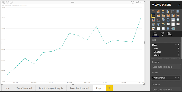
Let's hop into Power BI and make a quick time series chart. We'll be using the same Customer Profitability Sample PBIX from the previous posts. You can download it
here. If you haven't read
Getting Started with R Visuals, it's recommended that you do so now. Let's start by making a simple line chart of Total Revenue by Month.
 |
| Total Revenue by Year |
Looking at this data, it seems that our Total Revenue is increasing over time. However, it's difficult to know how strongly or if there is any seasonality. This is where the Time Series Decomposition chart can help us. Just as we did in the previous post,
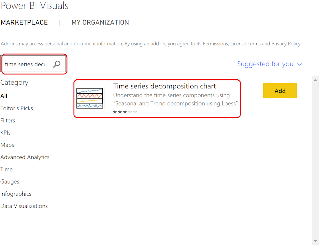
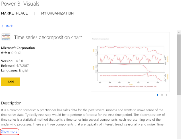
Clustering, we'll download this from the Power BI Marketplace.
 |
| Import From Marketplace |
 |
| Power BI Visuals |
 |
| Time Series Decomposition Chart |
 |
| Time Series Decomposition Chart Description |
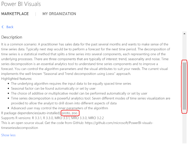
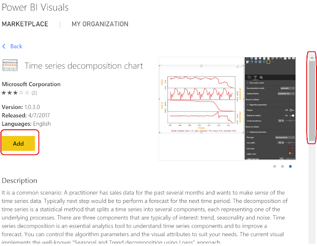
Looking at the description of the Time Series Decomposition chart, we see that it requires the
proto and
zoo packages in R. This will be important later in this post. Let's scroll up and add this chart to our PBIX.
 |
| Add Time Series Decomposition Chart |
Now, let's change our line chart to a time series decomposition chart by selecting the icon in the Visualizations pane.
 |
| Change to Time Series Decomposition Chart |
 |
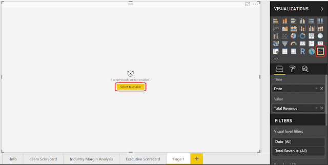
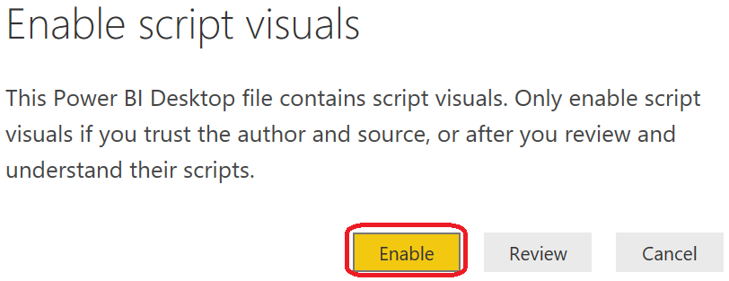
| Enable Script Visuals |
Since we just opened this report, we need to enable R Script Visuals.
If you get this error, you need to install the
zoo and
proto R packages. The previous
post walks through this process. You may need to save and reopen the PBIX after installing the packages to see the chart.
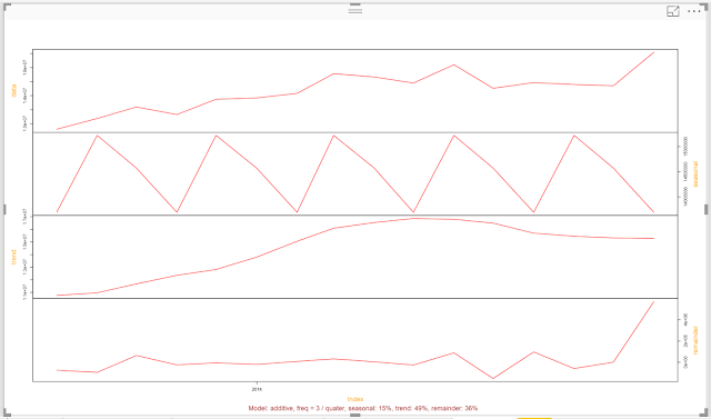 |
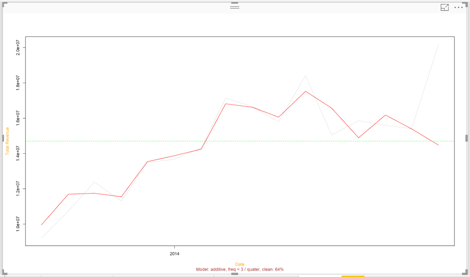
| Time Series Decomposition of Total Revenue by Month |
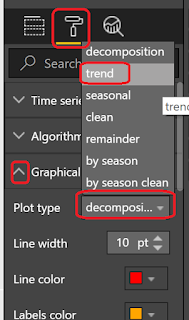
This chart is extremely interesting. In order, these lines represent the actual data, seasonal, trend and remainder, also known as random, components. However, this is too small to easily read. Fortunately, the makers of this chart give us the option to look at one piece at a time. Let's take a look at the trend first.
 |
| View Trend |
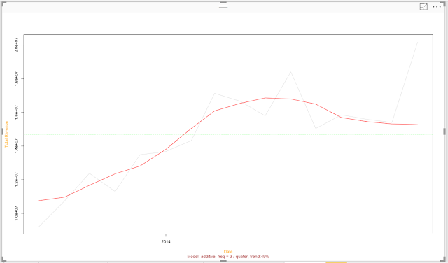 |
| Trend |
This shows us the trend of our time series is red, compared to the actual data in light grey. Now we have much more evidence to say that our trend was increasing over time. However, we also see that the algorithm recorded a decreasing trend recently. It also didn't seem to pick up on the recent spike at all. We'll look into this later in this post. For now, let's take a look at the seasonality.
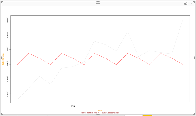 |
| Seasonality |
Looking at this, it appears our revenue spikes every third month (March, June, September, December). Unfortunately, the lack of detail on the horizontal axis makes this slightly frustrating to investigate. Perhaps in a later post we'll crack open this R code and make some adjustments. Let's move on to the remainder.
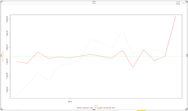 |
| Remainder |
According to this algorithm, it looks like the algorithm was able to accurately predict earlier values in the series. However, the more recent values in the series are showing some troubling variation. This is apparent by looking at the actual data as well. It's possible that our recent revenue values are not following the same pattern as last year. This may be an opportunity to utilize an algorithm that doesn't consider time as a factor, such as Regression.
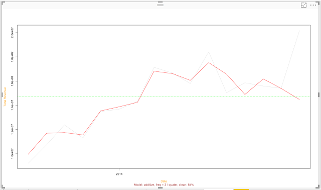 |
| Clean |
Interestingly, there's an option to display the "Clean" data, i.e. Trend and Seasonality without the Remainder. This could be an interesting way to see how well the decomposition fits the data. As we suspected, the recent months are causing an issue with the algorithm.
We could spend all day looking at all the data available here. Instead, let's end by looking at one final aspect of this chart, Algorithm Parameters.
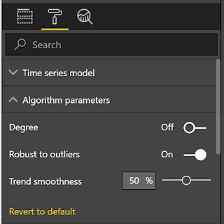 |
| Algorithm Parameters |
We have the option of tinkering with the parameters a little to make our algorithm better.
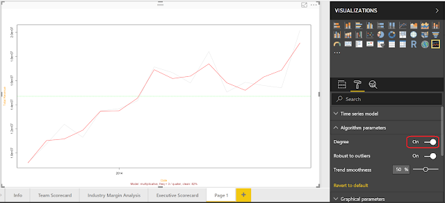 |
| Clean (Degree) |
By setting the Degree parameter to "On", we can sacrifice accuracy elsewhere in the series to be able to account for the recent spike. Is this the "right" answer? That's a much more complicated question. Let us know your thoughts in the comments.
Hopefully, this post opened your eyes just a little to the possible of performing time series analysis within Power BI. The custom visuals in the marketplace provide a strong "middle ground" offering that makes advanced analyses possible outside of hardcore coding tools like R and Python. Stay tuned for the next post where we'll be talking about Forecasting. Thanks for reading. We hope you found this informative.
Brad Llewellyn
Senior Analytics Associate - Data Science
Syntelli Solutions
@BreakingBI
www.linkedin.com/in/bradllewellyn
llewellyn.wb@gmail.com


No comments:
Post a Comment