Today, we will talk about how to handle data modeling in Power Pivot and Tableau. In order to do this, we need to talk about the difference between "Joining" (Power Pivot) and "Blending" (Tableau). A join is a static relationship that is reused over and over again for every calculation, with the exception of the ones you specifically code to reject that relationship. Blending is a dynamic relationship that is used for one chart and one chart only. Here's a simple example.
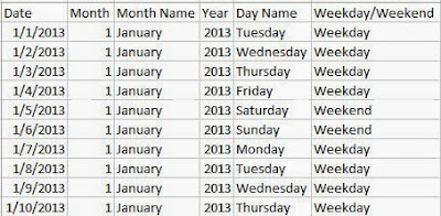
Imagine you have a fact table of sales per day with standard mm/dd/yyyy dates. You also have a fully functional date dimension. For those of you that don't know what a date dimension is, it's a table where you can find all of the information about a date. Some example information would be Month, Year, Weekday/Weekend, Fiscal Quarter, Holiday Status, etc. Here's a simple example of a date dimension.
 |
| Date Dimension |
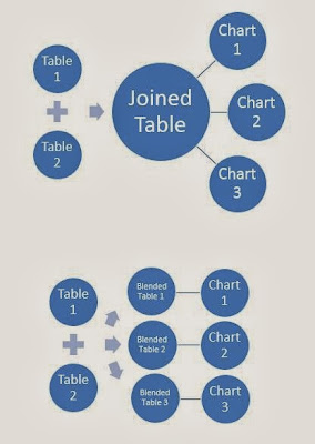
Your goal is to report using the data from the main table, but the Month Name from the date table. Now, if you wanted to "Join" these tables, you would want to join at the lowest possible level, i.e. the day. This is so that you maintain as much information as possible in this STATIC relationship. However, if you were to "Blend" these tables, you would only blend at the level you needed. So, if you wanted to report on Sales per Month, you would still "Join" at the day level, but you would "Blend" at the Month level. This is actually quite a neat feature. If you wanted a report that shows the day level, the month level, and the year level (in different charts), you would have to "Join" at the day level, but you could "Blend" each chart at it's respective level. I have created a picture to illustrate this point.
 |
| Joining vs. Blending |
Now, let's get to the examination.
1 Fact and 1 Dimension
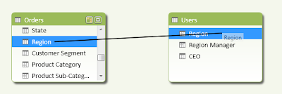
Here, we have a dimension that shows the managers for each Region and the CEO, who is over all Regions. Let's see how easy it is to report on Profit by Region Manager.
.png) |
| Orders to Users on Region (Power Pivot) |
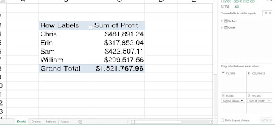
In order to define a relationship in Power Pivot, all you have to do is drag Region from Orders onto Region from Users. Now, we can report on Sales by Region Manager.
.JPG) |
| Profit by Region Manager (Power Pivot) |
After creating the relationship, this was just as simple as if there were in the same table. Now, let's see what Tableau thinks.
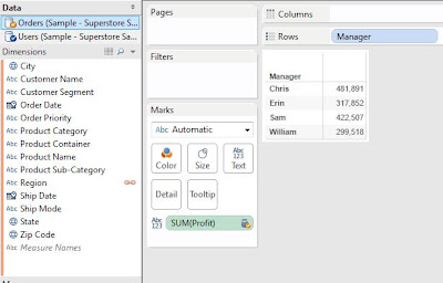.JPG) |
| Profit by Region Manager (Tableau) |
First, I had to drag Manager and Profit onto the chart. However, since there's no Manager field in the Orders table, I had to click on the "Chain" beside Region to get it to blend on Region. This would have been a much more complex task in Tableau 7. However, Tableau 8 has had some serious changes to the way it blends. In this case, both of the procedures were almost identical.
Winner: Tie
1 Fact and 3 Dimensions
Now, let's add a list of Returned orders as well as a Date dimension to the mix. Let's see how well we can see how many orders were returned for each Region Manager in 2012.
.JPG) |
| Orders to Users, Returns, and Date (Power Pivot) |
This design is what is typically called a Star Schema. A star schema is widely considered, at least in my experience, to be the gold standard for analytical data modeling. If you want to know more about Star Schema, check out the
Wikipedia article, which pays homage to
Ralph Kimball, the "father" of the Star Schema.
In Power Pivot, creating this was just a few drags. However, before we can go to the pivot table, we have to create our measure. In a Star Schema, the measures typically originate in the Fact table. Therefore, we need to flag which orders were returned from inside the Fact Table.
.JPG) |
| Returned? (Power Pivot) |
Now, we will need to find a way to count the number of distinct orders that had returns. To do this, we can add another calculated column.
.JPG) |
| Returned Order ID (Power Pivot) |
Now, we need to create a calculated field that performs a distinct count on this column and subtracts 1 to account for the zeros.
 |
| Distinct Count of Returned Orders (Power Pivot) |
Finally, we can create our pivot table.
.JPG) |
| Number of Returned Orders by Region Manager in 2012 (Power Pivot) |
This was a mess. It required a decent knowledge of how Power Pivot worked. The reason we had to distinct count was because the Orders table is at the Order Line level, and we wanted to know how many Orders were returned. Let's see how Tableau handles this. The first thing we need to realize is that we need to prep a chart BEFORE we start creating calculations. This is the opposite of the way Power Pivot does things. First, let's pull out our Region Managers.
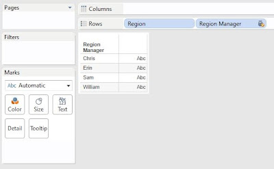.JPG) |
| Region Managers (Tableau) |
In order to keep the Orders table as the primary table, we had to put Region on the Chart, then hide it's header. Then, we can put Region Manager on the chart. Next, let's filter by Year.
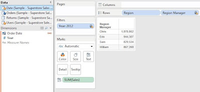.JPG) |
| Region Managers in 2012 (Tableau) |
We have to drag Year onto the Filters Shelf and click the chain next to Order Date to ensure the connection. We also have SUM( [Sales] ) on the chart so that we can be sure things are working the way we think they are. Now, here's where Tableau differs from Power Pivot. In order to properly calculate the returns, we must have Order ID on the chart. We will just have to hide it later. We can also create the same calculation we had in Power Pivot.
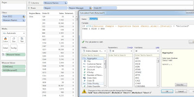.JPG) |
| Returned? (Tableau) |
Now, we need to hide the Order IDs and aggregate the chart up to the Region Manager level. First, we need to calculate the total number of returned orders per Region Manager.
.JPG) |
| Sum of Returned (Tableau) |
.png) |
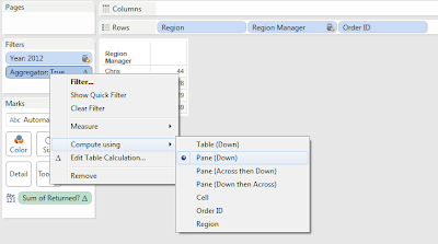
| Sum of Returned Compute Using (Tableau) |
Now, we have the number of returned orders per Region Manager. The last thing we need to do is aggregate out the Order ID's.
.JPG) |
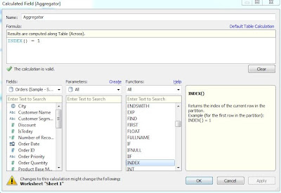
| Aggregator (Tableau) |
.png) |
| Aggregator (Compute Using) |
Avid readers of this blog will recognize this technique. However, it is not a beginner's technique. Now, let's look at our final chart.
.JPG) |
| Number of Returned Orders by Region Manager in 2012 (Tableau) |
These are the same numbers we saw in the Power Pivot table. This leads us to believe that they are correct. Looking back at this, the Power Pivot example required a beginner's knowledge of Power Pivot, while the Tableau example required an expert's knowledge of Tableau. These examples took us about the same amount of time to do. However, the beginner would likely struggle greatly with the Tableau version of this task. Therefore, Power Pivot wins this section easily.
Winner: Power Pivot
Summary
This was a great exercise. It showed that Tableau can handle basic data modeling. However, as the models get more complex, Power Pivot begins to show its strengths. We hope you found this informative. Thanks for reading.
EDIT:
Zen Master Jonathan Drummey pointed out that we gave credit to Power Pivot's drag-and-drop joining feature, but did not do the same justice for Tableau. Since Tableau's point-and-click joining mechanic is very powerful for Tableau, it should have been included in this post and we will utilize it in an upcoming post about advanced data modeling. In fact, it would have made the solution a great deal simpler for the second section.
Brad Llewellyn
Associate Data Analytics Consultant
Mariner, LLC
brad.llewellyn@mariner-usa.com
http://www.linkedin.com/in/bradllewellyn
http://breaking-bi.blogspot.com


.png)
.JPG)
.JPG)
.JPG)
.JPG)
.JPG)

.JPG)
.JPG)
.JPG)
.JPG)
.JPG)
.png)
.JPG)
.png)
.JPG)
Hi Brad,
ReplyDeleteI'm really glad you are doing this series, I think it will be useful to people as they compare PowerPivot to Tableau. I also think it's useful for thinking about different ways to do things. And I totally agree that the technique needed to do the COUNTD() across the blend in Tableau is more complicated.
However, I don't think that's the whole story for Tableau for this use case, because there's usually more than one way to do something in Tableau.In this case, we also have the ability to model our data by editing the data connection. With that, we can flatten the star schema with a couple of joins and then use an extract to get us COUNTD(Returned Order ID). Even though it requires more knowledge about data modeling, it can be done entirely with the mouse, no calculated field is necessary.
Jonathan,
DeleteThanks so much for your reply. You are totally right! I love the fact that these tools allow the user many paths to get to the right answer. In fact, I think maybe using Tableau's point-and-click joining feature would have been a good addition to this post. Perhaps I'll try to add it in a later post. As always, your comments are enlightening. Thanks!
This comment has been removed by a blog administrator.
ReplyDeleteThanks for posting the article on data modeling please keep posting
ReplyDelete