Monday, September 8, 2014

Data MIning in Excel Part 19: More Clustering

Today, we're going to continue our analysis of the Clustering algorithm.
Clustering
If you haven't read the previous post, we highly recommend you read it because this picks up right where it left off.  We just finished looking at the Cluster Profiles.  Let's move on to the Cluster Characteristics.
Cluster Characteristics
While the previous views allowed us to compare clusters to each other.  This view allows us to see what makes up each cluster individually.  This view is great for naming our clusters.  We could select the first few variables and use those as names.  So, we could call Cluster 1 (Older, Married, North American Home Owners with 2 Cars).  That's a pretty good description of a group of people that took almost no effort to get.  We could repeat this process for the remaining clusters if we wanted to.  But, let's move to the final view, Cluster Discrimination.
Cluster Discrimination (1 vs. 2)
This view is very similar to what we just saw.  However, this view shows us what's important in each cluster, as compared to another cluster.  For instance, we can see what really distinguishes Cluster 1 from Cluster 2.  Imagine you had a cluster that buys your products and another that doesn't.  We could use this view to come up with a list of candidate attributes that may have an impact on customers' buying habits.  We can even use this view to compare a cluster to everything that isn't in that cluster.  This is known as a complement.
Cluster Discrimination (1 vs. Not 1)
This view is perfect for determining which attributes uniquely define a cluster.  You might be wondering how this differs from the Cluster Characteristics.  The Cluster Characteristics view shows you what's in a cluster.  The Cluster Discrimination view shows you what's in a cluster that's NOT in other clusters.  So, you could use this view to develop unique names for your clusters.

Wait a minute!  That's the third view in a row that we could use to name our clusters.  Which view should you use?  That's up to personal choice and how the names will be used.  If you want a 1-stop shop for all of your information in a graphical format, the Cluster Profiles is a great place to start.  It also looks nice if you were ever presenting your results.  If you want to let the algorithm determine which features are important for your naming convention, then use the Cluster Characteristics or the Cluster Discrimination.  Personally, we think the Cluster Discrimination view is the most statistically sound way to do it.  Alas, the choice is yours.

In Statistics, there's a concept called "Robustness".  Basically, a robust model doesn't change very much if you try to tweak it.  Robutness is a very good thing that every model should have.  Imagine that you're a baseball coach.  Would you rather have a pitcher that can play well in all conditions, or a pitcher that can only play well when the sun's out, the temperature is 75 degrees and he's facing West?  It's pretty obvious; you want consistency, in your pitchers and your statistical models.  So, how do we make sure that our model is robust?  Let's check out the parameters.
Parameters
The first parameter we should notice is Cluster Seed.  This parameter determines which row the clustering algorithm uses to create the first cluster.  If you try a few different values here and the clusters don't change much, then the model is pretty robust.

The second parameter we should notice is Clustering_Method.  This parameters determines which of four different clustering algorithms get used to create the clusters.  The primary methods are 1 (E-M) and 3 (K-Means).  If you change this parameter and the clusters don't change much, then the model is pretty robust.

The question is "How do we know if the clusters changed?"  Unfortunately, we're not that far along yet.  We're still looking at the algorithms.  Have no fear, we'll soon start talking about how to take these models and get tangible results out of them.  Keep an eye out for the next post where we'll be talking about Associations.  Thanks for reading.  We hope you found this informative.

Brad Llewellyn
Director, Consumer Sciences
Consumer Orbit
llewellyn.wb@gmail.com
http://www.linkedin.com/in/bradllewellyn

Monday, September 1, 2014

Data Mining in Excel Part 18: Clustering

Today, we're going to talk about the next in the set of Data Mining algorithms, Clustering.
Clustering
Clustering is our all-time favorite statistical procedure.  It requires no knowledge of the data at all and gives great insight as to what is actually in the data.  To our knowledge, it's one of the only statistical procedures that doesn't require you to ask a question.  For instance, regression algorithms require you to ask "What would my profit be if I ordered this new product?".  With a clustering algorithm, you simply throw data at it and the algorithm tells you what's important and what's not.  Let's see it in action.  As usual, we will be using the Data Mining Sample data set from Microsoft.
Select Data Source
Of course, the first step is to select our data source.  We could use an external SQL source if we wished, but we'll go ahead and use the table.
Column Selection
The first thing we need to choose is the number of clusters, or segments, that we want.  Typically, it's not a good idea to specify the number of clusters.  The algorithm has different criteria it uses to choose this value for us.  So, we'll let the algorithm do the hard work.  Also, we never want to use IDs in our analyses.  Let's check out what kinds of parameters we have available.
Parameters
The clustering algorithm has more parameters than the decision tree algorithm.  The most important one to notice is the Clustering Method parameter.  Changing this value will likely have a serious impact on how your clusters are designed.  Perhaps a little foreshadowing here, but we may see that parameter again.  For more information on these parameters, look here.  Let's move on.
Training Set Selection
All of these algorithms require us to set aside a portion of the data for testing purposes.  We can keep the default of 30%.
Create Model
Finally, we need to create a structure and model to house the results.  Let's get to the analysis!
Cluster Diagram
The cluster diagram shows the relationships between the clusters.  The more similar two clusters are, the "stronger" the link between them will be.  The stronger the link, the darker the line.  You can show more or less links by using the slider on the left side of the window (enclosed in red below).  You can also examine the clusters by how dark they appear.  The shading of the clusters is determined by the box at the top of the screen (enclosed in brown below).
Cluster Diagram (Links and Population)
The shading variable is Population.  This means that the darkness of the cluster corresponds to the number of rows within it.  You can hover your cursor over any cluster to see it's size.  You can also change the shading value to see how certain values are distributed across clusters.  This is neat in some ways, but we prefer the Cluster Profiles for this type of analysis.
Cluster Profiles
We've created clusters in a number of programs.  We've even used Tableau in all of it's splendor.  However, the Microsoft Cluster Profiles view is by far the best view we've ever seen for inspecting clusters.  Let's zoom in on a couple pieces so we can see some things.
Cluster Profiles Zoom
In this view, each column is a cluster and each row is a variable.  The first cluster is actually the entire population.  They even do us the liberty of naming it "Population".  However, the real attraction here is the comparison of clusters.  With this view, we can scroll across a single row to see which variables distinguish each cluster.  For instance, Cluster 2 has mostly young people, while Clusters 1 and 3 are older.  Cluster 2 has quite a few people with zero cars, while Clusters 1 and 3 have mostly people with 2 cars.  We can repeat this process for all of the clusters and all of the variables to intuitively name our clusters if we chose.  For instance, we could call Cluster 2 "Young Adults with No Cars".  However, it gets slightly more complex because there are a quite a few other variables here we have to look at as well.  If your data has too many variables, you can use the parameters to force the algorithm to choose only the most distinct variables.

This is a great place to stop for today.  We've seen that the Clustering algorithm is a great way to get a good feeling for what's in your data, without having to do any manual investigation.  Stay tuned for the next post where we'll continue with our analysis and maybe even make some alterations.  Thanks for reading.  We hope you found this informative.

Brad Llewellyn
Director, Consumer Sciences
Consumer Orbit
llewellyn.wb@gmail.com
http://www.linkedin.com/in/bradllewellyn

Monday, August 25, 2014

Data Mining in Excel Part 17: Estimation

Today, we'll be talking about the next tool in the line of the Data Mining Tools, Estimate.
Estimate
In the previous posts, Part 15 and Part 16, we used decision trees to predict a Yes/No variable.  Estimate uses a similar algorithm to predict numeric values.  The algorithm itself is a variation of linear regression.  Linear regression is arguably the simplest and most widely-used technique for estimating numeric values.  If you want to learn more about linear regression, read this.  Let's jump into it and we'll discuss more along the way.  As usual, we'll be using the Data Mining Sample data set from Microsoft.
Select Data Source
The first step is always to select a data source.  As we've previously discussed, you can also connect to a SQL Database to query your data source directly if you choose.  Let's move on.
Column Selection
Here's where things get interesting.  First, we must choose which variable we want to predict.  Then, the algorithm will automatically select the columns it thinks will create the best predictions.  It does this using the same technique we used in Part 6.  There are a number of reasons why you would not include a certain variable in your model.  For instance, if you knew that a variable was extremely unrealiable, you wouldn't want to use it.  In other cases, there are political reasons you can't use a variable, such as Race and Gender.  However, we don't see any reason you wouldn't include all of the rest of the variables regardless of what the algorithm recommends.  If the variable is a bad predictor, the algorithm will throw it away anyway.  You might as well give it a chance to really test it.  Alas, we digress.

In a combination decision tree/regression model like this, there are two types of predictors, Regressors and Categories.  As a simple example, let's try to predict Income using Age and Region.  The model itself looks like

Income = C1 * V1 + C2 * V2 + ...

where the C's are fixed values determined by the model and the V's are variables that come from the data.  When you set a value as a Regressor, Age in our example, then Age is thrown directly in as a variable, like so

Income = C1 * Age + C2 * V2 + ...

However, Region isn't a numeric variable at all, how would you put it in this formula at all?  There is a technique called Dummy Variables.  You can read about it here.  Basically, you create a variable for each value that the variable can take.  For instance, Region can be "North America", "Europe", and "Pacific".  So, you would create a 1/0 variable for each value of Region.  Mathematically, you can actually leave one of the variables out entirely and it won't matter, but we won't go that far.  Read the article if you're truly interested.  So, our model would become

Income = C1 * Age + C2 * [Region = North America] + C3 * [Region = Europe] + C4 * [Region = Pacific]

In summary, any value that you want treated as a number should be a regressor and any value you want treated as a category should just be an input.  However, this algorithm in particular looks at things in a slightly different way.  The Categories are used to create the nodes in the tree and the Regressors are used in the regression equation.  You'll see what we mean in a minute.  Let's look at our columns again.
Column Selection
As you can see, we set all of the numeric variables as regressors and the rest of the variables as inputs.  As usual, we don't include the ID or the value we're trying to predict.  Let's check out the parameters.
Parameters
Remember how we said this is the same algorithm we used for Decision Trees?  Well that means that is also has the same parameters.  They can be very useful if you're trying to tweak the model to fit your needs.  We won't mess with it for now.  Let's keep moving.
Training Set Selection
As with all of the Data Mining Tools, we need to specify the size of the Training set.  We'll keep the default 70%.
Model Creation
Finally, we have to create a structure and a model to store our work.  These are housed directly on the Analysis Services server and can be recalled later if you wish.  Let's check out the results.
Browse
We get a pretty big tree on our first try.  If you're not familiar with the tree diagram, you can check out Part 15.  There are a couple of differences here.  Let's highlight them.
Nodes

Just like the previous Decision Trees, each node can branch into further nodes.  However, notice the bars that we've highlighted in red?  Each node represents a chunk of our data set.  This diamond represents the distribution of the Incomes within the node.  The further to the left or right the diamond is tells us where the average Income falls within this chunk.  We see that all of these nodes have low incomes because they are far to the left.  The wider the diamond is, the more spread out the incomes are, meaning that our predictions are likely to be less accurate.  Despite being low incomes, these diamonds are all very small, which means we can be confident in the predictions.  Let's look at another piece of diagram.
Coefficients
Remember the C's and V's we saw earlier in our formula.  The C's are the coefficients and are represented by the values in brown.  The V's are the variables and are represented by the values in red.  Combining these two allows us to create the formula that you can see at the bottom of the screen.  We won't go into explaining this formula more than we already have.  It's interesting to note that each node gets its own formula.  Just remember this, the categories create the nodes and the regressors create the formula.  Let's move on.
Dependency Network
This algorithm has Dependency Networks just like the last one.  If you're unfamiliar with Dependency Networks, check out Part 16.

By now, you should be seeing some use for these algorithms.  Even if you're not, there's still much more to come.  You might be asking "A pretty picture is great; but, how do I get the predictions into the data?"  Unfortunately, that's a more involved task for another post.  We'll restate it again for everyone to hear, "If you want the simple things done easily, check out the Table Analysis tools.  But, if you want to do the cool stuff and really push Data Mining to its limits, you need to learn to use the Data Mining tools."  Keep an eye out for our next post, where we'll be discussing Clustering.  Thanks for reading.  We hope you found this informative.

Brad Llewellyn
Director, Consumer Sciences
Consumer Orbit
llewellyn.wb@gmail.com
http://www.linkedin.com/in/bradllewellyn

Monday, August 18, 2014

Data Mining in Excel Part 16: More Classification

Today, we're going to continue our demonstration of the Classify algorithm.
Classify
In our previous post, we showed how to use this algorithm to build a basic classification tree.  However, the tree only branches once, which is not very useful.  Let's recreate the model changing one of the parameters so that we can get a bigger tree for demonstration purposes.
Complexity of .25
The Complexity Parameter affects how large the tree can grow.  By lowering the value to .25, we allow the tree to grow more than before.  Let's check out the new results.
Browse (.25 Complexity)
Right away, we can see that this tree is more complex than before.  We also see another attribute being displayed now.  Notice how some of the nodes are darker shades of blue than the others?  The darkness of the node indicates the number of rows it holds.  We can see that Node 3 (Age >= 39 and < 67) is much darker than the rest of the nodes.  See the + at the edge of the middle nodes in the last column?  These denote that there are more nodes beyond.  To display these nodes, we can either click the + or move the slider at the top of the window.
Expanding the Tree
Now, we have a few variables at play in this tree.  Let's click on the Dependency Network tab and see what's over there.
Dependency Network
This graph shows us all of the variables in our tree and whether they are used as predictors, responses, or both.  Since our model only has one response, it's a pretty clean network.  But these can get much more complex as the models grow.  Let's see what happens when we click on the response, Purchased Bike.
Dependency Network (Purchased Bike)
See that all of the predictors turn red, just like the legend at the bottom says.  Now, what happens if we select a predictor?
Dependency Network (Children)
We see that Purchased Bike turns blue, just like the legend says.  Unfortunately, our model doesn't allow for a variable to both a predictor and a response, so we don't get to see purple.  Notice the slider on the far left of the window?  What happens if we slide that down?
Dependency Network (3 Links)
Every notch we slide it down, another variable drops off based on how well it predicts Purchased Bike.  If we slide it halfway down, we are left with Cars, Age, and Commute Distance, which are the same three variables we saw in the first few levels of the classification tree.  This gives you a good idea of which variables are important for your predictions and which aren't.

Let's say that you accidentally closed the browser and didn't get to look at your model.  You can revisit the browser for the model any time you wish by using the Browse tool.
Browse
This gives you access to any model stored in your Analysis Services Instance.
Select Model
Right now, all we have is two models.  We'll have quite a few more by the time we finish this blog series.  Feel free to explore the multitude of ways you can use Decision Trees with your data.  All it takes is a binary variable and the willingness to put in the effort.  Stay tuned for our next post where we'll be talking about Estimation.  Thanks for reading.  We hope you found this informative.

Brad Llewellyn
Director, Consumer Sciences
Consumer Orbit
llewellyn.wb@gmail.com
http://www.linkedin.com/in/bradllewellyn

Monday, August 11, 2014

Data Mining in Excel Part 15: Classification

Today, we will be discussing the first of the Data Mining Tools, Classify.
Classify
In our previous posts, we focused on the Table Analysis Tools.  Those tools are very narrow, targetted ways to handle a single issue.  They offer very little in the area of customization and can only be used on Excel tables, but are also very simple to use.  The Data Mining Tools are one step more advanced.  These tools offer some customization with the added complexity that comes with it.  They also have the added functionality of being able to query your SQL Database directly using SQL.  This is immensely useful if you are dealing with a data set that exceeds Excel's million row limit.

The Classify tool focuses on an area of Data Mining known as "Decision Trees".  Basically, it's a series of cascading Yes/No questions that branch out like a tree.  If you want a more complete explanation, you can check out the wikipedia article.  Let's jump in.  As usual, we will be using the Data Mining Sample data set from Microsoft.
Select Data Source
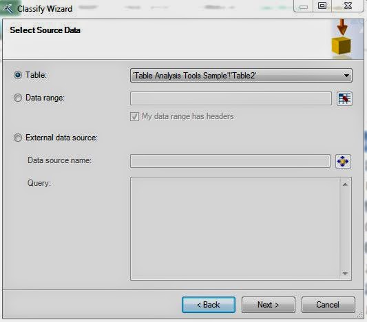
The first step to any analysis is to select a data source.  We have our table in Excel.  However, as we mentioned earlier, you can also use the "External Data Source" option to directly query a SQL Database.  Let's move on.
Column Selection
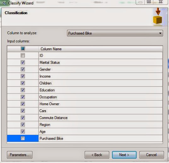
Next, we need to select which column we would like to analyze and which columns we would like to use for that analysis.  Let's try to predict whether the customer will buy a bike using all of variables, excluding ID and Purchased Bike.  Now, let's check out the "Parameters" section.
Parameters
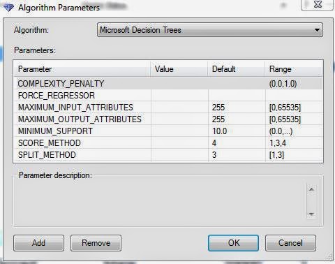
This is where the customization comes in.  This algorithm has seven parameters that can be customized to narrow the analysis.  We can see that most parameters have ranges that tell us the values that it expects.  For instance, you couldn't put a value of 5 for the Complexity Penalty.  Some of the values also have defaults.  For specifics on how each of these parameters functions, look here.  We won't mess with these just yet.
Training Set Selection
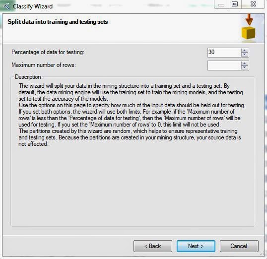
In every data mining algorithm, there are two sets of data that we use, Training and Testing.  The Training Set is what the algorithm uses to develop the underlying rules and predictions.  Then, it uses the Testing Set to see if the rules and predictions are accurate.  We'll talk more about this later.  Microsoft has a default of 70% Training, 30% Testing which is good enough for us.  Let's move on.
Model Creation
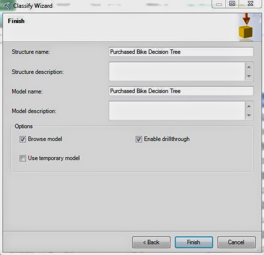
Finally, we get to a window we have not seen before.  The Data Mining tools are not just ad-hoc analyses done in Microsoft Excel.  They are actually legitimate data mining models built in Analysis Services.  In Analysis Services, each model is stored within a structure.  A structure is a logical grouping of models used for organizational purposes.  When you go through the process of using a Data Mining tool, such as Classify, a structure and model are created in your Analysis Services instance.  This is especially cool because it allows you reuse these models at later dates.  We'll get to that much later in the series.

We have three options here, Browse Model, Enable Drillthrough, and Use Temporary Model.  Browse Model allows us to see our results graphically in a similar fashion to the way we did for the Table Analysis Tools.  Enable Drillthrough allows us to look at the underlying data that was used for a certain conclusion.  Use Temporary Model would make our analysis temporary so that it doesn't appear in the Analysis Services instance.  We typically enable the first two options.  Let's see the results.
Browse (All)
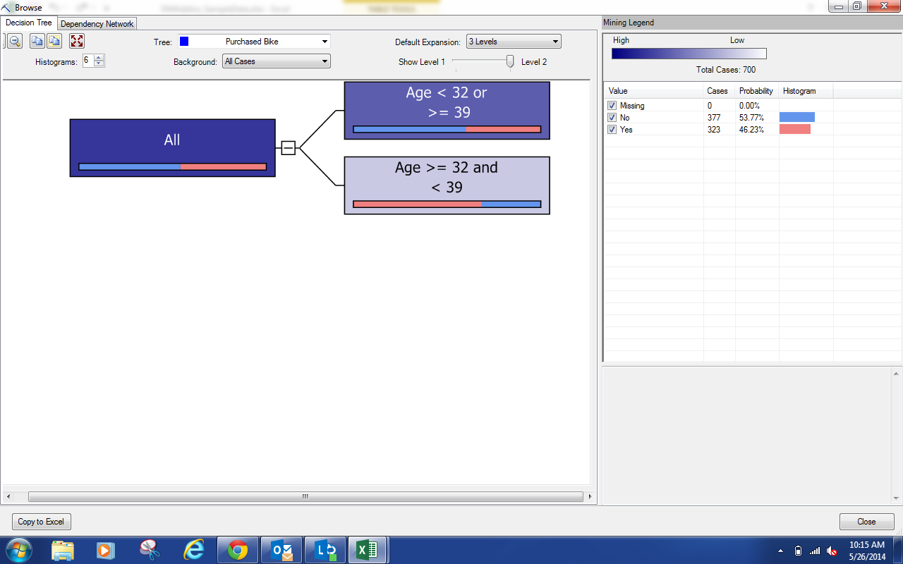
These results are not quite as flashy as the ones we were seeing from the Table Analysis tools, but they are much more useful as well.  On the left side, we can see our tree (which currently only has one split).  On the right side, we can see the composition of the selected node.  Since we haven't selected anything, we see the composition of the population.  If we select one of the nodes, we get a different story.
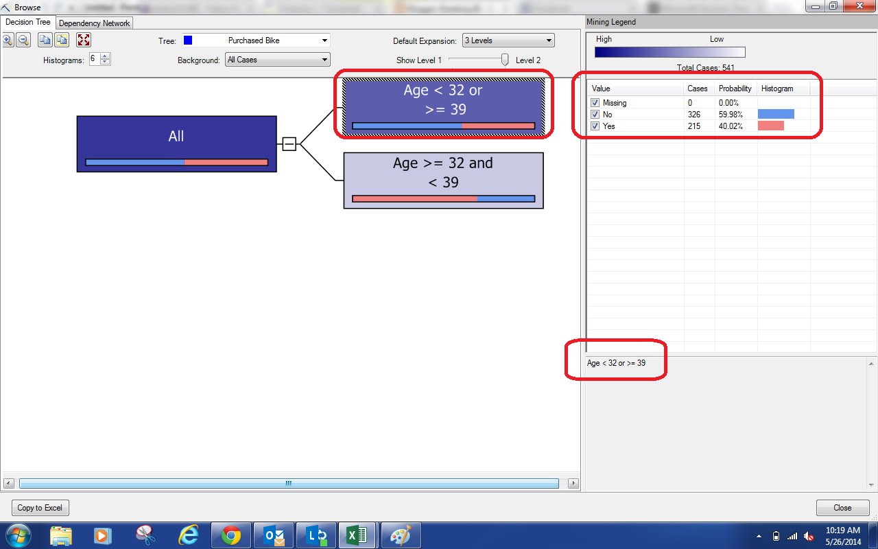
Browse (Subset)
If we look in the bottom-right of the window, we see the qualifications for the node we select, Age < 32 or >= 39.  In other words, not in the 30s.  We can see that this group has a high percentage of people who don't buy bikes.  As a bit of a shortcut, we can look at the bar on the bottom of each node.
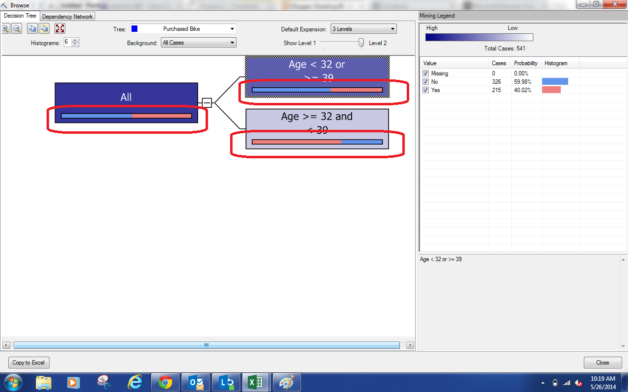
Shortcut
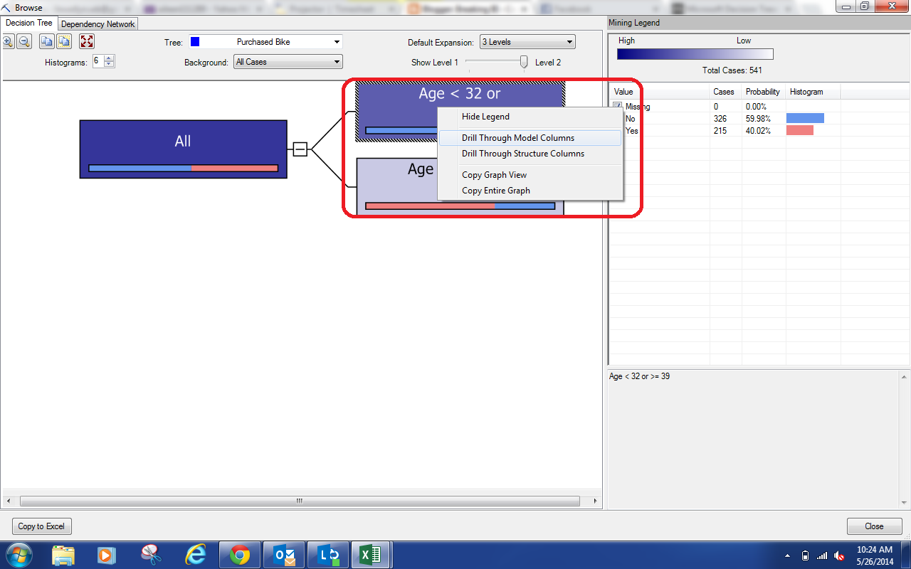
The legend on the right side tells us that Blue denotes No and Red denotes Yes.  So, we can look at the shortcut bars and see that the "Non-30s" node is mostly No and the "30s" node is mostly Yes.  Since we selected the "Allow Drillthrough" option, we can right-click on a node and drill-through to the underlying data.
Drill-through options
We can drill-through to either the Model Columns or the Structure Columns.  In our example, they are the same.  However, if you were to create multiple models under the same structure, you could restrict some models to only use some columns.  If we click one of the options, we see the underlying data.
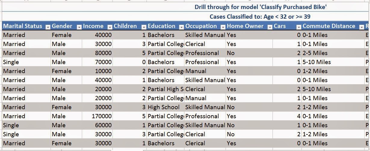
Underlying Data
This would be great if we wanted to do some further analysis on a particular node.  Let's stop our analysis here for now.  As you can see, there's quite a bit of customization that can be done here.  Notice how our tree only had one branch?  Stay tuned for our next post where we tackle that issue and show some more analysis that can be done using Classification Trees.  Thanks for reading.  We hope you found this informative.

Brad Llewellyn
Director, Consumer Sciences
Consumer Orbit
llewellyn.wb@gmail.com
http://www.linkedin.com/in/bradllewellyn

Monday, August 4, 2014

Data Mining in Excel Part 14: Shopping Basket Analysis

Today, we'll be talking about the final Table Analysis Tool and one of most commonly misunderstood topics in all of data mining, Shopping Basket Analysis.
Shopping Basket Analysis
This is a topic we've discussed with multiple clients and analytics vendors.  Every client wants it and every vendor says they can do it.  However, most of the time, the vendors will give you charts showing average number of items in a basket, average value of a basket, most popular items, etc.  But, this is not what the term actually means.

Shopping Basket Analysis, aka Market Basket Analysis, is an algorithm that tells you which items tend to be bought together.  For instance, do diapers and beer tend to be bought together?  This is a funny, old story with questionable origins that has been shown to not be true.  The interesting thing about this whole area is that Analysis Services has a built-in algorithm to do this for you, using data the almost every retailer will have.  Let's look at the data.
Data
This table is just a list of the items sold and their order numbers.  In fact, we've worked with quite a few different types of retailers and servicers that have data like this already.  Now, let's see the algorithm in action.
Column Selection
First, we need to tell the algorithm what the ID is for each transaction.  This is usually known as the Order Number or Order ID.  Next, we need to tell the algorithm what the name of the item is.  In most cases, you don't want to use the actual product name.  We are interested in whether cereal and milk are typically bought together.  We aren't interested in whether Kellogg's Raisin Bran is purchased with Pet 2% milk.  Those answers are way too specific to be useful and are almost guaranteed to hurt your analysis.  So, we are using the category instead.  Optionally, you can select a value so that the algorithm can determine how much each grouping is worth.  Finally, there are a few advanced options we can look at.
Add caption
Here, we can define the Minimum Support and Minimum Probability.  The support is total number of times that the grouping needs to appear in order to be valid.  For instance, if only one customer ever purchased batteries, and that customer also purchased milk, you don't want to say "100% of customers who buy batteries also buy milk."  So, we get to set a minimum support in order to ensure accuracy.  This value depends entirely on the size and distribution of your data set.  For our analysis, we'll use 10 items.

The probability is the number of times the rule is correct within the given support.  For instance, if 100 customers buy cereal, and 10 of those customers also buy ice cream, we may not want to make decisions based off of a 10% probability.  The algorithm has a default probability of 40% that works fine for us.  You can tune it for your needs if you wish.  Let's check out the results.
Results
We see that Road Bikes and Helmets are bought together quite a bit.  We can also see Jersey and Road Bikes, Bottles and Cages, and many other combinations.  The one downside to this algorithm is that it doesn't exclude the obvious choices.  For instance, most business analysts will know that some items are bought together.  For instance, why would you buy a bottle without a cage to put it in?  So, this algorithm is only a starting point for your analysis.  However, it does offer you statistically valid results that you can use to make real decisions.  As much as we'd love to use Tableau to liven up the algorithm a little.  The results don't lend themselves to easy integration with the original data set.  Therefore, this is as far we go for today.

The great thing about this algorithm is that it doesn't just apply to retailers.  Banks could use this algorithm to see which packages customers tend to buy together.  Network Administrators could use this algorithm to see which issues tend to occur together.  The possibilities are limited only by your imagination.  Keep an eye out for the next post on Classification.  Thanks for reading.  We hope you found this informative.

Brad Llewellyn
Director, Consumer Sciences
Consumer Orbit
llewellyn.wb@gmail.com
http://www.linkedin.com/in/bradllewellyn