Monday, June 9, 2014

Data Mining in Excel Part 6: Analyze Key Influencers

Today, we will move over to the "Analyze" Ribbon and talk about the "Analyze Key Influencers" component.
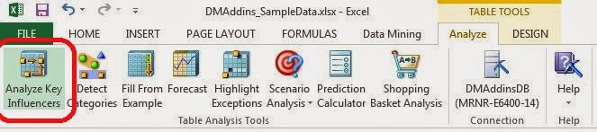
Analyze Key Influencers
If you click on a cell within a table in Excel, you will see the Analyze and Design Ribbons at the top of the screen.  Now, let's take a moment to discuss the Analyze Ribbon.  In order of customizability and complexity of the algorithms, the Analyze Ribbon is the simplest.  This makes it a great place to start our exploration into Data Mining.  These algorithms function within Excel and, in our opinion, have some of the best outputs.  Let's look at Analyze Key Influencers.

Analyze Key Influencers allows you to find out which columns in your data seem to heavily influence other columns.  Are Number of Children and Number of Cars correlated?  How about Income and Education?  These are very common questions that people ask, and this is the first place where we can really start to get answers.  Let's get going.
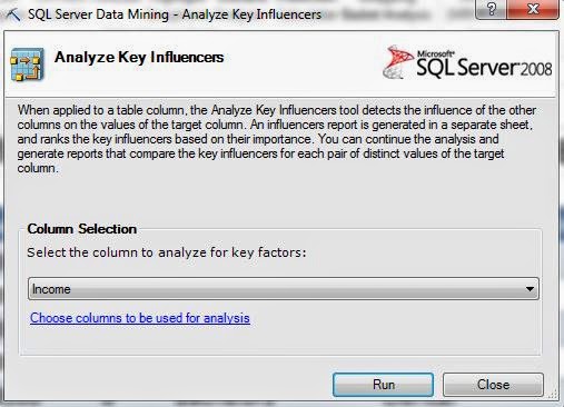
Column Selection
Since this component is only accessible from within a Table, the algorithm only uses data from within the table.  Next, we have to tell it which column we want to find the influencers of.  Everybody wants to know "What factors influence how much money people make?"  Well, here's where we can find out.  Please note that this is a sample data set and is very unlikely to unlock the golden ticket for you to earn a billion dollars.  We also want to select which columns to use for the analysis by clicking the hyperlink at the bottom of the box.
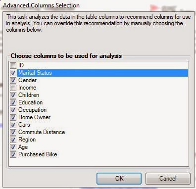
Advanced Column Selection
The ID field is a numeric value randomly assigned to each person by the database, so we almost never want to use those in our analyses.  Also, since we want to see what influences Income, we should also remove Income because it could skew our analysis.  After all, what's a better indicator of your Income than your Income?  Now, let's move on.
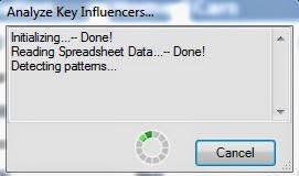
Detecting Patterns
When you run any of the Table Analysis Tools, you will see this box letting you know that it's working.
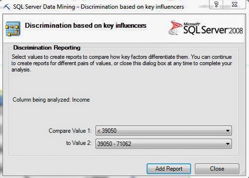
Discrimination Reporting
Now, we get to ask the algorithm to compare groups for us.  Since Income is numeric, it separates the values into buckets.  This process is called discretization.  We can choose to compare different categories to each other, or see what makes them unique from all other categories.  Let's start by comparing the lowest incomes category, which we'll call "Lower Class", from the second lowest incomes, which we'll call "Lower-Middle Class".  When we click "Add Report", another section is added to our Excel sheet that we can look at.  Let's check it out.
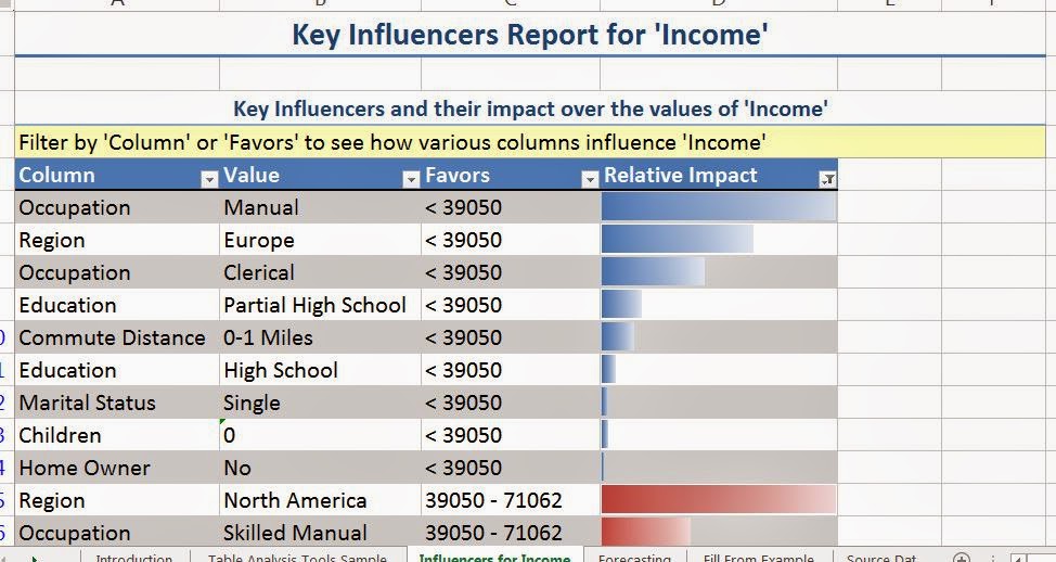
Key Influencers Report for Income
The first section we see shows us which values in other columns seems to correlate with certain values in Income.  The column labelled "Relative Impact" is a statistical ranking that shows us how strong the relationship is between the two values.  For instance, we see that the strongest predictor for having a low income is having a manual job.  We see that living in Europe and having a clerical job also influence having a low income.  Please take care to note that this is CORRELATION, not CAUSATION.  Nothing in this data set implies that having a manual job causes a low income.  It simply states that the two seem to occur together.  Let's see what distinguishes the highest income group.
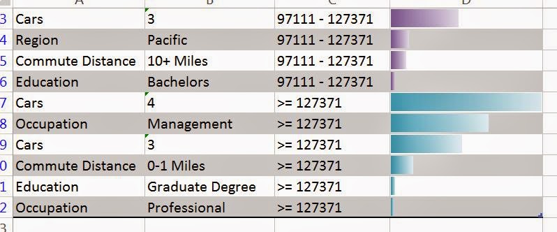
Influencers for High Income
We see that the heaviest influencer for having high income is having four cars.  Obviously, we know that having four cars doesn't make you rich.  In fact, we believe that it's the opposite.  You have four cars because you have a high income.  This just goes to show that care should be taken when interpretting the results.  We also see that having a management job and having three cars are also heavy influencers.

This leads us to another question, why did the algorithm discretize Income, but not Cars?
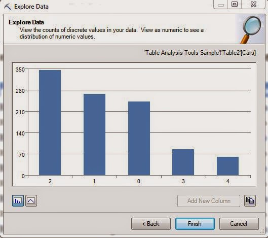
Cars
Despite the fact that Cars is numeric, it doesn't have too many distinct values.  Therefore, discretizing the value wouldn't make much sense.  Off the top of our head, we're not sure how many distinct values you have to have in order to get discretized, but we think it's probably at least eight.

Now, let's hope over to our Key Influencer Report again.  Remember that analysis we asked for comparing lower class to lower-middle class?  If we scroll down a little further, we see that it's been tacked right onto the bottom.
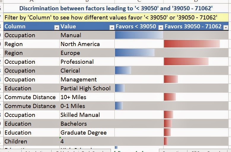
Discrimination Report
This is called a discrimination report.  It's designed to show you which values "Favor" which categories.  The report we previously looked at tried to discriminate each category from all the other categories.  This report only tried to discriminate one category from another.  We see that the same influencers we saw before are on this report as well.  Please note that this will not always be the case, it just happens to be the case in this data.  We also see that people in North America, with professional or management jobs are more likely to be in the lower-middle class.  Looking further down the list, we also see the introduction of lesser factors, such as education and commute distance.

We hope you enjoyed our first look at a true analytical procedure.  Stay tuned for the next post where we'll be talking about the "Detect Categories" component.  Thanks for reading.  We hope you found this informative.

Brad Llewellyn
Data Analytics Consultant
Mariner, LLC
llewellyn.wb@gmail.com
https://www.linkedin.com/in/bradllewellyn

Monday, June 2, 2014

Data Mining in Excel Part 5: Sampling from your Data

Today, we're going to talk about the last component of the Data Preparation Segment in the Data Mining Add-in for Excel, Sample Data.  Some of us have LOTS of data.  If you have a table with 1,000,000 rows of data and 50 columns, you're asking a lot from Excel when you try to run some analysis on that data.  So, a common practice is to randomly choose a handful of those rows, let's say 10,000, to do your analysis on.  The keyword in that sentence is "random".  If you choose the rows yourself, you may introduce some sort of unknown bias into your sample, which could heavily influence the results of your analysis.  So, we're going to let the tool do it for us.  As usual, we will be using the Data Mining sample data set from Microsoft.
Sample Data
The first step of any analysis is to select the source of data.
Select Source Data
This component is the first time we've seen the "External Data Source" option.  This is really cool.  Imagine you work for a giant bank that has a fact table for all of the transactions for all of your customers.  This fact table could easily be billions of rows.  That's way too much for Excel or Analysis Services to handle without some very powerful hardware.  Have no fear!  The Data Mining add-in will let you pick a few thousand rows from that table and play with them right in Excel.  Better yet, it will RANDOMLY pull those rows.  Also, you can right your own query here as well.  So, if you want to RANDOMLY select transactions from this year at all ATMs in the Southeast region, you can.  However, in our example, we only have 1000 rows of data.  Let's move on.
Select Sample Type
There are two types of sampling available here, Random Sampling and Oversampling.  Random sampling is the more common type.  It works just like flipping a coin or rolling a die.  No attention is paid to the data, it is only picked.  On the other hand, Oversampling is used to ensure that rare conditions are met.  For instance, if you want to run a test that compares millionaires to non-millionaires, then most random samples wouldn't have any millionaires in them at all.  It's difficult to test for something that doesn't occur in your data.  Back to our millionaires example, if you were to oversample your data, you could guarantee that at least 10% of your sample includes millionaires.  This does cause issues for some types of analysis, so only use it when you absolutely need to.  It's a very common practice in Fraud detection, where analysts are routinely looking for one transaction out of millions.  For now, let's just stick with a random sample.
Random Sampling Options
We're given two options.  We can either sample a fixed percentage of our data, or a fixed number of rows.  Let's stick with the default, 70%.
Random Sampling Finish
Finally, we get to name the sheet where the results will be stored.  Oddly enough, you can also choose to store the unselected data.  We can't think of any reason as to why you would want this data.  We will say that if you want to run repeated tests on samples, then you need to sample each time.  You can't create two random samples simply by using the selected and  unselected data from your first sample.  Now, let's go back and see what happens when we try Oversampling.
Oversampling Options
Here, we can decide which value we want to see more of.  We can also decide what percentage of our sample will have that value.  In fact, that percentage is guaranteed.  Consider this example.  You have a data set with 13 rows, 10 of which have yes and 3 of which have no.  If you oversample the data with a 30% chance of no and a sample of size 6, the algorithm will randomly select 2 of the 3 no values, and 4 of the 10 yes values.  However, if you increase the sample size to 13 (the entire data set), the algorithm will realize that there are only 3 no values, and restrict the sample size to 10.  This means that you will always have at least your requested percentage of a particular value.

These techniques are well respected in the scientific community and can be really useful when you want to explore and analyze really large data sets.  Stay tuned for the next post where we'll be talking about the "Analyze Key Influencers" component.  Thanks for reading.  We hope you found this informative.

Brad Llewellyn
Data Analytics Consultant
Mariner, LLC
llewellyn.wb@gmail.com
https://www.linkedin.com/in/bradllewellyn

Tuesday, May 27, 2014

Data Mining in Excel Part 4: Re-Labelling your Data

Today, we will talk about the second portion of the "Clean Data" feature of the Data Mining Add-in for Excel, "Re-Label".
Clean Data
While the Outlier feature was useful for removing extreme numeric observations, the Re-Label feature allows to you change string values.  As usual, we will be using the Data Mining Sample Data from Microsoft.  Let's skip the foreplay and jump right into it.
Select Source Data
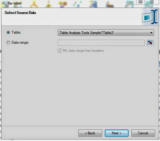
Of course, the first step is to select our data set.
Select Column
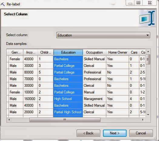
Then, we select the column where we would like to Re-label some values.  For this example, let's choose Education.
Re-Label Education
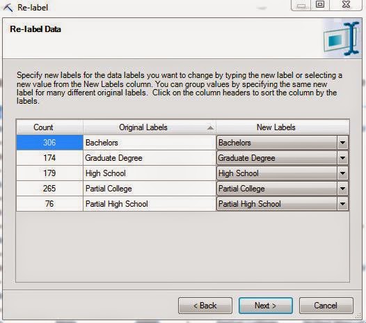
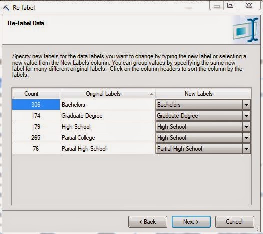
Now, we can proceed to Re-label these columns in any way we want.  For instance, what if we aren't interested in Partial College education?  If they didn't get the degree, then their education is High School.  That's an easy change here.
Partial College -> High School
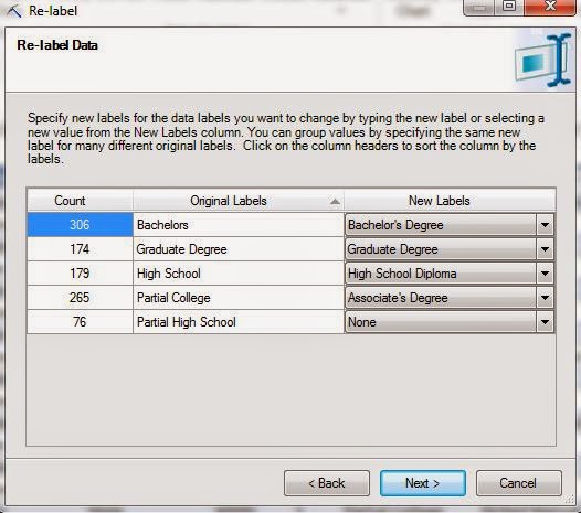
We aren't forced to choose from existing options either.  What if we want more consistent labels?  We can easily alter each label to look a little more professional.
Professional Titles
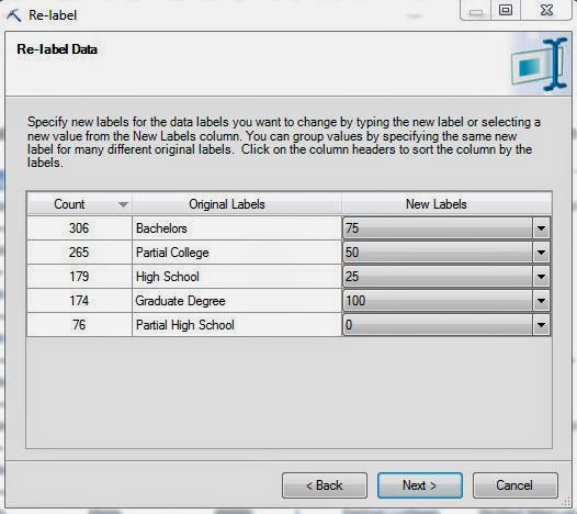
This isn't all we can do either!  What if we were Insurance Adjusters and we needed to rate these people.  We could assign points to them based on their level of education.  More education means more points, leading to a lower insurance premium.
Points
As you can see, this is all really easy to do.  In fact, there was an interesting anecdote in the Data Mining book we mentioned in the first post of this series.  A man was presenting the Data Mining tool in a foreign country.  At the start of his presentation, he noticed that the entire data set was in English.  In a matter of minutes, he was able to translate the entire data set into their native language just by using this feature.  We have no idea if this actually happened or not.  But, after using this feature, we don't have any doubts that it could be done.  Now, what do we do with these labels?  We have a couple of options.
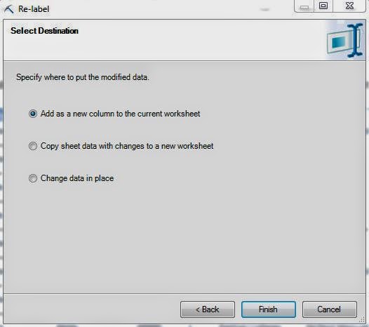
Select Destination
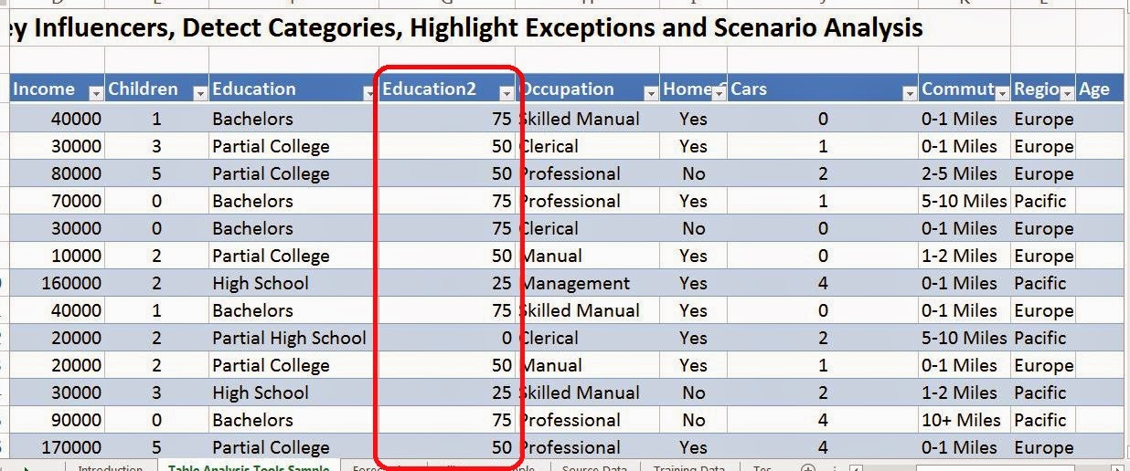
We can append the new column to our data, copy the changes into a new worksheet, or just replace the data where it is.  We recommend appending columns because it's typically not a good idea to outright change your data.
Data with Points
Now that we've re-labelled our data, it's time to move on with our analysis.  Unfortunately, you're just going to have to wait for the next post.  In the next entry, we'll be talking about the Sample data feature which allows you to easily chop up giant data sets into smaller ones for improved performance without losing any statistical significance.  Thanks for reading.  We hope you found this informative.

Brad Llewellyn
Data Analytics Consultant
Mariner, LLC
llewellyn.wb@gmail.com
https://www.linkedin.com/in/bradllewellyn

Monday, May 19, 2014

Data Mining in Excel Part 3: Cleaning Outliers

Today, we will talk about the second feature in the Data Preparation Segment, Clean Data.
Data Preparation Segment
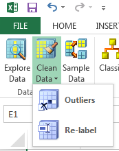
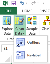
Most data that a business analyst would work with would probably not be perfectly clean.  There would be empty values, misspelled values, and worse.  This feature is designed to alleviate some of that.  When you click on "Clean Data", you have two options, Outliers and Re-Label.  In this post, we will be talking about the Outliers portion of this feature.
Clean Data
We added some bad income values to the data set.  So, how do I know if they are there?
Income (with -1)
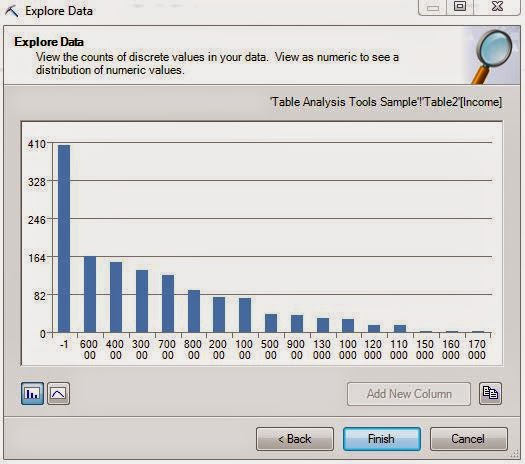
The Explore Data feature we talked about in the previous post is perfect for this.  We can easily see that there are a large number of bad values in the Income column.  Now, let's get rid of them using the Outliers portion of the Clean Data feature.
Income Outliers
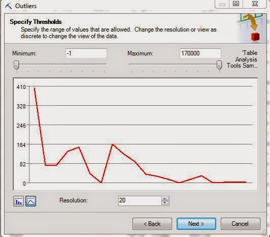
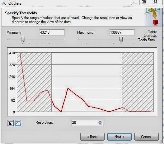
This feature shows us the distribution of our data again and we can see the same spike at -1 we saw before.  Unfortunately, this tool doesn't show us the values on the bottom axis, which is very disappointing.  However, it is pretty cool because you can move the sliders and see what data you would be removing.
Income Outliers (with Sliders)
However, in our case, we only need to remove the -1 values.  So, if we set the minimum at 0 and click "Next", we get a set of options.
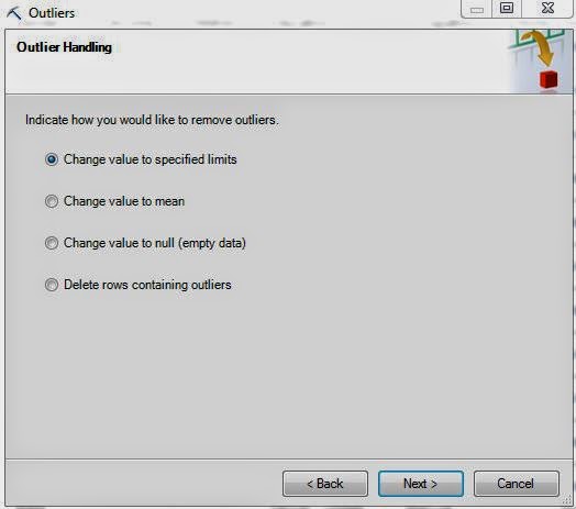
Outlier Handling
Each of these options is useful in its own way.  For instance, if you were dealing with percentages, then you would want to cap the percentages at 0% and 100%.  So, you would use the "Change value to specified limits" feature in that case.  If you were interested in looking at the distribution of this column without this data, then you would either want to change these values to Null or delete the rows altogether.  You should only delete the rows if you have no need for any of the other information.  In some very rare cases, you want want to replace the values with the mean (average) value.  This process as a whole is called "Imputation".  If you're interested, you can learn more here.  For our case, we want to remove these observations because we only care about income.
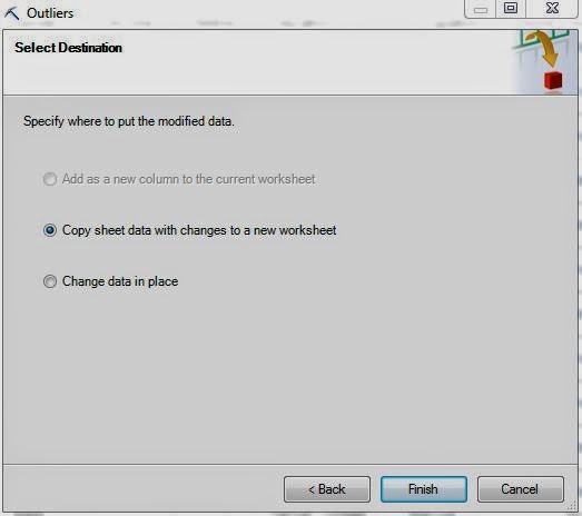
Select Destination
Lastly, we need to decide whether or not we want to copy the data to a new sheet or change the data where it is.  You should be extremely careful when working with real data because you typically don't want to delete data.  If you're experimenting with Data Mining, it's best to always use a copy of the data.
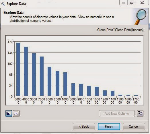
Income (Clean)
Now that we've cleaned the data, we see that -1 values are gone.  Now, we can move on with our analysis.  Stay tuned for our next post where we'll talk about the Re-Label portion of the Clean Data feature.  Thanks for reading.  We hope you found this informative.

Brad Llewellyn
Data Analytics Consultant
Mariner, LLC
llewellyn.wb@gmail.com
https://www.linkedin.com/in/bradllewellyn

Monday, May 12, 2014

Data Mining in Excel Part 2: Exploring your Data

Today, we'll talk about our first component of the Data Mining add-in for Excel, Explore Data.  We are beginning our analysis with the Data Preparation Segment of the Data Mining Ribbon.
Data Preparation Segment
The first component in this segment is the Explore Data feature.  This feature is pretty cool because it allows  you to look at the distribution of any column in your data set.  As usual, we will use the Data Mining Sample data from Microsoft.
Sample Data
In this data set, we have some categorical (slicer) columns like Gender and Education.  We also some discrete numeric columns such as children and cars.  So, how do we get a good feeling for what kind of distribution our data has.  Let's click on the Explore Data button and find out!
Select Data Source
The first step is to select the data source.  Since our data is in a table, the option is automatically selected.  You can enter a range if you'd like as well.  Moving on.
Select Column
Here, you can select any column you want by either scrolling through the dropdown box at the top or just clicking on the column in the sample window.  Once you select a column, you can see its distribution by clicking "Next".
Marital Status
We can quickly see that their are more married people than single people, about 20% more.  Now, we can easily click "Back" and move on to any other column we want.
Occupation
Choosing a column with more values leads to a much more interesting chart.  These charts could have easily been done using Excel's built-in features.  However, let's see what happens when we use this on a numeric column like Income.
Income (8 Buckets)
The tool automatically recognizes that this is a numeric value and discretizes it into 8 buckets.  If we wanted to see all of the values, we could click on the bar icon in the bottom-left corner of the window.  We could also change the number of buckets dynamically if we want more or less.  The really cool part of this feature happens when you click "Add New Column".
Appended Column
A discretized column was automatically appended to the data set.  As you can see, none of these features would be overly difficult to do with Excel.  The advantage of using this feature is being able to see it all quickly with just a few clicks.  Stay tuned for our next post where we talk about the "Outliers" portion of the "Clean Data" feature.  Thanks for reading.  We hope you found this informative.

Brad Llewellyn
Data Analytics Consultant
Mariner, LLC
llewellyn.wb@gmail.com
https://www.linkedin.com/in/bradllewellyn

Monday, May 5, 2014

Data Mining in Excel Part 1: Introduction

Today, we're beginning a new series about Data Mining.  Unlike my previous posts, this series will not focus on Tableau, but instead will focus on everyone's favorite analytics tool, Microsoft Excel.  The terms "Data Mining" and "Predictive Analytics" have been tossed around quite a bit recently and a lot of you might be wondering exactly what they mean.  In my mind, they revolve around predicting "unknown values."  This unknown value can range anywhere from "How many units will I ship next month?" to "Will this customer buy my product?" and even as far as "Which presidential party is likely to win the 2040 election?"

These questions are not new to industry by any means.  In fact, people have probably been budgeting since trade first began.  However, even with all of the current technology, quite a few companies still budget by getting a bunch of account managers in the room and basically guessing what they will earn next year.  This guess is based off of business knowledge, but typically with very little mathematical thought.  We won't go into a diatribe about human perception, but we will say that people have been shown to be terrible estimators.

So, why don't we use some of these really cool tools we have to do the math for us?  Well, the algorithms have been around for decades.  We think the issue is that they've remained solely in the realm of Mathematicians and Computer Programmers.  It doesn't take long for a businessman to throw away a tool like R or SAS when they see that it requires years of mathematical education and learning an entirely new programming language to even get started.  This is where we think the Data Mining tools within Microsoft Excel shine.  They require almost no knowledge to get started and are as easy as clicking a few buttons on your Excel ribbon.  However, it seems that almost none of the business users we've spoken even know that they exist.  For some reason, they think that data mining requires a multi-million dollar investment in software and resources.

We're here to show you differently.  Throughout this series, we'll show you that all it takes to get real results using your data is a few minutes of basic data prep and the imagination to ask the questions that are important to your business.  Another great bonus of using these tools within Excel is that they play nicely with Power Query and Power Pivot, the data integration and analytics tools within Microsoft's Power BI stack.

In order to use these tools, you will need access to SQL Server Analysis Services (SSAS) 2008 or higher.  Unfortunately, I do not think you can find a free copy of SSAS.  However, if your company has anything resembling an IT department, it's very likely that they have at least one instance.  All you need is access to the instance and be allowed to create mining models.  They don't even need to give you access to the production server or anything.

Once you have access to SSAS, the rest of the tools are free downloads.

Data Mining Add-in for Excel (Excel 2007, 2010, 2013):
http://www.microsoft.com/en-us/download/details.aspx?id=7294

Data Mining Sample Data:
https://dataminingaddins.codeplex.com/releases/view/87029

Power Pivot (Excel 2010, 2013):
http://office.microsoft.com/en-us/excel/download-power-pivot-HA101959985.aspx

Power Query (Excel 2013):
http://www.microsoft.com/en-us/download/details.aspx?id=39379

It should be noted that Microsoft's official stance is that there is no interaction between Power Pivot and the Data Mining Add-ins.  They are technically correct but we'll show you some very simple ways to combine them.  There's also a book on this topic that we found to be extremely helpful.

Data Mining with Microsoft SQL Server 2008:
http://www.amazon.com/Data-Mining-Microsoft-Server-2008/dp/0470277742

We look forward to exploring these tools with you.  Thanks for reading.  We hope you found this informative.

Brad Llewellyn
Data Analytics Consultant
Mariner, LLC
llewellyn.wb@gmail.com
https://www.linkedin.com/in/bradllewellyn

Monday, April 21, 2014

Combining Data Sources in Tableau: Joining vs. Blending

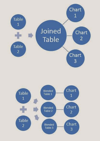
Today, we're going to talk about ways to combine different data sources in Tableau.  In particular, we will be talking about "Joining" and "Blending".  Joining is a SQL term that refers to combining two data sources into a single data source.  Blending is a Tableau term that refers to combining two data sources into a single chart.  The main difference between them is that a join is done once at the data source and used for every chart, while a blend is done individually for each chart.  Here's a picture we made a while ago illustrating the difference.
Joining vs. Blending
First, let's talk about restrictions for each of these methods.  When you join, both of the data sources have to exist in the same SQL database, Excel workbook, or whatever other joinable data  source you are using.  Multidimensional Sources (aka Cubes) cannot be joined.  On the other hand, you can blend data sources that come from completely different locations as long as the secondary source is not a cube.  Therefore, blending is much more universally applicable than joining.  However, it is much weaker in most situations and does not perform as well.  To summarize, if joining will solve your problem, then you should join.

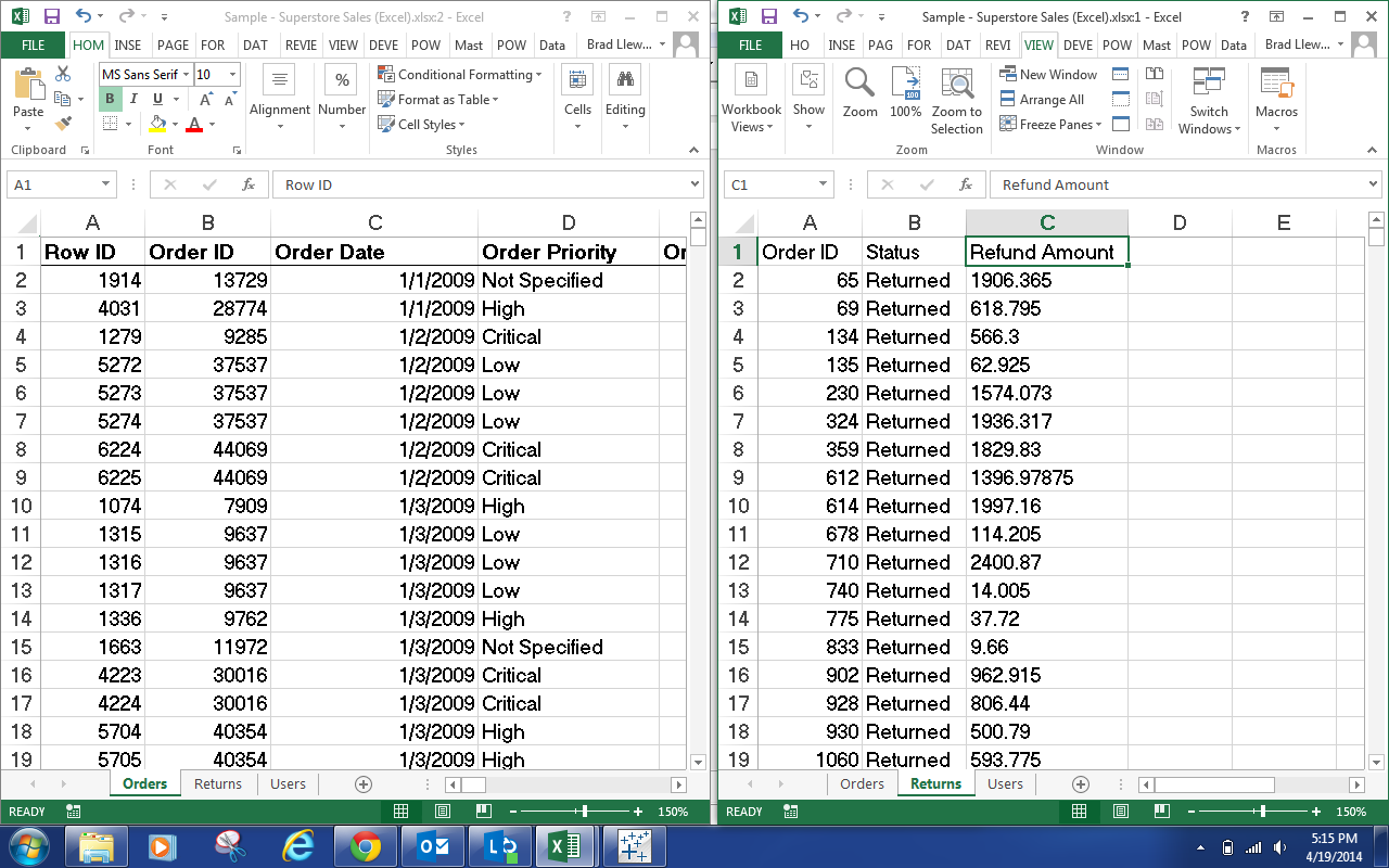
Now, let's look at a real world situation.  We have the tab with all of our order information in it and we have another tab with the returned orders in it.  We want to see which orders were returned.  So, the question is, "Should we join or blend?"  Well, let's take a look at the data.
Orders and Returns
We see that both data sets contain an Order ID field.  Also, we note that the Order ID field in the Returns data never repeats.  This is great news when it comes to joining.  So, we should just be able to join this data together and voila.
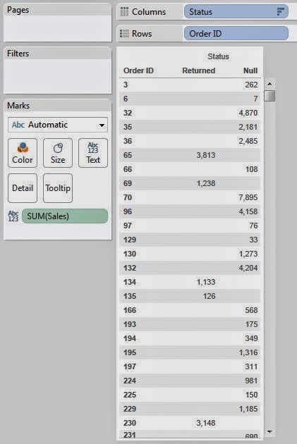
Returned Orders
It should be noted that since the Returns tab did not contain every Order ID from the Orders tab, we needed to make this a Left Join.  For more information on types of join, look here.  Also, if you would like an visual example of how we joined the data, there's a small set of pictures here.  In fairness, we could have achieved this exact same outcome with Blending.  However, remember that Blending is less efficient than Joining and should only be used when a join will not work.

Now, let's move on to a situation where joining will not work.  Let's say that I added a column to the Returns tab with the Refund Amount.  Let's take a look.
Orders and Refunds
Now, we want to know how much money we've refunded to customers.  Let's start by attempting to join the data.
Duplicated Rows
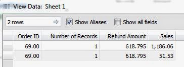
As you can see, there are multiple rows for this order.  This caused the Refund Amount to duplicate for each row.  This is because the Returns data is at the level of the Order ID, while the Order data is at the level of the Product within the Order (commonly known as the Order Line).  In this case, we have two measures with different granularities.  Therefore, we would need to aggregate our Orders data up to the Order ID level in order to join this data, and we don't want to do that.  On the bright side, this is exactly what blending is meant for.  

Let's start by talking about how Blending actually works.  First, let's create a simple table.
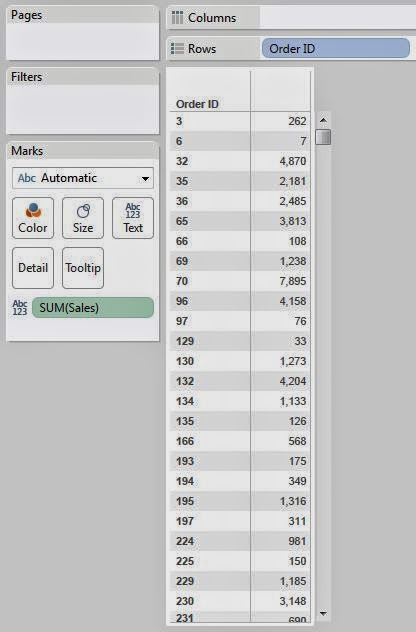
Sales by Order ID
When Tableau creates this table, it queries the data source for the appropriate data and stores the results in a temporary table known as the context.  Then, this table is used to create the visualization, whether it is a chart, line graph, etc.  When you are blending in another data source, it creates a similar temporary table from the secondary data source and performs a left join from the primary context to the secondary context.  This way, it doesn't matter what level each of the data sources is at.  All that matter is what level the chart is at.  Now, let's blend in Refund Amount to see this in action.
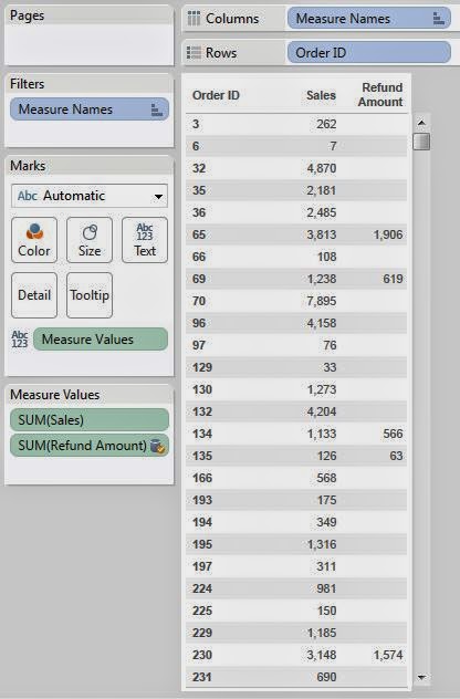
Sales and Refunds by Order ID
See how Order ID 69 has a refund amount of 619?  That value was 1238 when we naively joined these data sources.  This is just the evidence we need to say that our data blending worked.  If you want more information about combining multiple data sources in Tableau, look here.  Thanks for reading.  We hope you found this informative.

P.S.

We've never heard any official word on whether the temporary table used for Blending is the same as the context.  However, we haven't found a reason to believe that it isn't.  If you know for sure, please let us know in the comments.

Brad Llewellyn
Data Analytics Consultant
Mariner, LLC
llewellyn.wb@gmail.com
https://www.linkedin.com/in/bradllewellyn