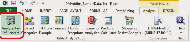
Today, we will move over to the "Analyze" Ribbon and talk about the "Analyze Key Influencers" component.
 |
| Analyze Key Influencers |
If you click on a cell within a table in Excel, you will see the Analyze and Design Ribbons at the top of the screen. Now, let's take a moment to discuss the Analyze Ribbon. In order of customizability and complexity of the algorithms, the Analyze Ribbon is the simplest. This makes it a great place to start our exploration into Data Mining. These algorithms function within Excel and, in our opinion, have some of the best outputs. Let's look at Analyze Key Influencers.
Analyze Key Influencers allows you to find out which columns in your data seem to heavily influence other columns. Are Number of Children and Number of Cars correlated? How about Income and Education? These are very common questions that people ask, and this is the first place where we can really start to get answers. Let's get going.
 |
| Column Selection |
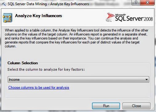
Since this component is only accessible from within a Table, the algorithm only uses data from within the table. Next, we have to tell it which column we want to find the influencers of. Everybody wants to know "What factors influence how much money people make?" Well, here's where we can find out. Please note that this is a sample data set and is very unlikely to unlock the golden ticket for you to earn a billion dollars. We also want to select which columns to use for the analysis by clicking the hyperlink at the bottom of the box.
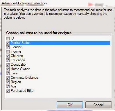 |
| Advanced Column Selection |
The ID field is a numeric value randomly assigned to each person by the database, so we almost never want to use those in our analyses. Also, since we want to see what influences Income, we should also remove Income because it could skew our analysis. After all, what's a better indicator of your Income than your Income? Now, let's move on.
 |
| Detecting Patterns |
When you run any of the Table Analysis Tools, you will see this box letting you know that it's working.
 |
| Discrimination Reporting |
Now, we get to ask the algorithm to compare groups for us. Since Income is numeric, it separates the values into buckets. This process is called discretization. We can choose to compare different categories to each other, or see what makes them unique from all other categories. Let's start by comparing the lowest incomes category, which we'll call "Lower Class", from the second lowest incomes, which we'll call "Lower-Middle Class". When we click "Add Report", another section is added to our Excel sheet that we can look at. Let's check it out.
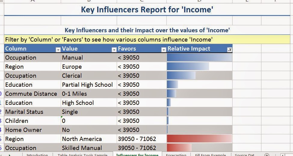 |
| Key Influencers Report for Income |
The first section we see shows us which values in other columns seems to correlate with certain values in Income. The column labelled "Relative Impact" is a statistical ranking that shows us how strong the relationship is between the two values. For instance, we see that the strongest predictor for having a low income is having a manual job. We see that living in Europe and having a clerical job also influence having a low income. Please take care to note that this is CORRELATION, not CAUSATION. Nothing in this data set implies that having a manual job causes a low income. It simply states that the two seem to occur together. Let's see what distinguishes the highest income group.
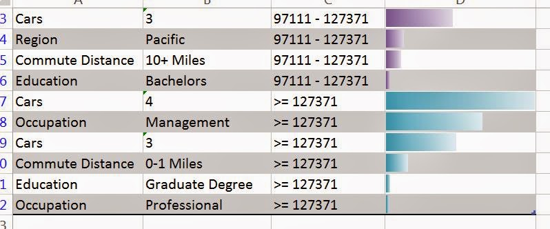 |
| Influencers for High Income |
We see that the heaviest influencer for having high income is having four cars. Obviously, we know that having four cars doesn't make you rich. In fact, we believe that it's the opposite. You have four cars because you have a high income. This just goes to show that care should be taken when interpretting the results. We also see that having a management job and having three cars are also heavy influencers.
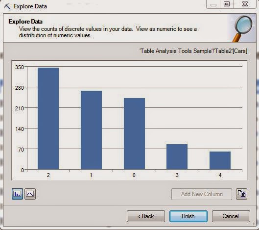
This leads us to another question, why did the algorithm discretize Income, but not Cars?
 |
| Cars |
Despite the fact that Cars is numeric, it doesn't have too many distinct values. Therefore, discretizing the value wouldn't make much sense. Off the top of our head, we're not sure how many distinct values you have to have in order to get discretized, but we think it's probably at least eight.
Now, let's hope over to our Key Influencer Report again. Remember that analysis we asked for comparing lower class to lower-middle class? If we scroll down a little further, we see that it's been tacked right onto the bottom.
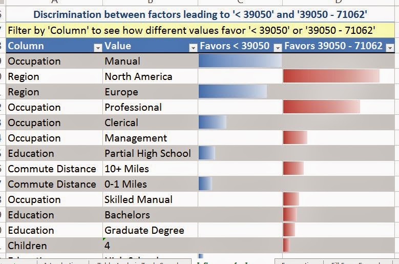 |
| Discrimination Report |
This is called a discrimination report. It's designed to show you which values "Favor" which categories. The report we previously looked at tried to discriminate each category from all the other categories. This report only tried to discriminate one category from another. We see that the same influencers we saw before are on this report as well. Please note that this will not always be the case, it just happens to be the case in this data. We also see that people in North America, with professional or management jobs are more likely to be in the lower-middle class. Looking further down the list, we also see the introduction of lesser factors, such as education and commute distance.
We hope you enjoyed our first look at a true analytical procedure. Stay tuned for the next post where we'll be talking about the "Detect Categories" component. Thanks for reading. We hope you found this informative.
Brad Llewellyn
Data Analytics Consultant
Mariner, LLC
llewellyn.wb@gmail.com
https://www.linkedin.com/in/bradllewellyn
No comments:
Post a Comment