Today, we will talk about performing simple linear regression in Tableau. You can see the effects of this by simply turning on trend lines. However, we don't know of a built-in way to get the equation of that line out of Tableau. You might ask "Why would I want to know the equation of the line?" Imagine that you wanted to find out whether a particular point was above or below the line, i.e. above or below average. If you had the equation of the line, it's nothing more than a simple algebraic exercise (which we won't discuss here). As usual, we will use the Superstore Sales sample data set in Tableau.
Step 1:
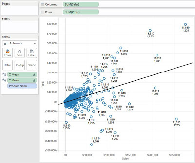
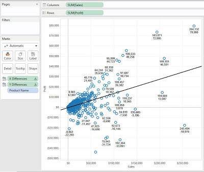
- Create a scatterplot of Profit vs. Sales per Product
- Add a Trend Line to the chart
 |
| Profit vs. Sales per Product |
Step 2:
- Find the means for Sales and Profit
- Create the following calculated fields
 |
| X Mean (Sales) |
 |
| Y Mean (Profit) |
I labelled these X and Y instead of Sales and Profit because it makes it easier to remember where they go in the formulas. You can name these anything you wish, as long as you know what they are. Since this procedure is involved, it's always best to drag the values onto the Label Shelf to see if they are calculated properly.
.JPG) |
| Means (Test) |
The means are the same for every point, and they seem to be reasonable values. This is good enough for us.
Step 3:
- Calculate the difference of each point from the mean for Sales and Profit, individually
- Create the following calculated fields
 |
| X Differences |
 |
| Y Differences |
Now, let's check our work.
.JPG) |
| Differences (Test) |
The values are different for each point, and get larger as they get further from the means. Check #2 complete.
Step 4:
- Calculate the Sum of Squares for XX and XY
- Create the following calculated field
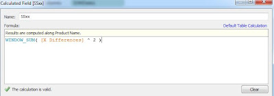 |
| SSxx |
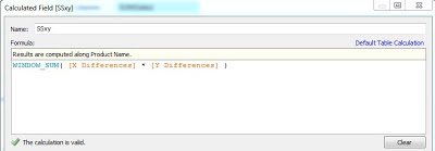 |
| SSxy |
We won't get into why these formulas are called Sum of Squares, or why they look the way they do. Just know that these are the mathematically correct formulas. Now, let's check our work.
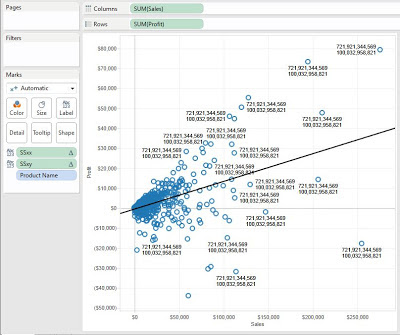.JPG) |
| Sum of Squares (Test) |
We can see that the values are the same for every point, and are really big (which is about all we can decipher from such a value). Check #3 complete.
Step 5:
- Calculate the Slope and Y Intercept
- Create the following calculated fields
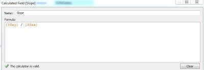 |
| Slope |
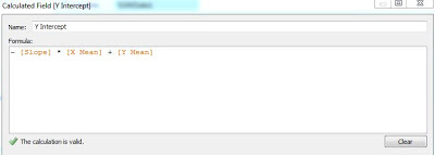 |
| Y Intercept |
Finally, let's check to see if these values are the same as what Tableau calculates.
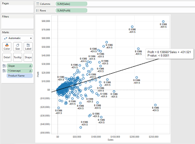.png) |
| Slope and Intercept (Test) |
Drawing back on high school, you might remember that Slope-Intercept form is y = mx + b. We can see that our values match the values for the trend line. Now, we can use these values for any other calculations. Thanks for reading. We hope you found this informative.
P.S.
For those of you that remember the Z-Test package we published to the Tableau forums a while ago, it has been updated to include this procedure as well. We have also created another document describing this technique at
http://community.tableausoftware.com/docs/DOC-1479.
Brad Llewellyn
Associate Consultant
Mariner, LLC
llewellyn.wb@gmail.com
https://www.linkedin.com/in/bradllewellyn


.JPG)


.JPG)


.JPG)


.png)
Very well done.
ReplyDeleteBrad what do you mean by "clustered bar graphs"?
ReplyDeleteHi Shawn,
DeleteI think you meant to reply to Tableau vs. Power Pivot: Part 2. A clustered bar graph is a bar graph that displays multiple dimensions on the same axis. It's somewhat difficult to explain. If you look at the examples for Excel and Power View, you will see clustered bar graphs. Thanks!
In version 8.1 of Tableau, the X and Y Differences return 0. I deleted Workbook, and recreated a 2nd time. Same issue...?
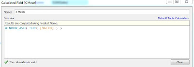
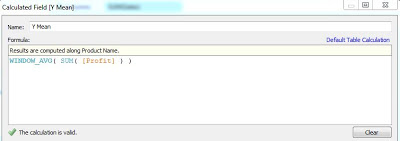
ReplyDeleteX Mean: WINDOW_AVG(SUM([Sales]))
Y Mean: WINDOW_AVG(SUM([Profit]))
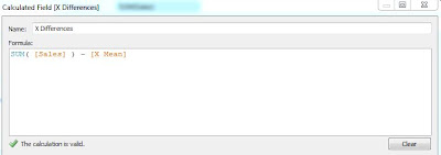
X Differences: SUM([Sales]) - [X Mean]
Y Differences: SUM([Profit]) - [Y Mean]
Sample - Superstore SubSet
columns: SUM(Sales)
rows: SUM(Profit)
Thanks for commenting! The likely culprit is Compute Using. Note that I compute using Product Name. If you're unaware how Compute Using works, you can check out
Deletehttp://breaking-bi.blogspot.com/2013/07/introduction-to-table-calculations.html
Is there a way to do this with the y-intercept forced to zero?
ReplyDeleteActually, that way is much easier. As a mathematical fact, a regression line must go through the ( average(x), average(y) ). So, if you force the y-intercept to be 0, then your line also goes through (0, 0). If you remember your eighth grade math, two points make a line. So, all you need to do is create an estimated y calculation of
Deleteaverage( [x] ) / average( [y] )
Then add the line (x, estimated y) to your graph. Let me know if you need an example.
Thanks!
Excellent work! Thanks Brad for bringing the regression line equation derivation into Tableau!
ReplyDeleteThanks for the post. I am a newbie to R and Tableau. Is it possible to recreate the simple linear regression using R? I saw your post on the 1st part of predictive analytics, but is it possible to just plot the simple regression line produced by R? Thanks.
ReplyDeleteI'm not sure I understand your question. The Predictive Analytics Part 1 post walks through creating the model. If you want the line from that, you can simply use the fit$fitted function to return the fitted values. Does this make sense?
Deletehi again, i solved it myself, no need to reply :D By the way this is really a great blog
DeleteCan you answer this question in the forum :
ReplyDeletehttp://community.tableau.com/thread/163382
Hi, great blog *bookmarked*, anyway i have a question. What if there is null in my Y variable, what will this formula do with the null data? i compare the slope and intercept using this formula with leaving the null data (not using it in modeling) just like what tableau trend line did, and the result is different, and i compare it again using excel regression with Y null replaced by 0, and the result still different.
ReplyDelete(For example : i use all data with this formula and the result -> slope = 2,13 and intercept = 2063, leaving null data i get the same as tableau trend line slope =2,17 and intercept =2024, i replaced null with 0 i get slope =1,95 and intercept=2239) how is this happened? please help. Thank you so much
Could you please explain why -[Slope] * [X mean] + [Y mean]?
ReplyDeleteWhy is Minus used?
Though the value is correct, why is it not y = mx+b
Thank you very much , works like a charm ?
ReplyDelete* How can we export the SLOPE as a Field for further uses ?
* How can we do computation at multiple levels ( for each City suppose i get this graph and i want to compare cities )
Hi, I was wondering if you were able to figure this out. Greatly interested in understand how you did this.
DeleteHi Brad,
ReplyDeleteI've followed the instructions and it works great, except for when I have null values for the dependent variable Y. How can the calculated fields be adapted such that when a data point does not have both an X and Y value it is removed from the calculations?
Thanks,
Dipesh
Any way to get regression statistics to show correlation coefficient, etc?
ReplyDeleteHello Brad,
ReplyDeleteThank you for this tutorial. I have an issue; I want to build a linear regression in Tableau following the steps decribed above but I couldn't succed. Can you help me please? I mean I added a trend line then I calculated all the fields but my trend line didn't change.
Brad,
ReplyDeleteHow would you handle X if it is a date range from September 2013 to August 2015?
Thank you!
JB