Today, we will veer from the traditional "follow the steps" style to talk about an area I have recently become more experienced in. Like most of you, I wanted to put the information on the screen in the best way possible. I would carefully create each chart following common best practices. For example, I would create line graphs to show patterns over time and bar graphs to show differences in values.
However, my dashboards were nothing more than a couple of these charts thrown together. There wasn't much elegance to them. So, I decided to take some sample data, and create a true best practice dashboard. I struggled for a while, until a colleague told me to check out some of the design's for Steven Few's dashboard contest at
http://www.perceptualedge.com/. The dashboard I found is below.
 |
| Student Performance Dashboard |
I stared at this for a minute and came across a revelation. The dashboard has a chosen level of detail, Student, and attempts to tell a complete story about that student, just like a book. This was huge for me. The elegance of telling a story is what led me to create the dashboard below.
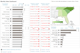 |
| Customer Performance Dashboard |
The story I tried to tell is as follows: Each customer has a certain value to the company, i.e. Revenue. The company attempts to predict how valuable this customer is, i.e. Forecast. Therefore, the first thing I'd like to know about each customer is, "Are they as valuable as I predicted?" This is why I created the alerts. Then, when I am alerted to a customer who is performing poorly, I want to know whether this is a trend or some type of outlier. For example, look at Tools R Us. They are performing massively under forecast, yet it seems to be caused by some sort of bi-weekly trend. This is a huge revelation that I might never have found without a dashboard that tells me this type of story.
The right side of the dashboard is filled with extra information about the customers, which could be used to find other trends, such as a customer no longer carrying a high-value product, or no longer servicing a particular region. I truly believe that a switch in mind-set from "Tell me X!!!" to "What story does my data want to tell me?" is incredibly valuable to anyone who utilizes these dashboards.
I hope you will comment on my design. Thanks for reading.
Brad Llewellyn
Associate Consultant
Mariner, LLC
llewellyn.wb@gmail.com
https://www.linkedin.com/in/bradllewellyn


It looks great- could you post your workbook so your readers can take a look at the function?
ReplyDeleteI wish I could. Unfortunately, the data set is actually an extremely muddied version of a sensitive data set. It is impossible to glean any sensitive information from the picture; but having access to the workbook would allow for "reverse engineering" some sensitive data.
DeleteIf I had known I was going to blog about it when I made it, I would have used a sample data set. Live and Learn!!! Thanks for commenting though :D
DeleteGood job Brad!
ReplyDeleteI have a question - have you figured out how to set the default font to something other than Arial?
I've never heard of a way of changing it. Have you tried posting on the Tableau forums?
DeleteExcellent article Brad. I teach a designed to help analysts and BI developers go from static reporting (fact dissemination) to visual story telling. This article, if you don't mind, is a great example of the thought process that goes into creating a narrative (story) behind the insight discovered with emerging BI technologies. As opposed to just leaving the recipient with a bunch of facts and leaving it to them to derive a story from the facts.
ReplyDeleteI'm glad you think so. If you don't mind, you think you could send me some info on this course of yours?
DeleteNice dashboard! I only see one issue (small): you're using red and green colours and roughly 9% of the male population is red/green color blind!!
ReplyDeleteThis is a concern that I realize now after having made it. I don't like the fact that the map is green at all. It should have followed the same muted grey scale as everything else. Thanks for your response!
DeleteGreat Job Thanks
ReplyDeleteBusiness Intelligence Dashboard