Monday, March 14, 2016

Power BI: Exploring your Data

Today, we're going to use Power BI to explore our data.  Let's say that someone hands us an Excel file and we want to know what's going on in it.  The sample data set we are using can be found here.  This workbook contains 3 sheets with data.  Let's try to import it into Power BI Online.
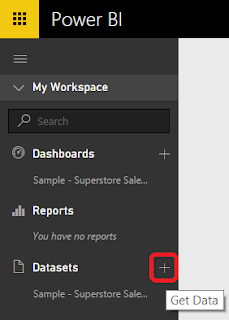
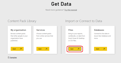
Get Data
Get Data from File

File Not Supported
Turns out that this file was created using a very old version of Excel.  This means that we need to convert it to a new version, then we can upload it.
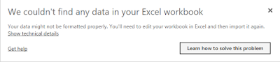
No Data
Now it's telling us the file has no data in it.  But, we know that it has 3 tabs of data.  Turns out that Power BI doesn't look at the tabs at all.  It looks for tables.  So, we need to turn each set of data into a table, for a total of 3.  Now that we have the data uploaded to Power BI Online, we can start exploring.  Where do we start?  Turns out that Power BI Online will do that for us via the Quick Insights option.
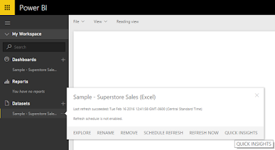
Quick Insights
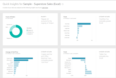
Quick Insights for Sample
This is amazing!  It churned through our data and showed us a some key features without us doing any work at all.  It doesn't just show us the 4 insights above.  The list continues on for pages and pages.  Some of the insights are quite interesting.  For instance, it shows that Technology is by far the most profitable Category and Tables are the least profitable Sub-Category.  Unfortunately, Power BI Online did not recognize the relationships between the tables automatically.  More to that point, there doesn't seem to be a way to create a data model from Power BI Online.  It seems that Power BI Online is designed as a way to share your insights, not to replace Power BI Desktop or any other modeling/ETL tool.

There's one more cool thing you can do with Power BI Online.  You can ask natural language questions to your data using the Q&A feature.
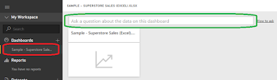
Q&A
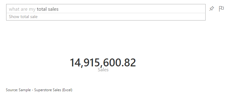
If you create a dashboard using the Sample data, you can ask Power BI a question, and it will try to answer it for you.  For instance, what happens if we ask "What are my total sales?"
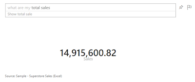
What are my total sales?
As you can see, it translates this question into "data-speak" so that the Power BI can return the appropriate query.  Amazingly, it doesn't seem to mind when you throw more logic at it.
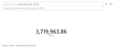
What are my total sales for 2012?
What are my total sales of Tables for 2012?
This is definitely one of the coolest things we've seen an analytics tool do.  Power BI Online definitely shows its chops when it comes to fast answers.  An interesting addition to the Q&A feature is Cortana.  You can enable Cortana to query Power BI Online directly from your Windows machine.  This functions in the same way that Q&A does, without requiring that you go through the browser to ask.  You can find more information on that here.  Now that we've seen how cool Quick Insights and Q&A can be, let's move over to Power BI Desktop and start tinkering.

Interestingly enough, Power BI Desktop is capable of connecting to the original Excel file, even though it's not a recent version.  Moreover, it can also connect directly to the tabs instead of us having to assign tables.  It also attempts to automatically detect relationships so that we don't have to explicitly define them.  As a note, automatic relationship detection may not work if you have unorthodox relationships or your columns are not named the same.  We'll talk more about modelling in a later post.  As you can see, we have modeled the data appropriately.
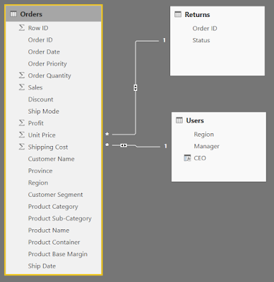
Relationships
There doesn't seem to be a Quick Insights or Q&A option in Power BI Desktop.  This is likely because it is designed more as a Power User tool, as opposed to a standard business user tool.  However, since our data is properly modeled, there's nothing stopping us from creating some charts.
Order Date
 We start by dragging Order Date onto an empty Power BI Desktop Canvas.
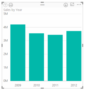
Sales by Order Date
 Then, we drag Sales onto the chart.  Power BI decides to display this as a bar chart.  Generally, when we are looking at an additive metric (like Sales) over time, we want to see it as a line.
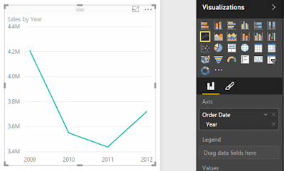
Sales by Order Date (Line)
We can easily do that by clicking the "Line" button in the "Visualizations" panel.  Now, let's split these lines by Category.
Sales by Order Date and Category
We can do that by simply dragging Category onto the chart.  What if we want to look at these at the Month-Year Level?  It turns out that this is one of the places where Power BI falters.  Not all charts have all capabilities.  For instance, there doesn't seem to be a way to drill down a line chart.  You can only show one dimension at a time.  We even decided to create a new column in our data model called Order Month and dragged it onto the chart.  We could not have Year and Month on the chart at the same time.  Therefore, if you want to see Month Year, you have to create a single calculated column that combines the two or better yet, have a date dimension that does it for you.  Fortunately, Matt Masson blogged about a way to do this using Power Query.  You can find the post here.  Now, we've run into the problem of using string names (which are sorted alphabetically, but this can be changed) or using YearMonth numerics, such as 200901 (which have huge gaps between 200912 and 201001).  Either way, this is disappointing.  Fortunately, bar charts give the option to drill-down.  So, we have something we can use, even if it's not perfect.
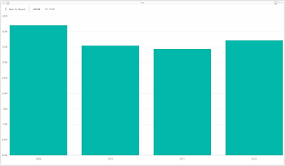
Sales by Year
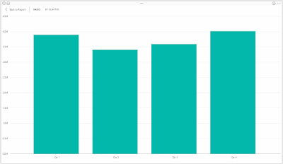
Sales by Quarter
A caveat of this approach is that you can't show multiple quarters across multiple years at the same time without using more advanced hierarchies.  You can either drill down into a single year (by clicking on the bar) or drill down across all years (by clicking the "Double Down-Arrow" button in the top-left).  Hopefully, someone in the community has come up with a good workaround for this.  Alas, we have seen some very powerful options for a free tool.  Stay tuned for more posts about the new Power BI.  Thanks for reading.  We hope you found this informative.

Brad Llewellyn
BI Engineer
Valorem Consulting
@BreakingBI
www.linkedin.com/in/bradllewellyn
llewellyn.wb@gmail.com

Monday, February 22, 2016

Power BI: What's Old Has Been Made New (and So Much Cooler)

Today, we're going to delve into the new Power BI.  Some of you may remember a couple of years ago when we wrote a series of posts comparing Tableau to Power Pivot (technically, it was a comparison of Tableau to Power BI).  Well, Power BI has matured substantially since then.  So, let's check in on it and see how it works now.

Power BI still contains the original four features, Power Query, Power Pivot, Power View, and Power Map.  However, they are all packaged into a single source that's both easy to install and easy to use, not to mention free.

We'll start by showing you some of the completed sample works from Microsoft's website.  You can download the sample content packs here.  Let's begin by looking at the Human Resources Sample.  This file is actually an Excel file with an underlying Power Pivot model, as well as some Power View dashboards.  We could open this file directly in Excel if we wish.  If we do this, we must enable all of the add-ins required to run a workbook with these features.
Human Resources Sample in Excel
This is using base Power Pivot and base Power View to create the dashboard.  That means that some of the more important pieces are missing.  For instance, this color palette is pretty uncomfortable.  Also, there doesn't seem to be an easy way to change this.  Now, let's open this in Power BI.

We start by installing Power BI Desktop, which can be found here.  Then, we open a blank Power BI canvas.  From here, we could open the file as an Excel file.
Get Data from Excel

Unusable Data
When we do this, the only data we have available appears to be some sort of header page.  Turns out that when you get data from an Excel file, Power BI only reads data that exists in the Excel file, it will not pull data from Power View sheets or the Power Pivot model.  In order to open this type of file, we need to use the Import Excel Contents option.
Import Excel Contents
Human Resources Sample in Power BI
As you can see, the custom color palettes came through just fine.  That's the first indication that this file was meant for Power BI, not Excel.  Every one of these charts has a plethora of options you can tinker with on the right "Visualizations" panel.

On the left side of the screen, you can switch between the "Report", "Data", and "Relationships" canvases.  The Report canvas is very similar to the old Power View sheets we are used to.  The Data and Relationships canvases are very similar to Power Pivot.

One important caveat is that not all visualizations come standard with Power BI.  Any of the more unconventional visuals will need to be downloaded from the Power BI Visual Library.  If you attempt to open a Power BI file that contains visuals you do not currently have installed, you will get an empty visual.  Here's an example from the Customer Profitability Sample.
Unsupported Visuals
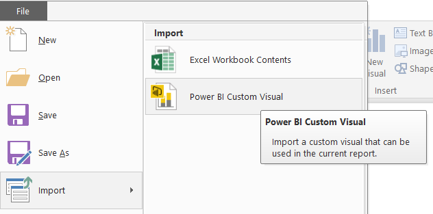
Importing a custom visual is easy.  Simply open the Power BI file you would like to use the visual in, then select the Import Custom Visual option.
Import Custom Visual
What if you want to make some cool dashboards without using the Power BI Desktop client?   Power BI also has a web interface that you can use to make you dashboards as well.  Simply navigate here and sign in to Power BI.  Currently, It seems as though you can only use this service if your organization has an Office 365 subscription.  However, this is constantly changing and we encourange you to try for yourself or check with your IT department to get a subscription.  Using the web interface, you can create, edit, and interact with dashboards and reports, as well as share them with your colleagues.  This service is integrated into Office 365 and should support the same sharing functionality that you are familiar with.  Even if your organization doesn't have Office 365, you can still use Power BI Desktop for free.

Hopefully, this opened your eyes to the potential of Power BI.  Stay tuned for further posts where we'll talk about how to create your own data models and build your own dashboards.  Thanks for reading.  We hope you found this informative.

Brad Llewellyn
BI Engineer
Valorem Consulting
@BreakingBI
www.linkedin.com/in/bradllewellyn
llewellyn.wb@gmail.com

Monday, January 11, 2016

Level of Detail Calculations in Tableau Part 6: Nested LoDs

Today, we're going to talk about Nested LoDs in Tableau.  Just like with Table Calculations, you can't always get the right answer with a single LoD.  So far, we've generally been dealing with SUM(), MAX(), and MIN().  These are unique because we know that the SUM() of a SUM() is the same as applying the SUM() over the entire set.  Similar logic applies to MAX() and MIN().  However, not all calculations work like this.  For instance, AVG() and COUNT() vary depending on the grain of the data.  Therefore, you have to be more careful when you use them.  Let's look at an example.

In Part 5, we looked at number of unprofitable items.  This was simple because our data set is at the item level.  What if we wanted to look at number of unprofitable orders?  Let's walk through it.
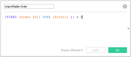
Unprofitable Order
We start by identifying which Orders are profitable.  We can do this by summing [Profit] to the [Order ID] level, then checking if that is less than 0.
Profit by Order ID
Next, we want to know how many unprofitable orders each customer has.
Number of Unprofitable Orders
We can calculate this by replacing the T/F values with 1/0 values (using the INT function), and summing them up from the Order level to the Customer level.
Number of Unprofitable Orders by Customer
Once you get to be slightly more experienced, you can do this in a single calculation.
Number of Unprofitable Orders (Single Calc)
Number of Unprofitable Orders by Customer (Single Calc)
There's one thing you may have noticed about the nested LoDs.  The inner LoD was not FIXED on the dimension included in the outer LoD.  The inner LoD was calculated at the Order level, then that was summed up to the Customer level.  In this case, it's fine because each order belongs to only 1 customer.  If this was not the case, then we'd have to explicitly define Customer in both LoDs.
Number of Unprofitable Orders (Single Calc) v2
Number of Unprofitable Orders by Customer (Single Calc) v2
At this point, you may have noticed that our Outer LoDs isn't actually necessary.  Since the chart is at the same grain as the Outer LoD (the Customer level), we don't actually need it.
Number of Unprofitable Orders (Single LoD)
Number of Unprofitable Orders by Customer (Single LoD)
You might be asking, "How does this calculation teach us about nesting if we don't even need to nest it?"  The nesting comes in handy when you want to step one level further.  What is we wanted to know the average number of Unprofitable Orders per Customer, for each Segment?
Number of Unprofitable Orders by Segment
As you can see, applying the SUM() (Red) to the LoD does not require nesting.  This is exactly what we talked about at the beginning of the post.  However, if you want to apply a different aggregation, like AVG() (Orange), then you need to nest.

Once again, we've run into the same issue with Segment as we did with Customer Name.  This only works because each Customer exists in only one Segment.  What happens if we swap Segment out for Category?  Will the total Orders still add up to 554 + 302 + 166 = 1022?
Number of Unprofitable Orders by Category
We can see that the Total correctly shows 1022 unprofitable orders.  However, the values in the column add up to much more than that.  This is because the unprofitable orders usually span multiple categories.  In fact, we can see that there are only two unprofitable orders that didn't involve Office Supplies.  So, is this right or wrong?  That depends on what you want out of each.  These numbers tell the story that "963 unprofitable orders contain Furniture".  Depending on what question you want to answer, you can use INCLUDE or EXCLUDE statements as well.

One final cool feature we want to point out here is that you can use these values to answer more questions.  For instance, what percentage of unprofitable orders contain Furniture?
Percentage of Unprofitable Orders
Percentage of Unprofitable Orders by Category
We just combined an LoD with a Table Calculation!  We could have also done this using another nested LoD.  Hopefully, LoDs have opened up a whole new world for you within Tableau.  They certainly have for us.  Thanks for reading.  We hope you found this informative.

The workbook for this post can be found here.

Brad Llewellyn
Business Intelligence Consultant
llewellyn.wb@gmail.com
http://www.linkedin.com/in/bradllewellyn

Monday, December 28, 2015

Level of Detail Calculations in Tableau Part 5: LoDs as Dimensions

Today, we're going to talk about using LoDs as Dimensions in Tableau.  Up until now, we've only been using LoDs as measures on our charts.  However, they can also be used as dimensions if you're careful.  One important caveat to note is that only FIXED LoDs can be used as dimensions because a dimension can not depend on what is already in the chart.  This is why Table Calculations are always measures.  Let's start by looking at ways to classify customers.  What if we wanted to classify customers by the number of unprofitable items they've bought?
Number of Unprofitable Items
The inner expression [Profit] < 0 flags each row with a TRUE/FALSE if it's an unprofitable item.  Then, we change those to 1/0 values and sum them up by customer.  If we drag this onto the chart as a dimension, it actually gets pushed down to the row-level of our underlying data, as if it were a dimension in the data set.  This allows us to apply measures on top of it.
Number of Customers by Number of Unprofitable Items
You can even view the underlying data to confirm that the calculation works.
Number of Customers by Number of Unprofitable Items (with Underlying Data)
Unfortunately, the Number of Unprofitable Items field will not appear in the underlying data because it's calculated at runtime.  Alas, this does give you some way to double check your calculations.

Since this field is now a dimension, we can even filter on it.
Sales by Year for Customers with at Least 3 Unprofitable Items
We do warn you to be careful with these types of situations, you may end up with incorrect calculations.  For instance, when you have year on the chart, does the LoD calculate for each year or does it calculate once, filter the underlying data source, and make a chart based on the filtered data source?  Our intuition says the latter.  Let's test it.
Number of Unprofitable Items (BC)
Number of Unprofitable Items by Customer
We can see that Zuschuss Carroll is the only customer with 13 unprofitable items.  Let's see what his/her Sales by Year are.
Sales by Year (Zuschuss Caroll)
His/her Sales for 2011 is $1,589.  Next, let's filter our first Sales by Year chart to show "exactly 13" Unprofitable Items instead of "at least 3".
Sales by Year for Customers with 13 Unprofitable Items
This is exactly what we saw when we filtered on Zuschuss Caroll directly.  This is amazing news.  We now know that filtering by an LoD does not take into account what's on the chart.  What about the other side?  When the LoD is placed on a chart, does it take into account the filters?
Sales by Number of Unprofitable Items for 2011
We see that $1,589 is the same number we saw when we filtered on Zuschuss Caroll.  This isn't especially surprising.  In Part 2, we established that FIXED LoDs always compute before traditional filters.  This brings up another interesting question.  What happens if we add the Year filter to the Context?
Sales by Number of Unprofitable Items for 2011 (Context)
There is no longer a row for 13.  This signals to us that the filter is taking place BEFORE the LoD.  It's a great sign to the simplicity of LoDs that the reality matches our expectations.  However, let's take it one step further.  What happens if you add an LoD filter to Context?  Does an infinite loop within Tableau rip a hole in the universe?  Let's find out.
Unprofitable Items by Year and Customer
The first numeric column you see is the LoD.  As we now know, it doesn't care if Year is also in the chart, it calculates across all years.  After that, we see the Basic Calculation version calculated for each year, followed by the total.  For now, this total matches the LoD.  Let's see what happens when we filter out rows with an LoD equal to 0.
Unprofitable Items by Year and Customer (Traditional Filter)
It filters out all rows with an LoD value of 0, as we expected.  Now, what happens if we add this filter to Context?
Unprofitable Items by Year and Customer (Context Filter) 
Nothing happens.  The filter acts the same whether it is context or traditional.  The real question is "How does this context filter interact with other filters?"  An LoD should always be calculated after Context Filters and before Traditional Filters.  This would lead us to believe that the following order takes place:

1) Non-LoD Context Filters are computed
2) FIXED LoDs are computed
3) Context is recomputed using LoD Context filter
4) Traditional filters are computed

This seems somewhat inefficient.  Calculating the Context can be quite cumbersome depending on your data.  Calculating it twice would make it even worse.  Let's see if this is the case.
Sales by Year for Customers with 13 Unprofitable Items (Context)
We've seen this chart before.  Now, what will happen if we add a traditional filter for 2011.  The LoD filter should calculate first, then the Year filter.  This means that the only row in the output should be 2011 with a value of $1,589.
Sales for Customers with 13 Unprofitable Items in 2011 (Traditional)
So far, so good.  Now, let's add the Year filter to Context.  If our above hunch was correct, the chart should go blank.  This would indicate that the Year filter is being taken into account before the LoD is calculated, thereby requiring the Context to be build twice.

Sales for Customers with 13 Unprofitable Items in 2011 (Context) v2
Interestingly enough, we were wrong.  The Year context filter was not calculated before the LoD.  This is an interesting find.  For one, it means that Tableau's not as inefficient as we expected it to be.  Second, it means that we found an exception to the "Context before FIXED" rule. In fact, it seems that ALL context filters, regardless of origin, are calculated before other FIXED LoDs.  This brings up another interesting question.  Is there any way to have a FIXED Context Filter affected by other filters?  It doesn't seem like it.  Alas, maybe someone will leave a comment with an idea.

That's all we're going to discuss about this today.  We learned a tremendous amount about LoDs and hope you did too.  Thanks for reading.  We hope you found this informative.

The workbook for this post can be found here.

Brad Llewellyn
Business Intelligence Consultant
llewellyn.wb@gmail.com
http://www.linkedin.com/in/bradllewellyn

Monday, December 14, 2015

Level of Detail Calculations in Tableau Part 4: How do they work?

Today, we're going to talk about using how Level of Detail Calculations work inside Tableau.  This is an extremely complex topic that could easily span its own series.  Alas, we'll try to touch on the basics.  Let's start with a simple LoD.  For this example, we'll use the Total Sub-Category Sales.
Total Sub-Category Sales
Judging by the syntax, this LoD calculates the SUM( [Sales] ) at the Sub-Category level.  What does it do with this information?  First, it creates an underlying table for this calculation.
Total Sub-Category Sales (Underlying Table)
We don't get to see this table, but it's still there.  Since this is a FIXED calculation, it also takes into account any data source or context filters that may be applied.  In this case, we don't have any of those.  So, what happens next?  This depends on the granularity of the chart that you're asking Tableau for.  Let's start by decreasing the granularity (less rows in the chart) by choosing to aggregate by Category.  Depending on your industry, this may also be referred to as going "Up the Hierarchy" or "Rolling Up".
Sales and Total Sub-Category Sales by Category
As you can see, when you attempt to roll up this aggregation, it takes the underlying Sub-Category Sales table, and sums it up to the category level.  Here's a rudimentary illustration.
Aggregation
Generally, summing a sum is not the most useful operation.  You can achieve the same result without the headache by just summing the values all the way through.  However, this does become more useful when you want to see things like the max of the sums, or the sum of the maxes.

Now, let's move on to the next level, Disaggregating.  Disaggregating is the exact opposite of Aggregation because you are increasing the granularity of the chart.  This may also be known as "Rolling Down", "Drilling Down", or "Down the Hierarchy".  To illustrate this, we'll use Manufacturer as our dimension.
Sales and Total Category Sales by Sub-Category and Manufacturer
As you can see, the Total Sub-Category Sales are the same for every manufacturer within the Sub-Category.  Why is this?  Well, this chart has the Sub-Category dimension in it already.  Therefore, Tableau simply takes our underlying table of Sales by Sub-Category, and appends it on to each row of the chart.
Appending
These two processes are pretty simple.  But, what if the dimension in your chart is completely unrelated to Sub-Category?  Let's find out by using Segment.
Sales and Total Sub-Category Sales by Segment
As you can see, the Total Sub-Category Sales is equal to the total sales (minus some rounding error).  Since Segment and Sub-Category are "unrelated", the sum of the Total Sub-Category Sales is the total sales.  However, what does it mean to be unrelated?
Total Sub-Category Sales by Segment and Sub-Category
Turns out that every combination of Segment and Sub-Category exists in our context.  Therefore, the sums will always be the same.  Some of you might be saying "But my data has holes in it!"  Holes are an extremely common part of data analysis and should always be considered.  So, what happens if we swap out Segment for State?
Total Sub-Category Sales by State and Sub-Category
As you can see, this cross-section has holes in it.  So, what do you think happens when you remove Sub-Category from the canvas?
Total Sub-Category Sales by State
You can see that most of the states don't add up to the Total Sales.  This is caused by the holes.  Here's a small illustration for you.
Incomplete Aggregation
That's pretty much all the basics for LoDs.  We've seen that when you use an LoD, Tableau creates an underlying table(s) and either appends or aggregates them to you chart.  Don't worry though.  There's plenty more amazing ways that Tableau uses LoDs.  Hopefully, we've laid the groundwork for many LoDs to come.  Thanks for reading.  We hope you found this informative.

The workbook for this post can be found here.

Brad Llewellyn
Business Intelligence Consultant
llewellyn.wb@gmail.com
http://www.linkedin.com/in/bradllewellyn