Thursday, January 31, 2013

More Uses for Sets in Tableau

Today, we will talk about more uses for "Sets" in Tableau.  If you don't know what sets are, I recommend you read my previous post, Working with Sets in Tableau.  As usual, we will use the Superstore Sales sample data set in Tableau.

Scenario 1: Creating combinations of fields

Let's say you want to filter out values where "Category = Furniture" and "Region = Central."  You can create a set using "Category" and "Region", then filter the set based on that unique combination of values.  An example of this is as follows:

Step 1:
  • Create the set
Set of Category and Region
I'm not sure what affects the ordering of the fields in the set.  I do know that dragging them around in the "Create Set" window has no effect on its display.  If you don't initially get the ordering you want, keep creating sets until you get the ordering you want.  Make sure to delete all of the extra sets.  If anyone knows how to change the ordering, please comment.  I'd love to find out why.

Step 2:
  • Filter the value
Filter on Category and Region
Now, you will see that there are no values for "Furniture, Central" in the chart.
Sales by Category and Region (without Furniture, Central)
Scenario 2: Saving a subset of data

Imagine that your data is quite complex and you only want to look at a particular subset.  You could create a global filter for this, but that would affect all of your graphs.  So, let's create a set which stores a particular subset of the data.

Step 1:
  • Choose your fields.
  • Apply the filter condition you want, e.g. "Top 10"
Top 10 Products by Total Sales
Now, instead of dragging "Product Name" onto all of your charts, you can simply drag the set onto it.  I also read somewhere that using sets is more computationally efficient than using filters.  I do not know why this is, but I've tested it and it seems to be true.

I hope you found this informative.  Feel free to comment if you have any questions/suggestions.  Thanks for reading.


Brad Llewellyn
Associate Consultant
Mariner, LLC
llewellyn.wb@gmail.com
https://www.linkedin.com/in/bradllewellyn

Wednesday, January 30, 2013

Basic Coloring in Tableau

Today, we'll talk about using colors to spice up your graphs in Tableau.  Colors are the easiest attribute for people to recognize.  You can have a graph with 3, 4, or 5 different colors; and each of them would be easily distinguishable at a glance.  We would be fools if we did not exploit this.  As usual, we will use the Superstore Sales sample data set in Tableau.

Step 1: Create a worksheet.
Profit Ratio by Sub-Category and Region
Step 2: Decide what you want to show with color

This text table is rather large and it's difficult to see what's important.  We can use color to show values that are important against those that are not.  We can use the typical negative versus positive scale to determine the areas that are profitable versus the areas that are not.

Step 3: Determine the vessel for your color

It is extremely easy to color a text table, you just drag "Profit Ratio" to the "Color" Shelf.  However, coloring in text tables is not easy to see, so why do it at all?
Text Table with Red-Green Coloring
So which areas are unprofitable?  Most of them are grayed out.  This doesn't help much.  In fact, it would be almost completely useless if the user was colorblind.

We can see three distinct issues here.  First, the text is not a very good vessel for the color.  Second, the continuous scale causes most values to be gray.  Finally, the color scale is unusable for colorblind people.  Let's fix these.

Step 4:
  • Change the "Mark Type" to "Square"
  • Right-Click on the Color Legend, Select "Edit Color"
  • Change the Palette to "Orange-Blue Diverging"
  • Check the "Stepped Color" Box and Type "5" in the "Steps" Box
  • Right-Click on any Square on the graph and Select "Format"
  • Under "Default -> Alightment -> Horizontal", Select the "Right Align" Option
  • Adjust the Column Width so that the Values do not overlap the Squares
Heat Map
This is what is referred to as a "Heat Map."  It is my favorite tool for quickly displaying differences across a single measure.  There's so much more that can be done.  Try creating Custom Color Palettes or using different shapes or background colors.  Thanks for reading.

Brad Llewellyn
Associate Consultant
Mariner, LLC
llewellyn.wb@gmail.com
https://www.linkedin.com/in/bradllewellyn

Issues Publishing Workbooks to Tableau Server

Today, let's talk about a couple of issues I've run into while publishing workbooks to Tableau Server.  As with all projects, the most important part is the delivery.  If the client never sees the product you slaved over, then what good did it do?  Tableau Server is a great mechanism for this.  You can work via Tableau Desktop on your local machine, and just publish them to Tableau Server.

Issue 1:  Include External Files

If your workbook runs off of a local extract, you will have to publish the extract to the server as well in order to have any data.  However, I was unaware that this applied to Custom Geocoding as well.  My workbook did not run off of a local extract, so I didn't see the need to include any external files.  I was wrong.  When I attempted to look at the workbook on the server, I would get an error and none of the graphs would display.  It turns out that "Include External Files" applies to local extracts as well as custom geocoding.  I haven't found a case where it was disadvantageous to check this box.  If you have, feel free to comment.

Issue 2: Packaging the Workbook

I had a worksheet with no external files that ran perfectly on my local machine.  However, when I published it to the Tableau Server, I would get an error saying "Field is invalid" and nothing would display.  Through trial and error, I found that the field was a necessary Date field.  Finally, I discovered that packaging the workbook would fix the problem.  I'm still curious as to why this is.  Needless to say, I always package my workbooks before I publish.

Issue 3: "Ghost" Columns

Once, I ran into an issue where I had an invalid field that was not appearing in Tableau Desktop, yet was causing an error on Tableau Server.  The error said something like "[Calculation_280932] is invalid."  I found a solution on a forum that I've forgotten how to find (Sorry to whoever wrote that, I wish I could credit you).  First, make sure there are no hidden fields in Tableau Desktop.  If you open the Tableau Workbook using Notepad, or some other rudimentary text-editing software, you can look at the XML code defining the workbook.  If you search for "hidden", you may find that there is a column that is labeled as hidden, even though it wasn't visible to Tableau Desktop.  If you delete this column, everywhere else it is called, and any syntax it leaves behind, you will have effectively eliminated it from the workbook.  Now, you can publish the workbook with no issues.  I HIGHLY recommend saving a copy of the workbook before you edit the XML code.  It would be very unfortunate if you broke your workbook with no way of repairing it.

I hope you found this informative.  If you have encountered any publishing issues and would like to share, feel free to comment.  Thanks for reading.

Brad Llewellyn
Associate Consultant
Mariner, LLC
llewellyn.wb@gmail.com
https://www.linkedin.com/in/bradllewellyn

Ways to Improve Performance in Tableau

Today, we will talk about various ways to improve the performance of your Tableau dashboards.  I recently worked on a project with a company that did not invest much into their server.  Therefore, they were handicapped by query speed and visualization performance.  However, that's not a problem for us, is it?  We are professionals.  So, let's look at some of the methods that can be used to squeeze as much as possible out of a small system.

Step 1:
  • Use an extract.
There is nothing else that comes close to the efficiency gained using an extract.  If you don't absolutely need live data, extracting is the best bet.

Step 2:
  • Limit your dashboard to fully answering only one scenario.
At it's simplest, a dashboard should be able to fully explore a single scenario.  If your dashboard has six sheets, five actions, and 3 quick filters, you might not be looking at only one scenario.  Remember, no matter how elegant and comprehensive your solution is, if it doesn't run as quickly as the user would like it to, he or she will not use it.  I would not recommend butchering your dashboard so heavily that it cannot fully handle a scenario.  If the user has to go somewhere else to find the answer, why did they use your dashboard at all?

Step 3:
  • Limit the data being introduced to each worksheet.
If you are not planning on using a set of rows, you should filter them out of the data set as early as possible.  If your table contains all sales, and you only want to look at US sales, create a Custom SQL query that filters it out.  If the filter is worksheet dependent, try using a Context Filter.  For more information on filtering, check out my other post Types of Filters in Tableau.  You can also click the Down Arrow beside the word "Dimension" and Select "Hide All Unused Fields" to hide any fields you are not using in any of your worksheets.  I'm not sure if this improves efficiency; but I'd have to imagine that it does, less data should always improve performance.

Step 4:
  • Remove components that add no value.
While aesthetics are very important to building a usable dashboard, unimportant objects aren't worth losing efficiency over.  In fact, you would be better off adding more functionality than you would by adding a purely aesthetic object.

Step 5:
  • Eliminate any non-essential components from the visualization.
This refers to values that would appear on the Pages, Filters, and Level of Detail Shelves.  If they are purely there for the user to see if they scroll over a point, then they aren't adding any value to the initial glance.  However, I leave this as the last step because it should be a last resort.

In most cases, a little forethought can save you a lot of heartache when you are creating dashboards.  Decide exactly what story you want to tell, and tell only that.  It is much easier to add functionality to a small dashboard, than to butcher a large one.  Thanks for reading.

Brad Llewellyn
Associate Consultant
Mariner, LLC
llewellyn.wb@gmail.com
https://www.linkedin.com/in/bradllewellyn

Tuesday, January 29, 2013

Basic Dashboard Formatting in Tableau

Today, we will look at basic ways to format your dashboards to increase usability and improve interpretation.  The goal of a "perfect" dashboard is to alert a user to a situation and give them all of the information they need to act based on that alert.  For example, a Store Manager would be alerted that sales were low last week and be able to easily see that sales were down because Bananas did not sell well.  Therefore, he will go speak to his Produce Manager.

This is quite a lofty goal.  In fact, it's virtually impossible to display all of the information needed to make a decision.  Therefore, we should strive to display as much information as possible, while still maintain usability and performance.  Let's create a simple scenario to discuss a few points.  As usual, we will use the Superstore Sales sample data set in Tableau.

Scenario:

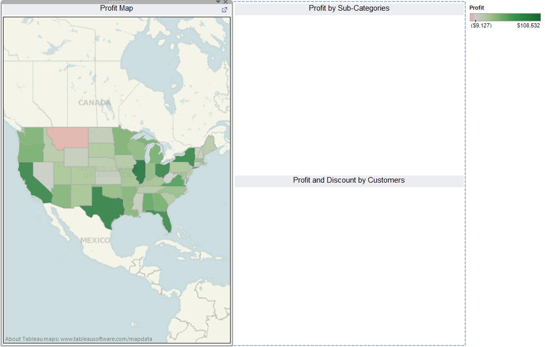
You are the US Manager for SuperStore.  Your are looking at this dashboard to make sure that your business is profitable.  The first sheet you look at it is a map of the US, colored by profit.
Profit Map
Uh oh.  Montana's not very profitable.  Let's pull up Profit by Sub-Category in Montana to see which Sub-Category isn't making money.
Profit by Sub-Category
Ah Hah.  Office Machines are losing huge amounts of money.  Let's look at Office Machine orders by Customer to see if this is widespread.
Profit and Discount by Customer
Turns out this was caused by one customer.  We can either click on this point to drill to the underlying data, or we can look her name up in our source system.  Either way, this was a lot of work in Tableau.  I wish we had a dashboard to do this.  HEY!!! Let's do that.

Step 1:
  • Drag the sheets onto the workbook

This is nice.  However, it needs actions to link it.  In the above scenario, we had two steps.  First, seeing a red State should lead us to the Sub-Categories.  Second, seeing a red Sub-Category should lead us to the Customers.  Also, we don't want to bombard the user with useless information.  So, let's make two filter actions that activate on click, with no information displayed beforehand.

Step 2:
  • Create the following two actions

Filter by State
Filter by Sub-Category

The keys to these filters are the "Exclude all values" button and the fields that are being carried over.  Notice that State is being carried over in the second filter as well.  This means that we had to add State to the level of detail on the "Profit by Sub-Categories" Sheet.  Now, we have a usable dashboard with actions.  However, we can still do a little more to make it look better.
Dashboard with Actions
Step 3:
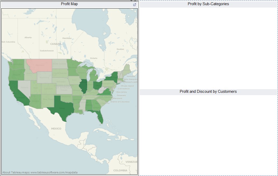
  • Remove the Color Legend.  It only maps to one graph and the extremity of the colors is of little importance in this scenario.
  • Make sure that all three graphs are set to "Entire View".  If you don't know what this means, it's located in a drop-box at the top of the screen.  The other options here "Normal", "Fit Width", and "Fit Height."
  • Right-click on the word "Category" in the "Profit by Sub-Categories" chart, then Select "Hide Field Labels for Rows."  The manager knows that "Furniture" is a "Category", we don't need to waste space to tell him that.
Dashboard with Complete Formatting
Great job!!! You've created a dashboard that you're boss can use to solve his problems.  You're definitely in for a raise.  Thanks for reading.

Brad Llewellyn
Associate Consultant
Mariner, LLC
llewellyn.wb@gmail.com
https://www.linkedin.com/in/bradllewellyn

Types of Filters in Tableau

In Tableau, there are three types of filters.  More explicitly, there are three different ways to limit the data that is displayed by your graph.  These types are Custom SQL "Filters", Context Filters, and Traditional Filters.  Each of these has its own strengths and weaknesses, and we will look at them one at a time.

First, a Custom SQL "Filter" is a WHERE clause that is placed in the SQL that queries the data to be used in the workbook.  "Filter" is a Tableau term that technically applies only to Context and Traditional Filters; however, the Custom SQL "Filter" emulates the behavior of a global Context Filter, so we will refer to it as such.  By construction, Custom SQL "Filters" are always global.  The most common reason for using a Custom SQL "Filter" is to limit the size of a data extract.  The smaller your data extract, the more quickly your charts will load.  In other words, you can make more complex charts without sacrificing efficiency.

One of the ways to create a Custom SQL "Filter" is during the Server Connection process.  For example, here I create a new SQL Server Connection.
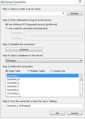
SQL Server Connection
Once I select the Server and Database I would like to use, I can select the table(s).  I can use either the Single Table or Multiple Tables feature to select the table, then I can click on the Custom SQL button.
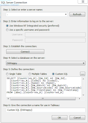
Custom SQL Server Connection
In the SQL code, I can place a WHERE clause to filter on any values I would like.  This is the most efficient of all filters.  If you would like to place a static, global filter on your data, this is where you should do it.

Next, a Context Filter is a filter in Tableau that affects the data that is transferred to each individual worksheet.  Context Filters are great when you want to limit the data seen by the worksheet.  When a worksheet queries the data source, it creates a temporary, flat table that is uses to compute the chart.  This temporary table includes all values that are not filtered out by either the Custom SQL or the Context Filter.  Just like with Custom SQL "Filters", your goal is to make this temporary table as small as possible.

Context Filters have a few advantages over Traditional Filters.  First, they execute more quickly than Traditional Filters.  They are also executed before Traditional Filters and can be executed all at once, which further improves efficiency.  However, they do have one drawback.  It takes time for the filter to be placed into context.  A rule of thumb, from Tableau's KnowledgeBase, is to only place a filter into context if it reduces the data by at least 10%.

A Context Filter is created by dragging a field onto the "Filters" Shelf and editing the filter.  Then, you can Right-Click the field on the shelf and select "Add to Context."  If you have multiple context filters, you can CTRL-Select them all and add them to context in a batch.  This will improve the efficiency of your filter.

Lastly, a Traditional Filter is exactly what most people think of when they think of filters.  When Tableau is creating the visualization, it will check to see if a value is filtered out by a Traditional Filter.  Since this is not performed at the table level, it is the slowest of all filter types.  However, it does have the advantage of being performed after the Context Filters.  This is a necessity if you are dealing with complex "Top N" filters.  A Traditional Filter can be created by simply dragging a field onto the "Filters" Shelf.

EDIT: If you would like to know more about the order in which Traditional Filters are processed.  Check out this link submitted by Jonathan Drummey:

 http://community.tableausoftware.com/message/139603#139603

(Jonathan's Google+)
https://plus.google.com/114523841892404322313

I hope you found this post to be informative.  Thanks for reading.

Brad Llewellyn
Associate Consultant
Mariner, LLC
llewellyn.wb@gmail.com
https://www.linkedin.com/in/bradllewellyn

Monday, January 28, 2013

Different Types of Graphs in Tableau

Today, we will look at a few different types of graphs in Tableau.  More specifically, we will look at the options within the "Marks" Card.  As usual, we will use the Superstore Sales sample data set in Tableau.

Type 1: Text Table
Text Table

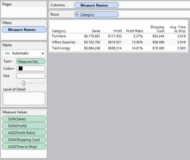
Text Tables are definitely the simplest of charts in Tableau.  They contain no graphics at all.  Despite their simplicity, they excel at displaying multiple measures simultaneously.  In the above chart, I easily displayed five measures without cluttering the screen.  Text tables also display much more quickly due to their non-existent graphics.

Type 2: Bar Graph
Bar Graph
Bar Graphs, sometimes improperly referred to Histograms, are great for displaying a small number of measures across one or two dimensions.  The stacked bar graph above gives an easily interpreted view of Sales across Region and Category.  Bar Graphs display somewhat more quickly as well, due to their visual simplicity.

Type 3: Line Graph
Line Graph
Line Graphs are somewhat similar to bar graphs in their interpretation.  There is one minor difference.  In a bar graph, it is difficult to detect differences in size across a single color due to the bar being located in different places.  A line graph does not have this limitation due to the fact that the values are linked via a line.  However, line graphs typically denote some sort of ordering, usually time.  It is unwise to use a line graph when your dimension has no innate ordering (That's what a bar graph is for).

Type 4: Area Graph
Area Graph
An area graph is pretty much a mix of a line and a bar graph.  It is a line graph where all of the area below the line is shaded.  While this is pretty much a waste of space in most applications, I find it useful when combined with the "Bin" feature to create a probabilistic function.  However, if you were to switch this graph from an area graph to a bar graph, it will maintain it readability and become something people have seen before (This is the description of an actual histogram).  Alas, I like this view.

Type 5: Shape Tables
Shape Graph
Shape graphs are the broadest range of graphs.  They allow you to place pretty much any shape you want, wherever you want, while also giving it dynamic sizes and colors to allow easy interpretation.  The graph above is called a heat map.  It allows the user to see, at a glance, which values are high and which values are low.  Shape graphs are my favorite in my most applications.  However, due to their complexity, they tend to display more slowly than other types of graphs.

Type 6: Pie Chart
Pie Chart
The pie chart may be the most universal of graphical charts.  It is widely known exactly how to interpret these.  They are also rejected by most visualization experts due to their lack of space efficiency and their limitation of only being able to display a single concept.  The above chart is the best example I could come up with as to how to use a pie chart.  Alas, I still feel this information would be better displayed in some other form, like a Heat Map.

Type 7: Gantt Bar Graph
Gantt Bar Graph
A Gantt Bar Graph is similar to a line graph, but the points don't connect.  So far, I've yet to see someone up with a good use for one.  However, I will keep my eyes open.  Maybe there's a hidden use for them that I'm missing?

Type 8: Filled Map
Filled Map
A filled map is a great way to display geographic data.  It's pretty much a heat map superimposed on an actual map.  With Tableau's abilities to generate all kinds of maps, as well as allow custom maps, this could be the best of the basic display tools.  If you have geographic data, I highly recommend using some type of filled map.

Type 9: Polygon
Polygon
This is an interesting concept that Tableau implemented.  This is not a graph "per se."  It is more of a visualization tool.  Tableau allows you to create your own coordinates and superimpose them on an image.  Therefore, with enough time and effort, you would create some incredibly detailed visuals with this tool.

I hope you found this introduction to be enlightening.  Thanks for reading.

Brad Llewellyn
Associate Consultant
Mariner, LLC
llewellyn.wb@gmail.com
https://www.linkedin.com/in/bradllewellyn