Wednesday, April 24, 2013

Conducting 1 and 2-sample Z Tests in Tableau (NEW AND IMPROVED)

In a previous post, Conducting a 2-sample Z Test in Tableau, we gave a rudimentary way to conduct a 2-sample Z Test in Tableau.  Today, we will talk about a more concrete way for performing these both 1 and 2-sample Z Tests.  Due to the complexity of creating the workbook, we will not be walking you through the creation.  Instead, we will post the .twbx and show you how to use it.  As usual, we will use the Superstore Sales sample data set in Tableau.

The packaged workbook can be found here.  A major advantage to using this approach is that you can use any Excel file, regardless of the grain or dimensions of the data.  Tableau will do any and all slicing and aggregations for you.

There are two things you must have though.  First, the data must be stored in an Excel file.  Second, the grain and slicer you would like to use must each exist as a single field in the workbook.  If your slicer/grain is complex, you are free to create any calculated fields and/or groups, then use these in the calculations.

Step 1:
  • Open the workbook
Initial Workbook
Step 2:
  • Right-Click the Data Source -> Select "Edit Connection"
  • Connect to your Excel Workbook
Connecting to the Excel Workbook
Step 3:
  • Select the values and aggregations you would like to use in the test
Value
Step 4:
  • Select the grain you would like your values aggregated up to
Grain
Step 5:
  • Select the dimension/field/group you would like to slice your data with
Slicer
Step 6:
  • Select 1 slice to conduct a 1-sample test, comparing the slice against the [Theoretical Mean] Parameter
  • Select 2 slices to conduct a 2-sample test, comparing the slices against each other
Outcome
That's it!!! You've conducted a Z test in a matter of seconds.  You can easily group your data differently and conduct it again, if need be.  Since this is completely unproven ground, we will now appeal to you guys, the readers.  If you attempt to use this workbook, and run into any problems with things not working right, you wish it did something a little different, whatever.  LET US KNOW!!!  We want to make this great and we need your help.  Thanks for reading.

Brad Llewellyn
Associate Consultant
Mariner, LLC
llewellyn.wb@gmail.com
https://www.linkedin.com/in/bradllewellyn

Tuesday, April 23, 2013

Using the LOOKUP() function in Tableau

Today, we will talk about the LOOKUP() function in Tableau.  The LOOKUP() function allows you to find values that exist elsewhere in your table, or not in the table at all.  At its most basic, it returns a value from a different row in the partition.  It works exactly like INDEX(), TOTAL(), and all of the WINDOW functions.  As usual, we will use the Superstore Sales sample data set in Tableau.

Step 1:
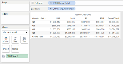
  • Create a table!!!
Sales by Year
Now, let's create a simple lookup that returns the sales from the previous year.

Step 2:
  • Lookup SUM( [Sales] ) from the previous year
  • Create the following calculated field
Previous Year Sales
Now, let's see how it works.
Sales by Year (with Previous Year Sales)
Remember how we defined our LOOKUP() location as -1?  That means it looks one space backwards in the partition.  So, what would happen if we changed the order of the year?

Step 3:
  • Change the sort order of the years to be descending.
Sales by Year (with Next Year Sales)
The calculation changed from previous year to next year, without us having the change the formula.  This is the extremely important aspect of the LOOKUP() function.  We can also use this LOOKUP() value in calculations.

Step 4:
  • Change the sort order back to ascending
  • Calculate the YoY Growth
  • Create the following calculated field
YoY Sales Growth
Now, let's see if it works.
Sales by Year (with YoY Growth)
Now that we have a basic understand of how LOOKUP() works, let's talk about 2 great uses for it.

Use 1: Coercing a calculation to be a table calculation.

You might be asking "Why would we want a calculation to become a table calculation?"  If you remember an earlier post, Creating Table Calculations on Values outside of the Filter Range, you know that table calculations are calculated after other calculations.  This means that if we can force a calculation to be a table calculation, we can control WHEN it is calculated.  This is extremely important in more complex scenarios.  Check out that post for a specific case where it is helpful.  The important aspect to recognize about this use is that SUM( [Sales] ) and LOOKUP( SUM( [Sales] ), 0 ) return exactly the same value, yet are calculated at different times.

Use 2: Looking up values across time.

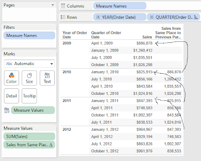
This is a huge category that very few people will ever fully utilize.  To emphasize it, I will show you a very extreme example, you can look up virtually any types of values you want simply by sorting your data in different ways.  First, we created the following calculated field:
Sales from Same Place in Previous Partition
Here's what it did:
Sales by Quarter (with Sales from Same Place in Previous Partition)
First, notice that we mixed up the Quarters in each year so that they do not match.  Then, we applied our LOOKUP().  You will notice that the 2nd column contains the value from the same place in the previous partition, regardless of what the date was.  This is how LOOKUP() actually works.  We actually exploited this concept in a project with a customer who had a fiscal calendar with days that are mixed up similarly to the above graph.

LOOKUP() is one of the most powerful functions in Tableau.  There are so many ways to exploit these features to calculate some truly incredibly values.  I hope you found this informative.  Thanks for reading.

Brad Llewellyn
Associate Consultant
Mariner, LLC
llewellyn.wb@gmail.com
https://www.linkedin.com/in/bradllewellyn

Wednesday, April 17, 2013

Creating More Effective Dashboards

Today, we will veer from the traditional "follow the steps" style to talk about an area I have recently become more experienced in.  Like most of you, I wanted to put the information on the screen in the best way possible.  I would carefully create each chart following common best practices.  For example, I would create line graphs to show patterns over time and bar graphs to show differences in values.

However, my dashboards were nothing more than a couple of these charts thrown together.  There wasn't much elegance to them.  So, I decided to take some sample data, and create a true best practice dashboard.  I struggled for a while, until a colleague told me to check out some of the design's for Steven Few's dashboard contest at http://www.perceptualedge.com/.  The dashboard I found is below.

Student Performance Dashboard
I stared at this for a minute and came across a revelation.  The dashboard has a chosen level of detail, Student, and attempts to tell a complete story about that student, just like a book.  This was huge for me.  The elegance of telling a story is what led me to create the dashboard below.
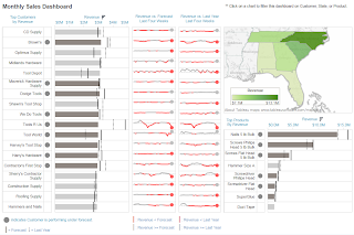
Customer Performance Dashboard
The story I tried to tell is as follows: Each customer has a certain value to the company, i.e. Revenue.  The company attempts to predict how valuable this customer is, i.e. Forecast.  Therefore, the first thing I'd like to know about each customer is, "Are they as valuable as I predicted?"  This is why I created the alerts.  Then, when I am alerted to a customer who is performing poorly, I want to know whether this is a trend or some type of outlier.  For example, look at Tools R Us.  They are performing massively under forecast, yet it seems to be caused by some sort of bi-weekly trend.  This is a huge revelation that I might never have found without a dashboard that tells me this type of story.

The right side of the dashboard is filled with extra information about the customers, which could be used to find other trends, such as a customer no longer carrying a high-value product, or no longer servicing a particular region.  I truly believe that a switch in mind-set from "Tell me X!!!" to "What story does my data want to tell me?" is incredibly valuable to anyone who utilizes these dashboards.

I hope you will comment on my design.  Thanks for reading.

Brad Llewellyn
Associate Consultant
Mariner, LLC
llewellyn.wb@gmail.com
https://www.linkedin.com/in/bradllewellyn

Thursday, April 4, 2013

Using IF Statements in Tableau

Today, we will look at how to properly use IF Statements in Tableau, as well as a trick I find indispensable in most of my work.  Basically, an IF statement is a statement that returns different values based on a set of conditions.  A very simple example is as follows:

IF [Year] = 2012 THEN "2012" ELSE "Other" END

This statement returns the string "2012" if [Year] = 2012, and "Other" if [Year] <> 2012.  (For those who are less techy, <> is the "not equal to" operator.)  As usual, we will use the Superstore Sales sample data set in Tableau.

Step 1:
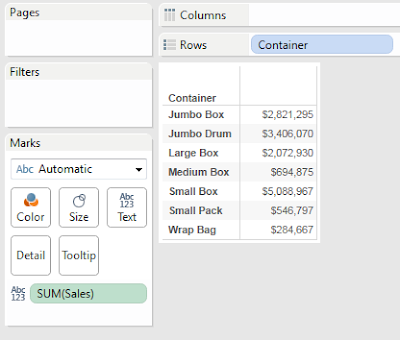
  • Create a graph of Sales by Container
Sales by Container
Step 2:
  • Categorize the Containers by how much Sales they generate
  • Create the following calculated field
Container Category
Step 3:
  • Add [Container Category] to the graph to check the results
Sales by Container (with Container Category)
We've created a simple calculation that tells us how our Containers are performing, without having to scan through a list of numbers.  We could make this even easier by adding colors, or using something other than a text table.  However, we'll leave that up to you.

Let's shift over to that trick we mentioned earlier.  Let's say you want to calculate the total sales for your containers like we did earlier.  However, the Boxes should only be calculated for the last 30 days and everything else should be calculated for the last 45 days.  We've often received the question "How do you calculate a total over the last X days for one product and Y days for another?"  You're about to see!!!

Step 1:
  • Create the graph of Sales by Category
  • Filter the graph to only show the last 30 days
Wait a minute!!! If we filter the graph to only show the last 30 days, all of the containers will show the last 30 days; the same goes for 45 days.  How do we make them different?

Step 2:
  • Remove the Date filter (if you added it at all)
  • Calculate the 30 day sum for boxes and 45 day sum for the other categories
  • Create the following calculated fields
This is a complex step; so, we'll walk through it step-by-step.  First, decide which type of container you have as follows:
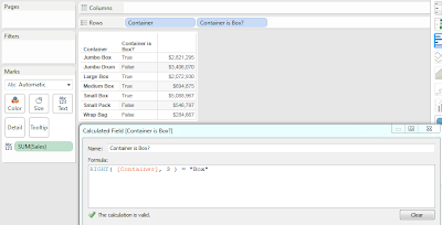
Container is Box?
Next, we need to create a parameter so that we can alter our anchor date for this calculation.  In practice, you could also use TODAY() or a custom field you create in the back-end.
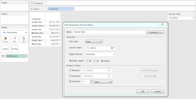
Anchor Date
Now, let's use [Anchor Date] and [Container is Box?] to create our calculation.
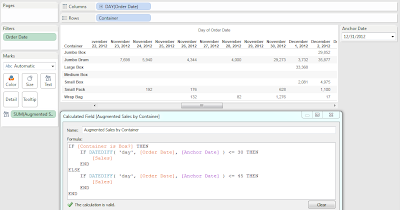
Augmented Sales by Container
This graph is a little messy because of sparcity in the data.  However, you will notice that there are no [Sales] for Boxes before December 1, 2012, which is exactly 30 days before [Anchor Date].  We could check to make sure that the other Containers stop after 45 days, but it's easier to take my word for it and move on.  Finally, we can plot our new sums using whatever graph fits our fancy.
Final Graph
What makes this trick so neat is that the rows for days beyond 45 are still in the data set, yet they have no values for [Augmented Sales by Container].  This means that we could still add other types of data to this chart. (Egregious use of different time frames is not wise though.)  Also, the other aggregation functions, such as Average and Maximum, will still work on this data as well because Tableau does not consider NULL values when it calculates an aggregation.  I hope you found this informative.  Thanks for reading.

Brad Llewellyn
Associate Consultant
Mariner, LLC
llewellyn.wb@gmail.com
https://www.linkedin.com/in/bradllewellyn

Monday, April 1, 2013

Working with Totals and Subtotals in Tableau

Today, we will talk about how to utilize totals and subtotals in Tableau.  All a total/subtotal does is apply the TOTAL() function to the current calculation.  At it's most basic, this applies the underlying calculation to data within all of the panes.  Here, we can see a very simple, yet naive way to display totals.  For the first example, let's use the Superstore Sales sample data set in Tableau.

Sales by Quarter (with Simple Totals)
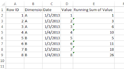
However, what if your data was set up differently.  I worked with a client who wanted some pretty complex Period to Date calculations.  Their data looked something like
Sample Data
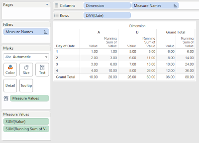
Notice that the Running Sum is calculated at the data source, not in Tableau.  This makes calculations a little more complex.  Let's put these in our naive mock-up again.
Naive Totals
We can see that our Row Totals are pretty intuitive.  They give the total across the dimension, as well as the running sum of that total.  Technically, they are doing the sum of the running sum.  However, these values are identical because addition is associative, (Math fact of the day :P).

On the other hand, the column grand totals are somewhat strange.  The value grand totals are fine, but the running grand totals are adding, when they shouldn't be.  We can make this better.

Step 1:
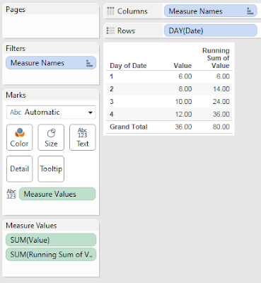
  • Remove "Dimension" from the chart
Value and Running Sum of Value by Day
This chart looks much cleaner, and simpler to show the technique.  Now, let's do something about this total.  To my knowledge, there is no way to get the max if you are summing over a dimension as well (the dimension is Dimension in this case).  Therefore, let's do the next best thing, remove it.

Step 2:
  • Create a calculation that returns SUM( [Running Sum of Value] ) only if there is 1 value for Day of [Date], i.e. not the total
  • Create the following calculation
Running Sum of Value (with No Total)
Step 3:
  • Show it on your chart
Value and Running Sum of Value by Day (with Proper Totals)
Now, the chart is much cleaner because there is no misleading information.  Alas, this is just the beginning.  Try using this technique for more complex charts and data sets.  I hope you found this informative.  Thanks for reading.

Acknowledgements:

The inspiration for this idea came in part from Jonathan DrummeyMarco Russo, and Alberto Ferrari.

Brad Llewellyn
Associate Consultant
Mariner, LLC
llewellyn.wb@gmail.com
https://www.linkedin.com/in/bradllewellyn