Today, we will talk about "Management Dashboards" in Tableau. In a previous post, I said that a dashboard should fully address one scenario; however, that is only one type of dashboard. A "Management Dashboard" is a single glance overview of a set of scenarios, with no actionable information attached. It is usually set up in a 2x2 or 3x3 grid where each graph shows a different metric. In a perfect world, any deviation from the norm would be immediately visible to the user. As usual, we will use the Superstore Sales sample data set in Tableau.
Example Metric:
- Determine whether a combination of Segment and Sub-Category was profitable in the last month.
 |
| Heat Map of Profit by Customer Segment and Sub-Category |
Here, we can easily see which Segments and Sub-Categories are profitable. If we were to combine this chart with a few other similar charts on a dashboard. We would have a simple "Management Dashboard." There are a few things to note about creating effective "Management Dashboards."
Note 1:
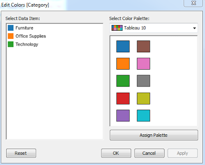
- Notifications should be consistent across all graphs. For example, Orange should always be bad, or Large Box should always be bad.
In my experience, this is the most common mistake made when creating a "Management Dashboard." When one graph is a heat map with Orange being bad, while another graph is a bar chart where Large is bad. To make it even worse, you could have another graph that uses the color Orange, yet it is completely unrelated to the decision to be made, e.g. Orange denotes Southeast Region.
Failure to adhere to this strategy causes the user to have to look individually at each graph to determine what they mean. Even worse, they may misconstrue that the Southeast Region is performing poorly because it is Orange.
Note 2:
When the user sees something alarming, they need to be able to take action on that. If it is not immediately obvious how they should act, then allow them to click on the "Bad" object, i.e. an Orange box, and be directed to another chart which shows in-depth information about why that box is Orange.
This concept should also be consistent throughout your graphs. It is unwise to assume that the user has as much knowledge about the data as you do, especially if you are knowledgeable enough to create new metrics about your data.
Note 3:
- Limit the scope of the dashboard to a particular audience.
If the audience for your dashboard is Regional Sales Managers, there is probably not much use in telling them how the company is doing as a whole. I try to work with the overlying concept of "Less is More!" Tell them exactly what they need to know and no more.
I hope you found this informative. If you have any comments or questions, feel free to comment. Thanks for reading.
Brad Llewellyn
Associate Consultant
Mariner, LLC
llewellyn.wb@gmail.com
https://www.linkedin.com/in/bradllewellyn


.PNG)






.PNG)

.PNG)


.PNG)
.PNG)


