Monday, December 22, 2014

Using the In/Out Tools in Alteryx

We've recently been exposed to a Data Analysis Tool called Alteryx.  It exists in the gaping middle ground where Excel is too weak and SQL is too cumbersome.  With complete honesty, we can say that Alteryx lets us do analysis in less than half the time it would take in SQL or Excel.  To make things even better, Alteryx can output data directly to a Tableau Data Extract for visualization in Tableau.  This makes it 10x better in our book.  If you haven't seen Alteryx in action, you can check out their On-Demand Training Videos here.

Today, we're going to walk through the In/Out Tools.

Input Tool 1: Input Data
Input Data
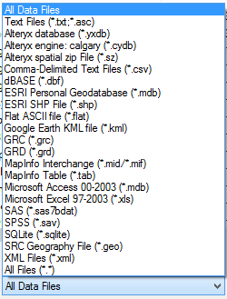
This is the second most common tool you will use in Alteryx.  It is the beginning of almost every analysis and requires very little explanation.  This is where you specify your data set.  This tool can take in quite a few different types of files.
Input File Types
Basically, this covers most of the files you are going to find.  If you need to connect to a database, they allow you to create your own connections, similarly to the way Excel does it.
Database Connection
There are certainly some databases missing from this, Hadoop to name a big one.  However, in the database world, there's almost always a way to connect to your database using a generic connector, such as ODBC or OleDB.  If you have one of these systems, you may need to get IT to help you create the connection.

Input Tool 2: Map Input
Map Input
This is probably the coolest input tool, albeit the least useful for real analysis.  It allows you to select point, draw lines, or create polygons by drawing with your mouse.  You can even use a map as the base to draw polygons around geographic areas.  For instance, if you wanted to point out key locations on a map, or draw a polygon around a location or set of locations.
Statue of Liberty
You can even import your own Alteryx Database (YXDB) files to use as a start.
Ad Areas
This tool is really useful for cool presentations.  But, we don't see it having much analytical use other than estimating locations of things for geocoding purposes.

Input Tool 3: Text Input
Text Input
This tool is really useful when you need to relabel or append data on a one-off basis.  Let's say that you have a file with all of your customers and you need to Categorize them according to a complex list.  You could create that list with a Text Input and join it to your original data.
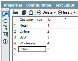
Customer Types
If you have the ability to change the original data, you should definitely add this there.  You could also create a separate Excel file with just this table so that you can use it in other places as well.  If for some reason you can't do any of that, then the Text Input tool is a quick alternative.

We actually had a case where we created a complex R macro that always required at least 1 row of data.  However, some times we would not have any data to give it.  So, we added a Text Input with a blank row and appended it to the data source.  This way, there was always at least 1 row in the data set.  Alas, this is a very situational tool.

Input Tool 4: Directory

Directory
This tool allows you to input the file names, paths, and a myriad of other data about the files within a certain folder on your hard drive or server.  
Directory Properties
This is useful for determining the last time certain files are updated and how often people are writing files to a directory.  Combined with the Dynamic Input tool, you can use this to import multiple files within multiple directories using very complex logic.  This could allow to keep track of all your data in a single place without having to archive it in a single folder.  There's a Sample Module in Alteryx that uses this tool to a similar purpose.

Input Tool 5: Date Time Now
Date Time Now
This tool hardly needs an explanation.  You tell it the format, and it outputs the Date and Time that your Alteryx Module runs.
Date Time Now Properties
This is great if you want to track the times that a module or finding which pieces of a macro or module are taking a long time.  Interestingly enough, the Formula tool can give you this same information in a more efficient way.  Therefore, we can't think of too many cases where this tool would be useful.

Output Tool 1: Browse
Browse
This is the most common tool you will use in Alteryx.  It allows to you to view the data being passed through any section of your Alteryx module.  It can even view charts, visualizations, and maps.
Pet Store Monthly Sales
If you want to save this data for later, you can copy it to the clipboard or save it to one of the output file types.
Save Browse

Output Tool 2: Output Data
Output Data
This tool is great if you want to output files without the manual work of using the Browse tool.  It can output a pretty comprehensive list of file types.
Output File Types
You can even name the file using a field within the data if you want to use this tool within some type of Iterative or Batch Macro.  The big thing to note here is that Alteryx can output proprietary file types like Tableau Data Extracts, QlikView data eXchanges, and ESRI SHP Files.

As you can see, Alteryx is pretty sophisticated when it comes to reading in and writing out different types of data.  The real power of the tool comes when you quickly join the data together and create advanced analyses.  Stay tuned for the next post where we'll be talking about the Field Preparation tools.  Thanks for reading.  We hope you found this informative.

Brad Llewellyn
Director, Consumer Sciences
Consumer Orbit
llewellyn.wb@gmail.com
http://www.linkedin.com/in/bradllewellyn

Monday, December 1, 2014

Data Mining in Excel Part 31: Querying your Model

Today, after months of creating and validating models, we get to the final piece of the Data Mining puzzle, Querying your Model.  In addition to Querying, we'll also briefly touch on the other components of the Model Usage and Management segments.
Model Usage and Management
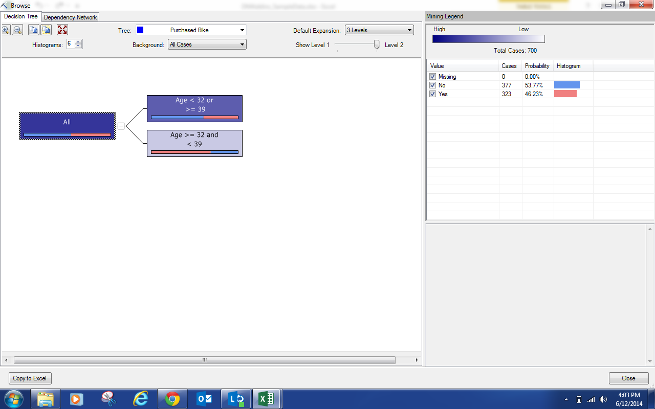
First, the Browse option allows you see the Result sets we've been looking at all along.  For instance, let's check out the Results from our Classify Purchased Bike Model.
Browse
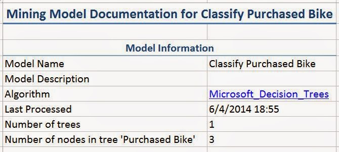
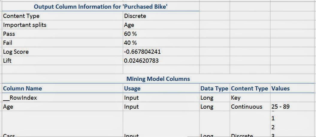
Now, what if you needed to provide documentation of the model you built to allow other people to reference it later?  The "Document Model" option does exactly that.
Summary Information
Complete Information
You can choose to get a short amount of Summary Information or you can choose to get a long list of Complete Information that has basically all of the information about your model.  This can be very helpful in a large-scale production environment.

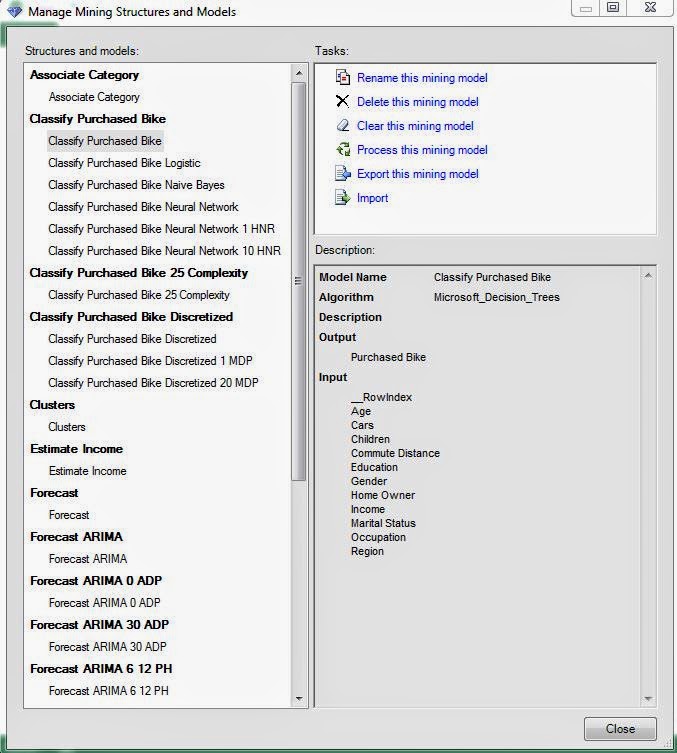
Next, you can use the Manage Models option to rename, delete, clear, process, export, and import models.  This can be really helpful when you are using these models quite a bit over long periods of time.
Manage Structures and Models
Finally, let's get to the Querying.  You be wondering "Why did you make us wait 31 weeks to get this information?"  Well, querying a model is one of the easiest thing to do.  However, that's only the very last piece of an analysis.  What truly separates good data miners from bad ones is how well they analyze and validate their models.  That's why we spent such a large amount of effort in those areas.  Now, let's click on the "Query" button and see what happens.
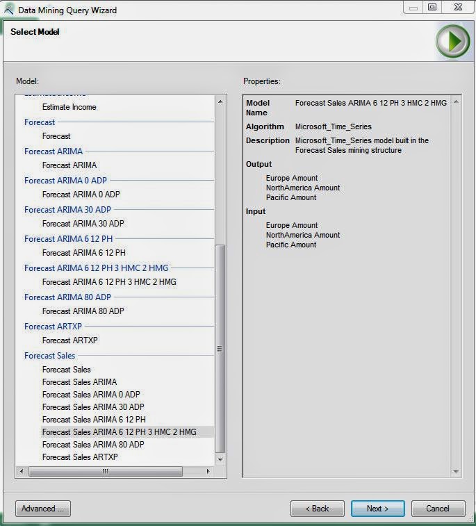
Select Model
First, we need to select the Model that we would like to query.  Let's say that we want to use our Forecasting models.  Remember that we chose the Forecast Sales ARIMA 6 12 PH 3 HMC 2 HMG as our best model.  Let's keep going.
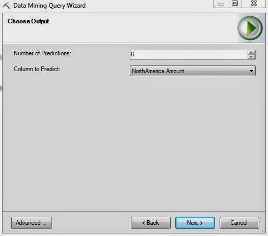
Choose Output
Next, we need to choose how many months into the future and which series we would like to predict.
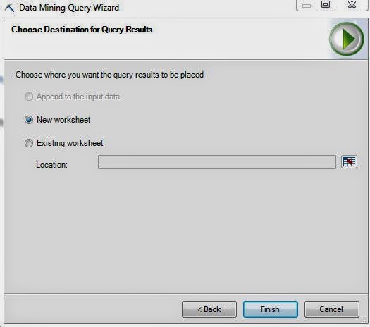
Choose Destination
Finally, we need to choose where we would like to store these predictions.  Let's check them out.
North America Amount Prediction
See how easy that was?  Remember when we chose our Naive Bayes Model as the best model for predicting who is going to buy a bike?  Let's try it with that model.
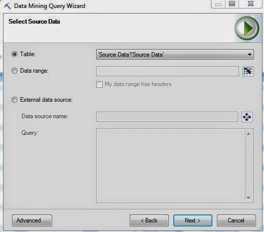
Select Data Source
When we queried our forecasting model, we didn't have to specify an input because the model always predicts based on previous values.  However, the classification predicts based on other values for that observation.  This means that we have to specify some input data.  Let's use the Source Data, which contains ALL of the customers.  Let's keep going.
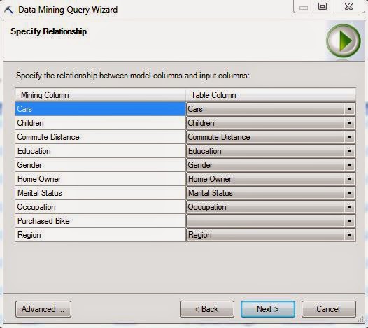
Specify Relationship
Since the input data may be different from the training data, we need to make sure that all of the columns match up.  Since this data is formatted the same way, we have the same column names.  Let's move on.
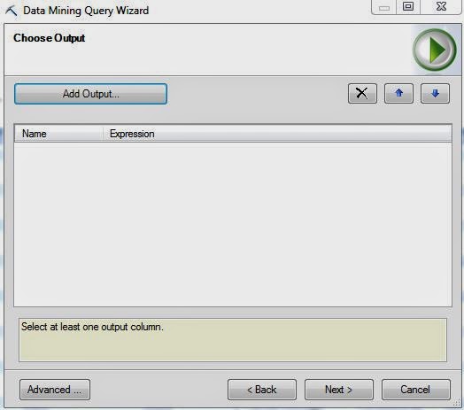
Choose Output (Empty)
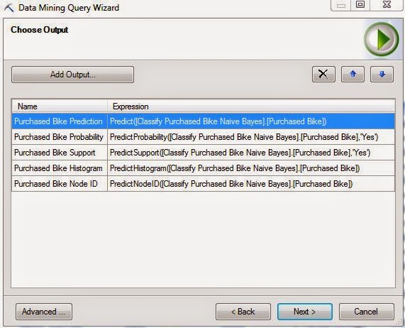
Here, we have a slightly different Choose Output window.  We need to decide which types of output we would like by clicking the "Add Output" button.
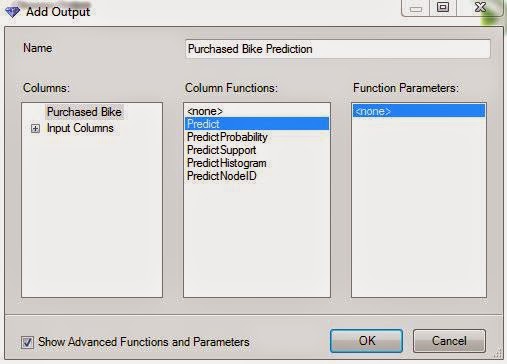
Add Output
Here, we can can decide which of the five types of output we would like.  Just to see them, let's choose them all, including the Advanced Functions that can be seen by checking the box in the bottom-left corner.
Choose Output (Complete)
Let's move on.
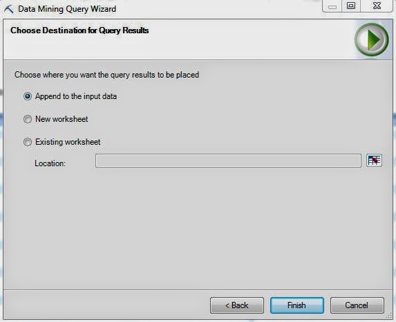
Choose Destination (Purchased Bike)
Here, we can choose to append the results to our data set.  Let's check them out!
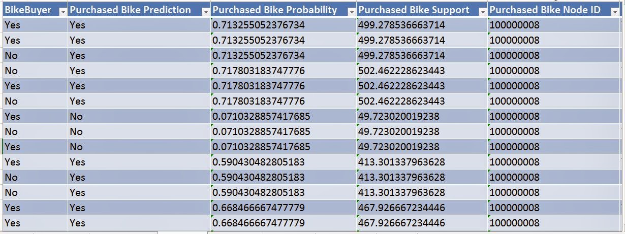
Results
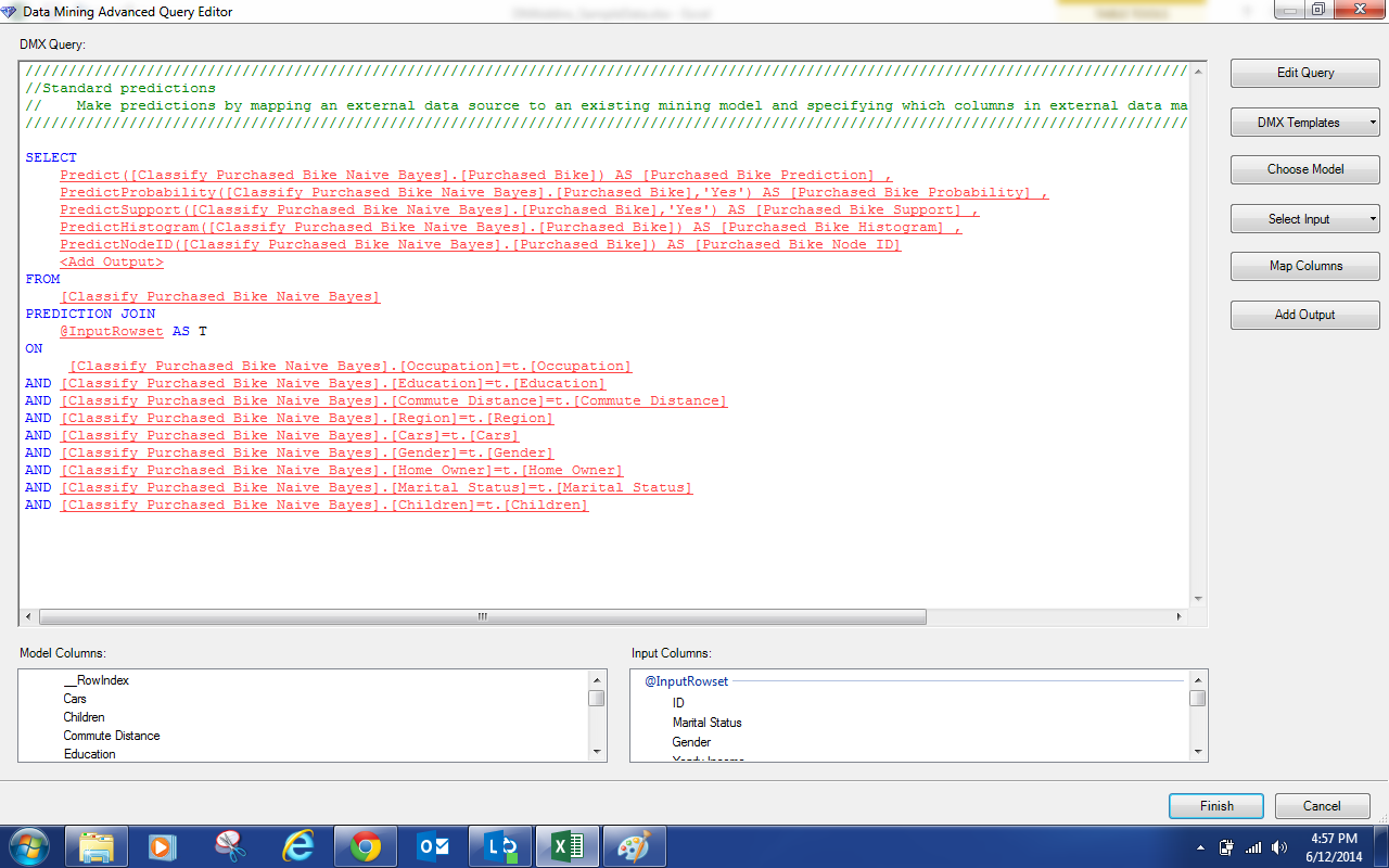
We have so much information in front of us now.  The really important pieces are the Predictions and Probabilities.  Now, we can compare known Bike Buyer values to our Predictions to see how well our model actually works.  We can also see that larger probabilities correspond to Yes values while smaller probabilities correspond to No values.  We won't go any further into detail about this area.  But we will say that there is a TON more to do here.  This functionality also exists in SQL Server Analysis Services and can be used for even more cool stuff.  We'll leave you with one final piece.  In a few of the windows we looked at, there's an "Advanced" button.  Clicking on it will give you a snippet of a programming language called DMX.
Query Editor
You can alter this to create almost anything you want.  You can even use this as a good way to learn DMX.  We hope you enjoyed this series and want to take what you've learned here and apply it to your data.  Thanks for reading.  We hope you found this informative.

Brad Llewellyn
Director, Consumer Sciences
Consumer Orbit
llewellyn.wb@gmail.com
http://www.linkedin.com/in/bradllewellyn
Monday, November 24, 2014

Data Mining in Excel Part 30: Cross-Validation

Today, we're going to talk about the final tool in the "Accuracy and Validation" segment of the Data Mining Ribbon, Cross-Validation.
Cross-Validation
Imagine you have a data set with 10,000 rows.  Then, you randomly assign 1,000 rows to each of 10 buckets.  Next, you create a model using 9 of the buckets (9000 rows) as training data and 1 bucket (1000 rows) as testing data.  Then, you repeat this process for the using each of the remaining 9 buckets as testing data.  After this is done, you have 10 models using parts of the same data set, which means you have 10 different predictions for each row.  Then, you can compare the predictions and see how much they deviate from each other.  If they are all very close to each other, then the model is "good".  If some of them are very far apart, then the model may not be appropriate for the data you have.  You can also compute a single prediction by combining all or part of your 10 predictions into a single value.  This process is called Cross-Validation.  For more information, read this.  Let's see it in action.
Select Structure
First, we need to select the structure or model we would like to use.  Unlike the previous methods, this technique can technically use Association Rules Models as well.  However, the structure must have a variable with the "Predict" flag, which doesn't come from the Association Rules Model.  Therefore, we're not sure how you could use this technique on an Association Rules Model.  Let's move on.
Select Parameters
Next, we need to select our parameters to be used.  Fold Count refers to the number of partitions we create using the data.  In our earlier example, we used 10.  You also need to define how many rows you would like to be used for consideration.  The larger the number of rows, the longer the algorithm will take.  Then you need to define with value you are looking, Purchased Bike = Yes in our case.  Finally, you need to decide what probability defines a "True".  These algorithms don't actually assign a True/False value to the field, they assign a probability.  The higher the probability, the more likely the customer will buy a bike.  For now, let's just set this value at .5, like the flip of a coin.  Finally, let's check out the results.
Prediction Summary (.5 TT)
We rearranged the tables to make it easier to read.  Here, we have tables telling us the average number of true positives, false positives, true negatives, and false negatives across the 10 folds, as well as the associated standard deviations.  We want to have high numbers for True scores and low number for False scores.  We also want standard deviations to be small because this implies that the models are robust, i.e. aren't heavily influenced by differences in the data.  Looking at this carefully, we see that the Naive Bayes Model performs well on all fronts and has a pretty low standard deviation.  This, combined with the fact that this model also performed well on the other previous Model Validation tests, leads us to believe that the Naive Bayes Model is a good fit for this type of analysis.  However, this is just our opinion and is definitely up to interpretation.  Let's check out the next set of metrics further down the sheet.
Metric Summary (.5 TT)
Here, we have 3 metrics displayed, Log Score, Lift, and Root Mean Squared Error.  We won't go into detail about what these metrics mean.  If you want to know you can read Log Score, Lift, and Root Mean Squared Error.  Basically, we want Log Score and Lift to be high, while keeping Root MSE low.  Of course, we also want the standard deviations to be small.  Personally, we don't feel like these metrics are as important as the prediction values we saw previously.  So, we'll just use them to confirm that the Naive Bayes Model is reasonable, and they do.  Before we finish, let's check the Prediction Summary for different values of Target Threshold to ensure stability of our Naive Bayes Model.
Prediction Summary (.2 TT)
Prediction Summary (.8 TT)
By looking at these charts, we see that the Naive Bayes Model seems reasonable in all cases.  This leads us to conclude that the Naive Bayes Model is the model we will use to predict which customers will buy our bikes.  Stay tuned next week where we'll be talking about our final topic, Querying your Models.  Thanks for reading.  We hope you found this informative.

Brad Llewellyn
Director, Consumer Sciences
Consumer Orbit
llewellyn.wb@gmail.com
http://www.linkedin.com/in/bradllewellyn
Monday, November 17, 2014

Data Mining in Excel Part 29: Profit Chart

Today, we're going to talk about the next in the Microsoft suite of Model Validation tools, Profit Chart.
Profit Chart
The Profit Chart is an amazing tool that allows you to mathematically decide how many people to market to.  Imagine that you're trying to sell bikes to a list of 50,000 prospective customers.  You already have some models that tell you how likely each customer is to buy a bike.  So, which ones do you send advertisements to?  Obviously, you want to send flyers to customers that are "likely" to buy.  The question is, "How likely does that customer need to be in order for them to worth marketing to".  Let's say it costs $10 to send a flyer to someone and you make $15 if they buy a bike.  If only 20% of the customers will buy, then you will spend $10 per person for an average of $3 profit because only one out of every five will.  You'd lose money that way.  However, if you advertise to a group of people where 80% of the customers will buy, then you make an average of $12 profit. Now you're making money.  The profit chart allows you to input your cost parameters for your advertising campaign and it will tell you which people you should advertise to.  For more information on Profit Charts, read this.  Let's see it in action.
Select Structure
First, we need to select our structure or model.  Just like the previous two posts on Accuracy Charts and Classification Matrices, this chart cannot be used on models that were built using the Association Rules or Time Series algorithms.  Let's move on.
Select Parameters
Here, we can input the cost of our campaign.  First, we need to decide which value we're looking for.  In our case, we want to find people who will buy a bike.  Next, you input the number of potential customers, 50000 in our case.  Then, you input the fixed cost of creating the campaign, $5000 for us.  Now, you input the individual cost to advertise to a person, $10 in this example.  Lastly, you need to define how much money you would make it you sold a bike, $15 per bike.  This is a great start.  However, in the real world, we get discounts for dealing in bulk.  So, what if an advertiser will give you a discount to create a certain amount of advertisements.  If we click the "..." beside the "Individual Cost" box, we can input that.
Individual Cost (Advanced)
Here, we're saying that the first 1000 flyers will cost $10 per flyer, the next 9000 will cost $7.50 per flyer and everything above that costs $5 per flyer.  Let's keep going.
Select Data Source
Finally, we need to choose our data source.  As usual, we strongly advise against testing the model using the same data that you used to train the model.  Let's check out the results.
Profit Chart (Purchased Bike)
This chart requires a little background.  Imagine that you used these algorithms to assign a probability to each prospective customer (which we haven't learned how to do yet).  This probability tells you how likely that customer is to buy a bike from you.  Then, you order these customers according to those probabilities, highest probability to lower probability.  This ordering is how the horizontal (X) axis of this chart works.  Let's pick 30%.  This point says that if you advertised to the top 30% of your prospective customers as defined by this model, you would make Y dollars.  So, the goal is to see what percentage of our population we need to advertise to in order to maximize our profit.  We see that the blue line (random) is basically the worst performer out of the bunch, followed closely by the red line (Decision Tree Model).  The rest of the models seem to be pretty tightly packed.  The algorithm gives us an easier chart to read.
Maximum Profit per Model
This table was originally on a single line in the Excel worksheet.  We moved it around for easy readability.  We see that the best model is the Neural Network (again).  Followed closely by each of the other models.  This table also tells us what percentage of the population we would have to advertise to in order to make that amount of money.  Compare the Neural Network Model (Middle Right) to the Neural Network 10 HNR Model (Bottom Right).  If we advertise to 5% more people, we make $2500 more.  This isn't an incredibly large amount.  If there's some subtle reason why we wouldn't want to advertise to that many people, then perhaps we should pick the Neural Network 10 HNR Model despite the fact that it's not worth as much.

Now that we've gone through three different Model Validation procedures, we should have a good grasp on how to analyze these models to see which perform the best.  Stay tuned for our next post where we'll be talking about Cross-Validation.  Thanks for reading.  We hope you found this informative.

Brad Llewellyn
Director, Consumer Sciences
Consumer Orbit
llewellyn.wb@gmail.com
http://www.linkedin.com/in/bradllewellyn
Monday, November 10, 2014

Data Mining in Excel Part 28: Classification Matrix

Today, we're continuing our discussion about Model Validation by looking at the Classification Matrix.
Classification Matrix
A Classification Matrix is very useful for determine how well a model predicts values by comparing the predictions to the known values.  Simply put, there are four outcomes for a binary (Yes/No) variable.  First, the actual value is No and the prediction is No (this would be a correct prediction).  Second, the actual value is Yes and the prediction is Yes (this would also be a correct prediction).  Third, the actual value is No and the prediction is Yes (this would be an incorrect prediction and a Type I Error).  Lastly, the actual value is Yes and the prediction is No (this would be an incorrect prediction and a Type II Error).  For more information on Type I and Type II Errors, read this.  A good model reduces the chance of error and increases the chance of correct predictions.  We can display this in a simple grid format.
Classification Matrices (Mock-up)
The first model has a high chance (80%) of correct predictions (No/No and Yes/Yes) and a low chance (20%) of incorrect predictions (No/Yes and Yes/No), while the bad model only has a 50/50 chance of predicting the correct value.  There's not really a golden rule for how well a model needs to be able to predict values.  For instance, it's not fair to say that a model needs at least a 75% chance of predicting correctly in order to called "Good".  How much is good enough depends on the data and the problem.  For instance, in some marketing campaigns, you have success rates at low as 5% or 10%.  The only thing needed for a good model is that it gleams reasonable insight from actual data.  Everything else comes from good data stewardship and model validation.  Let's see it in action.
Select Structure
 The first thing we need to do is pick a model or structure that we would like to create some classification matrices for.  A classification matrix is perfectly valid for a single model, but they are definitely better if you can compare multiple models.  Just like the previous post on Accuracy Charts, this technique will not work on models built using the Association Rules or Time Series algorithms.  Let's keep going.
Select Column
 The next step is to select which column we would like to predict.  Since this structure only has one predictable column, we don't have much choice.  However, we do have the option of seeing percentages, counts, or both.  Personally, we like to see percentages, but the choice is yours.  Let's move on.
Select Data Source
Again, we have the option of choosing a data source.  We defined test data for exactly this reason; so, there's no harm in using it.  Just remember, it's not acceptable to use the same data that you used to train the model.  Let's check out the results.
Classification Matrices (Purchased Bike)
We have a classification matrix for each model in the structure.  The percentages in these matrices are calculated slightly differently than in our mock-up.  In these matrices, each column adds up to 100%.  This is because we can conceptualize each Actual value as a unique outcome.  After all, a single person can't be a bike buyer while also not being a bike buyer.  We prefer this method, but there are quite a few others as well.  You're free to google them if you want.  Just on the first page of results we saw at least four distinct types of classification matrices.

An important thing to note from these models is how well they predict the outcome you are looking for.  In our case, we want to find bike buyers.  We don't care about the non-bike buyers.  So, all we need to focus on is the Yes column.  In that case, the Logistic Model (the bottom one) seems to be a pretty poor model.  It's barely better than flipping a coin!  However, if you compare it to the Decision Tree Model (the top one), you'll see that 52% is not a bad percentage.  Let's take a look at the last type of chart.
Multi-Model Classification Matrix
This matrix was originally on a single line in Excel.  However, it was difficult to screenshot.  So, we used some Excel magic to put it on multiple lines.  This matrix shows us how well each model compares, regardless of which outcome we care about.  It also highlights the "best" model in green.  If we look back down at our single model classification matrices, we see that the Naive Bayes Model actually has the highest Yes/Yes classification percentage at 53.8%.

So, the accuracy chart told us to use the Logistic Model, the single-model classification matrix told us to use the Naive Bayes Model and the multi-model classification matrix told us to use the Neural Network Model.  Which model is the right one?  There's no real answer to that question.  It's up to each of us to make that decision on our own.  In the real world, there is rarely a "best" answer.  Simply choose the model that works well for you.  Keep an eye out for our next post where we'll be talking about Profit Charts.  Thanks for reading.  We hope you found this informative.

Brad Llewellyn
Director, Consumer Sciences
Consumer Orbit
llewellyn.wb@gmail.com
http://www.linkedin.com/in/bradllewellyn