Today, we're going to change it up a little and compare two visuals from the Power BI Marketplace. These visuals are "Forecasting with ARIMA" and "Forecasting TBATS".
 |
| Forecasting Visuals |
ARIMA stands for "AutoRegressive Integrated Moving Average". Basically, it's a method for breaking a time series model down into three components. It's important to note that this type of model is not capable of utilizing multiple variables. It simply predicts future values of a variable based on previous values of that variable. Technically, the "Forecasting with ARIMA" model also includes a seasonal component as well. However, it can only include one continuous model for the trend, denoted by (p,d,q) and one continous model for the season, denoted by (P,D,Q,m). The results from these models are added together to get the value for each point in time. You can read more about it here and here.
TBATS stands for "Trigonometric, Box-Cox Transform, ARMA Errors, Trend, Seasonal". Basically, it's a method for predicting a time series that exhibits more than one seasonal effect. For instance, retail sales is affected independently by day of the week and month. Sales may go up in December because of Christmas and may go up further on the weekend because most people are not working. There's not a ton of information online about this technique, but you can read more it here and here.
Before we can utilize these visuals in Power BI, we may need to install some R packages. If you've been following along in this series, you'll only need the forecast package. An earlier post in this series, Clustering, walks through this process in R Studio. As with the previous posts, we'll be using the Customer Profitability Sample PBIX. You can download it here if you don't already have it. Let's create forecasts for [Total COGS] by [Date] using both of these visuals.
 |
| ARIMA (Initial) |
 |
| TBATS (Initial) |
 |
| TBATS Forecasting Settings (10 Months) |
 |
| TBATS (10 Months) |
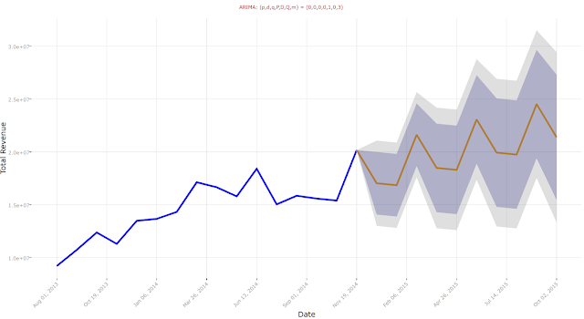
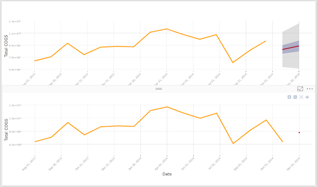
The scale of the graph is much better now, but the forecast is still pretty worthless. As a side note, we originally wanted to use "Total Revenue" for this analysis. Alas, we were unable to get any type of useful forecasts using that variable.
As a differentiator from the ARIMA chart, this chart type allows us to explicitly define the seasonality of our data.
 |
| TBATS (6 Month Season) |
 |
| Together |
This is where it gets tricky. Our data starts in August 2013 and ends in November 2014. That's 16 months of data. This means that we would lose a huge chunk of information if we hold out too much information. This is where a slightly more advanced technique comes into play, "one step ahead" forecasting. Basically, we pick any historic point in the time series and remove all of the data points AFTER that point. Effectively, we are building the time series model as we would have AT THAT POINT IN TIME. Then, we use that model to predict the next point in time. This mirrors how time series algorithms are utilized in practice. To finish the approach, we replicate this technique for every point in time, effectively giving us predictions for every point in time. Obviously, we can't go back too far, as time series trends change over large time periods and we don't have much data to begin with. So, let's start by removing the three most recent months.
 |
| Three Month Holdout Filter |
 |
| ARIMA (3M Holdout) |
 |
| TBATS (3M Holdout) |
 |
| ARIMA (1M Holdout) |
 |
| TBATS (1M Holdout) |
 |
| Predicted vs Actual |
We have a few options for how to proceed. The best idea in this case would be to reduce the granularity of our dataset from months to weeks. This would give us approximately 4.5x as many data points to work with. In our case, that's not possible because the data is stored at the month level. As a next best alternative, we could lean on the time series decomposition. In our previous post, we explored this chart type. Since we had to pivot to use [Total COGS] instead of [Total Revenue], here's what the decomposition for [Total COGS] looks like.
 |
| Decomposition |
Hopefully, this post showcased some of the forecasting and time series analysis techniques available in Power BI. These techniques require very little knowledge of statistical coding, but still allow us to get some valuable insights from our data. Stay tuned for the next post where we will discuss Correlations. Thanks for reading. We hope you found this informative.
Brad Llewellyn
Senior Analytics Associate - Data Science
Syntelli Solutions
@BreakingBI
www.linkedin.com/in/bradllewellyn
llewellyn.wb@gmail.com