Monday, July 28, 2014

Data Mining in Excel Part 13: Prediction Calculator

Today, we will be talking about one of the more interesting Table Analysis Tools, Prediction Calculator.
Prediction Calculator
Imagine that you are a marketing analyst that buys a list of prospective customers from a vendor.  These lists come with data such as Income, Gender, Number of Children, etc.  Now, you want a simple formula that will quickly score each customer on whether they are likely to buy your product(s).  For instance, if they score greater than 500, then they are worth contacting.  This is what the Prediction Calculator does.  Let's see it in action.  As usual, we will use the Data Mining Sample data set from Microsoft.
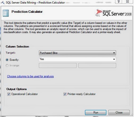
Column Selection
First, we have to tell the algorithm the value that we want to see.  In our example, this is "Purchased Bike = Yes".  We can optionally choose to exclude some columns from the analysis if the need arises.  Finally, we are given two optional outputs, Operational Calculator and Printer-ready Calculator.  We will show you both of these outputs later in the post.  First, let's look at the first output sheet, Prediction Report.  This output sheet is always displayed, regardless of which output options you select.
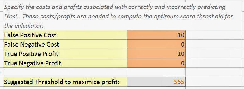
Profits and Costs
The first component of this report is the Profit and Cost matrix.  Let's go one line at a time to see what these values mean.  If you market to a potential customer and they do not buy your product, then you have spent money on the marketing but have gained no profit.  This is called "False Positive Cost".  If you do not market to a potential customer and they would have bought your product, then you have lost potential profit.  We can't think of a case where this would actually cost you anything because you aren't actually doing anything.  However, it is possible and is known as "False Negative Cost".  If you know of a situation where this value would exist, let us know in the comments.  If you market to a customer and they buy your product, then you have spent money on marketing and made money from the sale.  The money from the sale should be higher than the cost to market, else you aren't going to be in business very long.  This value is known as "True Positive Profit".  Finally, if you do not market to a customer and they would not have bought your product, then you saved money on marketing.  Once again, doing nothing doesn't typically cost money, so we're unsure how to use this field.  However, the algorithm does account for it and it is called "True Negative Profit".  Once we fill these values in, the algorithm calculates the threshold you should employ in order to maximize your profit.  It also shows you a handy graph to the side.
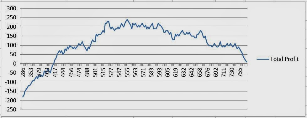
Profit Chart
This is known as a profit chart and we will see it again later in the series.  This profit chart tells us the estimated profit if we employ a certain threshold.  For instance, if our threshold is too low, then we are marketing to too many people who will not buy our product.  In that case, we would spent more on marketing then we would make from Sales.  On the other end, if our threshold is too high, then we don't market to enough customers, causing our sales to be low.  Let's look further down the sheet for more information.
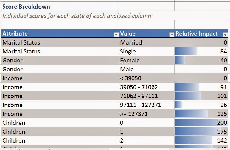
Score Breakdown
This chart shows you every possible value from the data set, as well as how many points that value would earn the customer.  This is useful for seeing which attributes are good predictors for buying a bike.
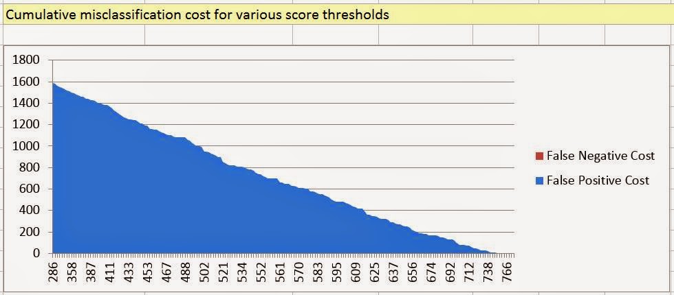
Cumulative Misclassification Cost
To the side of the Score Breakdown, we have a chart that displays the Cumulative Misclassification Cost.  In Layman's terms, this cost shows you the estimated cost of "wasted" marketing for each of these thresholds.  No matter the threshold, there will be someone who doesn't fit the model and will not buy your bike.  This chart attempts to show you just how severe that cost would be for each threshold.  Obviously, the lower the threshold, the more people you market to.  In turn, this means that more people will say no.  Let's move on to the first optional output, Prediction Calculator.
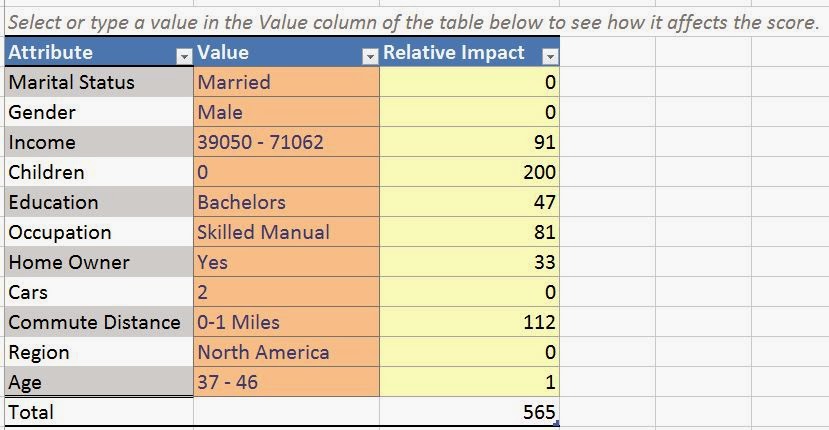
Prediction Calculator
This sheet appears if you select the "Operational Calculator" option.  Here, you can enter the customer's attributes and the algorithm will give them a total score.  If the total score is greater than the threshold, then you should market to them.  Pretty simple indeed.  Finally, let's look at the Printable Calculator.
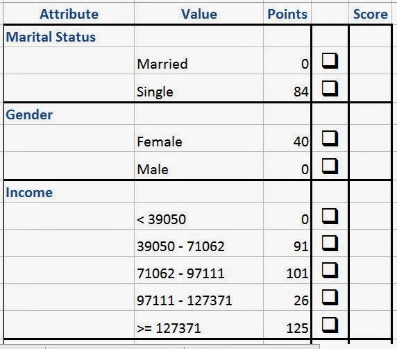
Printable Calculator
This sheet appears if you select the "Printer-Ready Calculator".  This sheet is especially useful if you are doing door-to-door sales and won't have access to a computer to use the Operational Calculator.  You simply check each option and tally up the scores.

The Prediction Calculator tool is extremely useful for marketing purposes.  In fact, we've never seen any tool quite like it, especially given that it's free if you already own Analysis Services.  Stay tuned for the next post where we'll be talking about the final Table Analysis Tool, Shopping Basket Analysis.

Brad Llewellyn
Director, Consumer Sciences
Consumer Orbit
llewellyn.wb@gmail.com
http://www.linkedin.com/in/bradllewellyn

Monday, July 21, 2014

Data Mining in Excel Part 12: What-If

Today, we'll be talking the next component in the Table Analysis Tool set, What-If.
What-If
In our previous post, we talked about the Goal Seek algorithm which would give you the optimal value needed to obtain a particular result.  The What-If algorithm accomplish the converse.  You tell it what you want to change, and it will determine the likely result of that change.  For instance, "Would this person's buying habits be affected if we gave them a 10% discount?"  Once again, our data set consists of attributes about people, which we cannot change.  Therefore, this analysis is purely theoretical and is designed to demonstrate the tool.  Let's get going.
What-If Window
The first section allows us to choose which value we are willing to change.  There are two options here, "To value" and "Percentage".  "To value" allows you to specify the exact value you would to change it to, while "Percertange" allows you to increase the value by a certain percentage.  Obviously, "Percentage" only applies to numeric variables, which is why we couldn't select it here.  The next section allows us to choose the variable we would like to see the effect on.  For instance, our question here becomes "Would these customers be more likely to buy bikes if they moved to the Pacific Region?"  Let's see.
Relocation to Pacific
The algorithm appends two columns onto our data set.  The first column tells us whether the customer would buy a bike if they relocated.  The second column tells us how confident the algorithm is with the result.  Higher confidence is a good thing.  Now, let's ask "How many children would I have if I made 20% more money?"
20% Higher Income
As you can see, this only takes a few clicks.  Most of the work goes into figuring out an insightful question to ask.  Now, let's combine this with the "Detect Categories" algorithm and look at the data in Tableau to see some relationships.
Dashboard
Within a couple of minutes, we were able to take a set of data and create some interesting visuals out of it that really tell us a story about our data and help us make better decisions.  Stay tuned for the next post when we'll be talking about the Prediction Calculator.  Thanks for reading.  We hope you found this informative.

Brad Llewellyn
Director, Consumer Sciences
Consumer Orbit
llewellyn.wb@gmail.com
http://www.linkedin.com/in/bradllewellyn

Monday, July 14, 2014

Data Mining in Excel Part 11: Goal Seek

Today, we will be talking about another one of the Table Analysis Tools, Goal Seek.
Goal Seek
Imagine that you have a table with the characteristics of each customer, as well as the price of each of your products. What if you wanted to determine what the price of the product should be in order to entice the customer to buy it?  This algorithm handles this type of problem.  However, our sample data set only has data about the customer, which we cannot change.  For example, we can't make a customer have 3 children instead of 2.  Therefore, this example is technically flawed; but, it is still a good way to demonstrate the procedure.  As usual, we will be using the Data Mining Sample data set from Microsoft.  Let's get started.
Goal Seek Window
First, we need to specify the variable that will be our "goal" and the value that we are "seeking".  In this example, our goal is to get the customer to buy a bike.  Notice that there are three options for goals.  You can tell the algorithm the exact value you are looking for, a certain percentage increase or decrease in the current value, or a range of values.  We should note that the second and third options are only applicable for numeric values.  Next, we need to choose the column that we want to manipulate.  Here we are asking the question "How many miles would this customer have to commute in order for them to want to buy a bike?"  Finally, we tell the algorithm whether we want to use a single row, or the entire table.  Let's use the entire table.

Recommended Commute Distance
We see that the algorithm returned the best possible commute distance, as well as whether or not the goal was capable of being achieved.  Sometimes, there is no commute distance that would make the customer likely to buy a bike.  For these customers, you would need to figure out a different way to entice them to buy.  Now, let's try using a numeric value as our goal instead.  Let's ask "What level of education would this person need to obtain a 20% increase in income?"
Increasing Income by 20%
Recommended Education
This wasn't so difficult.  Now, let's see if we can combine these algorithms in some cool ways.  Let's also use a clustering algorithm that doesn't consider the four new columns we just added.  Then let's create a simple analysis in Tableau examining how they relate.
Dashboard
Goal Seek is a useful tool when you want to ask questions TO your data, not ABOUT your data.  We were able to pretty quickly toss together a few questions and get some pretty interesting results from our analysis.  Keep an eye out for our next post where we'll be talking about "What-If".  Thanks for reading.  We hope you found this informative.

Brad Llewellyn
Director, Consumer Sciences
Consumer Orbit
llewellyn.wb@gmail.com
http://www.linkedin.com/in/bradllewellyn

Monday, July 7, 2014

Data Mining in Excel Part 10: Highlight Exceptions

Today, we will be talking about one of the coolest, yet least common algorithms found in the Table Analysis Tools, Highlight Exceptions.
Highlight Exceptions
Imagine that you're a bank with a large transaction table and you want to detect fraudulent transactions.  One of the methods for doing this is to determine which transactions aren't like the others.  A mother typically withdraws $500 each wednesday and last friday she withdrew $2000?  Possible Fraud.  A frugal Dad typically makes small purchases on most days of the week and last weekend he spent over $3000?  Possible Fraud.  The question becomes "How do you find these occurrences ?"  This problem is precisely what the Highlight Exceptions tool is for.  Let's see how it works.  As usual, we will be using the Data Mining Sample data set from Microsoft.
Column Selection
Of course, we don't want to use the ID field.  Next, let's see what it does.
Exception Table
Here, we get to see which variables have the most "extreme" or "unusual" observations.  This is a somewhat complex process.  The algorithm doesn't simply look for extreme values in each column.  It finds unusual rows in the data and determines which column is likely making that row unusual.  In this case, the question becomes "Which attribute of this person is making him or her unusual?"  We also have the option of adjusting the threshold.  If we set the threshold to 100, we get no rows.
100 Threshold
Conversely, if we set the threshold to 0, we get every row.
0 Threshold
So, we have to choose a good middle ground.  The algorithm defaults to 75, which is good enough for now.  If you find that there are too many credible rows that the algorithm is selecting, the perhaps you should increase the threshold.  If you find that too many unusual rows are being missed, then decrease the threshold.  However, the cool part is still to come.  Let's go back to our original data set.
Data
At first glance, there doesn't appear to be anything different about the rows.  But, if we filter by color, we see that all of the rows flagged by the algorithm are colored Yellow.
Exceptions
Moreover, the value which is likely causing the problem is highlighted in a different shade of Yellow.  Let's look at the first row, a male professional with partial college education, lots of cars, lots of kids, and makes $130,000 per year who works from home.  That's very unusual.  Perhaps there was a clerical error or something.  This could even be a real, yet rare person.  In fact, we actually know a person who fits criteria very similar to this.  Now, let's see which observations would drop off if we increased the threshold.
Less Exceptions
It turns out that the example we chose wasn't significant enough to meet the threshold of 80.  As you an see, this algorithm is extraordinarily useful and very easy to use.  On a negative note, we wish that the algorithm would append a column onto the data telling which threshold it falls out at.  For instance, the row used as an example would have a threshold somewhere between 75 and 80.  If the data had a column for this value, we could do some really interesting analysis with it.  However, since the data isn't altered in any way, we can't use this within Tableau to make any more cool charts.

On the other hand, there's nothing stopping you from combining the algorithms.  If you were to use the "Detect Categories" tool before using "Highlight Exceptions", you might find that some exceptions change thresholds.  What's unusual in relation to the whole data set, might not be as unusual when compared to other rows in the same category.  Check out our next post where we'll be looking at Goal Seek.  Thanks for reading.  We hope you found this informative.

Brad Llewellyn
Director, Consumer Sciences
Consumer Orbit
llewellyn.wb@gmail.com
http://www.linkedin.com/in/bradllewellyn