Monday, October 29, 2018

Data Science in Power BI: Creating Custom R Visuals

Today, we're going to talk about Creating Custom R Visuals within Power BI.  If you haven't read the earlier posts in this series, Introduction, Getting Started with R Scripts, Clustering, Time Series Decomposition, Forecasting and Correlations, they may provide some useful context.  You can find the files from this post in our GitHub Repository.  Let's move on to the core of this post, Creating Custom R Visuals.

In Power BI, it's possible to create custom visuals using TypeScript.  It's also possible to have these visuals leverage custom R code.  You can find out more about this process here.  While extremely interesting, these is NOT the type of visuals we'll be talking about today.

Over the last few posts, we've shown how to use custom R visuals built by others.  Today, we're going to build our own using the Custom R Visual available in Power BI Desktop.  If you haven't read the second post in this series, Getting Started with R Scripts, it is highly recommended you do so now, as it provides necessary context for how to link Power BI to your local R ISE.

In the previous post, we created a bunch of log-transformed measures to find good predictors for Revenue.  We're going to use these same measures today to create a basic linear regression model to predict Revenue.  If you want to follow along, the dataset can be found here.  Here's the custom DAX we used to create the necessary measures.

<CODE START>

Revenue Current Month (Log) = IFERROR( LN( CALCULATE( [RevenueTY], 'Date'[YearPeriod] = "201411" ) ), BLANK() )

Revenue Previous Month (Log) = IFERROR( LN( CALCULATE( [RevenueTY], 'Date'[YearPeriod] = "201410" ) ), BLANK() )

COGS Previous Month (Log) = IFERROR( LN( CALCULATE( [Total COGS], 'Date'[YearPeriod] = "201410" ) ), BLANK() )

Labor Cost Previous Month (Log) = IFERROR( LN( CALCULATE( [Sum of Labor Costs Variable], 'Date'[YearPeriod] = "201410" ) ), BLANK() )

Third Party Costs Previous Month (Log) = IFERROR( LN( CALCULATE( [Sum of Cost Third Party], 'Date'[YearPeriod] = "201410" ) ), BLANK() )

Travel Expenses Previous Month (Log) = IFERROR( LN( CALCULATE( [Sum of Travel Expenses], 'Date'[YearPeriod] = "201410" ) ), BLANK() )

Rev for Exp Travel Previous Month (Log) = IFERROR( LN( CALCULATE( [Sum of Rev for Exp Travel], 'Date'[YearPeriod] = "201410" ) ), BLANK() )

<CODE END>

Next, we create an empty "Custom R Visual".
Custom R Visual
Then, we add "Name" from the Customer table and all of our new measures to the Values Shelf for the Custom R Visual.
Values Shelf
Now, we could begin writing our script directly in Power BI.  However, it's very difficult to test and debug within Power BI.  So, we recommend using an external ISE, such as RStudio.  Fortunately, Power BI has a button that exports the data to a csv and loads it into the ISE we specified in the options.
Edit Script in External ISE
In our ISE, the first thing we want to do is take a look at our dataset using the following command:
head(dataset)
Dataset Head
We can see that we have nulls (R calls them NAs) in our dataset.  In our case, we can assume that all of these nulls are actually 0's.  Please note that this is not always the case, but we are assuming it in this case.  We've done a number of posts in the past on different ways to handle "imputation".  Check them out here and here.  There are probably some more further back if you want to dig.  For now, all we want to do is replace all NA's with 0's.  We can do this using the following command:
dataset[is.na(dataset)] <- 0
head(dataset)
Imputed Dataset Head
Now, we're ready to build a basic linear regression model.  However, we don't want to include the Name column, as it provides no analytical value.  We can do this using the following command:
reg <- lm(`Revenue Current Month (Log)` ~ . - `Name` , data = dataset )
summary(reg)
Regression Results
Those with experience in linear regression will notice that an "Adjusted R-Squared" of .08 and a "P-Value" of .15 mean that this model is terrible.  However, the purpose of this point is on visualizations, not regression models!  We have a previous post that touches on the finer points of regression.

Now that we have a regression model, we can plot some interesting things about it.  Our original dataset contained seven columns, not counting "Name".  We can't plot seven dimensions on a scatterplot.  So, we need another way to look at our regression model.  One of the ways to do this is with a Residuals vs. Fitted plot.  Basically, this plot shows how "far off" the regression model was.  A better model would have residual values tightly clustered around zero, whereas a worse model would have larger residual values.  We can make one using the following code:
plot(x = reg$fitted.values, y = reg$residuals, xlab = "Fitted Values", ylab = "Residuals")
Residuals vs. Fitted Plot
While this chart is interesting, it's tough to see where zero is for the residuals.  Let's add a horizontal line to make it more obvious.  We can accomplish this using the following code:
abline(h = 0)
Residuals vs. Fitted (Horizontal Line)
This is becoming easier to understand.  Now we can see that the majority of our points are slightly above the zero line, with a few points very far below.  It's pretty obvious that these three points are having a major impact on our model.  This is the value of using a Residuals vs. Fitted plot.  Alas, this post is not about improving our model.  Let's add one final detail, the R-Squared value.  We can use the following code to add the R-Squared value to the title:
plot(x = reg$fitted.values, y = reg$residuals, xlab = "Fitted Values", ylab = "Residuals", main = paste( "Predicting Revenue Current Month (Log): R-Squared = ", round(summary(reg)$r.squared, digits = 3), sep=""))
abline(h = 0)
Now we have a plot that gives us some interesting information about our data.  The final step is to take the R code we've created and copy it into the Custom R Visual in Power BI.  We don't need any of the heads or summaries since Power BI won't output them anyway.  Here's all the code we need:
dataset[is.na(dataset)] <- 0
reg <- lm(`Revenue Current Month (Log)` ~ . - `Name` , data = dataset )
plot(x = reg$fitted.values, y = reg$residuals, xlab = "Fitted Values", ylab = "Residuals",
      main = paste( "Predicting Revenue Current Month (Log): R-Squared = ", round(summary(reg)$r.squared, digits = 3), sep=""))
abline(h = 0)
Now for the final piece.  One of the main reasons this R functionality is so powerful is that you can filter this R visual by using other Power BI charts or slicers.  For instance,  we can see the difference in our regression before and after excluding certain products.
Custom R Visual (All Products)
Custom R Visual (Some Products)
We can see that our R-Squared increased by .1 when we removed the (Blank) and Sova products.  This would be a great way for us to see which products may follow a different sales pattern.

Hopefully, this post opened your minds to the possibilities of creating your own R visuals within Power BI.  Obviously, we only scratched the surface of this incredibly complex topic.  There are many excellent blog posts around the internet showcasing some of the coolest visuals available in R.  We encourage you to try some of them out.  Stay tuned for the next post where we'll dig into R Scripts in Power Query to see what they have to offer.  Thanks for reading.  We hope you found this informative.

Brad Llewellyn
Senior Analytics Associate - Data Science
Syntelli Solutions
@BreakingBI
www.linkedin.com/in/bradllewellyn
llewellyn.wb@gmail.com

Monday, October 8, 2018

Data Science in Power BI: Correlations

Today, we're going to talk about Correlations within Power BI.  If you haven't read the earlier posts in this series, Introduction, Getting Started with R Scripts, Clustering, Time Series Decomposition and Forecasting, they may provide some useful context.  You can find the files from this post in our GitHub Repository.  Let's move on to the core of this post, Correlations in Power BI.

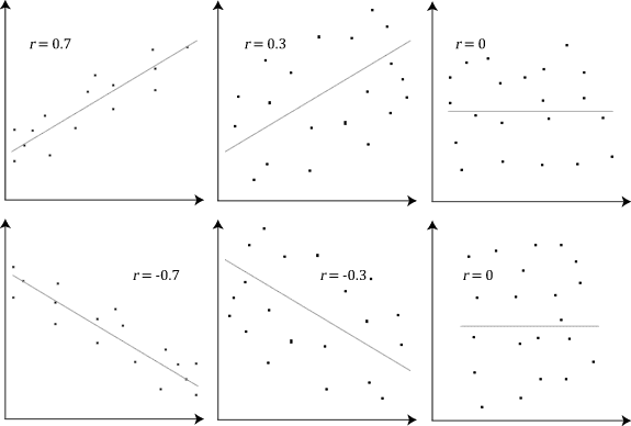
Correlation is a measure of how different values tend to relate to each other.  When we talk about correlation in a statistical context, we are typically referring to Pearson Correlation.  Pearson Correlation is the measure of how linear the relationship between two sets of values is.  For instance, values that fall perfectly in a "up and to the right" line would have a correlation of 1, while values that fall roughly on that line may have a correlation closer to .5.  These values can even be negative if the line travels "down and to the right".
Pearson Correlation
In many industries, the ability to determine which values tend to correlate with each other can have tremendous value.  In fact, one of the first steps commonly performed in the data science process is to identify variables that highly correlate to the variable of interest.  For instance, if we find that Sales is highly correlated to Customer Age, we could utilize Customer Age in a model to predict Sales.

So, how can we use Power BI to visualize correlations between variables?  Let's see some different ways.  We'll start by making a basic table with one slicer and two measures.
Revenue Current Month and Revenue Previous Month by Customer Name (Table)
This table lets us see the current and previous month's revenue by customer.  While this is good for finding individual customers, it doesn't give us a good idea of how closely related these two measures are.  Scatterplots are usually much better at visualizing this type of information.  Let's switch over to one of those.
Revenue Current Month and Revenue Previous Month by Customer Name (Scatterplot)
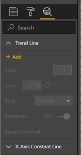
We can add a trend line to this graph by using the "Analytics" pane.
Add Trend Line
Revenue Current Month and Revenue Previous Month by Customer Name (Trend)
There's something missing with the way this data is displayed.  It's very difficult to understand our data when it looks like this.  Given the nature of money, it's common for a few large customers to have very large values.  One way to combat this to change the scale of our data by using the logarithm transformation.  It's important to note that the LN() function in DAX returns an error if it receives a negative or zero value.  This can be remedied using the IFERROR() function.
Revenue Current Month and Revenue Previous Month by Customer Name (Log)
We can see now that our relationship is much more linear.  It's important to note that Pearson correlation is only applicable to linear relationships.  By looking at this scatterplot, we can guess that our correlation is somewhere between .6 (60%) and .8 (80%).

Now, how would we add another variable to the mix?  Let's try with COGS.
Revenue Current Month and Revenue Previous Month by Customer Name (COGS)
It's not easy to see which scatterplot has the higher correlation.  In addition, this solution required us to create another chart.  While this is very useful for determining if any transformations are necessary (which they were), it isn't very scalable to being able to visualize a large number of variables at once.  Fortunately, the Power BI Marketplace has a solution for this.
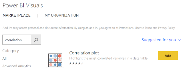
Correlation Plot
If you haven't read the previous entries in this series, you can find information on loading Custom R Visuals in this post.  Once we load the Correlation Plot custom visual, we can utilize it pretty simply.
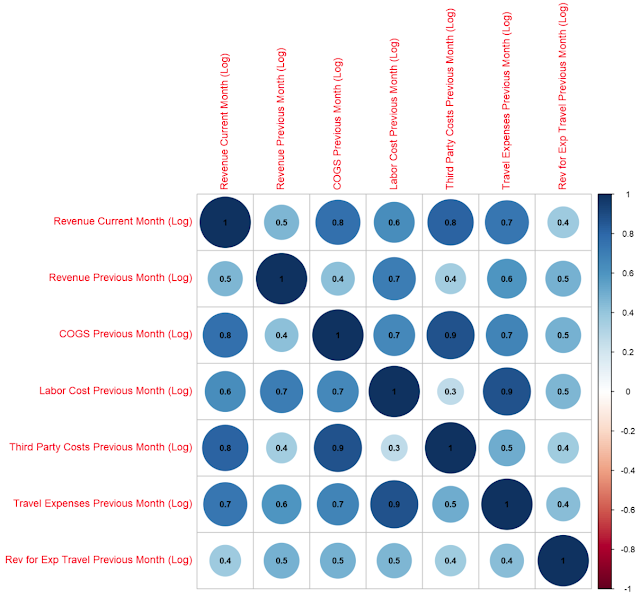
Correlations
We made one tweak to the options to get the coefficients to display, but that's it.  This chart can very easily allow us to look across a number of variables at once to determine which ones are correlated heavily.  This, combined with the scatterplots we saw earlier, gives us quite a bit of information about our data that could be used to create a great predictive or clustering model.

Hopefully, this post piqued your interest to investigate the options for visualizing correlations within Power BI.  This particular custom visual has a number of different options for changing the visual, as well as grouping variable together based on clusters of correlations.  Very cool!  Stay tuned for the next post where we'll dig into the R integration to create our own custom visuals.  Thanks for reading.  We hope you found this informative.

Brad Llewellyn
Senior Analytics Associate - Data Science
Syntelli Solutions
@BreakingBI
www.linkedin.com/in/bradllewellyn
llewellyn.wb@gmail.com