Step 1: Create a worksheet.
 |
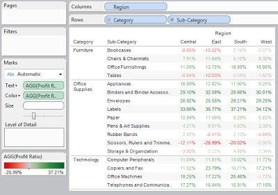
| Profit Ratio by Sub-Category and Region |
This text table is rather large and it's difficult to see what's important. We can use color to show values that are important against those that are not. We can use the typical negative versus positive scale to determine the areas that are profitable versus the areas that are not.
Step 3: Determine the vessel for your color
It is extremely easy to color a text table, you just drag "Profit Ratio" to the "Color" Shelf. However, coloring in text tables is not easy to see, so why do it at all?
 |
| Text Table with Red-Green Coloring |
We can see three distinct issues here. First, the text is not a very good vessel for the color. Second, the continuous scale causes most values to be gray. Finally, the color scale is unusable for colorblind people. Let's fix these.
Step 4:
- Change the "Mark Type" to "Square"
- Right-Click on the Color Legend, Select "Edit Color"
- Change the Palette to "Orange-Blue Diverging"
- Check the "Stepped Color" Box and Type "5" in the "Steps" Box
- Right-Click on any Square on the graph and Select "Format"
- Under "Default -> Alightment -> Horizontal", Select the "Right Align" Option
- Adjust the Column Width so that the Values do not overlap the Squares
 |
| Heat Map |
Brad Llewellyn
Associate Consultant
Mariner, LLC
llewellyn.wb@gmail.com
https://www.linkedin.com/in/bradllewellyn
https://www.linkedin.com/in/bradllewellyn
No comments:
Post a Comment