Clustering is a statistical process by which we group records or observations into categories based on how similar they are to one another.
 |
| Clustering |
Fortunately, the Power BI Marketplace has a pre-built "Clustering" visual that uses R scripts on the back-end. Let's check it out!
We start by opening the "Customer Profitability Sample PBIX" we downloaded in the previous post. In case you haven't read that post, you can find the file here.
 |
| Import From Marketplace |
 |
| Power BI Marketplace |
 |
| Power BI Marketplace (Cluster) |
 |
| Visualizations |
 |
| Enable Script Visuals |
 |
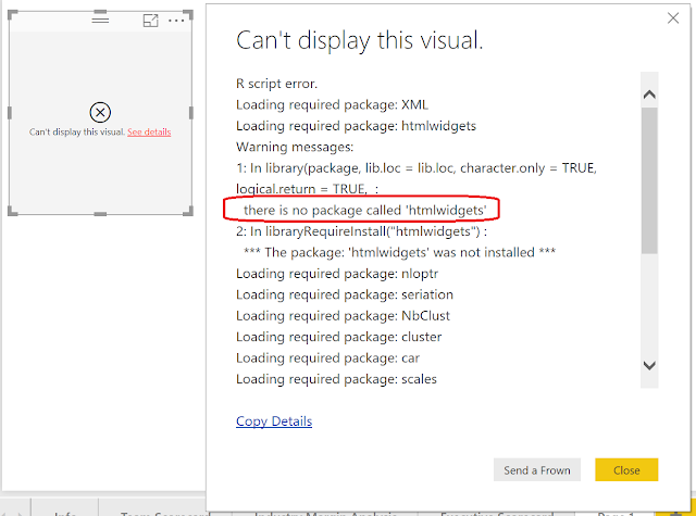
| Can't Display This Visual |
 |
| Install Packages |
C:\Users\<Username>\Documents\R\win-library\3.3\Once we completed that, we faced our next challenge. This custom visual does not allow us to use measures. This means that basic questions like "How many clusters of customers exist based on Total Revenue and Total Labor Costs?" become more complex to solve. Fortunately, it's not too difficult to turn the measures into calculated columns. We do this by creating a new table in Power BI.
 |
| New Table |
 |
| Customer Summary |
<CODE START>
CustomerSummary =
SUMMARIZE(
'Fact'
,'Customer'[Name]
,"Total Revenue", SUM( 'Fact'[Revenue] )
,"Total Labor Costs", SUM( 'Fact'[Labor Costs Variable] )
)
<CODE END>
You can read more about the SUMMARIZE() function here if you are interested.
 |
| Total Revenue and Total Labor Costs by Customer Name |
Finally, we can create our Clustering chart by adding [Total Revenue] and [Total Labor Costs] to the "Values" shelf and [Name] to the "Data Point Labels" shelf. The resulting chart is less than inspiring. "Cluster 2" at the top-right of the chart contains two outlying points, leaving "Cluster 1" to contain the rest of the dataset. The issue here is that K-Means Clustering is not robust against outliers. You can more about K-Means Clustering here.
In order to make a more interesting set of clusters, we need a way to reduce the influence of these outliers. One approach is to rescale the data so that extremely large observations aren't quite so large. Two common functions to handle this are logarithm and square root. Let's alter our code to take the square root of [Total Revenue] and [Total Labor Costs].
<CODE START>
CustomerSummary =
SUMMARIZE(
'Fact'
,'Customer'[Name]
,"Total Revenue (Square Root)", SQRT( SUM( 'Fact'[Revenue] ) )
,"Total Labor Costs (Square Root)", SQRT( SUM( 'Fact'[Labor Costs Variable] ) )
)
<CODE END>
Since we altered the field names, we also need to recreate our chart to contain the [Total Labor Costs (Square Root)] and [Total Revenue (Square Root] fields in the "Values" shelf.
 |
| Total Revenue (Square Root) and Total Labor Costs (Square Root) by Customer Name |
We can see that we now have a more interesting set of clusters. The outliers are still present, but not nearly as dominant. This custom visual has quite a few more interesting options. We encourage you to play around with it to create some visuals that would not be possible in standard Power BI.
Hopefully, this post opened your eyes to the Data Science possibilities in Power BI. The power of custom R scripts has created a new world of potential, just waiting to be unleashed. Stay tuned for the next post where we'll be talking about Time Series Decomposition. Thanks for reading. We hope you found this informative.
Brad Llewellyn
Senior Analytics Associate - Data Science
Syntelli Solutions
@BreakingBI
www.linkedin.com/in/bradllewellyn
llewellyn.wb@gmail.com
Senior Analytics Associate - Data Science
Syntelli Solutions
@BreakingBI
www.linkedin.com/in/bradllewellyn
llewellyn.wb@gmail.com
No comments:
Post a Comment