Monday, June 24, 2013

Creating Fast Navigation Buttons in Tableau

Today, we will talk about how to create fast navigation buttons in Tableau.  In most cases, navigation is quite easy to do by simply using the tabs.  However, if you have a very large workbook or are using a mobile device, such as an iPad, the tabs can be difficult to work with.  Let's look at an alternative.  As usual, we will use the Superstore Sales sample data set in Tableau.

Step 1:
  • Create some dashboards
Step 2:
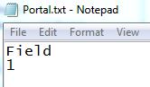
  • Create the following text file
Portal Text File
Step 3:
  • Create a Tableau Extract using this text file.
Portal Connection
Step 4:
  • Connect directly to the extract
Portal Extract Connection
Step 5:
  • Create the following calculated field in the "Portal" Data Source
Dashboard 1 Portal
Step 6:
  • Drag it onto the Label Shelf of a Blank Sheet
  • Format it however you would like
Dashboard 1 Portal Sheet
Step 7:
  • Drag it onto Dashboard 2
  • Add the following filter action
Dashboard 1 Portal Action
Now you have a navigation button that takes you to another dashboard.  While this method takes up more processing time than using the tabs, it is a useful alternative when tabs are not a viable option.  The main processing issue with method is that the sheet must execute a query and compute the visualization.  However, executing a query against a one-element extract and computing a text table are the fastest possible processes.  We hope you found this informative.  Thanks for reading.

Brad Llewellyn
Associate Consultant
Mariner, LLC
llewellyn.wb@gmail.com
https://www.linkedin.com/in/bradllewellyn

Sunday, June 16, 2013

Creating Waterfall Charts in Tableau

Today, we will talk about how to create waterfall charts in Tableau.  A waterfall charts is a good tool for seeing how sequential processes contribute to the whole.  It is very similar to a stacked bar, albeit with a different twist.  Here is a sample we pulled from Google.

Sample Waterfall Chart
For this, we created a sample checking account statement in Excel.  Here is a snippet of it.  In case you were wondering, this is fictitious and in no way reflects the statement of ourselves or anyone that we know of.

Row ID Date Description Amount Daily Posted Balance
2 4/2/2013 Direct Deposit $485.00 $1,596.56
3 4/2/2013 Rent ($804.74) $791.82
4 4/4/2013 Food ($16.00) $775.82
5 4/4/2013 Car ($374.43) $401.39
6 4/5/2013 Cable ($34.23) $367.16
7 4/8/2013 Direct Deposit $1,598.75 $1,965.91
8 4/8/2013 Gas ($39.56) $1,926.35

Step 1:
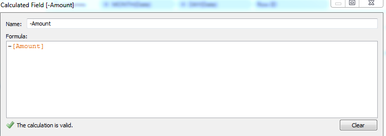
  • Create a Negative Amount calculation
  • Create the following calculation
Negative Amount
Step 2:
  • Drag MONTH( [Date] ), DAY( [Date] ) and [Row ID] to the Columns Shelf
  • Drag [Daily Posted Balance] to the Rows Shelf
  • Drag [Amount] to the Colors Shelf, play with it if you choose
  • Drag [-Amount] to the Size Shelf
  • Drag [Description] and [Date] to the Details/Tooltip Shelf
Waterfall Chart
Now, we can see a simple representation of our account balance throughout the month.  However, what if your data set doesn't contain a nice [Daily Posted Balance] field.  Have no fear, you can recreate it using table calculations.  Obviously, we would lose the ability to see the start balance, but that's a topic for another post.

Step 1.5:
  • Create a Running Sum of Amount
  • Create the following calculation
Balance
Step 2:
  • Create the same chart as before, using [Balance] instead of [Daily Posted Balance]
  • Also, you will need to place [Description] and [Date] on the Tooltip Shelf this time
Waterfall Chart (with Running Sum)
Look familiar?  It should because it is the same exact chart we just saw, except that we now start at 0 instead of ~1100.  Depending on how your data looks you may have to slightly alter the way you approach this.  There are a ton more cases where you can use Waterfall Charts.  We hope you found this informative.  Thanks for reading.

Brad Llewellyn
Associate Consultant
Mariner, LLC
llewellyn.wb@gmail.com
https://www.linkedin.com/in/bradllewellyn

Monday, June 3, 2013

Top N% Filters in Tableau

Today, we will talk about Top N% Filters in Tableau.  In our opinion, there are two types of Top N% Filters.  These are showing the top N% of Customers by Profit or the Customers that correspond to the top N% of Sales.  To our knowledge, neither of these features are built-in to Tableau, yet they can be easily achieved using calculated fields.  As usual, we will use the Superstore Sales sample data set in Tableau.

First, we will look at the Top N% of Customers.

Step 1:
  • Create a chart of Profit by Customer, sorted by SUM( Profit )
Profit by Customer
Step 2:
  • Create a parameter for the N% you want
  • Duplicate the parameter
    • We will use the 2nd parameter for the 2nd filter
Top N% Parameter
Step 3:
  • Calculate the Total Number of Customers
  • Create the following calculated field
Total Customers
For those of you who read this blog often, you will recognize this method.  It is an extremely simple method for executing a distinct count.  Basically, it adds 1 for each row of Customer.

Step 4:
  • Create a calculated field that returns true for customers less than or equal to the cut-off point.
  • Create the following calculated field
  • Add it to the filters shelf, filtering on "True"
Top N% Filter 1
Now, let's see if it works.

Profit by Customer (Filter 1)
As you can see, there are a lot less customers in this chart than the original.  You can play with the parameter to make sure it works.  Now, let's work on filtering Customers that correspond to the Top N% of Sales.  You might wonder why we don't just use Profit again.  Since, Profit can, and sometimes will, be negative, you will get funny results if you use this technique on it.  You are welcome to do it on your own to see.

Step 1:
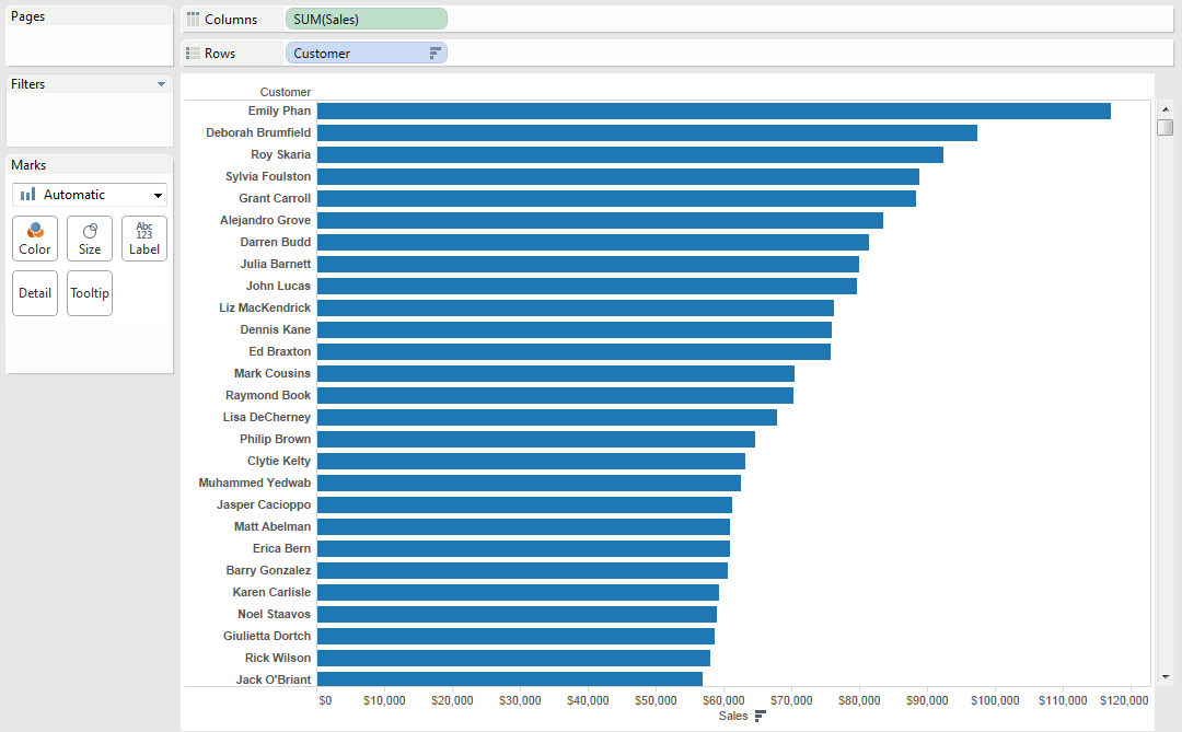
  • Create a chart of Sales by Customer, sorted by SUM( Sales )
Sales by Customer
Step 2:
  • Calculate the Total Sales
  • Create the following calculated field
Total Sales
We could have used WINDOW_SUM() here, just like we did earlier.  However, we'd imagine that WINDOW_SUM() is slower than TOTAL(), so we used TOTAL() here, primarily because this is exactly what TOTAL() is meant for.

Step 3:
  • Calculate the Running Sum of Sales
  • Create the following calculated field
Running Sum of Sales
Step 4:
  • Calculate which Customers are above the threshold
  • Create the following calculated field
  • Add it to the Filters Shelf, filtering on "True"
Top N% Filter 2
Now, let's see the results.

Sales by Customer (Filter 2)
As you can see, calculated fields are very powerful when it comes to creating custom filters.  I hope you found this informative.  Thanks for reading.

Brad Llewellyn
Associate Consultant
Mariner, LLC
llewellyn.wb@gmail.com
https://www.linkedin.com/in/bradllewellyn

Tuesday, May 21, 2013

Creating Histograms in Tableau

Today, we will talk about how to create histograms in Tableau.  When we say histogram, we are referring to the statistical concept of a histogram.  Basically, this means we are looking at the distribution of values of a continuous variable.  The following is a simple example.  As usual, we will use the Superstore Sales sample data set in Tableau.
Sales by Container
This shows a continuous variable sliced by a discrete dimension.  Despite the fact that some people refer to this as a histogram, we call it a "Bar Chart."
Histogram of Sales
This is what we refer to as a histogram.  It shows the distribution of sales.  Now, we will look at how to create these in Tableau.  We will also show you a trick that we recently discovered for creating histograms at higher grain than the underlying data.

Step 1:

  • Right-click [Sales] -> Select "Create Bins..."
Sales (bin)
Step 2:

  • Add [Sales (bin)] to the Columns Shelf
  • Add [Number of Records] to the Rows Shelf
Histogram of Sales (again)
Now, you have created a histogram and can see that smaller [Sales] are more common than expensive ones.  While this is good, what if you want to look at SUM( [Profit] ) per [Customer]?  To our knowledge, there is no built-in way to do this in Tableau.  Have no fear; there is a way!!!

Step 1:
  • Create a [Bin Size] Parameter

Bin Size
Step 2:
  • Calculate the bin that corresponds to SUM( [Profit] )
  • Create the following calculated field
Sum Profit (bin)
Step 3:
  • Calculate a 1 for each member at our new grain (which will be Customer)
  • Create the following calculated field
Number of Observations
Step 4:
  • Drag [Customer] to the Detail Shelf
  • Drag [Sum Profit (bin)] to the Columns Shelf
  • Drag [Number of Observations] to the Rows Shelf
  • Click on the Colors Shelf -> Change "Border" to "None"
Histogram of Profit per Customer
You may notice something odd about this histogram.  The zero bin seems to have a REALLY large number of values in it.  This is actually because most of our bins are calculated as -200 to -100 or 100 to 200, yet the 0 bin is calculated as -100 to 100.  That's twice as many possible values!!!  Let's fix this.

Step 5:
  • Shift the negative profits back one space to create room for the extra bin.
  • Create the following calculated field
Sum Profit (bin) (Corrected)
Now, we can test this to see if our hypothesis was correct.
Sum Profit (bin) Test
We were right!!! There were two sets of values in the zero bin.  Now, let's remove [Sum Profit (bin)] from the chart to get our final histogram.
Histogram of Profit per Customer (Corrected)
Now, we can see that most customers are worth between -$500 and $1000.  While creating this method, we did find one interesting flaw in this design.  We could not find a way to calculate the total number of observations in each bin.  We tried using WINDOW_SUM(), but were unable to get it to restart because [Sum Profit (bin)] is not a dimension, but a discrete measure.  If anyone knows any way to get around this, let us know.  We also have another treat.  Remember the Z-Test workbook we created a couple of weeks ago?  We were able to use this technique to add a histogram sheet to that workbook.  Here's a sneak peek.
Z-Test Histograms
The updated Z-Test workbook can be found at http://community.tableausoftware.com/docs/DOC-1429.  We hope you found this informative.  Thanks for reading.

Brad Llewellyn
Associate Consultant
Mariner, LLC
llewellyn.wb@gmail.com
https://www.linkedin.com/in/bradllewellyn

Sunday, May 12, 2013

What-If Analysis in Tableau

Today, we will talk about What-If Analysis in Tableau.  What-If Analysis is when you propose a hypothetical scenario and use it to see how it will affect your business.  A simple example is, how much will my profit increase if I stop doing business with unprofitable customers?  As usual, we will use the Superstore Sales sample data set in Tableau.

Step 1:
  • Find the unprofitable customers
Unprofitable Customers
Step 2:
  • Create a line graph of Profit per Year, segregated by Profitable/Unprofitable Customers
  • Use the Pages Shelf to hide the Unprofitable line.
Profit by Year, from Profitable Customers
Step 3:
  • Calculate the Total Profit using both Profitable and Unprofitable Customers
  • Create the following table calculation
Total Profit
Step 4:
  • Use this table calculation to create a synchronized, dual-axis line chart.
Total Profit and Profit from Profitable Customers by Year
As you can see, there is a pretty significant increase in Profit if we stop doing business with unprofitable customers.  Some of you may say, "This isn't the kind of What-If Analysis I'm used to!!!"  You're right.  This example was useful for showing the strength of Tableau in the area.  

Now, let's look a more traditional What-If Analysis.  What would happen to my profit if I decreased my shipping cost by X%?

Step 1:
  • Create a parameter for the X%
Shipping Cost Decrease Percentage
Step 2:
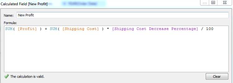
  • Calculate the new profit
  • Create the following calculated field
New Profit
Some of you might be asking, "Why did you calculate profit that way?"  The simple answer is, I didn't have the right variables in my data set to calculate Profit the traditional way, i.e. Profit = Sales - Costs.  At its simplest, this way adds the Shipping Cost back into the Profit.  There are some much more complicated ways to do something like this, but for the sake of simplicity, we'll keep it like this for now.

Step 3:
  • Create a line chart to compare Profit and New Profit by Year
Profit and New Profit by Year
As you can see, if you can decrease shipping costs by 20%, you can increase profit by about 1% or 2%.  While these aren't substantial numbers, there's a very important concept to remember.  Shipping is a notoriously inefficient business.  It's not uncommon for companies to reduce shipping costs 20% or 30% just by using a new piece of technology or creating a new initiative.  Also, it's pretty easy to make your boss smile if you can show him a way to increase his profits by a few percent each year.  I hope you found this informative.  Thanks for reading.


Brad Llewellyn
Associate Consultant
Mariner, LLC
llewellyn.wb@gmail.com
https://www.linkedin.com/in/bradllewellyn

Wednesday, April 24, 2013

Conducting 1 and 2-sample Z Tests in Tableau (NEW AND IMPROVED)

In a previous post, Conducting a 2-sample Z Test in Tableau, we gave a rudimentary way to conduct a 2-sample Z Test in Tableau.  Today, we will talk about a more concrete way for performing these both 1 and 2-sample Z Tests.  Due to the complexity of creating the workbook, we will not be walking you through the creation.  Instead, we will post the .twbx and show you how to use it.  As usual, we will use the Superstore Sales sample data set in Tableau.

The packaged workbook can be found here.  A major advantage to using this approach is that you can use any Excel file, regardless of the grain or dimensions of the data.  Tableau will do any and all slicing and aggregations for you.

There are two things you must have though.  First, the data must be stored in an Excel file.  Second, the grain and slicer you would like to use must each exist as a single field in the workbook.  If your slicer/grain is complex, you are free to create any calculated fields and/or groups, then use these in the calculations.

Step 1:
  • Open the workbook
Initial Workbook
Step 2:
  • Right-Click the Data Source -> Select "Edit Connection"
  • Connect to your Excel Workbook
Connecting to the Excel Workbook
Step 3:
  • Select the values and aggregations you would like to use in the test
Value
Step 4:
  • Select the grain you would like your values aggregated up to
Grain
Step 5:
  • Select the dimension/field/group you would like to slice your data with
Slicer
Step 6:
  • Select 1 slice to conduct a 1-sample test, comparing the slice against the [Theoretical Mean] Parameter
  • Select 2 slices to conduct a 2-sample test, comparing the slices against each other
Outcome
That's it!!! You've conducted a Z test in a matter of seconds.  You can easily group your data differently and conduct it again, if need be.  Since this is completely unproven ground, we will now appeal to you guys, the readers.  If you attempt to use this workbook, and run into any problems with things not working right, you wish it did something a little different, whatever.  LET US KNOW!!!  We want to make this great and we need your help.  Thanks for reading.

Brad Llewellyn
Associate Consultant
Mariner, LLC
llewellyn.wb@gmail.com
https://www.linkedin.com/in/bradllewellyn

Tuesday, April 23, 2013

Using the LOOKUP() function in Tableau

Today, we will talk about the LOOKUP() function in Tableau.  The LOOKUP() function allows you to find values that exist elsewhere in your table, or not in the table at all.  At its most basic, it returns a value from a different row in the partition.  It works exactly like INDEX(), TOTAL(), and all of the WINDOW functions.  As usual, we will use the Superstore Sales sample data set in Tableau.

Step 1:
  • Create a table!!!
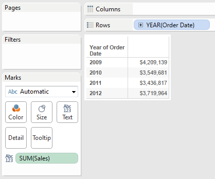
Sales by Year
Now, let's create a simple lookup that returns the sales from the previous year.

Step 2:
  • Lookup SUM( [Sales] ) from the previous year
  • Create the following calculated field
Previous Year Sales
Now, let's see how it works.
Sales by Year (with Previous Year Sales)
Remember how we defined our LOOKUP() location as -1?  That means it looks one space backwards in the partition.  So, what would happen if we changed the order of the year?

Step 3:
  • Change the sort order of the years to be descending.
Sales by Year (with Next Year Sales)
The calculation changed from previous year to next year, without us having the change the formula.  This is the extremely important aspect of the LOOKUP() function.  We can also use this LOOKUP() value in calculations.

Step 4:
  • Change the sort order back to ascending
  • Calculate the YoY Growth
  • Create the following calculated field
YoY Sales Growth
Now, let's see if it works.
Sales by Year (with YoY Growth)
Now that we have a basic understand of how LOOKUP() works, let's talk about 2 great uses for it.

Use 1: Coercing a calculation to be a table calculation.

You might be asking "Why would we want a calculation to become a table calculation?"  If you remember an earlier post, Creating Table Calculations on Values outside of the Filter Range, you know that table calculations are calculated after other calculations.  This means that if we can force a calculation to be a table calculation, we can control WHEN it is calculated.  This is extremely important in more complex scenarios.  Check out that post for a specific case where it is helpful.  The important aspect to recognize about this use is that SUM( [Sales] ) and LOOKUP( SUM( [Sales] ), 0 ) return exactly the same value, yet are calculated at different times.

Use 2: Looking up values across time.

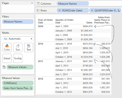
This is a huge category that very few people will ever fully utilize.  To emphasize it, I will show you a very extreme example, you can look up virtually any types of values you want simply by sorting your data in different ways.  First, we created the following calculated field:
Sales from Same Place in Previous Partition
Here's what it did:
Sales by Quarter (with Sales from Same Place in Previous Partition)
First, notice that we mixed up the Quarters in each year so that they do not match.  Then, we applied our LOOKUP().  You will notice that the 2nd column contains the value from the same place in the previous partition, regardless of what the date was.  This is how LOOKUP() actually works.  We actually exploited this concept in a project with a customer who had a fiscal calendar with days that are mixed up similarly to the above graph.

LOOKUP() is one of the most powerful functions in Tableau.  There are so many ways to exploit these features to calculate some truly incredibly values.  I hope you found this informative.  Thanks for reading.

Brad Llewellyn
Associate Consultant
Mariner, LLC
llewellyn.wb@gmail.com
https://www.linkedin.com/in/bradllewellyn