Today, we're going to talk about how to use Slicers to choose which measure you want to display in your Table or Chart. This is probably one of the coolest and easiest features to implement, yet it completely opens your reporting world. It easily allows the user to select which measure they want to display, without you having to build multiple tabs or charts. Let's get to it!
We'll start off by building a very simple data model.
 |
| Sales Table |
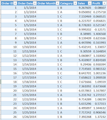
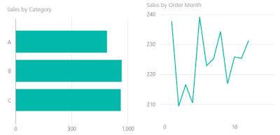
We start with a table of orders. Each order has a few slicer columns (Date, Month, Category) and a couple of measure columns (Sales, Profit). We can easily pull this into Power BI Desktop and build some simple charts.
 |
| Sales Charts |
Now, this is great if we only want to show Sales. However, what if we want to allow the user to select whether they want to see "Total Sales", "Average Sales", or "Total Profit"? We can achieve this with a little slight-of-hand.
 |
| Create Table |
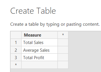
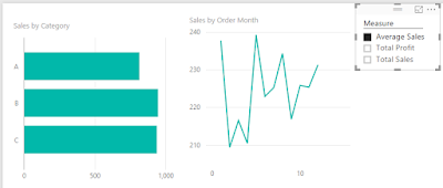
Let's start by creating a table with a single column called Measure. Remember that slicers/filters can only be creating by using existing columns in your data. When you select a value in the slicer, it filters the underlying table, as well as any tables further down the chain of relationships. In our model, we don't have any relationships. Therefore, when we select a value in the filter, nothing happens.
 |
| Unconnected Filter |
Now, we need to create a measure that changes based on the value of the filter. This is where the SWITCH() function comes in handy. The SWITCH() function is nothing more than a simple way to write long IF-ELSE chains. In this scenario, we want to check whether [Measure] is "Total Sales", "Average Sales", or "Total Profit" and return the appropriate measure.
 |
| Invalid Switch |
We get an error. Since there is no relationship between these two tables, Power BI doesn't know how to choose which of the three values in the [Measure] field to use. There are a couple of ways to resolve this, and they all depend on how you want the measure to act when multiple values are selected in the filter. The simplest method is simply to wrap Table2[Measure] in a FIRSTNONBLANK() function. FIRSTNONBLANK() functions very similarly to MIN(). However, MIN() only accepts numeric data, where FIRSTNONBLANK() can accept any data type.
 |
| Selected Measure (FirstNonBlank) |
Now, all we have to do is rebuild our charts, replacing [Sales] with [Selected Measure (FirstNonBlank)].
 |
| Dynamic Measure (FirstNonBlank) (Average Sales) |
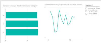
Since all of the values are between 7 and 8, we know that are looking at Average Sales. This is what we would expect given that we have chosen Average Sales in our slicer. However, what would happen if we selected all values in the slicer?
 |
| Dynamic Measure (FirstNonBlank) (No Selection) |
We see that the charts still display Average Sales. This is because Average Sales is the first non-blank value in the Measures column (text fields are sorted alphabetically). What would the charts look like if we selected the other measures?
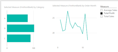 |
| Dynamic Measure (FirstNonBlank) (Total Profit) |
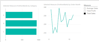 |
| Dynamic Measure (FirstNonBlank) (Total Sales) |
We can see that this methodology works fine when an individual measure is selected, but works somewhat awkwardly when more than one is. Depending on which media you are using to house your reports (Power Pivot via Excel, Tabular via Excel, Power BI Online, Power BI Desktop, etc.), you may have the option of not allowing the user to select more than option in the slicer. This would be our preferred option. However, Power BI Desktop doesn't seem to have that option. So, let's shoot for the next best thing.
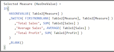 |
| Selected Measure (HasOneValue) |
The HASONEVALUE() function will return TRUE if the field contains only one value after all filters are applied and FALSE otherwise. Therefore, wrapping our original Switch inside of an IF() statement with a HASONEVALUE() condition will allow us to control what happens when the user doesn't select a single value. In this case, we want the charts to go blank.
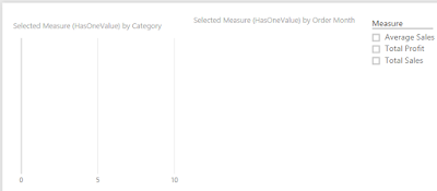 |
| Dynamic Measure (HasOneValue) (No Selection) |
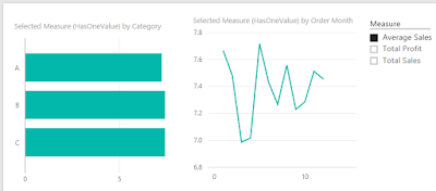 |
| Dynamic Measure (HasOneValue) (Average Sales) |
We hope this enlightened you to the possibilities for Dynamic Measure Switching in DAX. The possibilities of this technique are nearly endless. Any type of information that can be conveyed via measures, can be altered with this technique. Thanks for reading. We hope you found this informative.
Brad Llewellyn
BI Engineer
Valorem Consulting
@BreakingBI
www.linkedin.com/in/bradllewellyn
llewellyn.wb@gmail.com


Hello Maybe a stupid question but I'm new to Powerbi I'm missing the step were I connect the measure to the filter, or better how I'm able to put the measure in the filter?
ReplyDeleteHi there, Thank you for the post found it very useful.
ReplyDeletehaving a finance background I'm quite a noob at this . I would like to know If it possible to apply a similar calculation to a column based on a slicer selection .
I have a table to use as a slicer (12 months, 24 months, 36 months and overall) This used to display SALES Figures.
On my date table I have created corresponding columns that have a 1 or 0 value based whether they within the 12 month / 24 / 36 month or overall range. (This is dynamic based on a simple IF formula). I want to create on extra column That would give me the value of either the 12 month column, 24 month and so on based on the slicer selection. Please advise if possible. regards Kam
Great!! Thank you for sharing.
ReplyDeleteHi Brad, Thank you so much for your DAX script which I used to replicate a client's dashboard onto PowerBI. The only challenge remaining is that for selected columns where the data type is fixed decimal ($) the Y axis does not show any scale and all the value displayed above each bar are 0 however each bar is the correct length. Any guidance on what root causes maybe would be much appreciated. Thank you.
ReplyDeleteHI Brad, Thank you for your Dax script which allowed my client to get "slicer select columns" in PowerBI. Everything works 100% except for fixed decimal columns which display correct bar length (bar graph) however display blank Y axis scale and 0 value above each bar. Any ideas on root cause? Thank you
ReplyDeleteMillion of Thankssss
ReplyDeleteBrad, you are my hero! :):)
ReplyDeleteThis is a great practical use of the SWITCH function : thanks for explaining it so clearly !
ReplyDelete