Monday, October 31, 2016

Azure Machine Learning: Classification Using Two-Class Averaged Perceptron

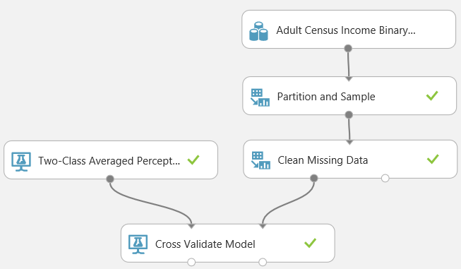
Today, we're going to walk through Sample 3: Cross Validation for Binary Classification Adult Dataset.  So far, the Azure ML samples have been interesting combinations of tools meant for learning the basics.  Now, we're finally going to get some actual Data Science!  To start, here's what the experiment looks like.
Sample 3: Model Building and Cross-Validation
We had originally intended to skim over all of these models in a single post.  However, it was so interesting that we decided to break them out into separate posts.  So, we'll only be looking at the initial data import and the model on the far left, Two-Class Averaged Perceptron.  The first tool in this experiment is the Saved Dataset.
Adult Census Income Binary Classification Dataset
As usual, the first step of any analysis is to bring in some data.  In this case, they chose to use a Saved Dataset called "Adult Census Income Binary Classification dataset".  This is one of the many sample datasets that's available in Azure ML Studio.  You can find it by navigating to Saved Datasets on the left side of the window.
Sample Dataset
Let's take a peek at this data to see what we're dealing with.
Adult Census Income Binary Classification Dataset (Visualize)
As you can see, this dataset has about 32k rows and 15 columns.  These columns appear to be descriptions of people.  We have some of the common demographic data, such as age, education, and occupation, with the addition of an income field at the end.
Adult Census Income Binary Classification Dataset (Visualize) (Income)
This field takes two values, "<=50k" and ">50k", with the majority of people being in the lower bucket.  This would be a great dataset to do some predictive analytics on!  Let's move on to the next tool, Partition and Sample.
Partition and Sample
This is a pretty cool tool that allows you to trim down your rows in a few different ways.  We could easily spend an entire post talking about this tool; so we'll keep it brief.  You have four different options for "Partition or Sample Mode".  In this sample, they have selected "Sampling" with a rate of .2 (or 20%).  This allows us to take random samples from our data.  We also have the "Head" option which allows us to pass through the top N rows, which would be really good if we were debugging a large experiment and didn't want to wait for the sampling algorithm to run.  We also have the option to sample Folds, which is another name for a partition or subset of data.  Let's take a quick look at the visualization to see if anything else is going on.
Partition and Sample (Visualize)
We have the same 15 columns as before, the only difference is that we only 20% of the rows.  Nothing else seems be happening here.  Let's move on.
Clean Missing Data
In a previous post, we've spoken about the Clean Missing Data tool in more detail.  To briefly summarize, you can tell Azure ML how to handle missing (or null) values.  In this case, we are telling the algorithm to replace missing values in all columns with 0.  Let's move on to the star of the show, Model Building.  We'll start with the model on the far left, Two-Class Averaged Perceptron.
Two-Class Averaged Perceptron
This example is really interesting to us because we've never heard of it before writing this.  The Two-Class Averaged Perceptron algorithm is actually quite simple.  It takes a large number of numeric variables (it will automatically translate Categorical data into Numeric if you give it any.  These new variables are called Dummy Variables.).  Then, it multiplies the input variables by weights and adds them together to produce a numeric output.  That output is a score that can be used to choose between two different classes.  In our case, these classes are "Income <= 50k" and "Income > 50k".  Some of you might think this logic sounds very similar to a Neural Network.  In fact, the Two-Class Averaged Perceptron algorithm is a simple implementation of a Neural Network.

This algorithm gives us the option of providing three main parameters, "Create Trainer Mode", "Learning Rate" and "Maximum Number of Iterations".  "Learning Rate" determines how many steps the algorithm takes in order to calculate the "best" set of weights.  If the "Learning Rate" is too high (making the number of steps too low), the model will train very quickly, but the weights may not be a very good fit.  If the "Learning Rate" is too low (making the number of steps too high), the model will train very slowly, but could possibly produce "better" weights.  There are also concerns of Overfitting and Local Extrema to contend with.

 "Maximum Number of Iterations" determines how many times times the model is trained.  Since this is an Averaged Perceptron algorithm, you can run the algorithm more than once.  This will allow the algorithm to develop a number of different sets of weights (10 in our case).  These sets of weights can be averaged together to get a final set of weights, which can then be used to classify new values.  In practice, we could achieve the same result by creating 10 scores using the 10 sets of weights, then averaging the scores.  However, that method would seem to be far less efficient.

Finally, we have the "Create Trainer Mode" parameter.  This parameter allows us to pass in a single set of parameters (which is what we are currently doing) or pass in multiple sets of parameters.  You can find more information about this algorithm here and here.

This leaves us with a few questions that perhaps some readers could help us out with.  If you have 10 iterations, but set a specific random seed, does it create the same model 10 times, then average 10 identical weight vectors to get a single weight vector?  Does it use the random seed to create 10 new random seeds, which are then used to create 10 different weight vectors?  What happens if you define a set of 3 Learning Rates and 10 Iterations?  Will the algorithm run 30 iterations or will it break the iterations into sets of 3, 3, and 4 to accomodate each of the learning rates?  If you know the answers to these questions, please let us know in the comments.  Out of curiosity, let's see what's under Visualize for this tool.
Two-Class Averaged Perceptron (Visualize)
This is interesting.  These aren't the same parameters that we input into the tool, nor do they seem to be affected by our data stream.  This is a great opportunity to point out the way that models are built in Azure ML.  Let's take a look at data flow
Data Flow
I've rearranged the tools slightly to make it more obvious.  As you can see, the data does not flow into the model directly.  Instead, the model metadata is built using the model tool (Two-Class Averaged Perceptron in this class).  Then, the model metadata and the sample data are consumed by whatever tool we want to use downstream (Cross Validate Model in this case).  This means that we can reuse a model multiple times just by attaching it to different branches of a data stream.  This is especially useful when we want to use the same model against different data sets.  Let's move on to the final tool in this experiment, Cross Validate Model.
Cross Validate Model
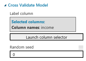
Cross-Validation is a technique for testing, or "validating", a model.  Most people would test a model by using a Testing/Training split.  This means that we split our data into two separate sets, one for training the model and another one for testing the model.  This methodology is great because it allows us to test our model using data that it has never seen before.  However, this method is very susceptible to bias if we don't sample our data properly, as well as sample size issues.  This is where Cross-Validation comes in.

Imagine that we used the Testing/Training method to create a model using the Training data, then tested the model using the Testing data.  We could estimate how accurate our model is by seeing how well it predicts known values from our Testing data.  But, how do we know that we didn't get lucky?  How do we know there isn't some strange relationship in our data that caused our model to predict our Testing data well, but predict real-world data poorly?  To do this, we would want to train the model multiple times using multiple sets of data.  So, we separate our data into 10 sets.  Nine of the sets are used to train the model, and the remaining set is used to test.  We could repeat this process nine more times by changing which of the sets we use to test.  This would mean that we have created 10 separate models using 10 different training sets, and used them to predict 10 mutually exclusive testing sets.  This is Cross-Validation.  You can find out more about Cross-Validation here.  Let's see it in action.
Scored Results (1)
There are two outputs from the Cross Validate Model tool, Scored Results and Evaluation Results by Fold.  The Scored Results output shows us the same data that we passed into the tool, with 3 additional columns.  The first column, Fold Assignments, is added to the start of the data.  This tells us which of the 10 sets, or "folds", the row was sampled into.
Scored Results (2)
The remaining columns, Scored Labels and Scored Probabilities, are added to the end of the data.  The Scored Labels column tells us which category the model predicted this row would fall into.  This is what we were looking for all along.  The Scored Probability is a bit more complicated.  Mathematically, the algorithm wasn't trying to predict whether Income was "<=50k" or ">50k".  It was only trying to predict ">50k" because in a Two-Class algorithm, if you aren't ">50k", then you must be "<=50k".  If you looked down the Scored Probabilities column, you would see that all Scored Probabilities less than .5 have a Scored Label of "<=50k" and all Scored Probabilities greater than .5 have a Scored Label of ">50k".  If were using a Multi-Class algorithm, it would be far more complicated.  If you want to learn about the Two-Class Average Perceptron algorithm, read here and here.

There is one neat thing we wanted to show using this visualization though.
Scored Results (Comparison)
When we click on the "Income" column, a histogram will pop up on the right side of the window.  If we click on the "Compare To" drop-down, and select "Scored Labels", we get a very interesting chart.
Contingency Table
This is called a Contingency Table, also known as a Confusion Matrix or a Crosstab.  It shows you the distribution of your correct and incorrect predictions.  As you can see, our model is very good at predicting when a person has an Income of "<=50k", but not very good at predicting ">50k".  We could go much deeper into the concept of model validation, but this was an interesting chart that we stumbled upon here.  Let's look at the Evaluation Results by Fold.
Evaluation Results by Fold
This shows you a bunch of statistics about your Cross-Validation.  The purpose of this post was to talk about the Two-Class Averaged Perceptron, so we won't spend much time here.  However, don't be surprised if we make a full-length post about this in the future because there is a lot of information here.

We hope that this post sparked as much excitement in you as it did in us.  We're really starting to see just how much awesomeness is packed into Azure Machine Learning Studio; and we're so excited to keep digging.  Thanks for reading.  We hope you found this informative.

Brad Llewellyn
BI Engineer
Valorem Consulting
@BreakingBI
www.linkedin.com/in/bradllewellyn
llewellyn.wb@gmail.com

Monday, October 10, 2016

Azure Machine Learning: Edit Metadata, Clean Missing Data, Evaluate Probability Function, Select Columns and Compute Linear Correlation

Today, we're going to look at Sample 2: Dataset Processing and Analysis: Auto Imports Regression Dataset in Azure ML.  In our previous post, we took our first look inside Azure ML using a simple example.  Now, we're going to take it a step further with a larger experiment.  Let's start by looking at the whole experiment.
Sample 2
This definitely looks daunting at first glance.  So, let's break it down into smaller pieces.
Data Import
As you can see, this phase is made up of an HTTP Data Import, which we covered in the previous post.  However, this Edit Metadata tool is interesting.  Let's take a look inside.
Edit Metadata
In most tools, you don't "replace" columns by editing metadata.  For instance, if you were using a data manipulation tool like SSIS, you would have to use one tool to create the new columns with the new data types, then use another tool to remove the old columns.  This is not only cumbersome from a coding perspective, but it's also performs inefficiently because you have to carry those old columns to another tool after you no longer need them.

The Edit Metadata tool on the other hand, does both of these in one.  It allows you rename your columns, change data types, and even change them from categorical to non-categorical.  There's also a long-list of options in the "Fields" box to choose from.  We're not sure what any of these options do, but that sounds like a great topic for another post!  Alas, we're veering off-topic.

One of the major things we don't like about this tool is that it sets one set of changes for the entire list of columns.  That means that if you want multiple sets of changes, you need to use the tool multiple times.  Fortunately, this experiment only uses it twice.  Before we move on, let's take a look at the data coming out of the second Edit Metadata tool.
Data Before Analysis
The two edit metadata tools altered columns 1, 2 and 26, giving them names and making them numeric.  This leads us with one huge question.  Why did they not rename the rest of the columns?  Do they not intend on using them later or were they just showcasing functionality?  Guess we'll just have to find out.

Let's move on to the left set of tools.
Left Set
This set starts off with a Clean Missing Data tool.  Let's see what it does.
Clean Missing Data (Left)
As you can see, this tool takes all numeric columns, and substitutes 0 any time that the value is missing.  The process of replacing missing values is called Imputation and it's a big deal in the data science world.  You can read up on it here.  This tool also has the option to generate a missing value indicator column.  This means that any row where a value was imputed would a value of 1 (or TRUE) and all other rows would have a value of 0 in the column.  While we would love to go in-depth about imputation, it's a subject we'll have to reserve for a later post.

In our opinion, the coolest part about this tool has nothing to do with its goal.  It has one of the best column selection interfaces we've ever seen.  It allows you to programatically add or remove columns from your dataset. Looking at some of the other tools, this column selection interface pops in up in quite a few of them.  This makes us very happy.
Select Columns
We'll skip over the Summarize Data tool, as that was covered in the previous post.  Let's move on to the Evaluate Probability Function tool.
Evaluate Probability Function (Left)
There are a couple of things to note about this tool.  First, it lets you pick from a very large list of distributions.
Distributions
It chose to use the Normal Distribution, which is what people are talking about when they say "Bell-Shaped Curve".  It's definitely the most common used algorithm by beginner data scientists.  Next, it lets you select which method you would like to use.
Method
There are three primary methods in statistics, the Probability Density Function (PDF), Cumulative Distribution Function (CDF), and Inverse Cumulative Distribution Function (Inverse CDF).  If you want to look these up on your own, you can use the following links: PDF, CDF, InverseCDF.

You can get entire degrees just by learning these three concepts and we won't even attempt to explain them in a sentence.  Simply put, if you want to see how likely (or unlikely) an observation is, use the CDF.  We'll leave the other two for you to research on your own.  Let's move on to the Select Columns tool.

Select Columns (Left)
This tool is about as simple as it comes.  You tell it which columns you want (using that awesome column selector) and it throws the rest away.  Let's move on to the final tool, Compute Linear Correlation.
Compute Linear Correlation (Left)
This is another simple tool.  You give it a data set with a bunch of numeric columns, it spits out a matrix of Pearson correlations.
Linear (Pearson) Correlations (Left)
These are the traditional correlations you learned back in high school.  A correlation of 0 means that there is no linear relationship and a correlation of 1 or -1 means there is a perfect linear correlation.

We were planning on moving on to the other legs of this experiment.  However, they are just slightly altered versions of what we went through.  This is an interesting sample for Microsoft to publish, as it doesn't seem to have any real analytical value.  We can't imagine using this is any sort of investigative or analytic scenario.  What is it good for then?  Learning Azure ML!  This is exactly what we used it for.  It showed us some neat features and prompted a few good follow-up posts to get more in-depth on some of these tools.  Hopefully, it sparked some good ideas in you guys too.  Thanks for reading.  We hope you found this informative.

Brad Llewellyn
BI Engineer
Valorem Consulting
@BreakingBI
www.linkedin.com/in/bradllewellyn
llewellyn.wb@gmail.com

Monday, September 19, 2016

Azure Machine Learning: HTTP Data, R Scripts, and Summarize Data

Today, we're going to take a look at Sample 1: Download dataset from UCI: Adult 2 class dataset from Azure ML.  Since we're all new to Azure ML, this is a great way to learn some of the neat functionality.  Let's walk through and learn some stuff!
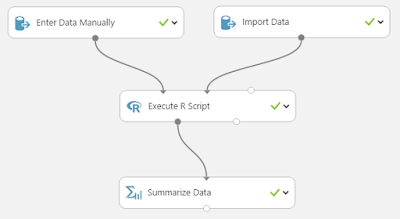
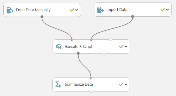
Sample 1 Workflow
We can see that this workflow (is that what it's called?) contains four items.  There are two Data Input items leading into an R script, which is then passed through to a Summarize Data item.  Let's start with the "Enter Data Manually" item on the left.
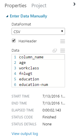
Enter Data Manually
We can see that the data is a bunch of column names being input in CSV format.  We're not sure how this will be used just yet, but it could definitely be helpful for naming the columns how we want them named.  We can also look at start, end and elapsed times.  This would be great for debugging slow-running items.  Let's take a look at the output log.

Record Starts at UTC 07/13/2016 15:48:39:

Run the job:"/dll "Microsoft.Analytics.Modules.EnterData.Dll, Version=6.0.0.0, Culture=neutral, PublicKeyToken=69c3241e6f0468ca;Microsoft.Analytics.Modules.EnterData.Dll.EnterData;Run" /Output0 "..\..\dataset\dataset.dataset" /dataFormat "CSV" /data "empty" /hasHeader "True"  /ContextFile "..\..\_context\ContextFile.txt""
[Start] Program::Main
[Start]     DataLabModuleDescriptionParser::ParseModuleDescriptionString
[Stop]     DataLabModuleDescriptionParser::ParseModuleDescriptionString. Duration = 00:00:00.0047673
[Start]     DllModuleMethod::DllModuleMethod
[Stop]     DllModuleMethod::DllModuleMethod. Duration = 00:00:00.0000228
[Start]     DllModuleMethod::Execute
[Start]         DataLabModuleBinder::BindModuleMethod
[Verbose]             moduleMethodDescription Microsoft.Analytics.Modules.EnterData.Dll, Version=6.0.0.0, Culture=neutral, PublicKeyToken=69c3241e6f0468ca;Microsoft.Analytics.Modules.EnterData.Dll.EnterData;Run
[Verbose]             assemblyFullName Microsoft.Analytics.Modules.EnterData.Dll, Version=6.0.0.0, Culture=neutral, PublicKeyToken=69c3241e6f0468ca
[Start]             DataLabModuleBinder::LoadModuleAssembly
[Verbose]                 Loaded moduleAssembly Microsoft.Analytics.Modules.EnterData.Dll, Version=6.0.0.0, Culture=neutral, PublicKeyToken=69c3241e6f0468ca
[Stop]             DataLabModuleBinder::LoadModuleAssembly. Duration = 00:00:00.0081428
[Verbose]             moduleTypeName Microsoft.Analytics.Modules.EnterData.Dll.EnterData
[Verbose]             moduleMethodName Run
[Information]             Module FriendlyName : Enter Data Manually
[Information]             Module Release Status : Release
[Stop]         DataLabModuleBinder::BindModuleMethod. Duration = 00:00:00.0111598
[Start]         ParameterArgumentBinder::InitializeParameterValues
[Verbose]             parameterInfos count = 3
[Verbose]             parameterInfos[0] name = dataFormat , type = Microsoft.Analytics.Modules.EnterData.Dll.EnterData+EnterDataDataFormat
[Verbose]             Converted string 'CSV' to enum of type Microsoft.Analytics.Modules.EnterData.Dll.EnterData+EnterDataDataFormat
[Verbose]             parameterInfos[1] name = data , type = System.IO.StreamReader
[Verbose]             parameterInfos[2] name = hasHeader , type = System.Boolean
[Verbose]             Converted string 'True' to value of type System.Boolean
[Stop]         ParameterArgumentBinder::InitializeParameterValues. Duration = 00:00:00.0258120
[Verbose]         Begin invoking method Run ... 
[Verbose]         End invoking method Run
[Start]         DataLabOutputManager::ManageModuleReturnValue
[Verbose]             moduleReturnType = System.Tuple`1[T1]
[Start]             DataLabOutputManager::ConvertTupleOutputToFiles
[Verbose]                 tupleType = System.Tuple`1[Microsoft.Numerics.Data.Local.DataTable]
[Verbose]                 outputName Output0
[Start]                 DataTableDatasetHandler::HandleOutput
[Start]                     SidecarFiles::CreateVisualizationFiles
[Information]                         Creating dataset.visualization with key visualization...
[Stop]                     SidecarFiles::CreateVisualizationFiles. Duration = 00:00:00.1242780
[Start]                     SidecarFiles::CreateDatatableSchemaFile
[Information]                         SidecarFiles::CreateDatatableSchemaFile creating "..\..\dataset\dataset.schema"
[Stop]                     SidecarFiles::CreateDatatableSchemaFile. Duration = 00:00:00.0121113
[Start]                     SidecarFiles::CreateMetadataFile
[Information]                         SidecarFiles::CreateMetadataFile creating "..\..\dataset\dataset.metadata"
[Stop]                     SidecarFiles::CreateMetadataFile. Duration = 00:00:00.0055093
[Stop]                 DataTableDatasetHandler::HandleOutput. Duration = 00:00:00.5321402
[Stop]             DataLabOutputManager::ConvertTupleOutputToFiles. Duration = 00:00:00.5639918
[Stop]         DataLabOutputManager::ManageModuleReturnValue. Duration = 00:00:00.5668404
[Verbose]         {"InputParameters":{"Generic":{"dataFormat":"CSV","hasHeader":true},"Unknown":["Key: data, ValueType : System.IO.StreamReader"]},"OutputParameters":[{"Rows":15,"Columns":1,"estimatedSize":0,"ColumnTypes":{"System.String":1},"IsComplete":true,"Statistics":{"0":[15,0]}}],"ModuleType":"Microsoft.Analytics.Modules.EnterData.Dll","ModuleVersion":" Version=6.0.0.0","AdditionalModuleInfo":"Microsoft.Analytics.Modules.EnterData.Dll, Version=6.0.0.0, Culture=neutral, PublicKeyToken=69c3241e6f0468ca;Microsoft.Analytics.Modules.EnterData.Dll.EnterData;Run","Errors":"","Warnings":[],"Duration":"00:00:00.8298274"}
[Stop]     DllModuleMethod::Execute. Duration = 00:00:00.8603897
[Stop] Program::Main. Duration = 00:00:01.0831653
Module finished after a runtime of 00:00:01.1406311 with exit code 0

Record Ends at UTC 07/13/2016 15:48:40.

Yikes!  This appears to be written in the language underpinning Azure ML.  There are some cool things to notice.  You can see that some tasks have durations.  This would be great for debugging.  Let's stay away from these outputs as they seem to be above our pay grade (for now!).

For those of you that have experience with ETL tools like SSIS or Alteryx, you'll recognize that it's a pain sometimes to have to store the output of every single item in case you have to debug. Well, Azure ML makes this really easy.  Many of the items have a Visualize option that you can access by right-clicking on the item after a successful run.
Enter Data Manually (Visualize)
Let's see what's underneath!
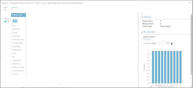
Enter Data Manually (Visualization)
This is definitely the coolest browse feature we've seen.  On the left side, we can see the raw data (row and columns).  In this case, we only have one column and fifteen columns.  However, above the column we can see a histogram of its values.  This is not very useful for a column of unique text values, but it would definitely be great for a refined data set.  On the right side, we can see some summary statistics, Unique Values, Missing Values, and Feature Type (Data Type).  We can also see a larger version of our histogram in this pane.  For this input, this isn't too enlightening, but we're already excited about what this will do when we have a real data set to throw at it.

Let's move on to the other input item, Import Data.
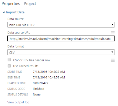
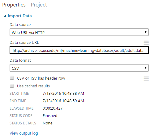
Import Data
We can see that this item is using a Web URL as its data source.  This is a really cool area that's becoming more popular along with Data Science.  We can also see that this data is being read in as a CSV with no header row.  That's why we needed to assign our own column names in the other input.  It even gives us the option of using cached results.  Why would you ever want to use cached results?  We're not sure, but maybe one of the readers could drop a comment explaining it to us.  In case you want to see the raw data, here's the link.  Let's move on to the visualization.
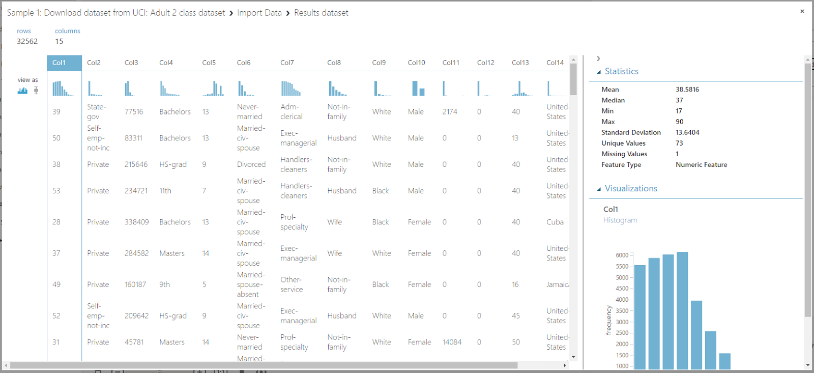
Import Data (Visualization)
Now this is what we've been waiting for!  We can look at all of the histograms to easily get a sense of how each column is distributed.  We can also click the "View As" option on the left side to change from histograms to box plots.
Import Data (Box Plots)
As you can see, this option only applies to numeric columns.  Looking at the Summary Statistics panel, we can see that we have a few more values for numeric columns than we did for the text column.  It gives us the standard "5-Number Summary" of Mean (Arithmetic Average), Median, Min, Max, and Standard Deviation.  The Missing Values field is also pretty interesting for checking data quality.  All in all, this is the best data visualization screen we've seen, and it comes built-in to all of these tools.  Now that we've got a dataset we like, we can look at another option called "Save as Dataset".
Import Data (Save As Dataset)
This would allow us to save this dataset so that we can use it later.  All we have to do is give it a name and it will show up in our "Saved Datasets" list.
Saved Datasets
Let's move on to the R script.
Execute R Script
This item gives us the option of creating an R Script to run, as well as defining a Random Seed and the version of R we would like to use.  The Random Seed is useful if you want to be able to replicate the results of a particular random experiment.  The R Version is great if you have a particular function or package that only works with certain versions.  This leads us to another question.  How do you manage R packages?  Is there a way to store R packages in your Azure Workspace so that you can use them in your scripts or do you need to have the script download the package every time?  Perhaps a reader could let us know.  Let's take a look at the script itself.

# Map 1-based optional input ports to variables
dataset1 <- maml.mapInputPort(1) # class: data.frame
dataset2 <- maml.mapInputPort(2) # class: data.frame

# Contents of optional Zip port are in ./src/
# source("src/yourfile.R");
# load("src/yourData.rdata");

# Sample operation
colnames(dataset2) <- c(dataset1['column_name'])$column_name;
data.set = dataset2;

# You'll see this output in the R Device port.
# It'll have your stdout, stderr and PNG graphics device(s).
#plot(data.set);

# Select data.frame to be sent to the output Dataset port
maml.mapOutputPort("data.set");

Whoever wrote this code did a good job of commenting, which makes it really easy to see what this does.  The two input data sets (column names and data) are stored as dataset1 and dataset2.  These two data sets are combined into a single data frame with the column names as the headers and the data as the data.  In R terminology, a data frame is very similar to a table in Excel or SQL.  It has a table name, column names, as well as values within each column.  Also, the values in different columns can be of different data types, as long as values within a single column are of a single data type.  Finally, this script outputs the data frame.  So, if we use the Visualize feature, we should see an identical data set to what we from Import Data, albeit with proper column names attached.
Execute R Script (Visualization)
Indeed this is the case.  There is another item in Azure ML that can handle this type of procedure called "Edit Metadata".  Perhaps they used an R Script as a display of functionality.  Either way, let's look at a specific feature of the "Execute R Script" item called "R Device".  This is basically a way to look at the R log from within Azure.
Execute R Script (R Device)
Execute R Script (R Log)
While this looks pretty simple, it's actually amazing.  One of our biggest frustrations with using R from other tools is that they make it difficult to debug code.  This log would make that just as easy as using the R Console.

Before we move on to the final item, we'd like to point out the "Run Selected" you can see by right-clicking on any tool in the workspace option.  When we initially saw this, we thought it would allow us to run only this tool using a cached set of data.  This would be a gamechanger when you are dealing with lengthy data import times.  However, this option runs the selected item, as well as any necessary items preceding it.  This is still really cool as it allows you to run segments of your experiment, but not as groundbreaking as we initially thought.  Let's move on to the "Summarize Data" item.
Summarize Data
Unfortunately, this item does not have any customization options, it gives you every option, every time.  It effectively gives you the same values you would see if you looked at every column individually in the earlier Visualization windows.  It also gives you a few more values like 1st Quartile, 3rd Quartile, Mode and Mean Deviation.  We're not quite sure what Mean Deviation is.  There are a few statistical concepts like Mean Squared Error and the Standard Deviation of the Sample Mean, but we're not quite sure what this value is trying to represent.  Again, maybe a knowledgeable reader can enlighten us.  Regardless, this view is really interested for looking at things like Missing Values, it's immediately apparently which columns have an issue with Missing values.  You can also see which columns have unusual mins, maxes, or means.  At the end of the day, this is a useful visualization if you want a high-level view of your dataset.

Hopefully, this piqued your interest in Azure ML (it definitely did for us!).  Join us next time when we walk through the next Sample to see what cool stuff Azure ML has in store.  Thanks for reading.  We hope you found this informative.

Brad Llewellyn
BI Engineer
Valorem Consulting
@BreakingBI
www.linkedin.com/in/bradllewellyn
llewellyn.wb@gmail.com

Monday, August 29, 2016

Azure Machine Learning: Getting Started

This week, we're going to start talking about Microsoft's new Cloud Data Science offering, Azure Machine Learning.  Let's start with a little terminology.  What we're referring to as Data Science, also known as Predictive Analytics, Data Mining and Machine Learning, is the task of trying to get algorithms to make complex decisions based on data.  It's a huge area that we are super excited about.  For the past decade or so, the only major Microsoft Data Science offering in the Microsoft BI world was Data Mining in SQL Server Analysis Services.

At every SQL conference, there would be a couple of speakers talking about Data Mining in SSAS.  However, there wasn't much usage around the community.  We authored a 31-part blog series on utilizing this functionality within Excel.  This was great for a learning exercise, but didn't have much impact.  We think there are a couple of reasons for this.

First, the tools in SSAS were not nearly as developed as those from other major vendors, like SAS.  Second, we never encountered encountered any businessmen who were ready for the kind of "uncertainty" that comes from predictive modeling.  They wanted to know last month's sales compared to this month's inventory, and so on.  Well, it's starting to look like times are changing.  More and more businessmen seem to be getting more comfortable (and educated) when it comes to Data Science, and this is great for us.

This is where Azure ML comes in.  It's Microsoft's "new kid on the block" and it's far superior to the old SSAS functionality.  For this post, we won't dive into too many specifics.  But, you can immediately tell that we're not in Kansas anymore.
Sample 1 Workflow
For those of you that have used SSIS or some other ETL tool with a GUI, you'll recognize this type of layout.  But we have to say, it definitely looks better than anything we've used before.

So, how do you get started?  It's easy, just go to the Azure Portal and select New -> Intelligence -> Machine Learning.
Create Machine Learning Environment
From here, all you have to do is decide on names and all that boring stuff.  We will comment that Azure Machine Learning and SQL Azure are NOT free.  However, if you're just tinkering around on the weakest machines doing small stuff, you'll probably get by on a couple bucks per month.  There is great news though!  You may be able to get free Azure credits (read: money) on a one-time or recurring basis.  So, check with your IT team to see if your organization has access to these types of subscriptions.

In the coming posts, we're going to start looking through the free samples to see what sort of cool things this tool can do.  Thanks for reading.  We hope you found this informative.

Brad Llewellyn
BI Engineer
Valorem Consulting
@BreakingBI
www.linkedin.com/in/bradllewellyn
llewellyn.wb@gmail.com

Monday, August 8, 2016

Power BI/PowerPivot: Using LOOKUPVALUE() to Emulate Relationships

Today, we're going to talk about a neat function in DAX called LOOKUPVALUE().  This function is pretty aptly named, as it simply returns a value from a different (or possibly the same) table.  Let's start with a very simple data model.
Sales Data
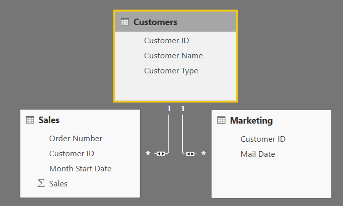
Data Model
We can see that we have two distinct transaction tables, Sales and Marketing, which roll up to a single Customers lookup table.  Pretty much all of these could be accomplished using a different function.  However, we always strive to find the easiest solution to understand and implement. That's where LOOKUPVALUE() shines.  Let's look at some options for looking up values across (or within) tables.

Retrieving a Value from the Same Table

Sometimes, you need to retrieve a value from a specific row in the table you're already in.  This is one of the great use cases for LOOKUPVALUE().  For our scenario, we want to compare the Sales for each row in the Sales table to the Sales for January for that same customer.  Let's see how it's done.
January Sales (Formula)
January Sales (Results)
All we have to do is define the value we're looking for, then a unique set of identifiers to identify where we want to look in the target table.  In this case, we're looking for the same [Customer ID], and a fixed [Month Start Date] of January 1, 2016.

Retrieving a Value From Up the Hierarchy

Now, what if we wanted to retrieve a specific value from the lookup table.  In our case, let's say that we want to pull Customer Type down into the Sales table.  We could use LOOKUPVALUE() to accomplish this as well.  However, there's a far simpler way, the RELATED() function.  The RELATED() function uses Row Context to retrieve a value from up the hierarchy.
Customer Type
The RELATED() function is far simpler than the LOOKUPVALUE() function.  All you have to supply is the field you are looking for.  However, RELATED() only works when you want to retrieve a single value from up the hierarchy and requires an active relationship.

Retrieving a Value From Down the Hierarchy

Now, what if we wanted to pull a value from the transaction table into the lookup table.  Ordinarily, this is done using aggregations and the CALCULATE() function.  However, in some cases, you want to retrieve a specific value with no aggregation.  Let's try pulling the Sales for February up into the Customers table.
February Sales
This time, we need to provide Customers[Customer ID] because we are querying from the Customers table.  The rest remains pretty simple.

Retrieving a Value from an Unrelated Table

We tried our best to find an example of this that works in a useful.  Simply put, this is VERY sticky territory.  DAX is built around utilizing relationships.  Therefore, it can become quite difficult to work without relationships.  To summarize, if you are trying to connect two tables without some type of relationship chain, you may want to reconsider your modelling.  If anyone in the comments can find a good example, let us know!

Hopefully, this post opened up your mind to the possibilities of using LOOKUPVALUE().  It's not a unique function by any means, but it sure is easy and intuitive to use.  That's worth quite a bit in our book.  Thanks for reading.  We hope you found this informative.

Brad Llewellyn
BI Engineer
Valorem Consulting
@BreakingBI
www.linkedin.com/in/bradllewellyn
llewellyn.wb@gmail.com