Monday, April 21, 2014

Combining Data Sources in Tableau: Joining vs. Blending

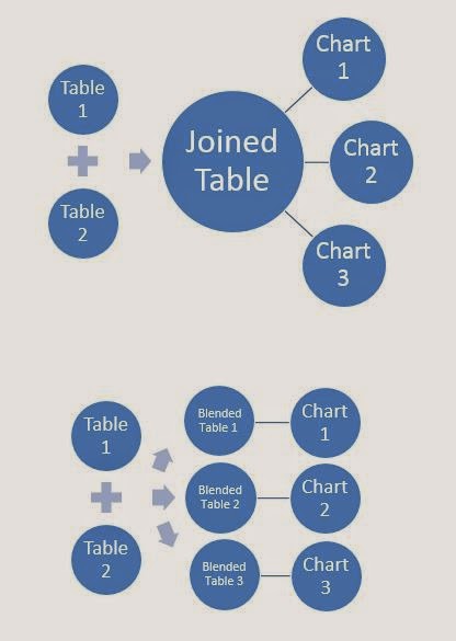
Today, we're going to talk about ways to combine different data sources in Tableau.  In particular, we will be talking about "Joining" and "Blending".  Joining is a SQL term that refers to combining two data sources into a single data source.  Blending is a Tableau term that refers to combining two data sources into a single chart.  The main difference between them is that a join is done once at the data source and used for every chart, while a blend is done individually for each chart.  Here's a picture we made a while ago illustrating the difference.
Joining vs. Blending
First, let's talk about restrictions for each of these methods.  When you join, both of the data sources have to exist in the same SQL database, Excel workbook, or whatever other joinable data  source you are using.  Multidimensional Sources (aka Cubes) cannot be joined.  On the other hand, you can blend data sources that come from completely different locations as long as the secondary source is not a cube.  Therefore, blending is much more universally applicable than joining.  However, it is much weaker in most situations and does not perform as well.  To summarize, if joining will solve your problem, then you should join.

Now, let's look at a real world situation.  We have the tab with all of our order information in it and we have another tab with the returned orders in it.  We want to see which orders were returned.  So, the question is, "Should we join or blend?"  Well, let's take a look at the data.
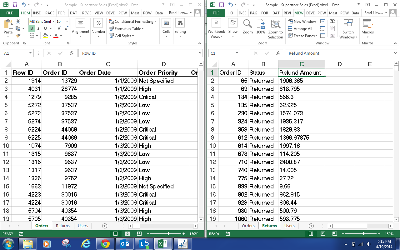
Orders and Returns
We see that both data sets contain an Order ID field.  Also, we note that the Order ID field in the Returns data never repeats.  This is great news when it comes to joining.  So, we should just be able to join this data together and voila.
Returned Orders
It should be noted that since the Returns tab did not contain every Order ID from the Orders tab, we needed to make this a Left Join.  For more information on types of join, look here.  Also, if you would like an visual example of how we joined the data, there's a small set of pictures here.  In fairness, we could have achieved this exact same outcome with Blending.  However, remember that Blending is less efficient than Joining and should only be used when a join will not work.

Now, let's move on to a situation where joining will not work.  Let's say that I added a column to the Returns tab with the Refund Amount.  Let's take a look.
Orders and Refunds
Now, we want to know how much money we've refunded to customers.  Let's start by attempting to join the data.
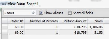
Duplicated Rows
As you can see, there are multiple rows for this order.  This caused the Refund Amount to duplicate for each row.  This is because the Returns data is at the level of the Order ID, while the Order data is at the level of the Product within the Order (commonly known as the Order Line).  In this case, we have two measures with different granularities.  Therefore, we would need to aggregate our Orders data up to the Order ID level in order to join this data, and we don't want to do that.  On the bright side, this is exactly what blending is meant for.  

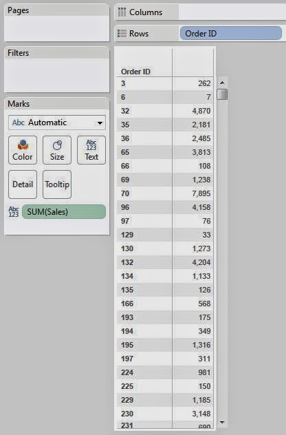
Let's start by talking about how Blending actually works.  First, let's create a simple table.
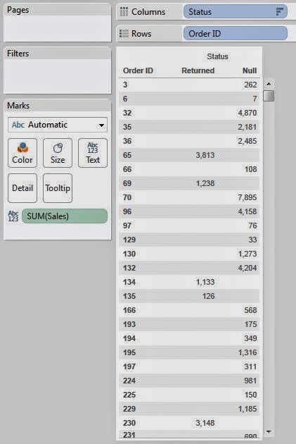
Sales by Order ID
When Tableau creates this table, it queries the data source for the appropriate data and stores the results in a temporary table known as the context.  Then, this table is used to create the visualization, whether it is a chart, line graph, etc.  When you are blending in another data source, it creates a similar temporary table from the secondary data source and performs a left join from the primary context to the secondary context.  This way, it doesn't matter what level each of the data sources is at.  All that matter is what level the chart is at.  Now, let's blend in Refund Amount to see this in action.
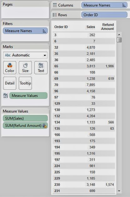
Sales and Refunds by Order ID
See how Order ID 69 has a refund amount of 619?  That value was 1238 when we naively joined these data sources.  This is just the evidence we need to say that our data blending worked.  If you want more information about combining multiple data sources in Tableau, look here.  Thanks for reading.  We hope you found this informative.

P.S.

We've never heard any official word on whether the temporary table used for Blending is the same as the context.  However, we haven't found a reason to believe that it isn't.  If you know for sure, please let us know in the comments.

Brad Llewellyn
Data Analytics Consultant
Mariner, LLC
llewellyn.wb@gmail.com
https://www.linkedin.com/in/bradllewellyn

Monday, April 7, 2014

Calculating First and Last Non-Empty in Tableau

Today, we will talk about calculating the first and last non-empty values in Tableau.  These calculations are extremely useful when you are looking at values that may be missing for the current time period.  For this demonstration, we will be using a mock-up data set designed for this demonstration.

First, let's look at the data.
Data
As you can see, products A and B are missing values for certain days while product C has all values.  Now, let's say that we want to know what the value was for these products in September. Well, we can look at September and see that Product A has no value.  Then, we can easily scroll our eyes up to August and see that Product A had a value of 96.  But, how do we get Tableau to do this work for us?

Well, let's start by looking at how to calculate the first non-empty value.  For instance, this value would be 41 and 80 for Products B and C because they have values for January.  However, Product A has no value for January.  Therefore, the value for Product A would be 13.  Let's look at how to get Tableau to tell us this.

The first thing we need to do is find the indices for all of the non-empty cells.  We can do this using the following calculation:
Non-Empty Index
Value and Non-Empty Index by Month and Product
As you can see, this calculation only returns the row index for non-empty values.  Now, if we want to find the first non-empty value, then we need to find the value corresponding to the smallest non-empty index.
First Non-Empty Index
Value, Non-Empty Index, and First Non-Empty Index by Month and Product
Voila!  We now know what index references the first non-empty value.  Now, we just need to use the LOOKUP() function to return that value.
First Non-Empty Value
Value and First Non-Empty Value by Month and Product
We can see that we have now returned the first non-empty value in the column.  However, this was not quite our original problem.  We wanted to be able to return the most recent value in the column.  In some circles, this is known as the "Last Non-Empty".  So, what would happen if we changed our calculation to return the max of the indexes instead of the min?
Last Non-Empty Index (Naive)
Value and Last Non-Empty Index by Month and Product (Naive)
Well, this just returns the last non-empty index with no consideration of the current position in the table.  However, we can alter the calculation slightly to return the last non-empty index without looking past the current row.
Last Non-Empty Index
Value and Last Non-Empty Index by Month and Product
Now, let's use this calculation to find the corresponding values.
Last Non-Empty Value
Value and Last Non-Empty Value by Month and Product
As you can see, this procedure is not overly difficult.  All it requires is a little ingenuity and a basic understanding of table calculations.  The cool thing about this technique is that it's extremely useful for so many different applications.  We've had plenty of clients put a lot of effort into find the last selling price for an item.  There's even more to do with this as well.  This procedure could easily be augmented to look at the last selling price for one item OR the current selling price for another item.  Thanks for reading.  We hope you found this informative.

Edit: Jim Wahl correctly asserted that you can utilize the PREVIOUS_VALUE() function to achieve similar results.  Just goes to show that there's typically more than one path to the right answer.

Brad Llewellyn
Data Analytics Consultant
Mariner, LLC
llewellyn.wb@gmail.com
https://www.linkedin.com/in/bradllewellyn

Monday, March 24, 2014

Partial Highlighting on Charts in Tableau

Today, we will talk about a concept that we're calling "Partial Highlighting."  In Tableau, you can link dashboards in a number of ways on a dashboard.  When you click on one chart, you can have the values in another chart either be highlighted or be filtered.  Let's examine these two aspects individually.  As usual, we will the Superstore Sales sample data set from Tableau.

First, when you use a highlight action in Tableau, it will only highlight the same values in the same field that you highlighted.
Highlighting
As you can see, when we click on Jumbo Box, the Jumbo Box values in Sheets 1 and 3 are highlighting.  However, there is no highlighting on Sheet 2 because the Container field is not in the chart.  Let's move on to filtering.

When you use a filter action in Tableau, it will add a filter to the chart so that only the values with the values you selected are shown.
Filtering
Now, when we click on Jumbo Box, the other Container values disappear completely from the other charts.  These are extremely useful options.  However, what if I wanted to click on Jumbo Box and have the bars in Sheet 2 highlight the portion of each bar that corresponds to Container = Jumbo Box?  Power View, the visual analytics portion of Microsoft's Power BI stack, actually does this very well.
Partial Highlighting
As you can see, when I click on Jumbo Drum, the top right bar graph highlights the appropriate portion, while still allowing us to see what the total was so that we don't lose perspective.  We recently had an epiphany about accomplishing this in Tableau and it's actually pretty easy!

In order to accomplish this, we're going what's known as a "Scaffold Data Source."  This idea was pioneered by Joe Mako.  You can find out more information by watching his "Think Data Thursday" presentation here.  Let's start by creating a regular bar graph.
Sales by Order Priority
If we place this on a dashboard using the filter action, then this chart will filter entirely based on another selection.  Next, we need to duplicate our data source so that we have two copies of it within Tableau.
Duplicate Data Source
Now, let's use the dual-axis feature to place the same set of bars on this chart again.  But, this time we're going to use SUM( [Sales] ) from our duplicated data source.
Sales by Order Priority (Hidden Dual Axis)
We renamed the [Sales] field in the secondary data source so that we knew which [Sales] was the primary.  Then, we created a dual axis bar graph, made sure the primary Sales was in front, synchronized the axes, hid the Blended Sales axis and colored the Blended Sales Bar bar a lighter shade of blue.  This way, it looks exactly like a regular bar graph.  Next, we need to make it so that these data sources blend on every field EXCEPT Container.
Unlinking Container
Once we do this, the secondary data source will not be filtered if we try to filter the primary data source on Container.  See where this is going?
Partial Highlighting (Tableau)
Now, when we click on Jumbo Drum in Sheet 1, the primary bar filters for Sheet 4.  However, since the secondary data source is not linked over Container, the underlying bar does not filter.  This gives the appearance of partial filtering!  The really cool thing about this technique is that you can do it for lots of other types of charts.  All you need a little imagination.  Thanks for reading.  We hope you found this informative.

Brad Llewellyn
Data Analytics Consultant
Mariner, LLC
llewellyn.wb@gmail.com
https://www.linkedin.com/in/bradllewellyn

Monday, March 10, 2014

Predictive Analytics in Tableau Part 11: How Data Moves Between R and Tableau

Today, we will end this series on an exploratory note.  We've wondered throughout this series precisely how data travels between R and Tableau and what precautions need to be taken to ensure that we are getting accurate results.  So, we've designed a sample data set that will allow us to test a couple of scenarios and develop solutions for solving this problem.  Let's take a look at our data.
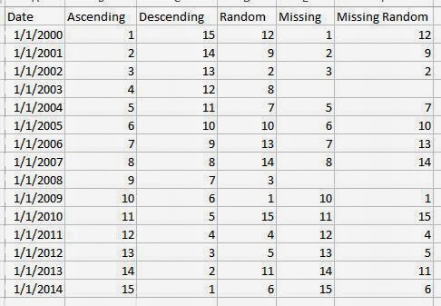
Data
First, we have a complete data set with years ranging from 2000 to 2014.  We also have five different numeric fields.  The first is ordered the same as the years.  The second is ordered in reversed/descending order.  The third is simply random.  The fourth is the same as the first, but with the years 2003 and 2008 missing.  The fifth is the same as the random one, but with the years 2003 and 2008 missing.  Now, let's start by passing ascending data and seeing if we get it back in the same order.
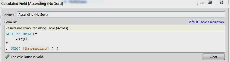
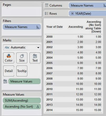
Ascending (No Sort)
Ascending (No Sort) by Year
As expected, R returned the data back exactly like it should have.  Now, let's try it with the random data to see if the values matter (they shouldn't).
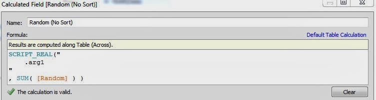
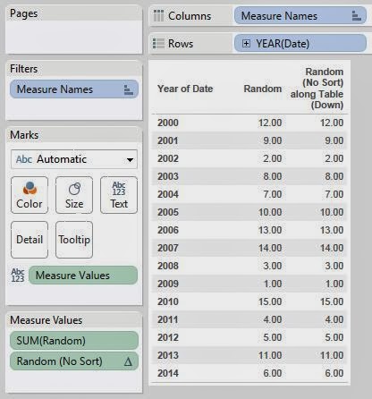
Random (No Sort)
Random (No Sort) by Year
Again, no issues.  Finally, let's see if the missing values cause any problems.
Missing (No Sort)
Missing (No Sort) by Year
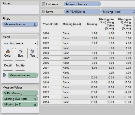
We finally have an interesting result.  Apparently, the SCRIPT_REAL function can't return NULL values.  R refers to these null values as NA.  This leads us to an interesting dilemma.  Is Tableau passing a Null and receiving a 0, or is Tableau passing a 0 initially.  We can test this.  First, let's show a simple example.
NA + 1
This picture shows that R is just like most languages in that you can't perform arithmetic on Null values.  So, let's use this to test what value R is receiving.
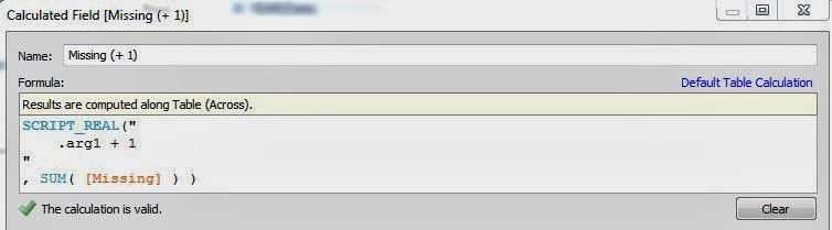
Missing (+ 1)
If R is receiving NAs, then this function should return NA, which Tableau would read as 0.  However, if Tableau is passing 0, then this function should return 1.  Let's see what happens.
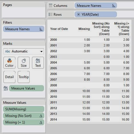
Missing (+ 1) by Year
We see that Tableau is in fact passing 0 instead of Null.  This seems awkward to us.  Before we jump to any conclusions, let's confirm using a different method.
is.na
R has this nifty function called is.na() that returns true if the value is null.  So, let's run this test using Tableau.
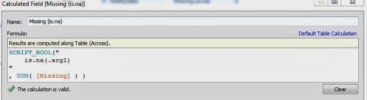
Missing (is.na)
Missing (is.na) by Year
We have confirmed that Tableau is not passing Null values to R.  We don't see any reason why Tableau couldn't just pass NA in place of the Nulls.  Perhaps it has something to do with Rserve?  If you know anything, please let us know in the comments.  This leads us to another issue.  How do we combat this?  We have an idea, but let's see how R handles it.
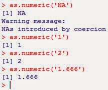
Coercing NA
This is great!  It seems that if we pass the values to R as strings, then anything that isn't a number should be turned into NA.  This leads us to another question.  What does Tableau pass in place of a Null for Strings?
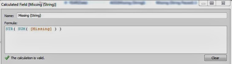
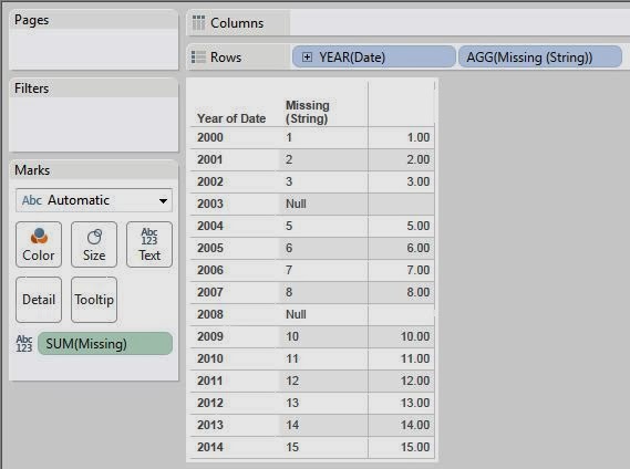
Missing (String)
Missing (String) by Year
We see that Tableau coerces Null values into the string value "Null".  This is great.  Now, let's see what happens when pass it to R and coerce it back to a number.
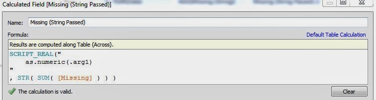
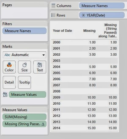
Missing (String Passed)
Missing (String Passed) by Year
Success!  We now know that if you have missing data, you can fix the problem by coercing them to strings before you pass them to R, then coercing them back to numbers in R.  However, this is a VERY serious issue.  It's shocking to us that a tool like Tableau would lack such simple functionality as Null handling.  We've put a post out of the Tableau forums to see if other people see it the same way.  You can see the post here.

EDIT:  Apparently this issue has been fixed in Tableau 8.1.3.

Now, let's move on to ordering.  What would happen if we passed the descending values to R, then sorted them and passed them back to Tableau?
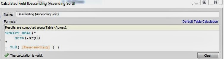
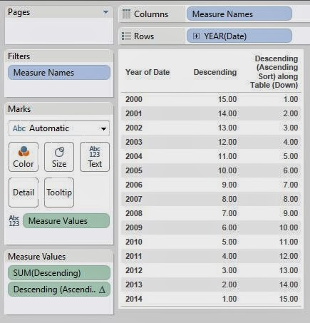
Descending (Ascending Sort)
Descending (Ascending Sort) by Year
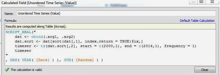
As you can see, Tableau was completely unaware that the data was sorted and sent it back in the order it was received.  This is a scary, yet unsurprising, result.  There are ways to handle this though.  Let's propose a real scenario for this.  Imagine that you want to create a time series that predicts the next value.  As we've seen in the last few posts, the data must be ordered in ascending order if you want to create a time series.  So, what would happen if we tried to pass in an unordered time series?
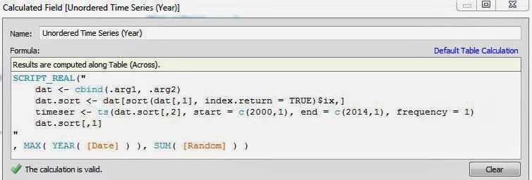
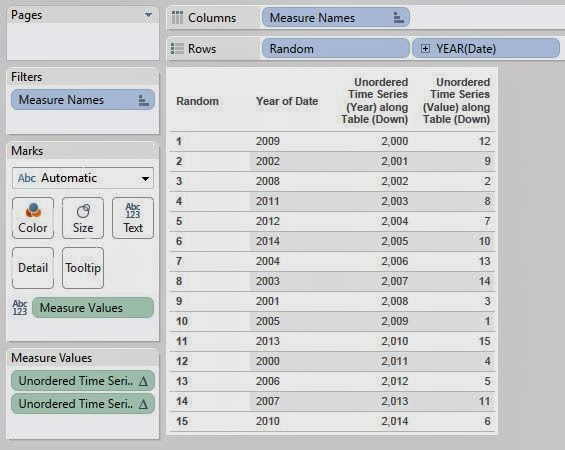
Unordered Time Series (Year)
Unordered Time Series (Value)
Unordered Time Series (Table)
As you can see, the time series gets returned in ascending order, regardless of the order in which it was received.  You might ask "Who would look at a time series out of order like you have in this table?"  That's where the interesting idea comes in.  Consider the traditional way you would look at time series data.
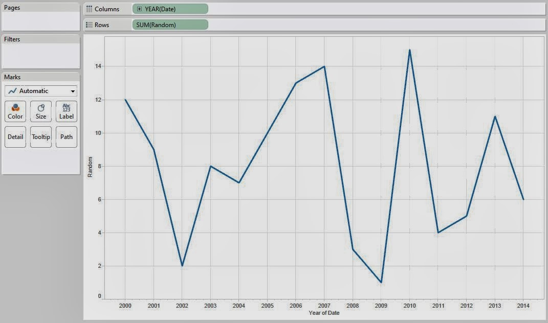
Time Series (Ordered)
How do you know what order the data is in?  Can you assume that the data is in ascending order?  Well, if we overlay Unordered Time Series (Year), we will see if any of the years don't match up.
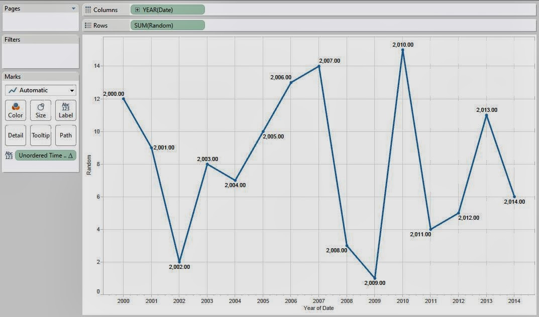
Time Series (Ordered) with Labels
Following the labels, we see that everything is in order.  Is this always the case?  Our data was originally in ascending order by Year.  What if we were to reorder it?  When Tableau creates an extract, it automatically sorts the data.  We're not sure of the precise algorithm, but we do know that it was sorting our data by date.  So, we added another date in a different order in an attempt to trick Tableau into ordering the data improperly.
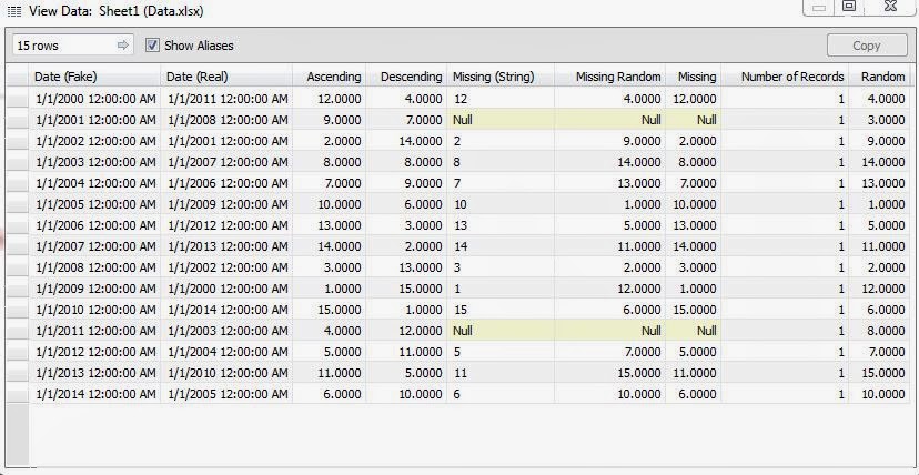
Data (Disordered)
Now, will our line chart still be in the correct order?
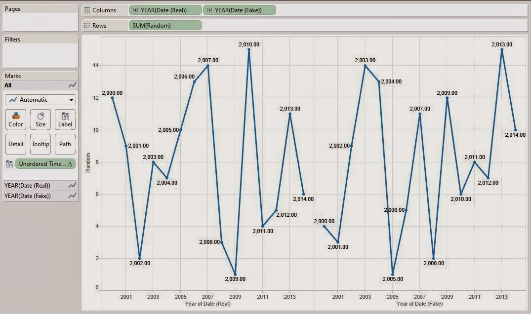
Time Series (Attempted Disordered)
As you can see, it doesn't matter whether the data is ordered or not.  These line charts always seem to be ordered by Date.  This is a very good thing.  It adds robustness to our procedures.  Now that we know these charts are always ordered, we can actually prevent a possible catastrophe.
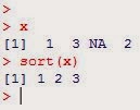
Null Sorted
Notice how the NA gets removed when we sort?  If we were to sort data in R when we had missing data, we would be removing our missing data, which would have huge repercussions.  Namely, you can pass ten values to R and receive nine in return.  Tableau will toss an error if this happens.  Fortunately, this isn't a problem for our situations.  However, keep this in mind if you do find yourself in a situation where you are sorting data that may be missing.

In short, Tableau expects to receive data in the order in which it passes it.  Therefore, if you need to order your data, order it in Tableau BEFORE you pass it to R.  Tableau also doesn't pass Null numeric values to R, it passes zeros.  If you want to pass numeric data that may be missing, you may need to coerce the data to strings first.  Thanks for reading.  We hope you found this informative.

P.S.  Zen Master Jonathan Drummey has done a similar analysis and it can be found here.

Brad Llewellyn
Data Analytics Consultant
Mariner, LLC
llewellyn.wb@gmail.com
https://www.linkedin.com/in/bradllewellyn