Monday, January 27, 2014

Predictive Analytics in Tableau Part 5: Polynomial, Exponential and Piecewise Regression

Today, we will talk about some more types of regression using Tableau 8.1's new R functionality.  We previously talked about prediction using Linear Regression.  But, what if the relationship isn't linear?  In the real world, linearity is rarely the truth.  For this demonstration, we will use the same data set we used in Parts 1, 2, and 3.

First, let's look at our data.
DJIA vs. Foreign by Year
As you can see, this data is not related linearly.  There is very little change in DJIA when Foreign is below 140.  However, when Foreign surpasses 140, DJIA skyrockets.  If we tried to use a line to predict these values, we would get something like this:
DJIA vs. Foreign by Year (with Linear Trend)
This line is pretty far off from most of those points.  Fortunately, Tableau offers some more built-in trend lines.  Here are some good ones:
DJIA vs. Foreign by Year (with Quadratic Trend)
DJIA vs. Foreign by Year (with Exponential Trend)
As you can see, both of these models fit the data pretty well.  Now, let's see how to do them using R.
DJIA (Quadratic)
DJIA (Exponential)
We see that all we have to do is make a new variable with whatever function we want and add it to the model.  As far as R knows, these are two completely different variables.  We could add all of the other variables to the mix as well if we wanted to.  We could easily model Foreign as a quadratic while modeling Consumer as a logarithm.  One important thing to note is that if you include a polynomial, you should include all lesser degrees.  Simply put, if you have a x^2, then you must also have x.  If you have x^3, you must also have x^2 and x.  We won't go into detail about why you should do this at this time.

Looking back at the earlier trends, we're not happy with either of these trends.  The quadratic trend has that troubling curvature at the left side while the exponential trend doesn't seem strong enough to capture the upward curvature.  Now, let's make a new model that Tableau doesn't even have!

What if we believe that there are actually two trends here?  Let's imagine that the relationship is linear for small values of Foreign (less than 135) and a different linear relationship for larger values of Foreign?  No problem!  We can combine our models!

SCRIPT_REAL("
    djia <- .arg1
    fore <- .arg2
    th <- 135
    fore2 <- fore^2

    smallfore <- fore[fore<th]
    smalldjia <- djia[fore<th]

    largefore <- fore[fore>=th]
    largedjia <- djia[fore>=th]

    smallfit <- lm( smalldjia ~ smallfore )
    largefit <- lm( largedjia ~ largefore )

    c(smallfit$fitted, largefit$fitted)
",
SUM( [DJIA] ), SUM( [FOREIGN] ) )

Finally, let's see the results.
DJIA vs. Foreign by Year (with Piecewise Prediction)
This model fits our data so much better!  This method is called Piecewise Regression.  The amazing thing about R is that there's a method for predicting anything you want.  You can even create your own prediction method if you need to.  Thanks for reading.  We hope you found this informative.

P.S.

We're curious how Tableau keeps track of which value in the output vector corresponds to each input.  This was a huge obstacle in Part 3 as well.  If you have ideas, let us know in the comments.

Brad Llewellyn
Data Analytics Consultant
Mariner, LLC
llewellyn.wb@gmail.com
https://www.linkedin.com/in/bradllewellyn

Monday, January 20, 2014

Predictive Analytics in Tableau Part 4: Logistic Regression

Today, we're going to talk about performing Logistic Regression using Tableau 8.1's R functionality.  Logistic Regression is very similar to Linear Regression, which we saw in the previous posts in this series.  However, Logistic Regression is designed to predict binary (Yes/No, 1/0) outcomes.  A very simple example is "Will this customer buy our product if we advertise to them?"  For this exercise, we will use the ubiquitous AdventureWorks data set from Microsoft.  If you've ever seen a Microsoft Data Mining demo, you've seen this data set.  Let's start by looking at our data.
Customer Demographics
As you can see, we have quite a bit of information about our customers, as well as whether or not they purchased a bike from us in the past.  Now, let's look at a logistic model with only one predictor so that we can understand how it works.
Purchased Bike (Predicted by Age)
As you can see, this code is extremely similar to the code for creating a linear regression model.  The only differences are that this model uses a more complex function, glm(), and an extra parameter, family = binomial( logit ).  Now, let's see what the predictions look like.
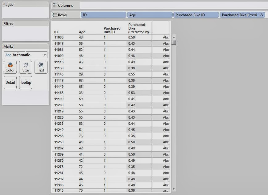
Predictions by Age
Some of you will immediately ask why this function returns decimals when we asked it to predict a Yes/No response.  Strictly speaking, logistic regression does not predict a Yes/No response, it predicts the probability of a particular response.  In other words, it tells us how likely this person is to buy a bike.  It's up to us to decide how we want to use these probabilities.  Let's look at these predictions in another way.
Predictions by Age (Scatterplot)
As you can see, the probability of buying a bike decreases as the customer gets older.  This is an important, and not very surprising, discovery.  Now, how do we turn these probability into actual predictions?  That's up to us!  An easy way is to say "If the chance is greater than 50%, we say they will buy.  If it's less than 50%, we say they won't."  Let's see what this gets us.
Predictions by Age (Classified)
This procedure doesn't seem to be very accurate.  Perhaps it's because we're only giving it one predictor.  Let's throw the rest of our variables in there and see if it gets better.
Predictions (Classified)
These predictions are much better, but still not as accurate as we'd like.  Unfortunately, we couldn't find an easy way to look at these predictions in aggregate using this method.  So far, it seems that the new R implementation is really good for generating predictions.  However, it falls a little short when it comes to examining the model.  Fortunately, there's even more we could do here.  We could try a different model for this data, such as an artificial neural network or a bayesian model.  Maybe one of our readers can find a really neat way to display this data that sums it up nicely.  The rest is up to your imagination.  We hope that you found this informative.  Thanks for reading.

Brad Llewellyn
Data Analytics Consultant
Mariner, LLC
llewellyn.wb@gmail.com
https://www.linkedin.com/in/bradllewellyn

Monday, January 13, 2014

Predictive Analytics in Tableau Part 3: Validating the Accuracy of your Predictions

Today, we will talk about validating the accuracy of your predictions using Tableau 8.1's R functionality.  In the previous posts in this series, we showed you how to create statistical models to predict values for your business.  However, we ignored a very important issue.  A model is supposed to be pretty good at predicting values that you used when you created it.  However, the true test of a model is how well it can predict values it doesn't know the answer to.  For this examination, we will use the same data set and design as we used in the first post in the series, Predictive Analytics in Tableau Part 1: Simple Linear Regression.

When you are creating a model, you typically want to "hold out" a portion of your data to use for testing later.  For instance, if we hold out 25% of our data, then we only use the remaining 75% when we created our model.  The 75% is known as the "Training Set" because it is used to train the model.  The 25% is known as the "Testing Set" because it is used to test the model after it has been trained.  First, let's see how you would create these sets.
Consumer vs. Foreign
This is the data we have for creating our model.  As you can see, we only have 12 observations.  So, we would expect the training set to be 9 observations, and the testing set to be 3 observations.  Let's see how we would create this.
Set
The code is not too complex.  Basically, it creates a 0/1 values for each year, with a 25% chance of 1 and 75% chance of 0.  Then, it changes the labels on these values to be more readable.  Now, let's see what it looks like on our chart.
Consumer vs. Foreign (with Set)
As you can see, it put 8 observations in our training set, and 4 observations in the testing set.  This isn't exactly 25%, but it's only one observation off.  You should be aware that Tableau is going to query the R server every time you refresh this chart.  This means that the observations in the training set WILL change.  This is exactly the way we want it to work.  We want our training set to be as similar as possible to our testing set, with the exception of the size. Now, let's see how we could create our regression model using only our training set.  The code for "Foreign (Predicted)" is below:

SCRIPT_REAL( "
    cons <- .arg1
    fore <- .arg2
    set <- .arg3

    fore.train <- fore[set=='Training']
    cons.train <- cons[set=='Training']

    fit <- lm( fore.train ~ cons.train )
    dat <- data.frame(cbind(fore, cons))
    names(dat) <- c( 'fore.train', 'cons.train' )
    predict(fit, dat, interval = 'prediction')[,1]
"
, SUM( [CONSUMER] ), SUM( [FOREIGN] ), [Set] )

This code simply uses the training data to create the model, then predicts values for all of the data.  Let's see this on our scatterplot.
Consumer vs. Foreign (with Set, Prediction, and Trend)
This is just like the scatterplots we've been looking at, with a couple of additions.  First, we added our Regression model as the grey line.  Then, we added Tableau's Trend Line as the black line.  Our model was not trained using the testing data, but Tableau's trend line was.  So, what's the difference?  Not much according to this graph.  The lines are very close to one another.  This is one piece of evidence saying that this model predicts well.  Let's look at it differently.
Consumer vs. Foreign (with Set, Prediction Interval, and Trend)
Here, we see that not only do all of the training and testing values fall within the bands, but so does the trend line.  This is a very good sign.  For those of you that are less graphical and more numeric, let's see this on a table.
Consumer vs. Foreign (with Set, Prediction, and % Diff)
As you can see, our predictions can be off by as much as 35%.  You might ask "Why did we talk so highly about the model before when it predicts so poorly here?"  The answer is simple.  The model did the best it could with the amount of data it was given.  When you give a model ten values to look at, how accurate do you expect it to be?  The answer is not very.  However, in the business world, it's exceedingly rare to have extremely small data sets.  For instance, if you have monthly sales values for 5 years, that's 60 values.  You could easily hold out 10 or 15 of those and still get a good model.

There are no right answers when it comes to forecasting.  Everything is up to interpretation.  That's why so many companies put so much money into statisticians to develop accurate forecasts.  Even more to that point, perhaps linear regression isn't appropriate for this data set.  Maybe you would want to use a time series method, multiple regression, or a bayesian model.  Your predictive abilities are limited only by your data and your imagination.  We hope you found this informative.  Thanks for reading.

Brad Llewellyn
Associate Data Analytics Consultant
Mariner, LLC
llewellyn.wb@gmail.com
https://www.linkedin.com/in/bradllewellyn

Monday, January 6, 2014

Predictive Analytics in Tableau Part 2: Linear Regression with Multiple Regressors


Today, we will talk about using Tableau 8.1's R functionality to perform predictive analysis via Multiple Regression.  In our previous post in the series, Predictive Analytics in Tableau Part 1: Simple Linear Regression, we talked about Simple Linear Regression.  Now, we're moving a step up and adding multiple variables to the mix.  However, we're going to keep it simple for now and keep all of the regressors at degree 1.  For those of you without advanced mathematics, which is probably most of you, a variable of degree 1 is linear, i.e. a straight line.  When the degrees get higher, the function get more curves.  If you want to know more, you can check out this article.  For this analysis, we will use the same data set as in the previous post, which can be found here.

To begin, let's look back at our scatterplot matrix again to see what our data looks like.
Scatterplot Matrix
Initially, we can just throw everything against the wall and see what comes out.  We don't particularly care about knowing what the relationship is, we just want some predictions.  In these simple scenarios, it is safe to assume that more data is always better.  However, it's not always the case with real data.  But, we'll deal with that in a later post.  For now, let's just put everything in the model.  The code is too long to fit in one screenshot; so I have pasted it below:

SCRIPT_REAL( "

    ## Defining Variables

    cons <- .arg1
    crud <- .arg2
    djia <- .arg3
    fore <- .arg4
    gnp <- .arg5
    inte <- .arg6
    purc <- .arg7

    ## Fitting the Model

    fit <- lm( cons ~ crud + djia + fore + gnp + inte + purc )
    fit$fitted
"
, SUM( [CONSUMER] ), SUM( [CRUDE] ), SUM( [DJIA] ), SUM( [FOREIGN] ),
SUM( [GNP] ), SUM( [INTEREST] ), SUM( [PURCHASE] ) )

Now, let's see the results.
Predicted Consumer Debt by Year (Text Table)
Just like in our previous post, this text table isn't very easy to read.  However, if you look closely, you will see that the predictions are significantly closer since we included all of the variables.  Now, we're stuck with another dilemma.  How do we see the results visually?  We can't have a seven-dimensional scatterplot.  Well, there are a couple of different ways.  First, let's look at what's called a Residual vs. Predicted plot.

Mathematically, the residuals are the differences between the actual value and the predicted value.  In the business world, you'll often hear this called a "Delta."
Consumer (Residual)
Now, imagine that our model fit our data extremely well.  We wouldn't expect that the model fit perfectly.  However, we would expect the model to remove most of the "systematic" variation within the data, leaving only random noise.  This is precisely what this plot is designed to see.
Residual vs. Predicted

Reading these types of charts is more art than science.  But, you can ask yourself one question, "Does the data form any significant pattern?"  We would say no.  Therefore, we believe that our model is a good fit for this data.  Now, let's visualize the data in its original context, by year.  Remember in the last post where we talked about "Prediction Intervals"?  We can make those here as well, using almost identical code.  The code for Consumer (Predicted Lower) is pasted below:

SCRIPT_REAL( "

    ## Defining Variables

    cons <- .arg1
    crud <- .arg2
    djia <- .arg3
    fore <- .arg4
    gnp <- .arg5
    inte <- .arg6
    purc <- .arg7

    ## Fitting the Model

    fit <- lm( cons ~ crud + djia + fore + gnp + inte + purc )

    ## Creating the Prediction Interval

    dat <- data.frame(cbind(cons,crud,djia,fore,gnp,inte,purc))
    predict(fit, dat, interval = 'prediction')[,2]
"
, SUM( [CONSUMER] ), SUM( [CRUDE] ), SUM( [DJIA] ), SUM( [FOREIGN] ),
SUM( [GNP] ), SUM( [INTEREST] ), SUM( [PURCHASE] ) )

To find the upper bound, you simply need to change the ,2 to a ,3.  Finally, let's plot our data.
Predicted Consumer Debt by Year (Line Chart)
As you can see, the bounds fit the actual data (blue line) very tightly and follow it as it increases over time.  Now, some of the more knowledgeable readers might say, "Multiple Regression requires uncorrelated observations, not time series data!"  You would be correct.  However, our goal here was simply to predict Consumer Debt.  We don't care about using the model to show correlation/causation between these variables.  We'll leave that to the econometricians.  Thanks for reading.  We hope you found this informative.

Brad Llewellyn
Associate Data Analytics Consultant
Mariner, LLC
llewellyn.wb@gmail.com
https://www.linkedin.com/in/bradllewellyn

Monday, December 30, 2013

Predictive Analytics in Tableau Part 1: Simple Linear Regression

Today, we will begin the next series of posts about performing predictive analysis via Tableau 8.1's new R functionality.  More specifically, we'll be talking about Simple Linear Regression.  Some of you may remember our previous post on this topic, Performing Simple Linear Regression in Tableau.  That procedure utilized Table Calculations, which despite being powerful in their own right, were not quite meant for such complex mathematics.  The new R integration makes this task significantly easier, as we are about to see.  For this procedure, we will use a sample data set from a collegiate source.

The first question you might ask is "Why is this important?"  Well, regression is one of the many ways in which you can predict new observations.  Want to know what your sales will be next month for a particular product line?  Regression can help.  Want to know how many new customers you will acquire in the next 3 months?  Regression can help.  The list goes on and on.  Now, all we need is a good foundation.  Then, addressing many of your business problems would be within our grasp.

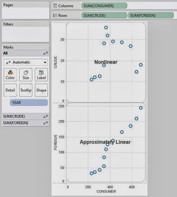
The first step of any regression model is determining which variables are going to be your predictors and which variables are going to be your responses.  In a simple linear regression model, we can only have one predictor and one response.  We also assume that they are related in a "linear" fashion, which is easiest understand via a picture.
Linear vs. Nonlinear
Now, we can see that the relationship between Foreign and Consumer is approximately linear.  However, some of you might ask, "What are these values?"  These are U.S. Economic figures for the years between 1976 and 1987.  Foreign is "Foreign Investments / Billions of Dollars" and Consumer is "Consumer Debt / Billions of Dollars."  Now, let's try to predict how much we will have in foreign investments given that we know what consumer debt will be.
Foreign (Predicted)
The code for creating a linear regression model is extremely simple, nothing more than two lines of actual code.  Now, let's see what values we get.
Consumer, Foreign, and Predicted Foreign by Year
Voila!  We have predictions.  However, it's difficult to see the relationship in a text table.  Let's create a % Difference calculation and make this into a highlight table.
Consumer vs. Foreign (Highlight Table)
Now we can easily see which predictions were close, and which were not so close.  This was a bit too easy though, let's try something else.  When you use a regression model to predict a value, you don't just get a single value, you actually get a range that the value is likely to be in.  This is called a prediction interval.  If you want a more rigorous definition, you can check out this article.  Now, what if we were to use R to calculate these intervals?  Let's see!
Foreign (Predicted Lower)
Foreign (Predicted Upper)
These calculations leverage a neat function called predict() that we won't go into detail on at this time.  However, it's one of R's many multi-purpose functions.  Now, we just need a way to look at these.  A little imagination goes a long way in these types of charts.
Consumer vs. Foreign (Banded Scatterplot)
As you can see, all of our values fall within the bounds.  This is a good thing.  It means that our model fit our data pretty well.

The really cool part about this new R integration is definitely in the prediction and forecasting scenarios.  As we just saw, it's really easy to get some cool predictions and display them.  There's WAY more to do here.  We could have gotten more technical by looking at residual plots or QQ plots.  Don't think that linear regression was the right model?  No problem!  We could have used a time series, artificial neural network, or even a Bayesian model.  You're only limited by your imagination.  We hope you found this informative.  Thanks for reading.

Data Analytics Consultant
Mariner, LLC
brad.llewellyn@mariner-usa.com
http://www.linkedin.com/in/bradllewellyn
http://breaking-bi.blogspot.com

Monday, December 16, 2013

Tableau vs. Power Pivot Part 13: Many-to-Many Relationships

Today, we will talk about resolving slightly more complex many-to-many (M2M) relationships.  In case you missed our introductory post on this topic, you can find it here.  In this example, we have a set of sales orders.  Also, each order can be assign to one or more sales reasons.  This also means that each sales reason can be assigned to one or more sales orders.  The data set we are using comes from the AdventureWorks database.

First, let's look at these tables.
Many-to-Many Relationship
You  might ask, "Why can't we just join these tables together since we have keys?"  We'll show you why.
Total Due for 2006 with Sales Reason
This is the Total Due for all Orders in 2006.  Now, let's see what happens if we join the tables together.
Joined Total Due for 2006 with Sales Reason
As you can see, this total is much higher than the actual total.  Why?  When you join across a M2M, you introduce duplicates into your data set.  Now, on to the business question.  We want to know how much money is generated from each Sales Reason for each Month in 2006.  Let's see how Power Pivot would solve this.
Many-to-Many Relationship (Power Pivot)
In order to report on the Month, we needed to add a Date dimension.  The rest of the model remains the same.  Now, let's make our pivot table.
Total Due for 2006 by Month and Sales Reason (Power Pivot)
As you can see, the same value is replicated for each column.  The totals are way too high as well.  This is what happens when you try to query across a M2M.  Now, let's fix it.
Total Due (Proper) (Power Pivot)
Remember this formula from Tableau vs. Power Pivot Part 12: Introductory Data Modeling?  This is the magic formula that allows Power Pivot to query across a M2M.  Let's see the results.
Total Due for 2006 by Month and Sales Reason (Proper) (Power Pivot)
The grand total now equals what it was supposed to.  If we look at the totals for the first 6 months, we see the issue.  The Manufacturer and Quality columns were complete duplicates.  However, it doesn't matter because Power Pivot realized this and calculated the totals accordingly.  Now, let's see how Tableau deals with this.
Simple Many-to-Many Blend (Tableau)
As we saw in our previous post on this topic, blending can take care of simple M2M relationships.  Namely, if you are reporting on the same fields you are blending on, then the totals add up perfectly.  However, when you try to report on columns that you aren't blending on, you run into problems.
Many-to-Many Blend with Extra Dimension (Tableau)
As you can see, adding the Name field doesn't change the granularity, yet still breaks the totals.  This will be a major problem if we try to blend in this scenario.  For kicks, here's what it would look like.
Total Due for 2006 by Month and Sales Reason (Blend) (Tableau)
There are so many things wrong with this chart, we won't even talk about it.  Let's move on to the proposed solution.  Since we can't blend in the dimensions, we will need to join them in.
Total Due for 2006 by Month and Sales Reason (Naive Join) (Tableau)
The chart looks great, except that the totals are wrong.  In fact, we showed that this would happen already.  However, now that we have the dimensions, can we alter the measures to remove the duplicates?  To see this, let's break this chart up into 4 areas.
Chart Areas (Tableau)
We will refer to these areas by the following names: Red = Primary, Orange = Month Totals, Green = Name Totals, Blue = Grand Total.  Now, we can see that the Red and Green areas sum up correctly.  However, the Orange and Blue Areas are being inflated due to the duplicates.  So, the first step is to identify the duplicates.
Total Due and Rank by Sales Order and Sales Reason (Tableau)
Using a ranking method, we can see that every value with an Index greater than 1 is a duplicate.  However, we did this with a table calculation which would cause a mess of other issues.  So, we need to push this ranking method directly into the data source.  We can do this by adding a single piece to Custom SQL SELECT statement.

RANK() OVER ( 
     PARTITION BY [SalesOrderHeaderSalesReason].[SalesOrderID] 
     ORDER BY [SalesOrderHeaderSalesReason].[SalesReasonID] 
) AS Duplicate

This piece of code will give us the same values we saw using the Index, without using a table calculation.
Total Due for 2006 by Name and Month (Filtered Join) (Tableau)
By filtering out the duplicates, we were able to fix our totals.  However, doing this also removed those values from the Primary and Name Total areas, which is not what we wanted.  We want the duplicates in the Primary and Name Total areas, but don't want them in the Month Total and Grand Total areas.  Remember that each of these names also corresponds to an ID number?  We can use that to our advantage.
Total Due (Fixed) (Tableau)
Each value in the Primary and Name Total areas corresponds to a single Sales Reason Name.  Therefore, they must also correspond to a single Sales Reason ID.  Also, when you only have one value, then MIN() = MAX().  So, the first section of the IF statement only affects the Primary and Name Totals areas, while the second section of the IF statement affects the Month Totals and Grand Total areas.  Now, when we are in the Primary and Name Totals areas, we don't want to change our values at all.  However, when we are in the Month Totals and Grand Total area, we want to remove the duplicate.  The [Duplicate] = 1 statement returns True/False.  When you wrap a True/False value in the INT() function, you get a 1/0 result, respectively.  Therefore, we can remove the duplicate values by multiplying by this 1/0 result.  Now, let's see if this works.
Total Due for 2006 by Month and Name (Fixed) (Tableau)
As you can see, we have fixed our calculation.  However, this took a significant amount of work and knowledge, as well as a good amount of ingenuity.  Comparing this to Power Pivot, which was a 1 line measure, it was an easy decision.

Winner: Power Pivot

Thanks for reading.  We hope you found this informative.

Data Analytics Consultant
Mariner, LLC
brad.llewellyn@mariner-usa.com
http://www.linkedin.com/in/bradllewellyn
http://breaking-bi.blogspot.com

Monday, December 9, 2013

Performing K-Means Clustering in Tableau

Today, we will talk about performing K-Means Clustering in Tableau.  In layman's terms, K-Means clustering attempts to group your data based on how close they are to each other.  If you want a rudimentary idea of how it looks, check out this picture.  Avid readers of this blog will notice that some of our previous posts, such as Simple Linear Regression and Z Tests, attempted to bring some hardcore statistical analysis into Tableau.  These posts required an extensive knowledge of statistics and Tableau.  Now, with Tableau 8.1's R integration, we can do even cooler stuff than that.  For those of you that don't know, R is a free statistical software package that is heavily used by Academic and Industry statisticians.  The inspiration for this post came from a post on the Tableau website.  You can read it here.

Microsoft's "Data Mining with SQL Server 2008" gave a perfect analogy for why you would want to use a clustering algorithm.  Feel free to read it here.  With this in mind, imagine that you have a bunch of demographic data about your customers, age, income, number of cars, etc.  Now, you want to find out what groups of customers you really have.  Take a look at some sample data we mocked up.
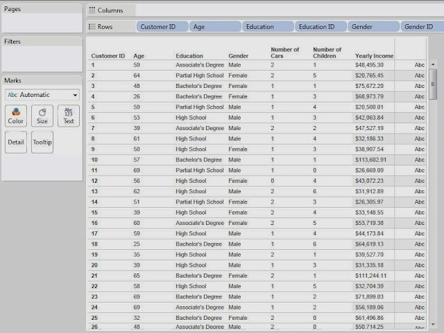
Sample Data
First, we need to examine our attributes.  In order to do this, we need to understand the difference between discrete and continuous attributes.  Simply put, a discrete attribute has a natural ordering, yet can only take a small number of distinct values.  Number of Children is a great example of this.  The values are numeric, which gives them a distinct ordering and there's a natural cap to how high this number can be.  It's extremely uncommon to see anyone with more than six children or so.  On the other hand, a continuous attribute can still be ordered, but takes far too many values for you to be able to list them all.  Income is a great example of this.  If you lined up all of your friends in a room, it's extremely unlikely that any of you would make the same exact amount of money.  An easy way to distinguish between these is to ask yourself, "Could I make a pie chart out of this attribute?"  If you answered yes, then the attribute is discrete.  If you answered no, then it is continuous.  Please note that this a gross oversimplification of these definitions, but they are good enough for this post.  Feel free to google them if you want to know more.

Now, let's see kinds of attributes we have.

Customer ID:           Unique Key
Age:                        Continuous
Education:                Discrete
Gender:                    Discrete*
Number of Cars:      Discrete
Number of Children: Discrete
Yearly Income:         Continuous

*Gender is technically a categorical attribute.  We'll touch back on this later.

Another important thing to note is that the K-Means Algorithm in R requires numeric input.  Therefore, we had to replace Education and Gender with numeric IDs.  Partial High School is a 1 and Doctorate Degree is a 6, with everything in the middle ordered appropriately.  Female is 0 and Male is 1.  This would have been an issue if we had a categorical attribute with more than two levels.

Now, we should also note that the R scripting functions qualify as Table Calculations.  Therefore, you need to set up your canvas before you can send the appropriate values to R.  Let's start by setting Customer ID on the Detail Shelf.  This defines the granularity of the chart.
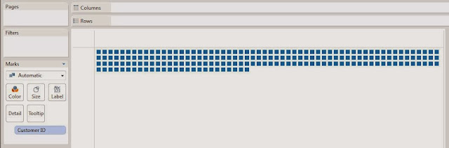
Customer ID
Now, we need to create the calculated field that will create the clusters.  This code is commented (comments in R start with #) so that you can read it more easily.

SCRIPT_INT("
    ## Sets the seed

    set.seed( .arg8[1] )

    ## Studentizes the variables

    age <- ( .arg1 - mean(.arg1) ) / sd(.arg1)
    edu <- ( .arg2 - mean(.arg2) ) / sd(.arg2)
    gen <- ( .arg3 - mean(.arg3) ) / sd(.arg3)
    car <- ( .arg4 - mean(.arg4) ) / sd(.arg4)
    chi <- ( .arg5 - mean(.arg5) ) / sd(.arg5)
    inc <- ( .arg6 - mean(.arg6) ) / sd(.arg6)
    dat <- cbind(age, edu, gen, car, chi, inc)

    num <- .arg7[1]

    ## Creates the clusters

    kmeans(dat, num)$cluster
",    

MAX( [Age] ), MAX( [Education ID] ), MAX( [Gender ID] ),
MAX( [Number of Cars] ), MAX( [Number of Children] ), MAX( [Yearly Income] ),
[Number of Clusters], [Seed]
)

Basically, this code sends our six attributes to R and performs the clustering.  We also passed two parameters into this code.  First, we made a parameter that can change the number of clusters.  Second, we made a parameter that sets the seed.  A seed is what determines the output from a "random" number generator.  Therefore, if we set a constant seed, then we won't get different clusters every time we run this.  This is EXTREMELY important to what we are about to do.

Now, we want to examine our clusters on an attribute-by-attribute basis so that we can determine what our clusters represent. In order to do this, we made the following chart:
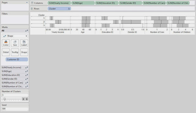
Clusters (Seed 500)
This chart is nothing more than a bunch of Shape charts, with the Transparency set to 0 so that we can't see the shapes.  Then, we put -1,+1 standard deviation shading references and an average reference line on each chart.  Next, our goal is to look at each chart to see how the clusters differ.  We will use very rough estimation when we look at these charts.  Don't beat yourself up over the tiny details of which box is bigger or which line is higher; this isn't an exact science.

On the Yearly Income chart, we see that Clusters 1 and 3 are pretty close, and Cluster 2 is much higher.  So, we'll say that Cluster 2 is "Wealthy."

On the Age chart, we don't see a significant difference between any of the Clusters.  So, we move on.

On the Education ID chart, we see that Clusters 1 and 3 are pretty close again, and Cluster 2 is much higher.  So, we'll call Cluster 2 "Educated."  Shocking Surprise!  Educated People seem to make more money.  It's almost like we built the data to look like this.  Anyway, moving on.

On the Gender ID chart, we see that Cluster 1 is almost entirely female and Cluster 3 is almost entirely male.

On the Number of Cars chart, we don't see a significant difference between the clusters.

On the Number of Children chart, we see that Cluster 3 has more children than the other clusters.  So, we'll call this Cluster "Lots of Children".

Now, let's recap our clustering:

Cluster 1: "Male."  We'll call this cluster the "Average Males"
Cluster 2: "Wealthy", "Educated."  We'll call this cluster "Wealthy and Educated"
Cluster 3: "Female", "Lots of Children."  We'll call this cluster "Females with Lots of Children"

Now, before anybody cries sexism at us, we will say that we intentionally created a relationship between income and education.  However, the fact that gender and number of children were clustered together were purely random chance.

This leads us to another question.  What if you don't like the clusters you got?  What if they weren't very distinguishable or you thought that the random number generator messed up the clusters.  Easy!  Just change the seed and/or the number of clusters.
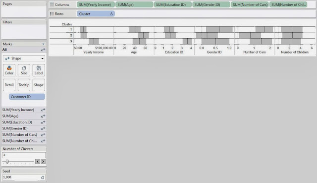
Clusters (Seed 1000)
Changing the seed to 1000 completely changed our clusters.  This is what's so cool about statistics.  There are no right answers.  Everything is up for interpretation.

Now, you might ask, "If the clusters change every time, why is this even useful?"  That's the singular defining question behind statistics and the answer is typically, "Run it more than once."  If you create 10 sets of clusters and 9 of them pair High Income with High Education, then that's a VERY good indication that your data contains that cluster.  However, if you run it 10 times and find that half of the time it groups Men with High Income and the other half of the time it groups Women with High Income, then that probably means there is not a very strong relationship between Gender and Income.

We're sorry that we couldn't explain in more depth how the R functionality or the clustering algorithm works.  It would probably take an entire book to fully explain it.  Feel free to do some independent research on how clustering algorithms work and how to interpret the results.  We encourage you to experiment with this awesome new feature if you get a chance.  If you find a different, and maybe even better, way of doing this, let us know.  We hope you found this informative.  Thanks for reading.

P.S.

We would have much rather represented our discrete attributes, or categorical in the case of Gender, using some type of bar graph.  However, we were completely unable to find a way to get it to work.  If you know of a way, please let us know in the comments.

Brad Llewellyn
Associate Data Analytics Consultant
Mariner, LLC
brad.llewellyn@mariner-usa.com
http://www.linkedin.com/in/bradllewellyn
http://breaking-bi.blogspot.com