Today, we're going to talk about the next in the line of Table Analysis tools, Fill From Example.
 |
| Fill From Example |
The Fill From Example tool allows you to "impute" values into your data set. We've spoken briefly on imputation in
Part 3 of this series. In layman's terms, it means filling in unknown or blank values with another value of your choosing. Imagine you are selling car stereos and would like to know what type of vehicle your customers drive. But, you can't ask every customer you've ever had. So, you ask a subset of the customers and apply some logic to make an educated guess as to what type of vehicles the rest of your customers drive. This algorithm is designed to do exactly that.
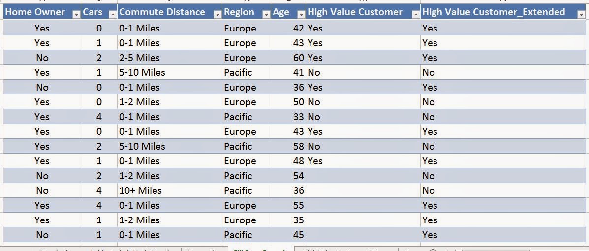
In this data set, we have the same customers we've been looking at all along. However, we also have an extra column now called "High Value Customer". This column indicates whether a customer is worth a lot of money. However, we only have values for a small number of customers.
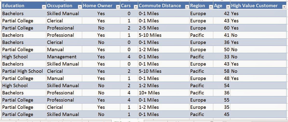 |
| Customers |
So, let's use the Fill From Example tool to make an educated guess about the rest of the values.
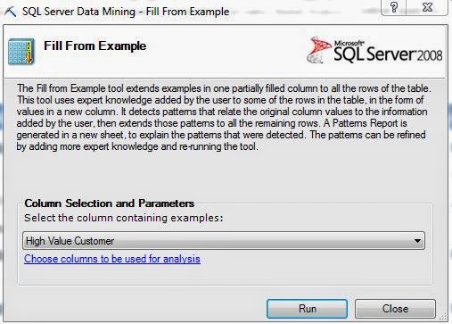 |
| Column Selection |
As usual, the first step requires us to choose which columns we want to use. We want to use the dropdown box to select the column we would like to impute values into. We can also click on the blue link to tell the algorithm that only certain columns should be considered in this analysis. Once we're done, another sheet gets added to our workbook.
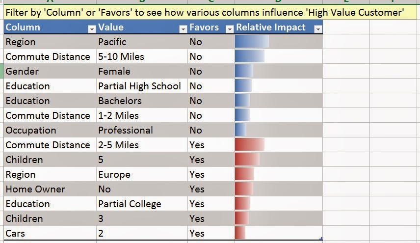 |
| Discrimination Table |
Here, we see a familiar table. This is a "Discrimination Table". We can use it to determine which values influence other values in our data set. For instance, we see that customers from the Pacific, who commute 5 - 10 miles, or are female, tend to not be very valuable customers. On the other hand, customers who are Professionals, commute 2 - 5 miles, or have 5 children, are likely to be valuable. We want to iterate again (and not for the last time) that these algorithms measure CORRELATION, NOT CAUSATION. This is arguably the most important point to emphasize when you are talking about Data Mining. Now, let's go back to our data.
.JPG) |
| Customers (Imputed) |
We see that the tool also appended a column to our data set with the predicted values. We should note that the tool will not predict values that actually exist, since we already know what the right answer is.
Finally, we are at the point where we can start combining the tools we have been using and gain more insight. Let's see what kind of visualizations we can build if we combine Detect Categories and Fill From Example.
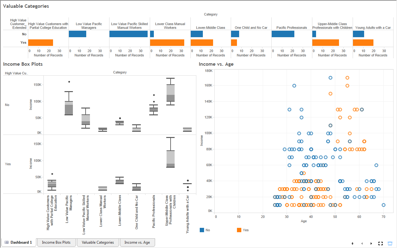 |
| Dashboard |
As you can see, our visualizations just got that much better, simply by clicking a button and waiting 15 seconds. This just goes to show how much insight you can gain with a tool this powerful. Stay tuned for the next post in the series, Forecasting. Thanks for reading. We hope you found this informative.
Brad Llewellyn
Director, Consumer Sciences
Consumer Orbit
llewellyn.wb@gmail.com
http://www.linkedin.com/in/bradllewellyn
Nice. What visualization tool do you use for your dashboard? (Last Image)
ReplyDeleteKindly ignore my query. Got it from your later posts. Cheers :P
ReplyDelete