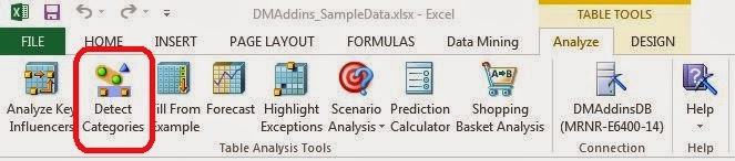
Today, we will be talking about the second component in the Table Analysis Tools ribbon, Detect Categories.
 |
| Detect Categories |
This component is designed to let you group your data into segments based on how similar the observations are to each other. Generally, the observations in a segment are more similar to each other than they are to observations in other segments. In more technical terms, this methodology is known as "Clustering", and is possibly the most common (and useful!) practice in Data Mining. As usual, we will be using the Data Mining Sample data set from Microsoft.
The greatest aspect of clustering is that it allows you to understand what types of values are in your data on a larger scale; and it takes very little knowledge of your data to do so. Let's begin.
 |
| Column Selection |
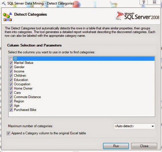
As you can see, it automatically identifies that ID should not be in the algorithm and removes it. Since we don't have any previous knowledge of this data, we want to give it everything. If you are looking for specific types of groupings, or don't care about certain fields, then you can remove them here. We also want to mention that specifying a precise number of categories takes a good bit of power away from the algorithm. If you want to find out what's in your data, why would you assume that you already know how many types of data you have? Therefore, it's generally a good idea to use the "Auto-detect" feature. Also, take note of the check box at the bottom of the window. We'll come back to that later. Let's move on.
 |
| Category Row Counts |
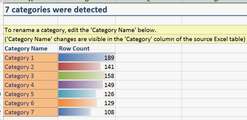
Voila! Our data has been categorized into seven categories with between 100 and 200 rows in each category. Now, the fun part begins.
 |
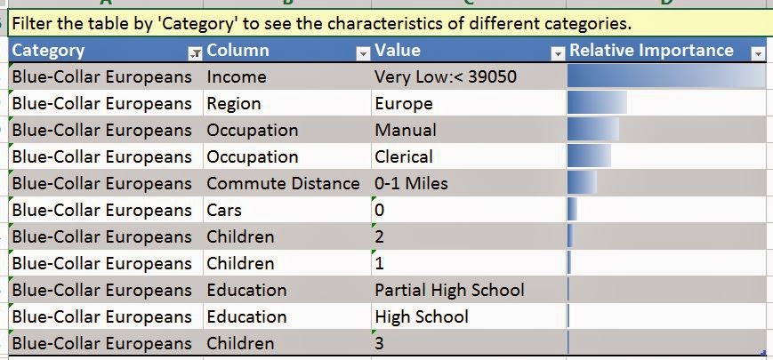
| Category 1 Characteristics |
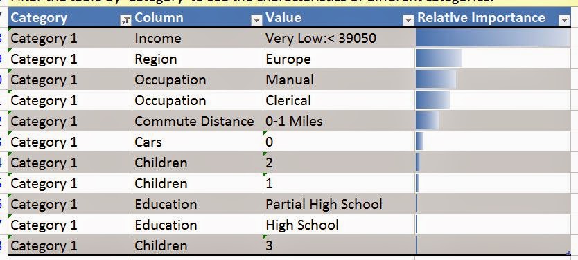
If we scroll down the worksheet a little bit, we see this chart. It shows which values are important for which cluster. These values are listed in order of "Importance". This basically assigns a number to how uniquely this value represents this cluster, the higher the value, the more it uniquely describes the cluster. So, we can use these values to give our cluster an intuitive name. The values with low importance are, pardon the redundancy, not important. So, let's use the first few values and call this cluster "Blue-Collar Europeans". Note that this is definitely the art within the science. We also think it's a lot of fun. Even better, if we rename the cluster using the "Category Row Counts" chart, it changes the names everywhere.
 |
| First Column Named |
 |
| Blue-Collar European Characteristics |
Now, let's repeat this process for Category 2.
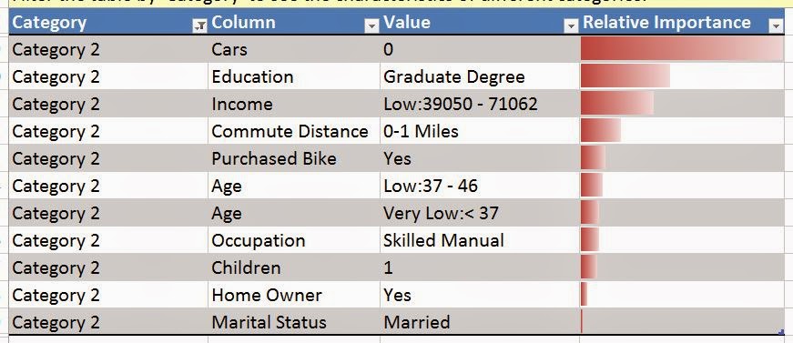 |
| Category 2 Characteristics |
This one doesn't have quite the same ring to it, but we'll call it "Graduate Degree with Low Income and No Car". Now, we'll repeat this process for the rest of the Categories and show you the end result.
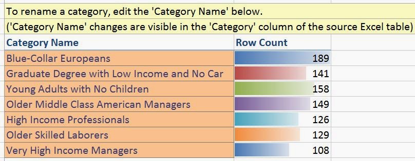 |
| All Categories Named |
Now that we've named all of the categories, let's check our original data source.
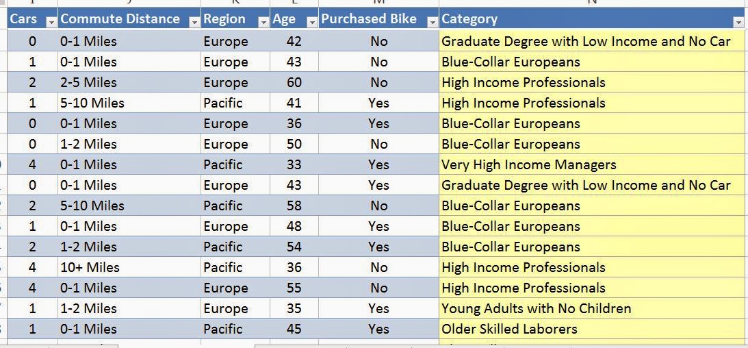 |
| Original Data |
The add-in automatically added and updated the category column onto our original data set. This would also allow us to use these categories in any further analysis we would want to. Furthermore, if we go back to the output sheet again, we can see another chart further down.
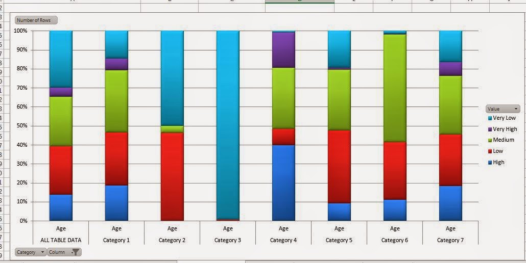 |
| Category Comparison |
This chart allows us to compare our categories across one or more variables. For instance, this view shows us that Category 3 is made up almost entirely of young people and Category 6 has the highest percentage of middle-aged people. You could also use the filters at the bottom to show multiple variables at the same time. However, we believe this to be too cluttered for any real analysis. Unfortunately, this chart doesn't update with the names we gave our Categories. Lastly, we see a very large table at the bottom of the sheet.
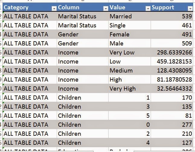 |
| Supports |
In this table, each row tells us how many rows had each value in each category, which is known as the "Support". For instance, we see that there 539 married people and 461 single people in the data. We're not sure what would cause the supports to be decimals, as they should be integers. Alas, the decimals aren't very important anyway. If they bother you, feel free to round the values to the nearest integer.
Finally, this is the first algorithm that appends a result onto the data set. This means that we can use this value in any sort of visualizations. Avid readers will know that this blog heavily emphasizes our favorite visual analytics tool, Tableau. Here's a tiny bit of what you can do if you combine the two tools.
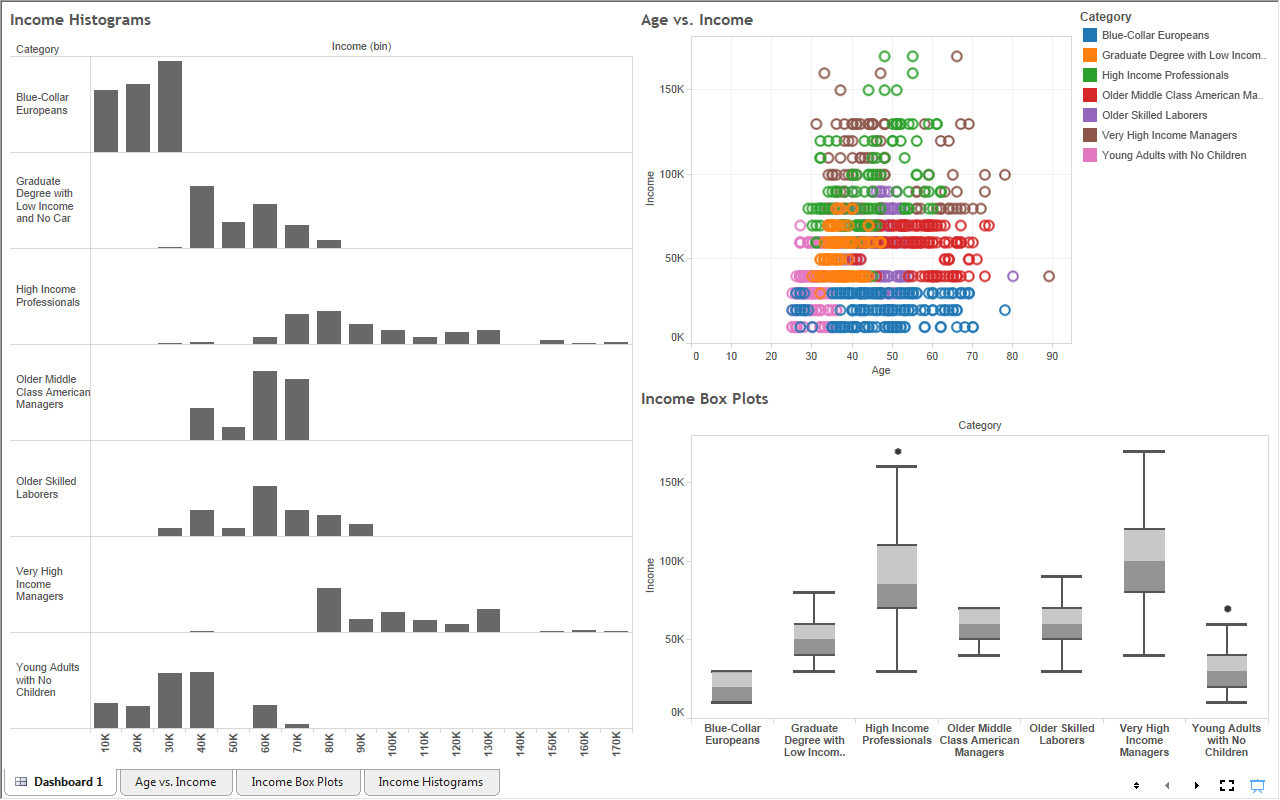 |
| Dashboard |
The Detect Categories, and later the Clustering algorithm, is probably the most useful component in the entire Data Mining feature set from Microsoft. It makes it so much easier to investigate your data in entirely new ways. There is so much exploration that can be done and so much insight that can be gained if you are willing to put just a small amount of effort into it. Stay tuned for the next entry, Fill From Example. Thanks for reading. We hope you found this informative.
Brad Llewellyn
Director, Consumer Sciences
Consumer Orbit
llewellyn.wb@gmail.com
http://www.linkedin.com/in/bradllewellyn
No comments:
Post a Comment