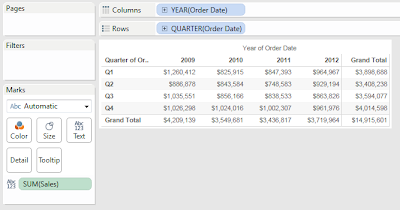
Today, we will talk about how to utilize totals and subtotals in Tableau. All a total/subtotal does is apply the TOTAL() function to the current calculation. At it's most basic, this applies the underlying calculation to data within all of the panes. Here, we can see a very simple, yet naive way to display totals. For the first example, let's use the Superstore Sales sample data set in Tableau.
.PNG) |
| Sales by Quarter (with Simple Totals) |
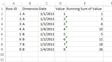
However, what if your data was set up differently. I worked with a client who wanted some pretty complex Period to Date calculations. Their data looked something like
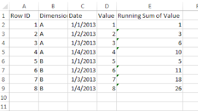 |
| Sample Data |
Notice that the Running Sum is calculated at the data source, not in Tableau. This makes calculations a little more complex. Let's put these in our naive mock-up again.
 |
| Naive Totals |
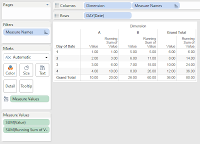
We can see that our Row Totals are pretty intuitive. They give the total across the dimension, as well as the running sum of that total. Technically, they are doing the sum of the running sum. However, these values are identical because addition is associative, (Math fact of the day :P).
On the other hand, the column grand totals are somewhat strange. The value grand totals are fine, but the running grand totals are adding, when they shouldn't be. We can make this better.
Step 1:
- Remove "Dimension" from the chart
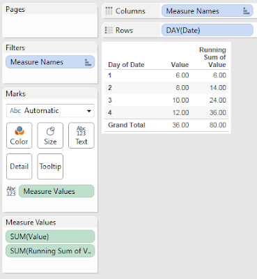 |
| Value and Running Sum of Value by Day |
This chart looks much cleaner, and simpler to show the technique. Now, let's do something about this total. To my knowledge, there is no way to get the max if you are summing over a dimension as well (the dimension is Dimension in this case). Therefore, let's do the next best thing, remove it.
Step 2:
- Create a calculation that returns SUM( [Running Sum of Value] ) only if there is 1 value for Day of [Date], i.e. not the total
- Create the following calculation
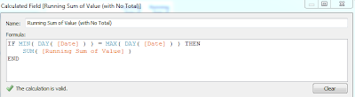.PNG) |
| Running Sum of Value (with No Total) |
Step 3:
.PNG) |
| Value and Running Sum of Value by Day (with Proper Totals) |
Now, the chart is much cleaner because there is no misleading information. Alas, this is just the beginning. Try using this technique for more complex charts and data sets. I hope you found this informative. Thanks for reading.
Acknowledgements:
Brad Llewellyn
Associate Consultant
Mariner, LLC
llewellyn.wb@gmail.com
https://www.linkedin.com/in/bradllewellyn
.PNG)


.PNG)
.PNG)
Hi Brad --- This was helpful today and did not have to spend time researching; the "Additon is Associative" was the key for me! Thank you! Angela
ReplyDeleteHai Brad...This was vey helpful..Thanks
ReplyDelete