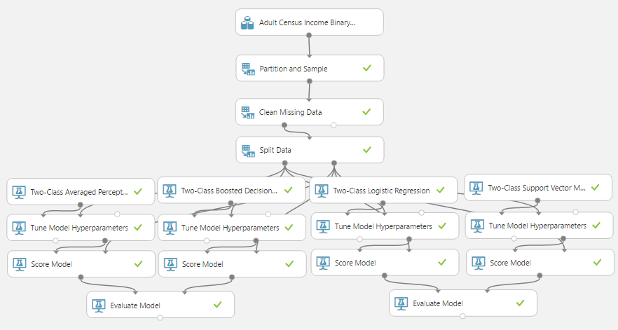
Today, we're going to continue looking at Sample 3: Cross Validation for Binary Classification Adult Dataset in Azure Machine Learning. In the previous
post, we looked at the ROC Tab of the "Evaluate Model" module. In this post, we'll be looking at the
Precision/Recall and
Lift tabs of the "Evaluate Model" visualization. Let's start by refreshing our memory on the data set.
 |
| Adult Census Income Binary Classification Dataset (Visualize) |
 |
| Adult Census Income Binary Classification Dataset (Visualize) (Income) |
This dataset contains the demographic information about a group of individuals. We see the standard information such as Race, Education, Martial Status, etc. Also, we see an "Income" variable at the end. This variable takes two values, "<=50k" and ">50k", with the majority of the observations falling into the smaller bucket. The goal of this experiment is to predict "Income" by using the other variables.
 |
| Experiment |
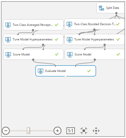
As a quick refresher, we are training and scoring four models using a 70/30 Training/Testing split, stratified on "Income". Then, we are evaluating these models in pairs. For a more comprehensive description, feel free to read the previous
post. Let's move on to the Precision/Recall tab of the "Evaluate Model" visualization.
 |
| Precision/Recall |
In the top left corner of the visualization, we see a list of tabs. We want to navigate to the Precision/Recall tab.
 |
| Precision/Recall Experiment View |
Just as with the
ROC tab, the Precision/Recall tab has a view of the experiment on the right side. This will allow us to distinguish between the two models in the other charts/graphs.
 |
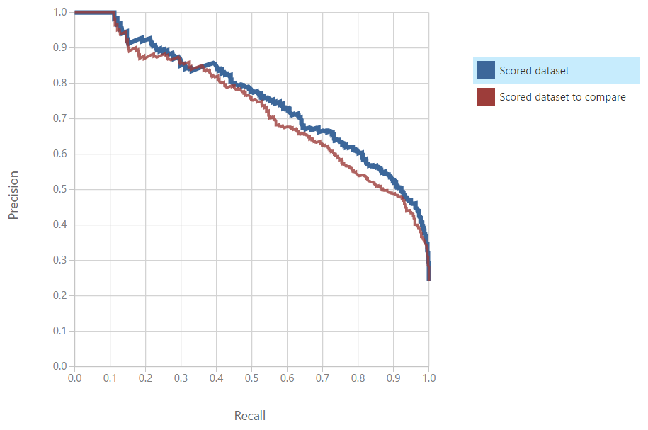
| Precision/Recall Curve |
On the left side of the visualization, we can see the
Precision/Recall Curve. Simply put, Precision is the proportion of "True" predictions that are correct. In our case, this would be the number of correct ">50k" predictions divided by the total number of ">50k" predictions. Conversely, Recall is the proportion of actual "True" values that are correctly predicted. In our case, this would be the number of correct ">50k" predictions divided by the number of actual ">50k" values. Obviously, we want to maximize both of these values. Therefore, we want to see curves that reach as far to the top right as possible. Using this logic, we can say that the Boosted Decision Tree is the most accurate model by this metric. Let's switch over the Lift tab.
 |
| Lift Curve |
On the left side of the visualization is the
Lift Curve. This curve is designed to what proportion of the sample you would have to run through in order to find a certain number of true positives. Effectively, this tells you how "efficient" your model is. A more "efficient" model can find the same number of true positives (aka successes) from a smaller sample. In our case, this would mean that we would have to contact less people in order to find X number of people with "Income > 50k". For analytic purposes, we are looking for curves that are closer to the top left corner. We see that the more "efficient" model is the Boosted Decision Tree. Let's take a look at the curves from the other "Evaluate Model" module.
 |
| Precision/Recall Curve 2 |
 |
| Lift Curve 2 |
Moving on to the next set of models, both of these charts show that the "better" model is the Logistic Regression model. Finally, let's compare the Boosted Decision Tree model to the Logistic Regression model.
 |
| Precision/Recall Curve (Final) |
 |
| Lift Curve (Final) |
We can see on both of these charts that the Boosted Decision Tree is the "better" model. Now that we've compared these models using four different techniques (Overall Accuracy, ROC, Precision/Recall, and Lift), we can definitively say that the Boosted Decision Tree is the best model out of the four. Does that mean that we can't possibly do better? Of course not! There's always more we can do to tweak these models. Some of the options for tweaking more power out of models are to take a larger sample, add new variables, try different sampling techniques, and so much more. The world of data science is nearly endless and there's always more we can do. Stay tuned for our next post where we'll dig deeper into the Threshold and Evaluation tables. Thanks for reading. We hope you found this informative.
Brad Llewellyn
Data Scientist
Valorem
@BreakingBI
www.linkedin.com/in/bradllewellyn
llewellyn.wb@gmail.com


No comments:
Post a Comment