Today, we'll talk about our first component of the Data Mining add-in for Excel, Explore Data. We are beginning our analysis with the Data Preparation Segment of the Data Mining Ribbon.
 |
| Data Preparation Segment |
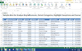
The first component in this segment is the Explore Data feature. This feature is pretty cool because it allows you to look at the distribution of any column in your data set. As usual, we will use the Data Mining Sample data from Microsoft.
 |
| Sample Data |
In this data set, we have some categorical (slicer) columns like Gender and Education. We also some discrete numeric columns such as children and cars. So, how do we get a good feeling for what kind of distribution our data has. Let's click on the Explore Data button and find out!
 |
| Select Data Source |
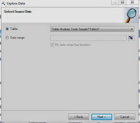
The first step is to select the data source. Since our data is in a table, the option is automatically selected. You can enter a range if you'd like as well. Moving on.
 |
| Select Column |
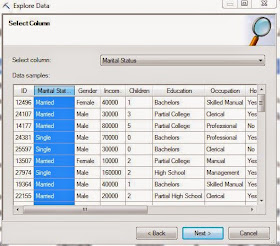
Here, you can select any column you want by either scrolling through the dropdown box at the top or just clicking on the column in the sample window. Once you select a column, you can see its distribution by clicking "Next".
 |
| Marital Status |
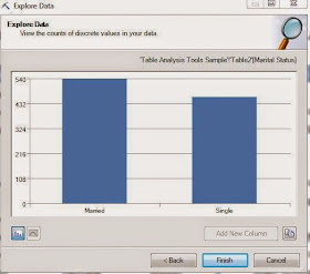
We can quickly see that their are more married people than single people, about 20% more. Now, we can easily click "Back" and move on to any other column we want.
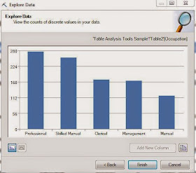 |
| Occupation |
Choosing a column with more values leads to a much more interesting chart. These charts could have easily been done using Excel's built-in features. However, let's see what happens when we use this on a numeric column like Income.
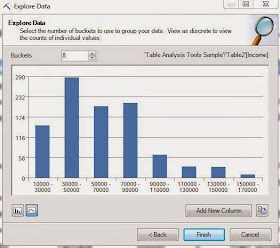.JPG) |
| Income (8 Buckets) |
The tool automatically recognizes that this is a numeric value and discretizes it into 8 buckets. If we wanted to see all of the values, we could click on the bar icon in the bottom-left corner of the window. We could also change the number of buckets dynamically if we want more or less. The really cool part of this feature happens when you click "Add New Column".
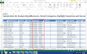 |
| Appended Column |
A discretized column was automatically appended to the data set. As you can see, none of these features would be overly difficult to do with Excel. The advantage of using this feature is being able to see it all quickly with just a few clicks. Stay tuned for our next post where we talk about the "Outliers" portion of the "Clean Data" feature. Thanks for reading. We hope you found this informative.
Brad Llewellyn
Data Analytics Consultant
Mariner, LLC
llewellyn.wb@gmail.com
https://www.linkedin.com/in/bradllewellyn


.JPG)

No comments:
Post a Comment