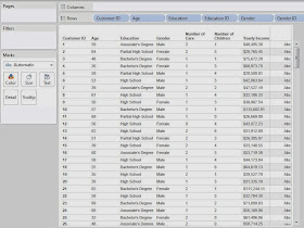
Microsoft's "Data Mining with SQL Server 2008" gave a perfect analogy for why you would want to use a clustering algorithm. Feel free to read it here. With this in mind, imagine that you have a bunch of demographic data about your customers, age, income, number of cars, etc. Now, you want to find out what groups of customers you really have. Take a look at some sample data we mocked up.
 |
| Sample Data |
Now, let's see kinds of attributes we have.
Customer ID: Unique Key
Age: Continuous
Education: Discrete
Gender: Discrete*
Number of Cars: Discrete
Number of Children: Discrete
Yearly Income: Continuous
*Gender is technically a categorical attribute. We'll touch back on this later.
Another important thing to note is that the K-Means Algorithm in R requires numeric input. Therefore, we had to replace Education and Gender with numeric IDs. Partial High School is a 1 and Doctorate Degree is a 6, with everything in the middle ordered appropriately. Female is 0 and Male is 1. This would have been an issue if we had a categorical attribute with more than two levels.
Now, we should also note that the R scripting functions qualify as Table Calculations. Therefore, you need to set up your canvas before you can send the appropriate values to R. Let's start by setting Customer ID on the Detail Shelf. This defines the granularity of the chart.
 |
| Customer ID |
SCRIPT_INT("
## Sets the seed
set.seed( .arg8[1] )
## Studentizes the variables
age <- ( .arg1 - mean(.arg1) ) / sd(.arg1)
edu <- ( .arg2 - mean(.arg2) ) / sd(.arg2)
gen <- ( .arg3 - mean(.arg3) ) / sd(.arg3)
car <- ( .arg4 - mean(.arg4) ) / sd(.arg4)
chi <- ( .arg5 - mean(.arg5) ) / sd(.arg5)
inc <- ( .arg6 - mean(.arg6) ) / sd(.arg6)
dat <- cbind(age, edu, gen, car, chi, inc)
num <- .arg7[1]
## Creates the clusters
kmeans(dat, num)$cluster
",
MAX( [Age] ), MAX( [Education ID] ), MAX( [Gender ID] ),
MAX( [Number of Cars] ), MAX( [Number of Children] ), MAX( [Yearly Income] ),
[Number of Clusters], [Seed]
)
Basically, this code sends our six attributes to R and performs the clustering. We also passed two parameters into this code. First, we made a parameter that can change the number of clusters. Second, we made a parameter that sets the seed. A seed is what determines the output from a "random" number generator. Therefore, if we set a constant seed, then we won't get different clusters every time we run this. This is EXTREMELY important to what we are about to do.
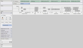
Now, we want to examine our clusters on an attribute-by-attribute basis so that we can determine what our clusters represent. In order to do this, we made the following chart:
.JPG) |
| Clusters (Seed 500) |
On the Yearly Income chart, we see that Clusters 1 and 3 are pretty close, and Cluster 2 is much higher. So, we'll say that Cluster 2 is "Wealthy."
On the Age chart, we don't see a significant difference between any of the Clusters. So, we move on.
On the Education ID chart, we see that Clusters 1 and 3 are pretty close again, and Cluster 2 is much higher. So, we'll call Cluster 2 "Educated." Shocking Surprise! Educated People seem to make more money. It's almost like we built the data to look like this. Anyway, moving on.
On the Gender ID chart, we see that Cluster 1 is almost entirely female and Cluster 3 is almost entirely male.
On the Number of Cars chart, we don't see a significant difference between the clusters.
On the Number of Children chart, we see that Cluster 3 has more children than the other clusters. So, we'll call this Cluster "Lots of Children".
Now, let's recap our clustering:
Cluster 1: "Male." We'll call this cluster the "Average Males"
Cluster 2: "Wealthy", "Educated." We'll call this cluster "Wealthy and Educated"
Cluster 3: "Female", "Lots of Children." We'll call this cluster "Females with Lots of Children"
Now, before anybody cries sexism at us, we will say that we intentionally created a relationship between income and education. However, the fact that gender and number of children were clustered together were purely random chance.
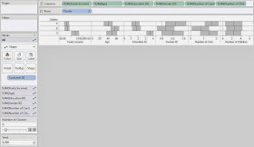
This leads us to another question. What if you don't like the clusters you got? What if they weren't very distinguishable or you thought that the random number generator messed up the clusters. Easy! Just change the seed and/or the number of clusters.
.JPG) |
| Clusters (Seed 1000) |
Now, you might ask, "If the clusters change every time, why is this even useful?" That's the singular defining question behind statistics and the answer is typically, "Run it more than once." If you create 10 sets of clusters and 9 of them pair High Income with High Education, then that's a VERY good indication that your data contains that cluster. However, if you run it 10 times and find that half of the time it groups Men with High Income and the other half of the time it groups Women with High Income, then that probably means there is not a very strong relationship between Gender and Income.
We're sorry that we couldn't explain in more depth how the R functionality or the clustering algorithm works. It would probably take an entire book to fully explain it. Feel free to do some independent research on how clustering algorithms work and how to interpret the results. We encourage you to experiment with this awesome new feature if you get a chance. If you find a different, and maybe even better, way of doing this, let us know. We hope you found this informative. Thanks for reading.
P.S.
We would have much rather represented our discrete attributes, or categorical in the case of Gender, using some type of bar graph. However, we were completely unable to find a way to get it to work. If you know of a way, please let us know in the comments.
Brad Llewellyn
Associate Data Analytics Consultant
Mariner, LLC
brad.llewellyn@mariner-usa.com
http://www.linkedin.com/in/bradllewellyn
http://breaking-bi.blogspot.com
http://breaking-bi.blogspot.com
Hey Brad,
ReplyDeleteGreat post!
I am trying to replicate this to identify members of a particular cluster. Although I am receiving an error within the kmeans function....
Error in sample.int(m, k) :
cannot take a sample larger than the population when 'replace = FALSE'
My cluster calculation is below:
SCRIPT_INT(
"
## Sets the seed
set.seed( .arg5[1] )
## Studentizes the variables
fte <- ( .arg1 - mean(.arg1) ) / sd(.arg1)
fr <- ( .arg2 - mean(.arg2) ) / sd(.arg2)
below <- ( .arg3 - mean(.arg3) ) / sd(.arg3)
dat <- cbind(fte, fr, below)
num <- .arg4[1]
## Creates the clusters
kmeans(dat, num)$cluster
",
MAX( [Special Ed FTE Fixed] ), MAX( [FR Status Fixed] ), MAX( [Below Standard] ), [Number of Clusters], [Seed]
)
Any ideas on why I would receive this error?
Thanks for your time
Brad,
ReplyDeleteAll I needed to do was turn off "Aggregate Measures" under Analysis
Thanks for commenting! Glad you figured out the issue.
DeleteHi Brad,
ReplyDeleteHow do you extract the clusters in table form once you use the R kmeans on tableau?
Thanks
Thanks for commenting! I'm not sure I understand your question. If you try using "Duplicate Sheet as Crosstab", you might find an answer. Does this make sense or am i misunderstanding?
DeleteHi Sir,
ReplyDeleteIm a highschool student and very new to R-script and Tableau, this is a question coming from a novice, I am trying to perform k-mean clustering and my script is
SCRIPT_INT("
## Sets the seed
set.seed( .arg6[1] )
## Studentizes the variables
CP <- ( .arg1 - mean(.arg1) ) / sd(.arg1)
Emp <- ( .arg2 - mean(.arg2) ) / sd(.arg2)
GVA <- ( .arg3 - mean(.arg3) ) / sd(.arg3)
Surv <- ( .arg4 - mean(.arg4) ) / sd(.arg4)
dat <- cbind(CP, Emp, GVA, Surv)
num <- .arg5[1]
## Creates the clusters
kmeans(dat, num)$cluster
",
MAX([CP]), MAX([Emp]), MAX([GVA]),
MAX( [Surv] ),
[Number of Clusters],[Seed]
)
I got an error saying:
Reference to undefined field [Number of Cluster].
Reference to undefined field [seeds].
got any advice where or how I got this problem? Thanks so much for the help.
In my workbook, I create a parameter for Number of Clusters and Seed. Therefore, I was able to use them in the calculation. Did you also create these parameters?
DeleteThank you so much for the advice sir, I have an extra letter in the parameter section Number of Clusters instead of Number of Cluster, seedd instead of seeds. R language is really quite a challenge to master.
DeleteThank you for this very interesting post.
ReplyDeleteI'm also working on a Tableau + R integration using the k-means model.
I'm trying to bring back the centers to the view as I would normaly do in R using: points(cl$centers, pch = 17, cex=2). But since Tableau only allows a vector of the same lenght to be brought back, I created two separated fields for the X and Y components:
SCRIPT_REAL('
set.seed(1234)
param <- max(.arg3)
result <- kmeans(x = data.frame(.arg1,.arg2), param)
df <- data.frame(.arg1,.arg2)
df2 <- cbind(df, result$cluster)
colnames(df2)[3] <- "Cluster"
df3 <- cbind(result$centers, c(1:param))
colnames(df3)[3] <- "Cluster"
df4 <- merge(df2, df3, by="Cluster")
df4[,4]',
SUM([Petal#Length]),SUM([Petal#Width]),[Parameter 1])
Now if I would like to only return the distinct values for the centers and plot them but I can't use
IF FIRST()==0 THEN WINDOW_SUM(COUNTD([X Centers])) END
Because [X Centers] is already an aggregated field. Any idea on how I should procede ?
Steven,
DeleteThanks for commenting! I think you're already there. If the vector you return to Tableau is the [X Center], but it is duplicated, then you could place your [X Centers] field on the Columns Shelf, with your arguments on the details shelf. This should create a 1-dimensional scatterplot with duplicate value on each [X Center]. Then, use the filter
FIRST() == 0
with Compute Using set to [Cluster] to remove all of the duplicates. This method requires that you also return the cluster number to Tableau, which shouldn't be an issue seeing that you've already computed it in your R code. Does this help?
I wanted to recreate the example but couldn't find the data. Could you please add the link (or am I missing something?)
ReplyDeleteThank you
Hi,
ReplyDeleteI tried standardizing the data as mentioned in your post but I am getting NA/NAN error while running kmean clustering for a demographic dataset. I want to standardize the data since my parameters have different units. The problem is similar to the one that you have mentioned in your post.
Below is the kmeans cluster code that I am using for normalization
age <- ( .arg1 - mean(.arg1) ) / sd(.arg1)
income <- ( .arg2 - mean(.arg2) ) / sd(.arg2)
experience <- ( .arg3 - mean(.arg3) ) / sd(.arg3)
Also I want to understand the use of aggregate functions like SUM,MAX,MIN in SCRIPT functions as I have seen different codes with different functions.It will be great if you could explain the reason for selecting MAX function in your example.
ReplyDeleteHi, i am new to statistics and Tableau. I am not quite getting the SD shading right - if you recall, did you leave the defaults? my shading is covering the entire range - did you choose scope of Per Pane? did you pick sample or population?
ReplyDeleteHi, when I tried to run the below code and in spite of turning off "Aggregate Measures" under Analysis, i met with the error "Error in sample.int(m, k) :
ReplyDeletecannot take a sample larger than the population when 'replace = FALSE'.
SCRIPT_INT("
## Sets the seed
set.seed(.arg6[1])
## Studentizes the variables
Overdue_Amount <- (.arg1 - mean(.arg1)) / sd(.arg1)
Days_Late_paid <- (.arg2 - mean(.arg2) ) / sd(.arg2)
Credit_Limit <- (.arg3 - mean(.arg3) ) / sd(.arg3)
DSO_Days <- (.arg4 - mean(.arg4)) / sd(.arg4)
dat <- cbind(Overdue_Amount, Days_Late_paid, Credit_Limit, DSO_Days)
num <- .arg5[1]
## Creates the clusters
kmeans(dat, num)$cluster
",
MAX( [A Total Overdue Open Inv Amt] ), MAX( [Avg DL Paid Invs] ), MAX( [Cash Cus Credit Limit] ),
MAX( [Cash Cus Dso Days]),
[Number of Clusters], [Seed]
)
Can any one be of some help?