Hello everybody. My new job has kept me busy, so I haven't been able to post as much as I would like. Alas, I'm here with more useful Tableau information. Today we'll be talking about the effectiveness of tooltips in Tableau. Tooltips are an easy way to allow you to show the user more information without having to clutter up your chart space with noise. Let's start by looking at a typical filled map you might build.
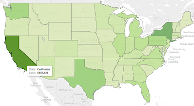 |
| Standard Filled Map |
This map easily shows us which states are generating the most sales and which could use some more work. There's nothing particular wrong with this design. However, it's not telling us very much either. What if we wanted the user to be able to see some more useful information about each state.
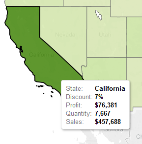 |
| Heavy Filled Map |
The user still sees the same information when they look at the map. However, when they want more information, they have to read through the tooltip. Nothing stands out to them as important, and it certainly doesn't look pretty. A few simple changes can spruce this tooltip up to improve readability and aesthetics.
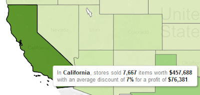 |
| Filled Map with Sentences |
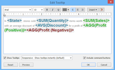
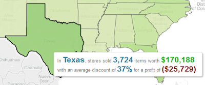
We turned the tooltip into a sentence. Now, the user does need any explanation as to what a metric means. If they do, then you can just add it to your sentence. But, this is still kind of dry and unappealing. A little bit of color and a change of font could easily change things.
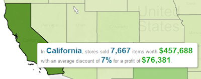 |
| Filled Map with Eyepopping Sentences |
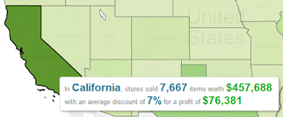
Now, we can immediately see which values are important and which ones aren't. For this example, we chose Blue as our "neutral" color and green as our "money" color. This method becomes even better when you can start applying conditional colors to your charts. For instance, Texas has a negative profit. So, we can make a couple of calculations to display this with color.
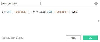 |
| Profit (Positive) |
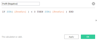 |
| Profit (Negative) |
 |
| Edit Tooltip |
 |
| Filled Map with Positive Profit |
 |
| Filled Map with Negative Profit |
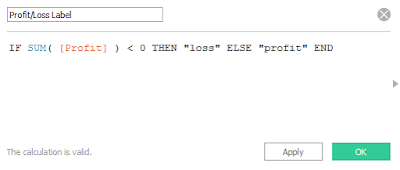
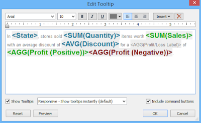
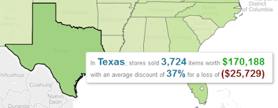
Now, you can see that the color of the profit value changes based on whether not the state has been profitable. We can do this because of the calculated fields we created. When the profit is positive, the Profit (Negative) field will take a NULL value, and vice-versa when the profit is negative. When a null field is placed in the tooltip, it does not take up any space. Looking at this tooltip a little more bugs me with for another reason. It says "profit of" a negative value. This is called a loss. Let's make another calculation to fix this.
 |
| Profit/Loss Label |
 |
| Edit Tooltip |
 |
| Filled Map with Loss |
It's easy enough to alter the small text with a calculated field, just like we did with the eyecatching text. I hope this sparked your mind to the possibilities. This works on every chart type and is a very easy way to add additional "wow"-factor to your dashboards. Thanks for reading. We hope you found this informative.
Brad Llewellyn
Director, Consumer Sciences
Consumer Orbit
llewellyn.wb@gmail.com
http://www.linkedin.com/in/bradllewellyn


