Today, we'll be talking about a very cool algorithm that absolutely everyone can make use of, Forecast.
 |
| Forecast |
Put simply, forecasting is the process of predicting future values. This can range anywhere from "How many units will I sell next month?" to "Which customers are likely to be profitable next year?". As long as you have data over time, Forecast can help you gain some serious insight.
We've worked with a fair number of companies and they all seem to budget the same way. Compare this month's sales to last month's sales, and the sales of the same month last year. While this technique is not bad by any means, it lacks any hint of sophistication. If you want to really get some good insights, you've got to use some math. But....math is hard! What if Excel could do it for us? Let's dive in.
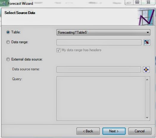 |
| Select Data Source |
Of course, the first step is to select your data. You can also choose to use an External SQL source if you would like. Moving on.
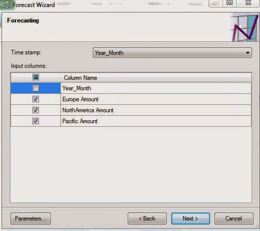 |
| Column Selection |
Next, we need to choose which field is our Time Stamp. If you are using data from Excel, the data source needs to be sorted in Ascending Order. We're not sure if the same applies if you are connecting to an Analysis Services data source. Feel free to let us know in the comments. Now, we need to select which columns we want to forecast. Let's check out the parameters.
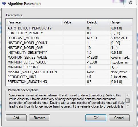 |
| Parameters |
There are quite a few parameters here. The really important one is Forecast Method. This algorithm supports two distinct methods, ARIMA and ARTXP. We recommend using the MIXED option unless you have a good reason not to. These methods are quite complex. For more information about them, you can visit
ARIMA and
ARTXP. The main difference that should be noted is that the ARIMA algorithm is Univariate and the ARTXP algorithm is Multivariate. This means that the ARIMA algorithm will not consider values from the other columns when it calculates its predictions. The ARTXP algorithm will. The process of using one series to predict another series is called "Cross-Prediction". This makes the ARTXP algorithm a good option for predicting one value ahead, while the ARIMA algorithm is typically better for predicting many future values. For more information on the rest of the parameters, read
this. Let's keep going.
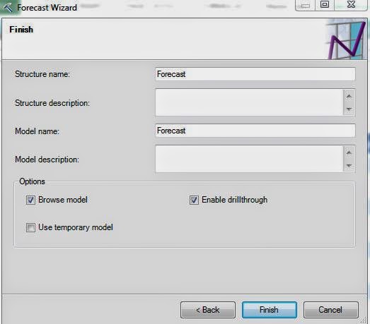 |
| Create Model |
Since a forecasting model doesn't want any missing values, we do not have to define Training and Testing Sets. We jump right to the model creation. Let's check out the results.
 |
| Forecasted Percentages |
This chart shows us the known values, as well as the predicted values for a certain number of steps in the future. Oddly enough, the default is to show the percentage different from the starting value in the series. This allows you to visualize many different series without having to worry about value. However, it does lack the functional ability to show real values. However, we can easily toggle to show absolute values.
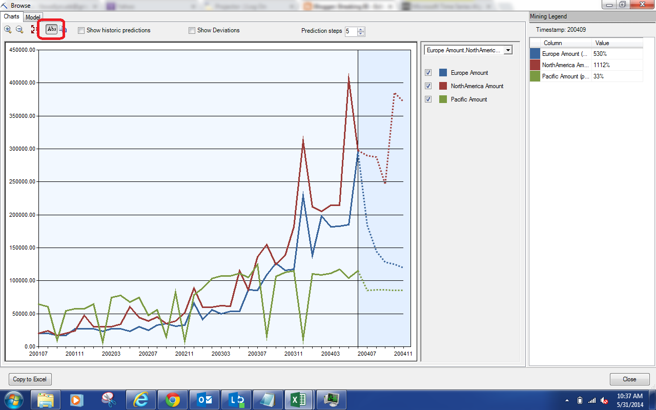 |
| Forecasted Absolutes |
By clicking the button in red at the top of the screen, you can toggle the display between Percentages and Absolute Values. Let's try selecting the "Show Historic Predictions" option.
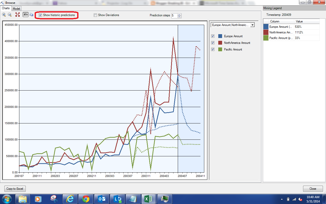 |
| Show Historic Predictions |
This options shows you some of the predictions that were made when the actual values were known. This is great for checking the accuracy of the model. The closer the predicted values are to the actual values, the better the model is at predicting. Unfortunately, this model doesn't seem to fit too well. No need to worry about that, we can tweak the parameters later. Let's check out the "Show Deviations" option.
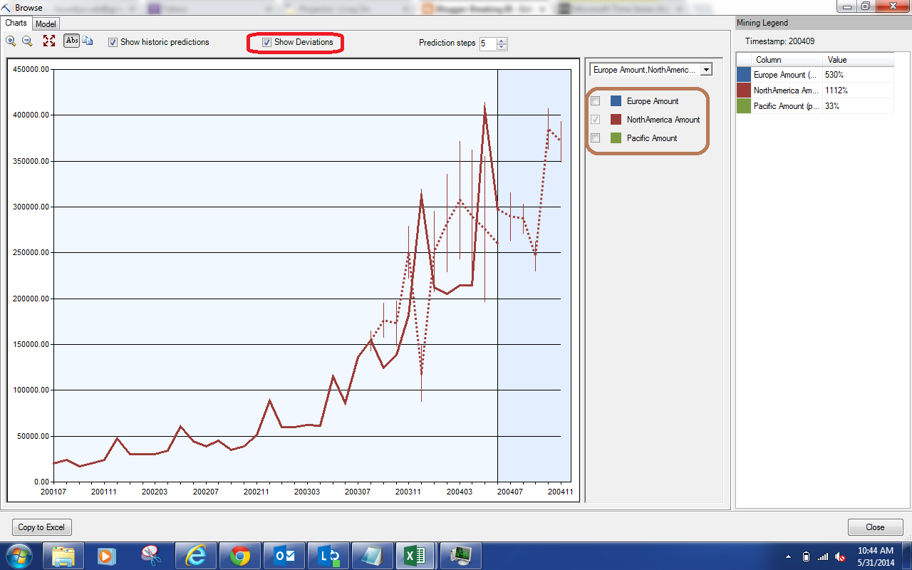 |
| Show Deviations |
Selecting this option made the chart a little too cluttered. So, we used the filter (highlighted in brown) to only show the North America data. The "Show Deviations" option shows us how much deviation is expected between the actuals and the predictions. If our actuals fall within the line, then the prediction was good. As you can see, this is usually not the case. This is great indication that our model needs some tweaking. Let's look at our last option, "Prediction Steps".
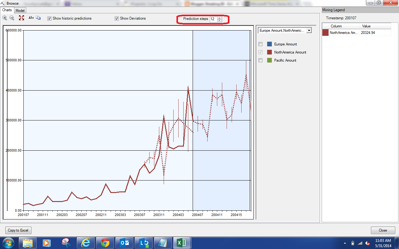 |
| Prediction Steps |
We can use this option to choose how many steps into the future we would like to predict. In our case, these steps are Months. Please note that adding more steps does not change the predictions for previous values. In other words, adding a sixth prediction doesn't change the previous five predictions. However, the further into the future you predict, the less reliable your predictions will become. Let's back up a little and look at the values on the right side of the screen.
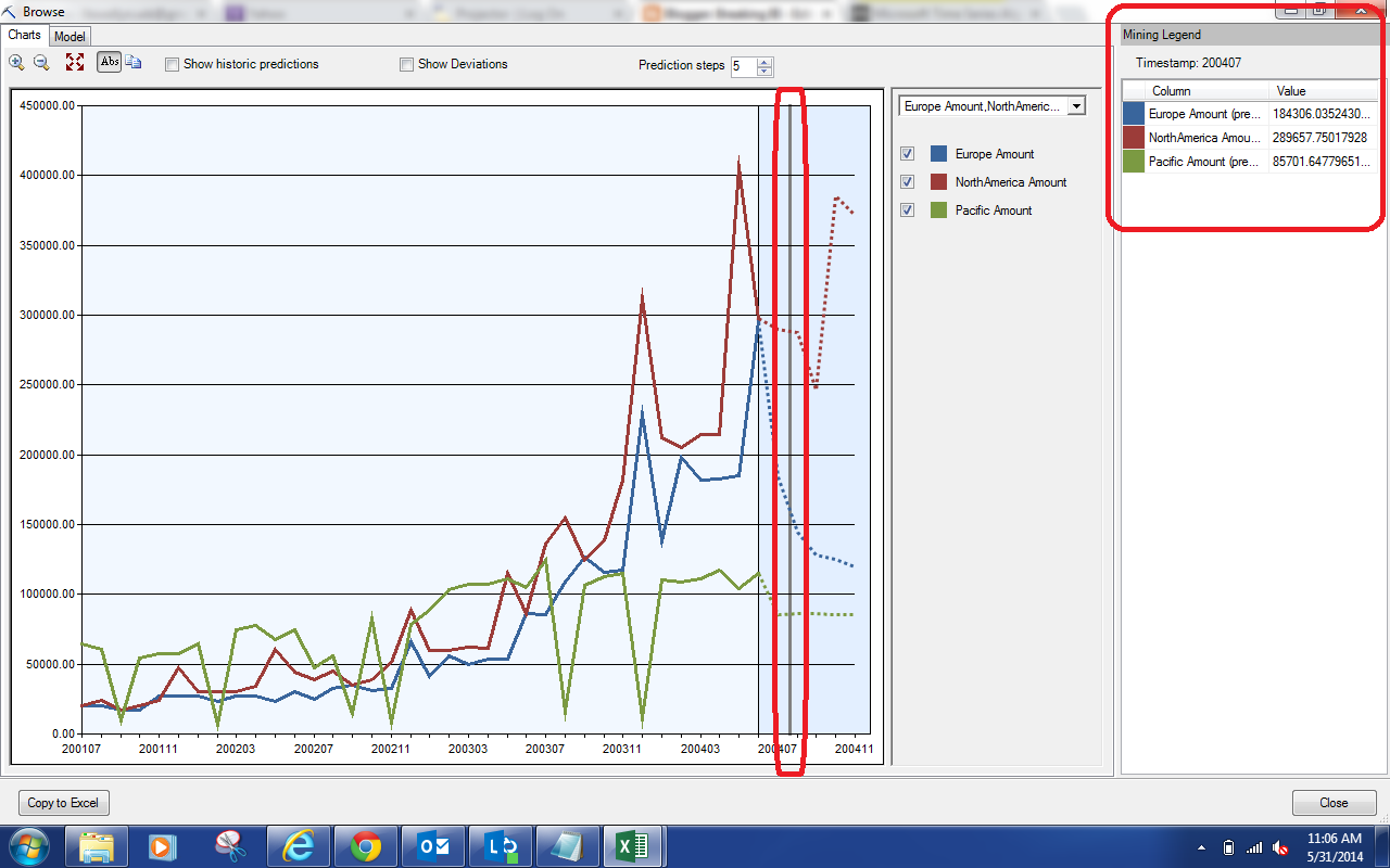 |
| Predicted Values |
The box on the far right of the window will show you the actuals and/or predictions corresponding to the spot on the graph you select. For instance, we selected 200407 on the chart and these values were populated. This is the only way to get these predictions from this chart. Let's move on to the Model.
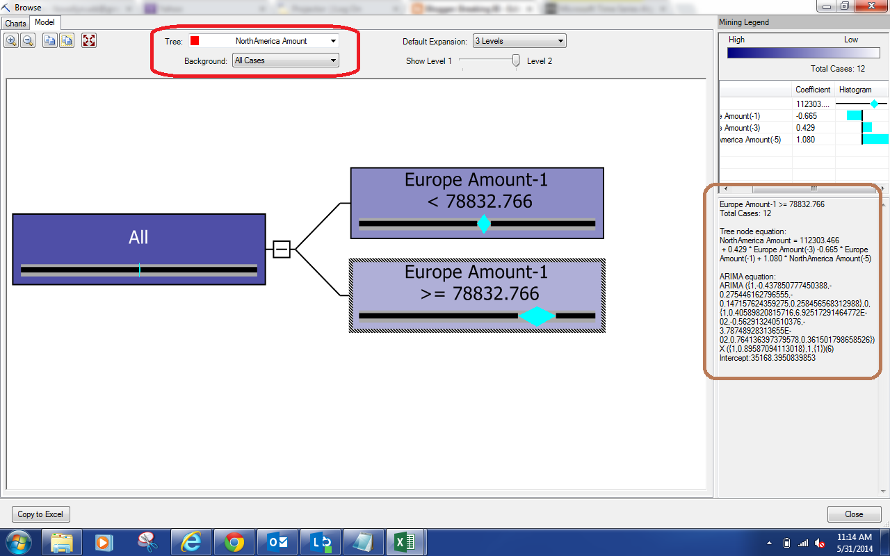 |
| North America Model |
Since the ARTXP model is a type of decision tree, we can visualize it the same way we did for our previous decision trees. It is interesting to note that we are looking at the North American Amounts (as indicated in the red box at the top of the window), while the tree is splitting based off of the European Amount. When you select a node, the right side of the window (highlighted in brown) will show the Tree node equation (ARTXP) and the ARIMA equation for the selected node. If you want to see the other series, you can select them from the red box.
This was a good example of showing how you can use the Forecast feature to develop some mathematically sound predictions based on your own data. Stay tuned for the next post where we'll attempt to tweak this model to be a little more relevant. Thanks for reading. We hope you found this informative.
Brad Llewellyn
Director, Consumer Sciences
Consumer Orbit
llewellyn.wb@gmail.com
http://www.linkedin.com/in/bradllewellyn


.png)
.png)
.png)

.png)

.png)


.png)
.png)


.png)

.JPG)